[http://www.ruanyifeng.com/blog/2015/07/flex-grammar.html](http://www.ruanyifeng.com/blog/2015/07/flex-grammar.html)
[https://css-tricks.com/snippets/css/a-guide-to-flexbox/](https://css-tricks.com/snippets/css/a-guide-to-flexbox/)
[https://blog.csdn.net/m0\_37058714/article/details/80765562](https://blog.csdn.net/m0_37058714/article/details/80765562)
**瀏覽器四大內核**
四大內核分別是:Trident(也稱IE內核)、webkit、Blink、Gecko
* **Firefox** (Gecko內核,俗稱Firefox內核)
* **Chrome谷歌瀏覽器**(統稱為Chromium內核或Chrome內核,以前是Webkit內核,現在是Blink內核)
* **Safari瀏覽器** (Webkit內核)
* **Opera瀏覽器**(最初是自己的Presto內核,后來是Webkit,現在是Blink內核)
* **搜狗、QQ瀏覽器、阿里云**(IE兼容模式+Webkit高速模式)
* **360極速、獵豹瀏覽器**(IE+Chrome雙內核)
* **2345瀏覽器、百度、世界之窗、遨游(3.x為雙內核)**(以前是IE內核,現在也是IE+Chrome雙內核)
### **flex兼容性**
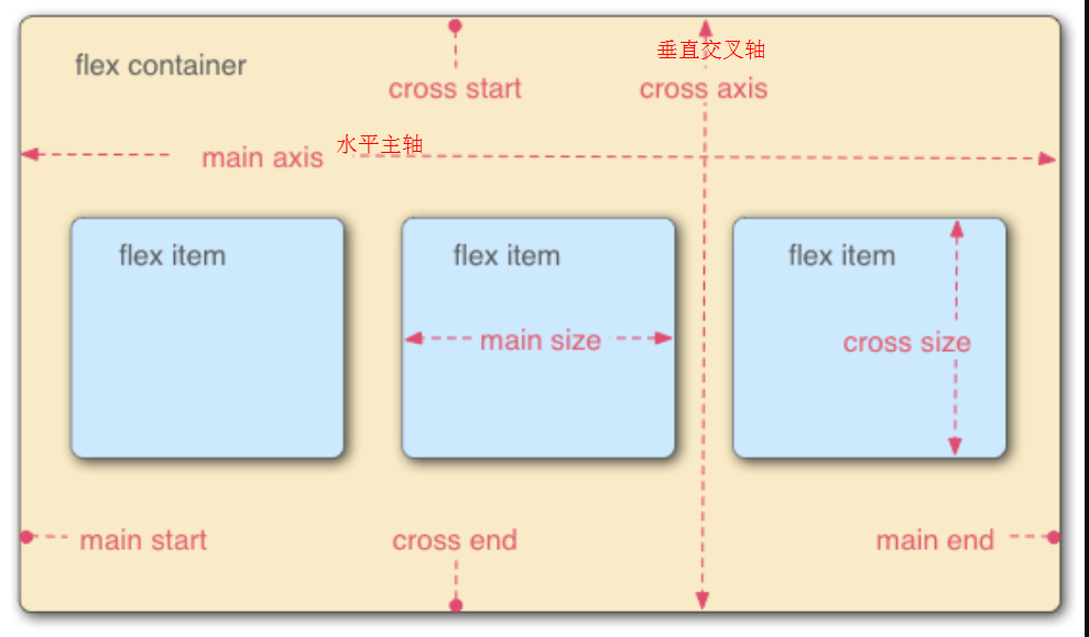
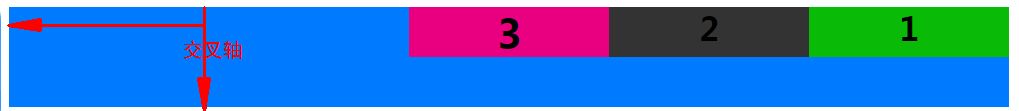
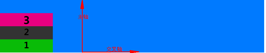
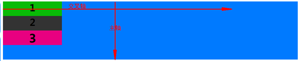
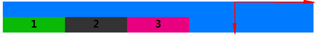
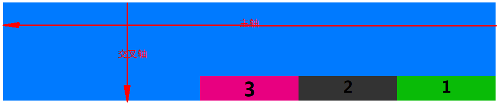
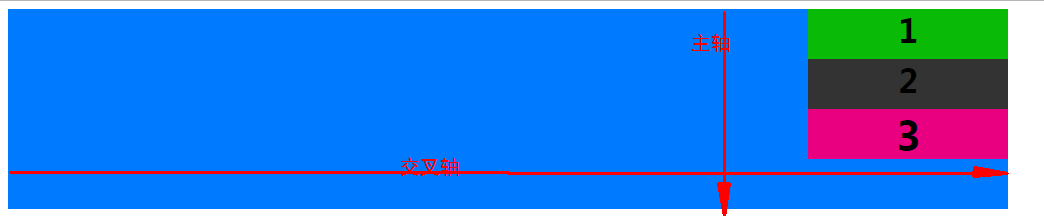
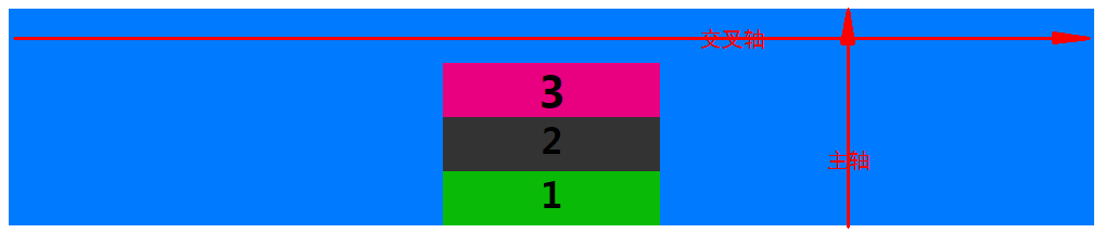
>容器默認存在兩根軸:水平的**主軸**(main axis)和垂直的**交叉軸**(cross axis)。主軸的開始位置(與邊框的交叉點)叫做`main start`,結束位置叫做`main end`;交叉軸的開始位置叫做`cross start`,結束位置叫做`cross end`。
項目默認沿主軸排列。單個項目占據的主軸空間叫做`main size`,占據的交叉軸空間叫做`cross size`。交叉軸根據主軸的方向分向下↓的交叉軸與向右→的交叉軸
~~~
.container{
display: flex;/*行內元素為:online-flex*/
/*Webkit 內核的瀏覽器,必須加上`-webkit`前綴*/
display: -webkit-flex; /* Safari */
}
~~~
>[danger]**注意**.container設為 Flex 布局以后,子元素的`float`、`clear`和`vertical-align`屬性將失效
## container容器的屬性
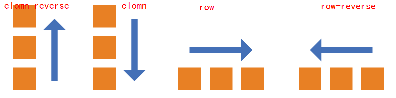
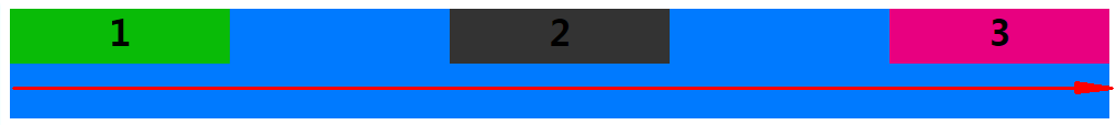
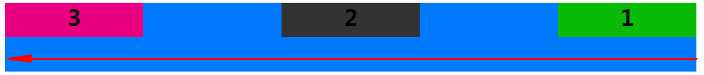
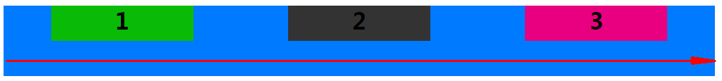
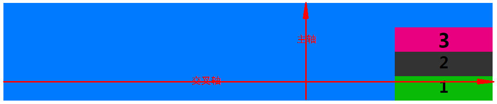
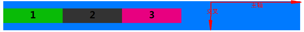
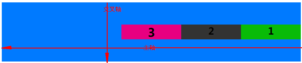
* **flex-direction** 屬性決定項目item**主軸的方向**(決定它的子元素按照什么方向來排列,**即項目item的排列方向**)
row: 默認,主軸方向為→
row-reverse:主軸方向為←
column:主軸方向為↓
column-reverse:主軸方向為↑
如果flex-direction是row或者row-reverse,那么主軸就是justify-contain
如果flex-direction是column或者column-reverse,那么主軸就是align-items
~~~
.container{
flex-direction: row(默認) | row-reverse | column | column-reverse;
}
~~~
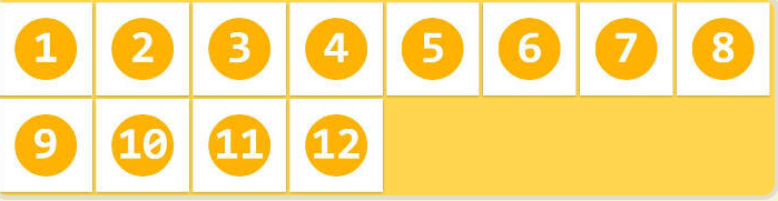
* **flex-wrap** 一條軸線排不下,如何換行
~~~
.container{
flex-wrap: nowrap(默認) | wrap | wrap-reverse
}
~~~
(1)`nowrap`(默認):不換行。
(2)`wrap`:換行,第一行在上方。
(3)`wrap-reverse`:換行,第一行在下方。

* **flex-flow** 是`flex-direction`屬性和`flex-wrap`屬性的簡寫形式,默認值為`row nowrap`
flex-flow: \<flex-direction\> || \<flex-wrap\>;
~~~
.container{
flex-flow: row nowrap;
}
~~~
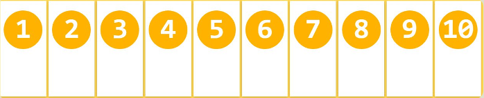
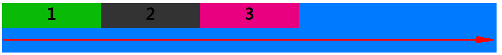
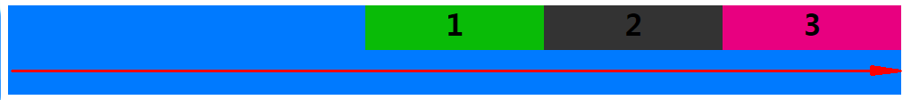
* **justify-content** 項目item在主軸上的對齊方式
從上可知 flex-direction屬性的row 與row-reverse決定主軸的方向
* `flex-start`(默認值):主軸起始方向對齊
* `flex-end`:主軸結束方向對齊
* `center`: 居中
* `space-between`:兩端對齊,項目之間的間隔都相等。
* `space-around`:每個項目兩側的間隔相等。所以,項目之間的間隔比項目與邊框的間隔大一倍。
```
display: flex;
flex-flow:row nowrap;
justify-content:flex-start;
```
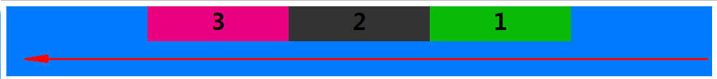
```
display: flex;
flex-flow:row nowrap;
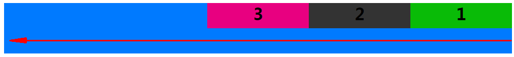
justify-content:flex-end;
```
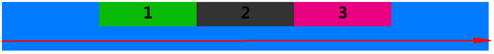
```
display: flex;
flex-flow:row-reverse nowrap;
justify-content:flex-start;
```
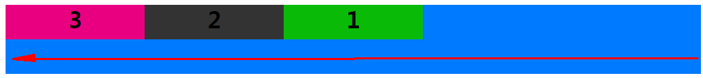
```
display: flex;
flex-flow:row-reverse nowrap;
justify-content:flex-end;
```
```
display: flex;
flex-flow:row nowrap;
justify-content:center;
```
```
display: flex;
flex-flow:row-reverse nowrap;
justify-content:center;
```
```
display: flex;
flex-flow:row nowrap;
justify-content:space-between;
```
```
display: flex;
flex-flow:row-reverse nowrap;
justify-content:space-between;
```
```
display: flex;
flex-flow:row nowrap;
justify-content:space-around;
```
```
display: flex;
flex-flow:row-reverse nowrap;
justify-content:space-around;
```

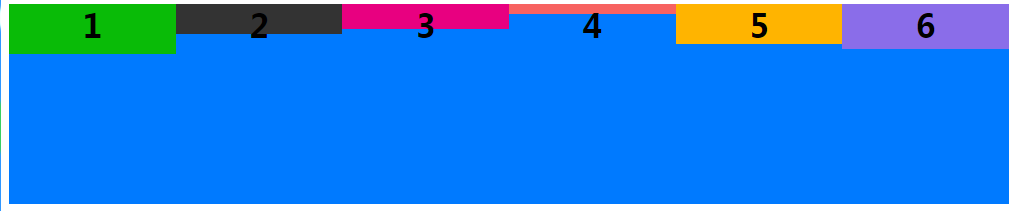
* **align-items** 定義項目在交叉軸上如何對齊。
* `flex-start`:交叉軸的起點對齊。
* `flex-end`:交叉軸的終點對齊。
* `center`:交叉軸的中點對齊。
* `baseline`: 項目的第一行文字的基線對齊。
* `stretch`(默認值):如果項目未設置高度或設為auto,將占滿整個容器的高度。
flex-start:交叉軸的起點對齊
```
display: flex;
flex-flow:row nowrap;/*默認 主軸方向→*/
justify-content:flex-start;/*默認 item在主軸的對齊方式*/
align-items: flex-start;/*item在交叉軸的對齊方式 */
```

```
display: flex;
flex-flow:row-reverse nowrap;/*主軸方向←*/
justify-content:flex-start;/*默認 item在主軸的對齊方式*/
align-items: flex-start;/*item在交叉軸的對齊方式 */
```
```
display: flex;
flex-flow:column-reverse nowrap;/*主軸方向↑*/
justify-content:flex-start;/*默認 item在主軸的對齊方式*/
align-items: flex-start;/*item在交叉軸的對齊方式 */
```
```
display: flex;
flex-flow:column nowrap;/*主軸方向↓*/
justify-content:flex-start;/*默認 item在主軸的對齊方式*/
align-items: flex-start;/*item在交叉軸的對齊方式 */
```
flex-end:交叉軸的終點對齊
```
display: flex;
flex-flow:row nowrap;/*默認 主軸方向→*/
justify-content:flex-start;/*默認 item在主軸的對齊方式*/
align-items: flex-end;/* item在交叉軸的對齊方式 */
```
```
display: flex;
flex-flow:row-reverse nowrap;/* 主軸方向←*/
justify-content:flex-start;/*默認 item在主軸的對齊方式*/
align-items: flex-end;/* item在交叉軸的對齊方式 */
```
```
display: flex;
flex-flow:column nowrap;/* 主軸方向←*/
justify-content:flex-start;/*默認 item在主軸的對齊方式*/
align-items: flex-end;/* item在交叉軸的對齊方式 */
```
```
display: flex;
flex-flow:column-reverse nowrap;/* 主軸方向↑*/
justify-content:flex-start;/*默認 item在主軸的對齊方式*/
align-items: flex-end;/* item在交叉軸的對齊方式 */
```
center:交叉軸的中點對齊
```
display: flex;
flex-flow:row nowrap;/*默認 主軸方向→*/
justify-content:flex-start;/*默認 item在主軸的對齊方式*/
align-items: center;/* item在交叉軸的對齊方式 */
```
```
display: flex;
flex-flow:row-reverse nowrap;/* 主軸方向←*/
justify-content:flex-start;/*默認 item在主軸的對齊方式*/
align-items: center;/* item在交叉軸的對齊方式 */
```
```
display: flex;
flex-flow:column nowrap;/* 主軸方向↓*/
justify-content:flex-start;/*默認 item在主軸的對齊方式*/
align-items: center;/* item在交叉軸的對齊方式 */
```

```
display: flex;
flex-flow:column-reverse nowrap;/* 主軸方向↑*/
justify-content:flex-start;/*默認 item在主軸的對齊方式*/
align-items: center;/* item在交叉軸的對齊方式 */
```
允許換行時center居中,換行后存在間隙,我們使用align-content: center;替換align-items: center;
```
display: flex;
flex-flow:row wrap;/* 主軸方向→*/
justify-content:flex-start;/*默認 item在主軸的對齊方式*/
align-items: center;/* item在交叉軸的對齊方式 */
```
baseline:項目的第一行文字的基線對齊
```
display: flex;
flex-flow:row nowrap;/*默認 主軸方向→*/
justify-content:flex-start;/*默認 item在主軸的對齊方式*/
align-items: baseline;/* item在交叉軸的對齊方式 */
```

```
display: flex;
flex-flow:row-reverse nowrap;/* 主軸方向←*/
justify-content:flex-start;/*默認 item在主軸的對齊方式*/
align-items: baseline;/* item在交叉軸的對齊方式 */
```
```
display: flex;
flex-flow:column nowrap;/* 主軸方向↓*/
justify-content:flex-start;/*默認 item在主軸的對齊方式*/
align-items: baseline;/* item在交叉軸的對齊方式 */
```
```
display: flex;
flex-flow:column-reverse nowrap;/* 主軸方向↑*/
justify-content:flex-start;/*默認 item在主軸的對齊方式*/
align-items: baseline;/* item在交叉軸的對齊方式 */
```
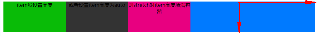
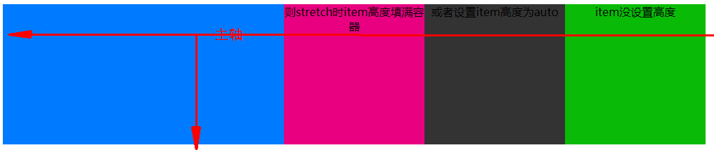
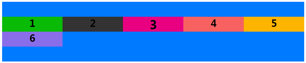
stretch:如果項目item未設置高度或設為auto,將占滿整個容器的高度
```
display: flex;
flex-flow:row nowrap;/*默認 主軸方向→*/
justify-content:flex-start;/*默認 item在主軸的對齊方式*/
align-items: stretch;/*默認 item在交叉軸的對齊方式 */
```
```
display: flex;
flex-flow:row-reverse nowrap;/* 主軸方向←*/
justify-content:flex-start;/*默認 item在主軸的對齊方式*/
align-items: stretch;/*默認 item在交叉軸的對齊方式 */
```
* **align-content** 用法與align-items一致,定義了多根軸線的對齊方式。如果項目只有一根軸線,該屬性不起作用。 即項目只有一行時無效果
* `flex-start`:與交叉軸的起點對齊。
* `flex-end`:與交叉軸的終點對齊。
* `center`:與交叉軸的中點對齊。
* `space-between`:與交叉軸兩端對齊,軸線之間的間隔平均分布。
* `space-around`:每根軸線兩側的間隔都相等。所以,軸線之間的間隔比軸線與邊框的間隔大一倍。
* `stretch`(默認值):軸線占滿整個交叉軸。
只有一根軸線時
```
display: flex;
flex-flow:row nowrap;/*默認 主軸方向→*/
justify-content:flex-start;/*默認 item在主軸的對齊方式*/
align-content: center;
```
如下圖所示沒有生效
修改代碼初始效果如下
當允許換行時項目就有兩行即兩根軸線align-content: center;生效
```
display: flex;
flex-flow:row wrap;/* 主軸方向→*/
justify-content:flex-start;/*默認 item在主軸的對齊方式*/
align-content: center;
```
html代碼參考,
```
<!DOCTYPE html>
<html lang="zh-cn">
<head>
<style type="text/css">
.container>div{
width: 200px;
height: 50px;
}
.container>.item-1{
background-color: #09BB07;
}
.container>.item-2{
background-color: #333333;
}
.container>.item-3{
background-color: #E80080;
}
.container>.item-4{
background-color: #F76260;
}
.container>.item-5{
background-color: #FFB400;
}
.container>.item-6{
background-color: #8A6DE9;
}
h1{
margin: 0;
}
.container{
width: 1000px;
height: 200px;
text-align: center;
background-color: #007AFF;
display:-webkit-flex;
display: flex;
flex-flow:row-reverse nowrap;/*主軸方向包括 row row-reverse column column-reverse*/
justify-content:flex-start;/*item在主軸的對齊方式 flex-start | flex-end | center | space-between | space-around;*/
align-items: stretch;/*item在交叉軸的對齊方式 flex-start | flex-end | center | baseline | stretch*/
}
.container{
width: 1000px;
height: 200px;
text-align: center;
background-color: #007AFF;
display:-webkit-flex;
display: flex;
flex-flow:row wrap;/*主軸方向包括 row row-reverse column column-reverse*/
justify-content:flex-start;/*item在主軸的對齊方式 flex-start | flex-end | center | space-between | space-around;*/
align-content: center;/*flex-start | flex-end | center | space-between | space-around | stretch*/
}
</style>
</head>
<body>
<div class="container">
<div class="item-1"><h1>1</h1></div>
<div class="item-2"><h1>2</h1></div>
<div class="item-3" style="font-size: 20px;"><h1>3</h1></div>
</div>
<hr>
<div class="container">
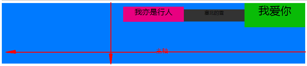
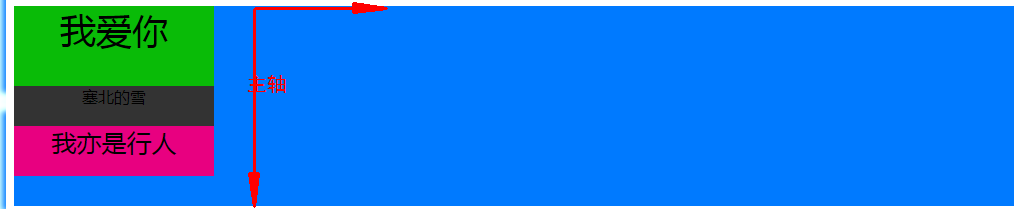
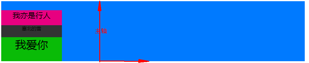
<div class="item-1" style="height: 80px;font-size: 36px;">我愛你</div>
<div class="item-2" style="height: 40px">塞北的雪</div>
<div class="item-3" style="font-size: 25px;">我亦是行人</div>
</div>
<hr>
<div class="container">
<div class="item-1" style="height:auto;">item沒設置高度</div>
<div class="item-2" style="height:auto;">或者設置item高度為auto</div>
<div class="item-3" style="height:auto;">則stretch時item高度填滿容器</div>
</div>
<hr>
<div class="container">
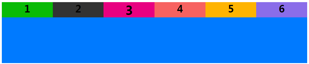
<div class="item-1"><h1>1</h1></div>
<div class="item-2"><h1>2</h1></div>
<div class="item-3" style="font-size: 20px;"><h1>3</h1></div>
<div class="item-4"><h1>4</h1></div>
<div class="item-5"><h1>5</h1></div>
<div class="item-6"><h1>6</h1></div>
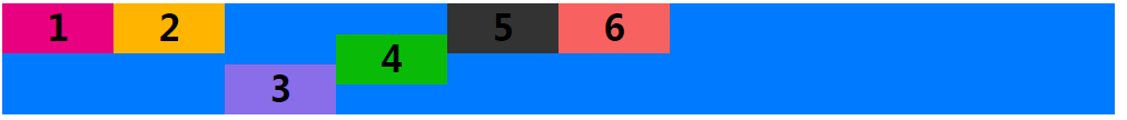
</div>
</body>
</html>
```
## **項目item的屬性**
* **order** 定義項目的排列順序。數值越小,排列越靠前,默認為0
* **flex-grow** 定義項目的放大比例,默認為`0`,即如果存在剩余空間,也不放大
* **flex-shrink**
* **flex-basis**
* **flex**
* **align-self**
**order**:定義項目的排列順序。數值越小,排列越靠前,默認為0
```
<style type="text/css">
.container1>div{
width: 200px;
}
.container1{
display:-webkit-flex;
display: flex;
flex-flow:row nowrap;/*主軸方向包括 row row-reverse column column-reverse*/
justify-content:flex-start;/*item在主軸的對齊方式 flex-start | flex-end | center | space-between | space-around;*/
align-content: flex-start;/*flex-start | flex-end | center | baseline | stretch*/
}
</style>
<div class="container1" style="width: 1000px;height: 200px;text-align: center;background-color: #007AFF;">
<div class="item1" style="background-color: #09BB07;height: 50px;"><h1>1</h1></div>
<div class="item2" style="background-color: #333333;height: 30px;"><h1>2</h1></div>
<div class="item3" style="background-color: #E80080;height: 25px;"><h1>3</h1></div>
<div class="item4" style="background-color: #F76260;height: 10px;"><h1>4</h1></div>
<div class="item5" style="background-color: #FFB400;height: 40px;"><h1>5</h1></div>
<div class="item6" style="background-color: #8A6DE9;height: 45px;"><h1>6</h1></div>
</div>
```
添加order
```
<style type="text/css">
.container1>div{
width: 200px;
}
.container1{
display:-webkit-flex;
display: flex;
flex-flow:row nowrap;/*主軸方向包括 row row-reverse column column-reverse*/
justify-content:flex-start;/*item在主軸的對齊方式 flex-start | flex-end | center | space-between | space-around;*/
align-content: flex-start;/*flex-start | flex-end | center | baseline | stretch*/
}
</style>
<div class="container1" style="width: 1000px;height: 200px;text-align: center;background-color: #007AFF;">
<div class="item1" style="order:3;background-color: #09BB07;height: 50px;"><h1>1</h1></div>
<div class="item2" style="order:2;background-color: #333333;height: 30px;"><h1>2</h1></div>
<div class="item3" style="order:1;background-color: #E80080;height: 25px;"><h1>3</h1></div>
<div class="item4" style="order:4;background-color: #F76260;height: 10px;"><h1>4</h1></div>
<div class="item5" style="order:6;background-color: #FFB400;height: 40px;"><h1>5</h1></div>
<div class="item6" style="order:5;background-color: #8A6DE9;height: 45px;"><h1>6</h1></div>
</div>
```

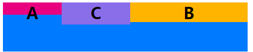
**flex-grow**:屬性定義項目的放大比例,默認為`0`(父元素的寬度存在剩余寬度,也不放大),當父元素的寬度大于所有子元素的寬度的和時(即父元素會有剩余空間),子元素如何分配父元素的剩余空間。?flex-grow的默認值為0,意思是該元素不索取父元素的剩余空間,如果值大于0,表示索取。值越大,索取的越厲害。
?**舉個例子**:
父元素寬500px,有兩個子元素:A、B和C。A寬為100px,B寬為200px,C寬為100px。 則空余空間為 500-(100+200+100)= 100px。 如果A,B都不索取剩余空間,則有100px的空余空間
```
<style type="text/css">
.container1{
display:-webkit-flex;
display: flex;
flex-flow:row nowrap;/*主軸方向包括 row row-reverse column column-reverse*/
}
</style>
<div class="container1" style="width: 500px;height: 100px;text-align: center;background-color: #007AFF;">
<div class="item1" style="flex-grow:0;order:1;background-color: #E80080;width: 100px;height: 25px;"><h1>A</h1></div>
<div class="item2" style="flex-grow:0;order:6;background-color: #FFB400;width: 200px;height: 40px;"><h1>B</h1></div>
<div class="item3" style="flex-grow:0;order:5;background-color: #8A6DE9;width: 100px;height: 45px;"><h1>C</h1></div>
</div>
```
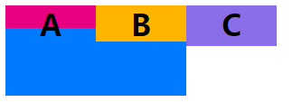
如果A索取剩余空間:設置item1類元素flex-grow為1,B、C不索取。則最終A的大小為 自身寬度(100px)+ 剩余空間的寬度(100px)= 200px

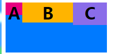
如果A,B都設索取剩余空間,C不索取,A設置flex-grow為1,B設置flex-grow為2。則最終A的大小為 自身寬度(100px)+ A獲得的剩余空間的寬度(100px?(1/(1+2)))=133.33...,最終B的大小為 自身寬度(200px)+ B獲得的剩余空間的寬度(200px?(2/(1+2)))=266.66...
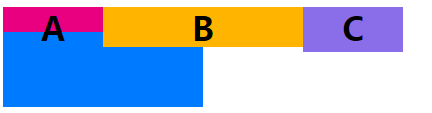
如果A,B、C都設索取剩余空間,A設置flex-grow為1,B設置flex-grow為2,B設置flex-grow為2。
則最終A的大小為 自身寬度(100px)+ A獲得的剩余空間的寬度(100px?(1/(1+2+2)))=120,
最終B的大小為 自身寬度(200px)+ B獲得剩余寬度為(100px?(2/(1+2+2)))=240,
最終C的大小為 自身寬度(100px)+ C獲得剩余寬度為(100px?(2/(1+2+2)))=140,
```
<style type="text/css">
.container1{
display:-webkit-flex;
display: flex;
flex-flow:row nowrap;/*主軸方向包括 row row-reverse column column-reverse*/
}
</style>
<div class="container1" style="width: 500px;height: 100px;text-align: center;background-color: #007AFF;">
<div class="item1" style="flex-grow:1;order:1;background-color: #E80080;width: 100px;height: 25px;"><h1>A</h1></div>
<div class="item2" style="flex-grow:2;order:6;background-color: #FFB400;width: 200px;height: 40px;"><h1>B</h1></div>
<div class="item3" style="flex-grow:2;order:5;background-color: #8A6DE9;width: 100px;height: 45px;"><h1>C</h1></div>
</div>
```
**flex-shrink**屬性定義了項目的縮小比例,默認為1,即如果空間不足,該項目將縮小。
當父元素的寬度小于所有子元素的寬度的和時(即子元素會超出父元素),子元素如何縮小自己的寬度的。?`flex-shrink`的默認值為1,當父元素的寬度小于所有子元素的寬度的和時,子元素的寬度會減小。值越大,減小的越厲害。如果值為0,表示不減小
```
<style type="text/css">
.container1{
display:-webkit-flex;
display: flex;
flex-flow:row nowrap;/*主軸方向包括 row row-reverse column column-reverse*/
}
</style>
<div class="container1" style="width: 200px;height: 100px;text-align: center;background-color: #007AFF;">
<div class="item1" style="flex-shrink:0;background-color: #E80080;width: 100px;height: 25px;"><h1>A</h1></div>
<div class="item2" style="flex-shrink:0;background-color: #FFB400;width: 100px;height: 40px;"><h1>B</h1></div>
<div class="item3" style="flex-shrink:0;background-color: #8A6DE9;width: 100px;height: 45px;"><h1>C</h1></div>
</div>
```
```
<style type="text/css">
.container1{
display:-webkit-flex;
display: flex;
flex-flow:row nowrap;/*主軸方向包括 row row-reverse column column-reverse*/
}
</style>
<div class="container1" style="width: 200px;height: 100px;text-align: center;background-color: #007AFF;">
<div class="item1" style="flex-shrink:2;background-color: #E80080;width: 100px;height: 25px;"><h1>A</h1></div>
<div class="item2" style="flex-shrink:0;background-color: #FFB400;width: 100px;height: 40px;"><h1>B</h1></div>
<div class="item3" style="flex-shrink:1;background-color: #8A6DE9;width: 100px;height: 45px;"><h1>C</h1></div>
</div>
```
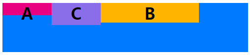
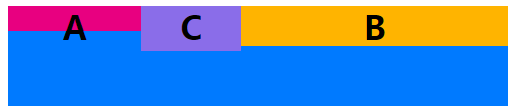
**flex-basis**屬性定義了在分配多余空間之前,項目占據的主軸空間(main size)。瀏覽器根據這個屬性,計算主軸是否有多余空間。它的默認值為`auto`,即項目的本來大小
它可以設為跟`width`或`height`屬性一樣的值(比如350px),則項目將占據固定空間
其實,width也可以設置item寬度。如果元素上同時設置了width和flex-basis,那么width 的值就會被flex-basis覆蓋掉。
如圖 flex-basis替換掉了item2的width
```
<style type="text/css">
.container1{
display:-webkit-flex;
display: flex;
flex-flow:row nowrap;/*主軸方向包括 row row-reverse column column-reverse*/
}
</style>
<div class="container1" style="width: 200px;height: 100px;text-align: center;background-color: #007AFF;">
<div class="item1" style="flex-shrink:0;background-color: #E80080;width: 100px;height: 25px;"><h1>A</h1></div>
<div class="item2" style="flex-shrink:0;flex-basis:200px;background-color: #FFB400;width: 100px;height: 40px;"><h1>B</h1></div>
<div class="item3" style="flex-shrink:0;background-color: #8A6DE9;width: 100px;height: 45px;"><h1>C</h1></div>
</div>
```
### **flex屬性**
`flex`屬性是`flex-grow`,`flex-shrink`和`flex-basis`的簡寫,默認值為`0 1 auto`。后兩個屬性可選。
該屬性有兩個快捷值:`auto`(`1 1 auto`) 和 none (`0 0 auto`)。
建議優先使用這個屬性,而不是單獨寫三個分離的屬性,因為瀏覽器會推算相關值。
### **align-self屬性**
`align-self`屬性允許單個項目有與其他項目不一樣的對齊方式,可覆蓋容器container的`align-items`屬性。默認值為`auto`,表示繼承父元素的`align-items`屬性,如果沒有父元素,則等同于`stretch`。
```
<style type="text/css">
.container1{
display:-webkit-flex;
display: flex;
flex-flow:row nowrap;/*主軸方向包括 row row-reverse column column-reverse*/
}
</style>
<div class="container1" style="width: 1000px;height: 100px;text-align: center;background-color: #007AFF;">
<div class="item1" style="align-self: auto;background-color: #E80080;width: 100px;height: 45px;"><h1>1</h1></div>
<div class="item2" style="align-self: flex-start;background-color: #FFB400;width: 100px;height: 45px;"><h1>2</h1></div>
<div class="item3" style="align-self: flex-end;background-color: #8A6DE9;width: 100px;height: 45px;"><h1>3</h1></div>
<div class="item3" style="align-self: center;background-color: #09BB07;width: 100px;height: 45px;"><h1>4</h1></div>
<div class="item3" style="align-self: baseline;background-color: #333333;width: 100px;height: 45px;"><h1>5</h1></div>
<div class="item3" style="align-self: stretch;background-color: #F76260;width: 100px;height: 45px;"><h1>6</h1></div>
</div>
```