## 三、容器的屬性
以下6個屬性設置在容器上。
* flex-direction
* flex-wrap
* flex-flow
* justify-content
* align-items
* align-content
### 3.1 flex-direction屬性
`flex-direction`屬性決定主軸的方向(即項目的排列方向)。
~~~
.box {
flex-direction: row | row-reverse | column | column-reverse;
}
~~~
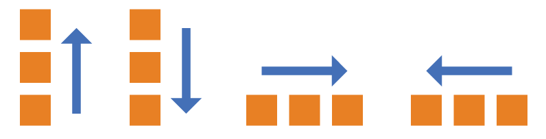
它可能有4個值。
* `row`(默認值):主軸為水平方向,起點在左端。
* `row-reverse`:主軸為水平方向,起點在右端。
* `column`:主軸為垂直方向,起點在上沿。
* `column-reverse`:主軸為垂直方向,起點在下沿。
### 3.2 flex-wrap屬性
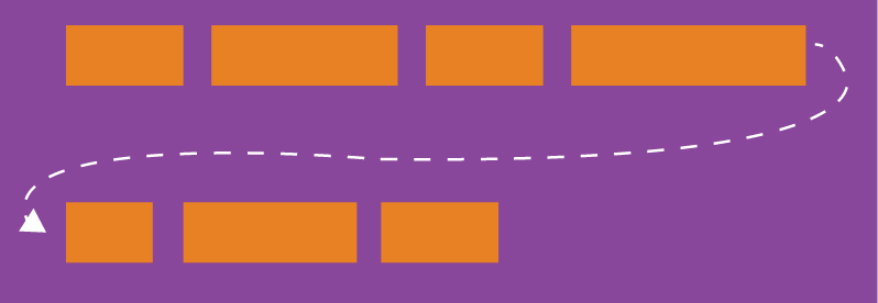
默認情況下,項目都排在一條線(又稱"軸線")上。`flex-wrap`屬性定義,如果一條軸線排不下,如何換行。
~~~
.box{
flex-wrap: nowrap | wrap | wrap-reverse;
}
~~~
它可能取三個值。
(1)`nowrap`(默認):不換行。
(2)`wrap`:換行,第一行在上方。

(3)`wrap-reverse`:換行,第一行在下方。

### 3.3 flex-flow
`flex-flow`屬性是`flex-direction`屬性和`flex-wrap`屬性的簡寫形式,默認值為`row nowrap`。
~~~
.box {
flex-flow: <flex-direction> || <flex-wrap>;
}
~~~
### 3.4 justify-content屬性
`justify-content`屬性定義了項目在主軸上的對齊方式。
~~~
.box {
justify-content: flex-start | flex-end | center | space-between | space-around;
}
~~~
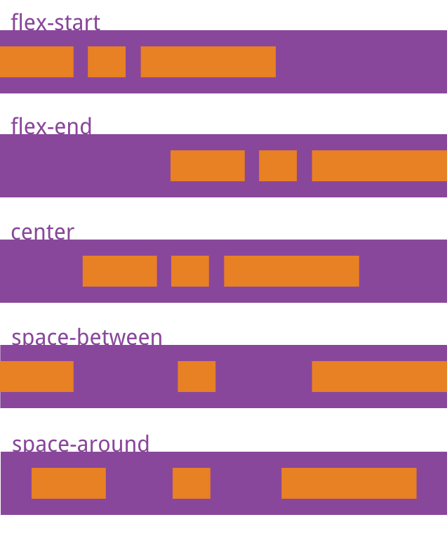
它可能取5個值,具體對齊方式與軸的方向有關。下面假設主軸為從左到右。
* `flex-start`(默認值):左對齊
* `flex-end`:右對齊
* `center`: 居中
* `space-between`:兩端對齊,項目之間的間隔都相等。
* `space-around`:每個項目兩側的間隔相等。所以,項目之間的間隔比項目與邊框的間隔大一倍。
### 3.5 align-items屬性
`align-items`屬性定義項目在交叉軸上如何對齊。
~~~
.box {
align-items: flex-start | flex-end | center | baseline | stretch;
}
~~~
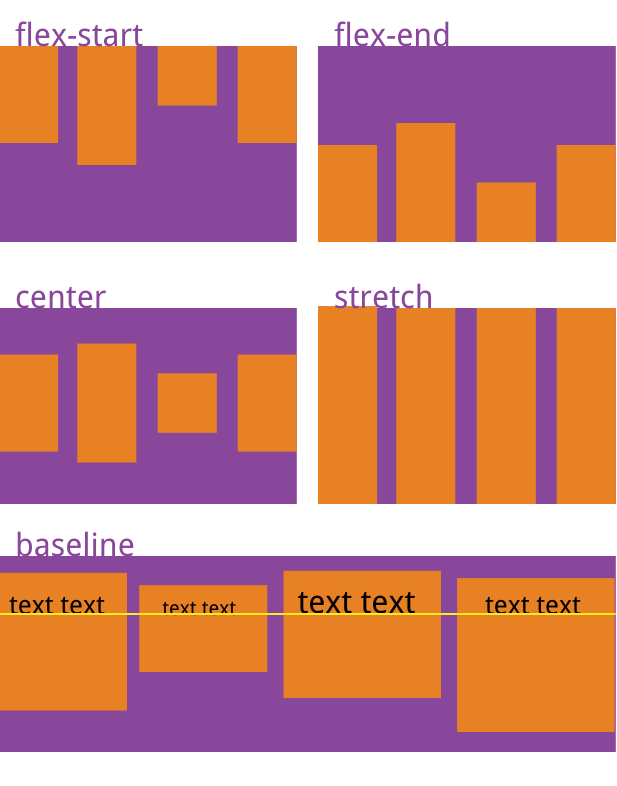
它可能取5個值。具體的對齊方式與交叉軸的方向有關,下面假設交叉軸從上到下。
* `flex-start`:交叉軸的起點對齊。
* `flex-end`:交叉軸的終點對齊。
* `center`:交叉軸的中點對齊。
* `baseline`: 項目的第一行文字的基線對齊。
* `stretch`(默認值):如果項目未設置高度或設為auto,將占滿整個容器的高度。
### 3.6 align-content屬性
`align-content`屬性定義了多根軸線的對齊方式。如果項目只有一根軸線,該屬性不起作用。
~~~
.box {
align-content: flex-start | flex-end | center | space-between | space-around | stretch;
}
~~~
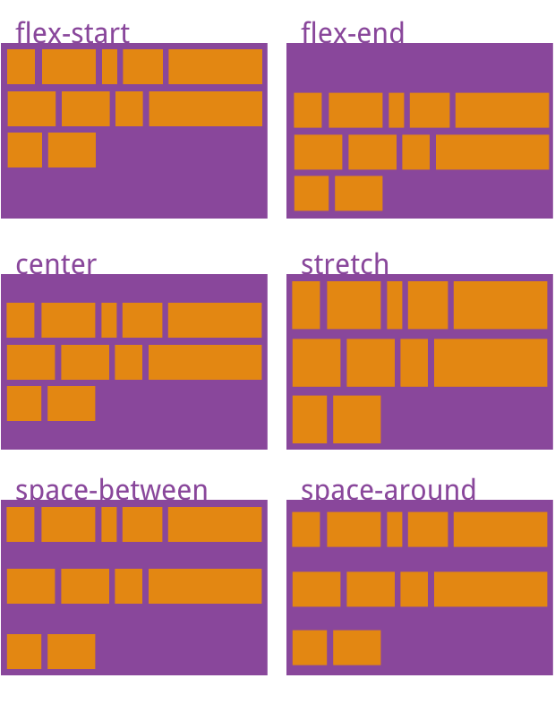
該屬性可能取6個值。
* `flex-start`:與交叉軸的起點對齊。
* `flex-end`:與交叉軸的終點對齊。
* `center`:與交叉軸的中點對齊。
* `space-between`:與交叉軸兩端對齊,軸線之間的間隔平均分布。
* `space-around`:每根軸線兩側的間隔都相等。所以,軸線之間的間隔比軸線與邊框的間隔大一倍。
* `stretch`(默認值):軸線占滿整個交叉軸。