HTML5
> [https://developer.mozilla.org/zh-CN/docs/Web/Guide/HTML/HTML5](https://developer.mozilla.org/zh-CN/docs/Web/Guide/HTML/HTML5)
* 語義化標簽類
* 音視頻處理 //代替flash
* canvas / webGL
* history API
* requestAnimationFrame
* 地理位置
* web scoket
* ……
* * CSS3
* 常規
* 動畫
* 盒子模型
* 響應式布局
* ……
* JavaScript
* ECMAScript 3/5/6/7/8/9
* DOM
* BOM
* 設計模式
* 底層原理
* 堆棧內存
* 閉包作用域 AO/VO/GO/EC/ECSTACK
// 預編譯:有函數預編譯AO,全局預編譯GO,變量對象(VO),## 執行環境(EC),變量對象(VO),活動對象(AO),作用域鏈(scope chain) ***
* 面向對象OOP
* THIS
* EventLoop
* 瀏覽器渲染原理
* 回流重繪
* ……
* 網絡通信層
* AJAX / Fetch / axios
* HTTP1.0 / 2.0
* TCP
* 跨域處理方案
* 性能優化
* ……
* Hybrid或者APP再或者小程序
* Hybrid
* uni-app
* RN
* Flutter
* 小程序 MPVUE
* Weex
* PWA
* ……
* 工程化方面
* webpack
* git
* linux / nginx
* ……
* 全棧方面
* node
* express
* koa2
* mongodb
* nuxt.js / next.js
* ……
* 框架方面
* Angular
* Vue
* 基礎知識
* 核心原理
* vue-router
* vue-cli
* vuex
* element ui
* vant
* cube
* SSR
* 優化
* ……
* React
* 基礎知識
* 核心原理
* react-router-dom
* redux
* react-redux
* dva
* umi
* mobix
* antd
* antd pro
* SSR
* 優化
* ……
* ……
* 游戲方向
* 可視化或者AI方向
* ……
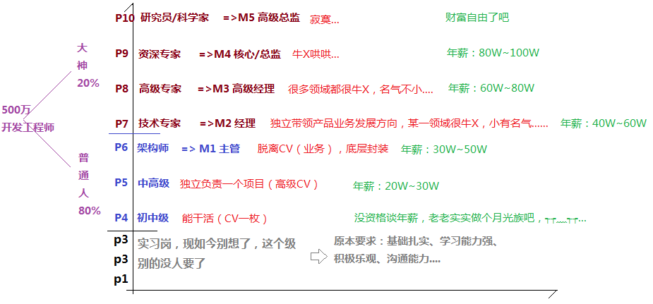
#### 2\. 阿里巴巴九段人才評估方案
**面試要求**
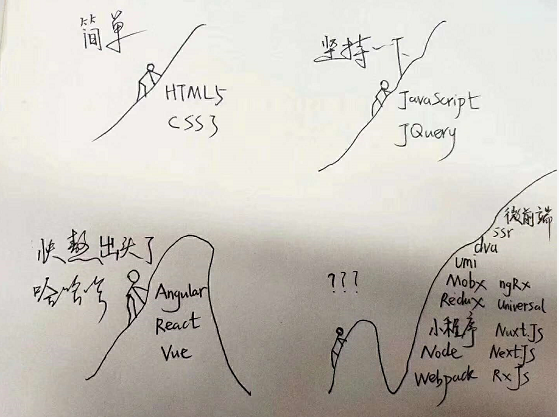
* 2012年:我要做前端(啪…,那叫網頁制作)
* 2013年:我要做前端,我會HTML5+CSS3,JQUERY會用
* 2014年:我懂JQUERY源碼,JS原生很好,可以做前后端分離(AJAX)
* 2015年:我會Hybrid,研究過backbone/sea.js/require.js/grunt…
* 2016年:我會angular,研究過phonegap / cordova / ionic,HTML5很溜 ….
* 2017年:我會react / vue,我會node.js
* 2018年:我會react native、小程序開發、flutter、webpack,可以做數據可視化、能獨立封裝公共組件、有很多大型項目經驗….
* 2019年:
* 面試官:上面那些你都會嗎? 面試者:不會 面試官:啪….,那你來面試個啥
* 面試者:會 面試官:好的,那你說一下他們的底層實現原理吧 =>啪啪啪….
* 2020年:面試官A:讓你來公司面試,你還能面過嗎? 面試官B:不能! 面試官A:那咋辦,咱們降低點難度? 面試官B:算了,還是繼續吧….
#### 3\. BAT/TMD這種大公司到底是怎樣面試的
**一個問題就知道你會不會CSS了,( ̄ε(# ̄)☆╰╮( ̄▽ ̄///)**
* 什么是標簽語義化
* 都有哪些標簽,都是啥意思
* 塊級標簽和行內標簽的區別
塊:div,p,h1-h6,ul,ol,dt,header,footer,main,section,acticle
行內:a,span,small,strong,em,i
行內塊:img,input,表單標簽
* 如何轉換
* display除了這幾個值還有哪些
* display:none
* 讓元素隱藏,你可以怎么做?
* display:none和visibility:hidden的區別?
* opacity的兼容處理
* filter還能做哪些事情
* ……
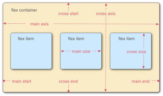
* display:flex
* 項目中你什么時候用到了flex
* 除了這種方式能居中還有哪些?
* 響應式布局還可以怎么做?
* 都有哪些盒子模型
* ……
o(╥﹏╥)o
**好了,咱們換下一個題….**
* * *
**說一下,你自己感覺自己擅長哪些?**
(#^.^#) 沒事的,在我們眼里,你擅長的點我比你更擅長,如果不是,沒關系,后面還有P7/P8們兜著呢!^\_^
* * *
**說一下,這個需求怎么做?**
還有嗎 ( ̄▽ ̄)/
還有嗎 ( ̄▽ ̄)/
……
那說一下,你感覺這幾種方式哪個更好,各自有啥問題……
* * *
**總之一句話,不把你問“死”,算我這次面試失敗!!!**
### 幾道前端經典的面試題
#### 1.掌握盒子水平垂直居中的五大方案
* 定位:三種
* display:flex
* JavaScript
* display:table-cell
~~~css
.father{
display: table-cell;
vertical-align: middle;
text-align: center;
//=>寬高不能是百分比
}
~~~
~~~
<!DOCTYPE html>
<html>
<head>
<meta charset="UTF-8">
<meta http-equiv="X-UA-Compatible" content="ie=edge">
<meta name="viewport" content="width=device-width, user-scalable=no, initial-scale=1.0">
<title>珠峰培訓 - 微信:18310612838</title>
<!-- IMPORT CSS -->
<link rel="stylesheet" href="css/reset.min.css">
<style>
html,
body {
position: relative;
/* height: 100%; */
overflow: hidden;
}
.box {
box-sizing: border-box;
width: 100px;
height: 50px;
line-height: 48px;
text-align: center;
font-size: 16px;
border: 1px solid lightblue;
background: lightcyan;
}
/* 定位1 */
/* body {
position: relative;
} */
/* .box {
position: absolute;
top: 50%;
left: 50%;
margin-top: -25px;
margin-left: -50px;
} */
/* .box {
position: absolute;
top: 0;
left: 0;
right: 0;
bottom: 0;
margin: auto; //不涉及寬高,但是要有寬高
} */
/* .box {
position: absolute;
top: 50%;
left: 50%;
transform: translate(-50%, -50%); //不需要具體寬高,不兼容
} */
/* body {
display: flex;
justify-content: center;
align-items: center;
} */
/* ============ */
body {
display: table-cell;
vertical-align: middle;
text-align: center;
/* 固定寬高 */
width: 500px;
height: 500px;
}
.box {
display: inline-block;
}
</style>
</head>
<body>
<div class="box" id="box">
珠峰培訓
</div>
<!-- IMPORT JS -->
<script>
/* let HTML = document.documentElement,
winW = HTML.clientWidth,
winH = HTML.clientHeight,
boxW = box.offsetWidth,
boxH = box.offsetHeight;
box.style.position = "absolute";
box.style.left = (winW - boxW) / 2 + 'px';
box.style.top = (winH - boxH) / 2 + 'px'; */
</script>
</body>
</html>
~~~
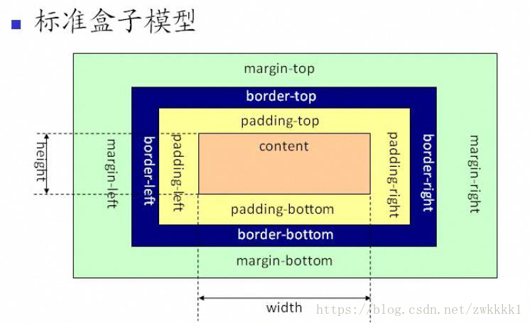
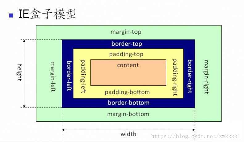
#### 2.關于CSS3中盒模型的幾道面試題
**標準盒子模型**
**IE盒子模型(怪異盒子模型)**
**FLEX盒模型**
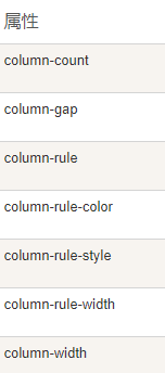
**多列布局**
#### 3.掌握幾大經典布局方案
圣杯布局
雙飛翼布局
=> 左右固定,中間自適應
**圣杯布局:浮動和負MARGIN**
~~~css
<style>
html,
body {
height: 100%;
overflow: hidden;
}
.container {
height: 100%;
padding: 0 200px;
}
.left,
.right {
width: 200px;
min-height: 200px;
background: lightblue;
}
.center {
width: 100%;
min-height: 400px;
background: lightsalmon;
}
.left,
.center,
.right {
float: left;
}
.left {
margin-left: -100%;
position: relative;
left: -200px;
}
.right {
margin-right: -200px;
}
</style>
<div class="container clearfix">
<div class="center"></div>
<div class="left"></div>
<div class="right"></div>
</div>
~~~
**雙飛翼布局:浮動和負MARGIN**
~~~css
<style>
html,
body {
height: 100%;
overflow: hidden;
}
.container,
.left,
.right {
float: left;
}
.container {
width: 100%;
}
.container .center {
margin: 0 200px;
min-height: 400px;
background: lightsalmon;
}
.left,
.right {
width: 200px;
min-height: 200px;
background: lightblue;
}
.left {
margin-left: -100%;
}
.right {
margin-left: -200px;
}
</style>
<body class="clearfix">
<div class="container">
<div class="center"></div>
</div>
<div class="left"></div>
<div class="right"></div>
</body>
~~~
**使用CALC**
計算的話,性能不好,
~~~css
.center {
/* 兼容到IE9 */
width: calc(100% - 400px);
min-height: 400px;
background: #ffa07a;
}
......
~~~
**flex**
[http://www.ruanyifeng.com/blog/2015/07/flex-grammar.html?utm\_source=tuicool](http://www.ruanyifeng.com/blog/2015/07/flex-grammar.html?utm_source=tuicool)
~~~css
html,
body {
overflow: hidden;
}
.container {
display: flex;
justify-content: space-between;
height: 100%;
}
.left,
.right {
flex: 0 0 200px; //既不放大,也不縮小
height: 200px;
background: lightblue;
}
.center {
flex: 1; //把剩余空間占了
min-height: 400px;
background: lightsalmon;
}
~~~
**定位**
~~~css
<style>
html,
body {
height: 100%;
overflow: hidden;
}
.container {
position: relative;
height: 100%;
}
.left,
.right {
position: absolute;
top: 0;
width: 200px;
min-height: 200px;
background: lightblue;
}
.left {
left: 0;
}
.right {
right: 0;
}
.center {
margin: 0 200px;
min-height: 400px;
background: lightsalmon;
}
</style>
~~~
#### 4.移動端響應式布局開發的三大方案
* media ***
* rem ***
* flex
* vh / vw
* ……
### 課后作業
#### 1\. 使用css,讓一個div消失在視野中,發揮想象力 ?
#### 2\. 請說明z-index的工作原理,適用范圍?
* 文檔流
* 定位
#### 3\. 談談你對HTML5的理解?
#### 4\. 如何使一個div里面的文字垂直居中,且該文字的大小根據屏幕大小自適應?
#### 5\. 不考慮其它因素,下面哪種的渲染性能比較高?
~~~css
.box a{ //先找a,再找box下的a
...
}
a{ // 這種
...
}
~~~