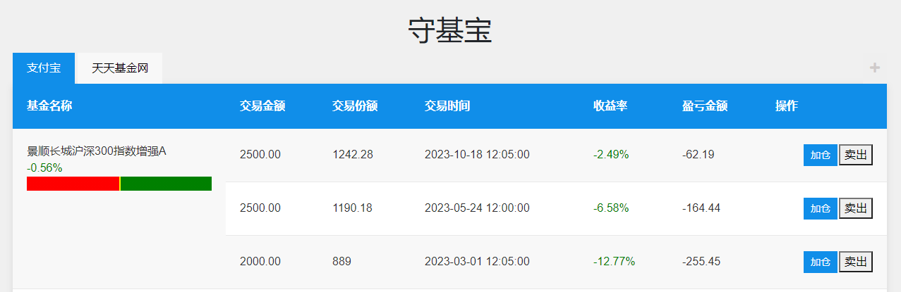
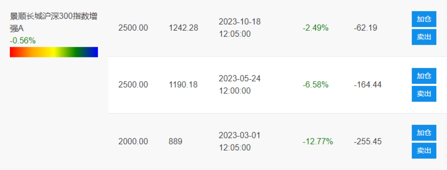
如何實現一個漸變進度條?
```
.recommendation-bar {
height: 20px;
background: linear-gradient(to right, red 50%, green 50%);
position: relative;
}
.pointer {
height: 100%;
width: 2px;
background: rgb(250, 246, 5);
position: absolute;
left: 50%;
transition: left 0.3s ease;
}
```
```
<div class="recommendation-bar">
<span class="pointer" style="left: ${pointerPosition};"></span>
</div>
```
## 如何實現漸變?
```
.recommendation-bar {
height: 20px;
background: linear-gradient(to right, green, red);
position: relative;
}
```
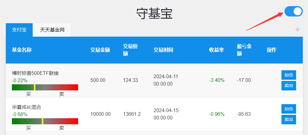
## 開關功能實現
頁面右上角增加可以切換的開關樣式,怎么用html+css實現?
```
<!DOCTYPE html>
<html lang="en">
<head>
<meta charset="UTF-8">
<meta http-equiv="X-UA-Compatible" content="IE=edge">
<meta name="viewport" content="width=device-width, initial-scale=1.0">
<title>Toggle Switch</title>
<style>
.toggle-switch {
position: fixed;
top: 20px;
right: 20px;
display: inline-block;
width: 60px;
height: 34px;
}
.toggle-switch input {
opacity: 0;
width: 0;
height: 0;
}
.slider {
position: absolute;
cursor: pointer;
top: 0;
left: 0;
right: 0;
bottom: 0;
background-color: #ccc;
-webkit-transition: .4s;
transition: .4s;
border-radius: 34px;
}
.slider:before {
position: absolute;
content: "";
height: 26px;
width: 26px;
left: 4px;
bottom: 4px;
background-color: white;
-webkit-transition: .4s;
transition: .4s;
border-radius: 50%;
}
input:checked + .slider {
background-color: #2196F3;
}
input:focus + .slider {
box-shadow: 0 0 1px #2196F3;
}
input:checked + .slider:before {
-webkit-transform: translateX(26px);
-ms-transform: translateX(26px);
transform: translateX(26px);
}
</style>
</head>
<body>
<label class="toggle-switch">
<input type="checkbox" id="toggle">
<span class="slider"></span>
</label>
<script>
const toggleSwitch = document.getElementById('toggle');
toggleSwitch.addEventListener('change', function() {
if (this.checked) {
console.log('Checkbox is checked');
} else {
console.log('Checkbox is unchecked');
}
});
</script>
</body>
</html>
```
效果如圖: