## **普通使用**
#### 示例
:-: 
#### **xxx.wxml**
```
<cu-custom bgColor="bg-gradual-blue" isBack="{{true}}">
<view slot="backText">返回</view>
<view slot="content">按鈕</view>
</cu-custom>
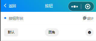
<view class="cu-bar bg-white solid-bottom">
<view class="action">
<text class="cuIcon-title text-blue"></text>按鈕形狀
</view>
<navigator class="action" url="design" hover-class="none">
<text class="cuIcon-skinfill"></text>
<text class="text-df">設計</text>
</navigator>
</view>
<view class="padding flex flex-wrap justify-between align-center bg-white">
<button class="cu-btn">默認</button>
<button class="cu-btn round">圓角</button>
<button class="cu-btn icon">
<text class="cuIcon-emojifill"></text>
</button>
</view>
```
#### **xxx.JS**
```
const app = getApp();
Page({
data: {
ColorList: app.globalData.ColorList,
},
SetShadow(e) {
this.setData({
shadow: e.detail.value
})
},
SetBorderSize(e) {
this.setData({
bordersize: e.detail.value
})
}
})
```
## **控制尺寸**
#### 示例
:-: 
#### **xxx.wxml**
```
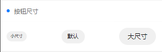
<view class="cu-bar margin-top bg-white solid-bottom">
<view class="action">
<text class="cuIcon-title text-blue"></text>按鈕尺寸
</view>
</view>
<view class="padding flex flex-wrap justify-between align-center bg-white">
<button class="cu-btn round sm">小尺寸</button>
<button class="cu-btn round">默認</button>
<button class="cu-btn round lg">大尺寸</button>
</view>
```
## **按鈕顏色**
#### 示例
:-: 
#### **xxx.wxml**
```
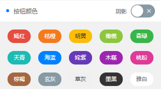
<view class="cu-bar margin-top bg-white">
<view class="action">
<text class="cuIcon-title text-blue"></text>按鈕顏色
</view>
<view class="action">
<text class="text-df margin-right-sm">陰影</text>
<switch class="sm" bindchange="SetShadow"></switch>
</view>
</view>
<view class="grid col-5 padding-sm">
<view class="margin-tb-sm text-center" wx:for="{{ColorList}}" wx:key>
<button class="cu-btn round bg-{{item.name}} {{shadow?'shadow':''}}">{{item.title}}</button>
</view>
</view>
```
## **鏤空按鈕**
#### 示例
:-: 
#### **xxx.wxml**
```
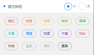
<view class="cu-bar margin-top bg-white">
<view class="action">
<text class="cuIcon-title text-blue"></text>鏤空按鈕
</view>
<view class="action">
<radio-group bindchange="SetBorderSize">
<label class="margin-left-sm">
<radio class="blue sm radio" value="" checked></radio>
<text> 小</text>
</label>
<label class="margin-left-sm">
<radio class="blue sm radio" value="s"></radio>
<text> 大</text>
</label>
</radio-group>
</view>
</view>
<view class="grid col-5 padding-sm">
<view class="margin-tb-sm text-center" wx:for="{{ColorList}}" wx:key wx:if="{{item.name!='white'}}">
<button class="cu-btn round line{{bordersize?bordersize:''}}-{{item.name}} {{shadow?'shadow':''}}">{{item.title}}</button>
</view>
</view>
```
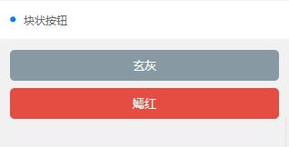
## **塊狀按鈕**
#### 示例
:-: 
#### **xxx.wxml**
```
<view class="cu-bar margin-top bg-white">
<view class="action">
<text class="cuIcon-title text-blue"></text>塊狀按鈕
</view>
</view>
<view class="padding flex flex-direction">
<button class="cu-btn bg-grey lg">玄灰</button>
<button class="cu-btn bg-red margin-tb-sm lg">嫣紅</button>
</view>
```
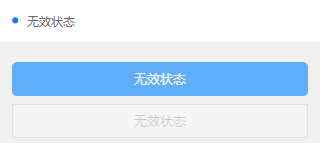
## **無效狀態**
#### 示例
:-: 
#### **xxx.wxml**
```
<view class="cu-bar margin-top bg-white">
<view class="action">
<text class="cuIcon-title text-blue"></text>無效狀態
</view>
</view>
<view class="padding">
<button class="cu-btn block bg-blue margin-tb-sm lg" disabled type="">無效狀態</button>
<button class="cu-btn block line-blue margin-tb-sm lg" disabled>無效狀態</button>
</view>
```
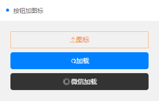
## **按鈕加圖標**
#### 示例
:-: 
#### **xxx.wxml**
```
<view class="cu-bar margin-top bg-white">
<view class="action">
<text class="cuIcon-title text-blue"></text>按鈕加圖標
</view>
</view>
<view class="padding-xl">
<button class="cu-btn block line-orange lg">
<text class="cuIcon-upload"></text> 圖標</button>
<button class="cu-btn block bg-blue margin-tb-sm lg">
<text class="cuIcon-loading2 iconfont-spin"></text> 加載</button>
<button class="cu-btn block bg-black margin-tb-sm lg" loading> 微信加載</button>
</view>
```
