
鏈接:
https://blog.csdn.net/Web_front/article/details/103653259?utm_medium=distribute.pc_relevant.none-task-blog-BlogCommendFromMachineLearnPai2-2.nonecase&depth_1-utm_source=distribute.pc_relevant.none-task-blog-BlogCommendFromMachineLearnPai2-2.nonecase
```
<!DOCTYPE html>
<html lang="en">
<head>
<meta charset="UTF-8" />
<meta name="viewport" content="width=device-width, initial-scale=1.0" />
<meta http-equiv="X-UA-Compatible" content="ie=edge" />
<title>Document</title>
<script src="https://cdn.bootcss.com/echarts/4.4.0-rc.1/echarts-en.common.min.js"></script>
</head>
<body>
<div id="main" style="width: 500px;height:300px;"></div>
<script>
var myChart = echarts.init(document.getElementById("main"));
option = {
tooltip: {
trigger: 'item',
formatter: "{a} <br/>{b}: {c} ({d}%)"
},
legend: {
orient: 'vertical',
x: 'left',
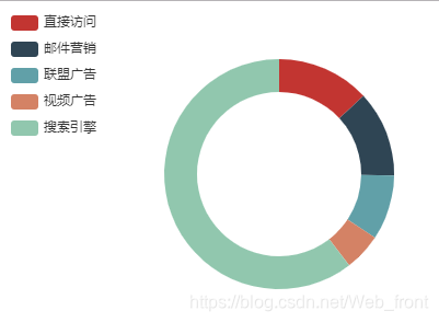
data:['直接訪問','郵件營銷','聯盟廣告','視頻廣告','搜索引擎']
},
series: [
{
name:'訪問來源',
type:'pie',
radius: ['50%', '70%'],
avoidLabelOverlap: false,
label: {
normal: {
show: false,
position: 'center'
},
emphasis: {
show: true,
textStyle: {
fontSize: '30',
fontWeight: 'bold'
}
}
},
labelLine: {
normal: {
show: false
}
},
data:[
{value:335, name:'直接訪問'},
{value:310, name:'郵件營銷'},
{value:234, name:'聯盟廣告'},
{value:135, name:'視頻廣告'},
{value:1548, name:'搜索引擎'}
]
}
]
};
// 使用剛指定的配置項和數據顯示圖表。
myChart.setOption(option);
</script>
</body>
</html>
```
**餅狀圖實現效果如下:**
### 柱狀圖
```
<!DOCTYPE html>
<html lang="en">
<head>
<meta charset="UTF-8" />
<meta name="viewport" content="width=device-width, initial-scale=1.0" />
<meta http-equiv="X-UA-Compatible" content="ie=edge" />
<title>Document</title>
<script src="https://cdn.bootcss.com/echarts/4.4.0-rc.1/echarts-en.common.min.js"></script>
</head>
<body>
<div id="main" style="width: 500px;height:300px;"></div>
<script>
var myChart = echarts.init(document.getElementById("main"));
// app.title = '坐標軸刻度與標簽對齊';
option = {
color: ['#3398DB'],
tooltip : {
trigger: 'axis',
axisPointer : { // 坐標軸指示器,坐標軸觸發有效
type : 'shadow' // 默認為直線,可選為:'line' | 'shadow'
}
},
grid: {
left: '3%',
right: '4%',
bottom: '3%',
containLabel: true
},
xAxis : [
{
type : 'category',
data : ['Mon', 'Tue', 'Wed', 'Thu', 'Fri', 'Sat', 'Sun'],
axisTick: {
alignWithLabel: true
}
}
],
yAxis : [
{
type : 'value'
}
],
series : [
{
name:'直接訪問',
type:'bar',
barWidth: '60%',
data:[10, 52, 200, 334, 390, 330, 220]
}
]
};
// 使用剛指定的配置項和數據顯示圖表。
myChart.setOption(option);
</script>
</body>
</html>
```
**柱狀圖實現效果如下:**

### 折線圖
```
<!DOCTYPE html>
<html lang="en">
<head>
<meta charset="UTF-8">
<meta name="viewport" content="width=device-width, initial-scale=1.0">
<meta http-equiv="X-UA-Compatible" content="ie=edge">
<title>Document</title>
<script src="https://cdn.bootcss.com/echarts/4.4.0-rc.1/echarts.min.js"></script>
</head>
<body>
<div id="main" style="width: 500px;height:300px;"></div>
<script>
var myChart = echarts.init(document.getElementById("main"));
option = {
xAxis: {
type: 'category',
data: ['Mon', 'Tue', 'Wed', 'Thu', 'Fri', 'Sat', 'Sun']
},
yAxis: {
type: 'value'
},
series: [{
data: [820, 932, 901, 934, 1290, 1330, 1320],
type: 'line'
}]
};
// 使用剛指定的配置項和數據顯示圖表。
myChart.setOption(option);
</script>
</body>
</html>
```
**實現的效果如下:**

- tp5圖片上傳
- 文件上傳到七牛云
- 上傳到阿里云
- 富文本編輯器
- phpexcel和spreadsheet
- phpexcel導出
- phpexcel導入
- spreadsheet
- tp5_api接口
- 跨域請求
- JWT
- 圖片和視頻上傳接口
- 驗證碼
- tp5小程序登錄
- tp5小程序支付
- tp5基礎架構
- 驗證層
- 模型層Model
- 控制器構找
- tp5.0支付寶
- 海報二維碼
- 輪播圖
- echarts柱狀圖
- layui的圖片彈窗
- p標簽顯示指定行數(全部)
- jquery和layerdate調用日期
- ajax發送文件和圖片的坑啊
- JS日期點擊上一天和下一天
- 百度分享js
- POST請求
- 商品數據表
- tp5.0支付寶最全
- tp5路由的坑
- 二維數組排序
- tp5模型分組group錯誤
- 二維變一維數組
- 無限樹形結構
- json對象轉數組
- 模型關聯查詢
- tp5的模型獲取器和字段設定
- 經緯度獲取距離排序