[TOC]
## 開發環境與生產環境
LESS叫做預編譯語言,寫好的LESS代碼,瀏覽器時不能直接渲染的,需要我們把它編譯成為能渲染的CSS才可以
>開發環境
>在本地開發中,這是開發環境
>生產環境
>本地開發完成了,我們需要把代碼上傳到服務器上,服務器上的環境叫做生成環境
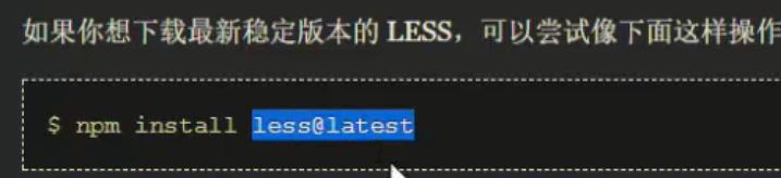
## 使用less的幾種方式
### 法一:下載less.js
會自動將.less文件轉譯成css并插入到動態生成的style標簽中
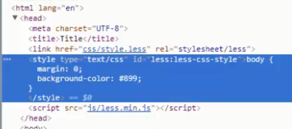
在開發環境下,我們一般都通過導入LESS插件(less-2.5.3.min.js)來隨時編譯LESS開發
```
<!--rel的值變為了stylesheet/less-->
<link rel='stylesheet/less' href='css/1.less'>
<script src="js/less=2.5.min.js"></script>
```
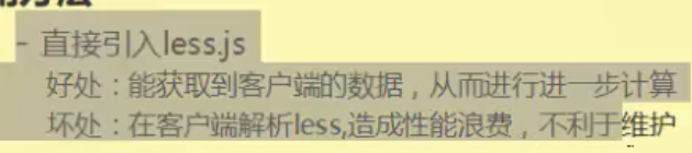
由于每一次加載頁面,都需要導入less.js,并且把less文件重新編譯為css(很消耗性能,頁面打開速度肯定會變慢),所以真實項目中,只有開發環境下,我們使用這中模式,生產環境下,我們肯定需要首先把寫好的LESS編譯為正常的css后再上線,以后用戶訪問的都是編譯好的css,而不是拿less先編譯
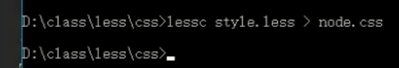
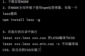
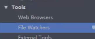
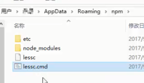
### 法二:node中使用
#### 下載包
#### 手動編譯
#### 集成webpack
略
#### webstorm配置編譯
## LESS作用
CSS層疊樣式表,它是標記語言,不是編程語言,所有預編譯CSS語言(less/sass...)都是賦予了CSS面向對象思想
```
.outer{
margin:50px;
width:200px;
height:200px;
border:1px solid green;
}
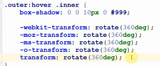
.outer .inner{
margin:20px;
width:100px;
height:100px;
background:lightblue;
// 第三個擦書為模糊半徑 第四個參為擴展半徑
box-shadow: 0 0 5px 0 #000;
transition:.5s
}
.outer:hover .inner{
box-shadow: 0 0 10px 0 #999;
-webkit-transfor:rotate(360deg);
...
transform:rotate(360deg);
}
```
So傳統的css 整個css的書寫層級是從網下的 并且有些需要兼容的需要手動添加前綴
## 語法
### 嵌套
```
li{
a.link{
&:hover{}
}
}
```
### 變量
在瀏覽器總引入`less.js`的情況可以這樣獲取文檔高度
```
@height:`document.documentElement.clientHeight`;
```
@可以支持傳統css中支持能夠支持的任何值
```
@a:1;
@b:30%;
@c:1000px;
@d:#000;
```
```
@width:2px;
@style:solid; //帶引號的話會把引號也傳入到border中
@color:red;
.box1{
width:300px;
height:100px;
border:@width @style @color;
}
```
變量名允許帶`-`
```
@shadow-color:red;
```
@可以參與運算
```
@a:1;
.box{
opacity:@a;
filter:alpha(opacity=(@a*100));
}
```
變量名帶`-`的變量參與運算時,需要使用括號括起來
```
@shadow-px:100;
@new:(@shadow-px)-20;
```
地址與變量
`@{}`插值表達式,可以將變量插入到要拼接的字符串中
```
.box{
background:url("../img/xxx.png");
}
@img-url:"../img/";
.box{
background:url("@{img-url}/xxx.png");
}
```
選擇器與變量
```
@selector:box;
.@{selector}{
}
```
@@var
```
@var:"name"
@name:"ahhh"
@@var; //->@name
```
### 連字符
`&`代表當前作用域中的css選擇器
```
&.pp{}
&>.mm{}
```
### 作用域
```
.box{
@a:10px; //這里的@a只在這大括號中起作用
}
```
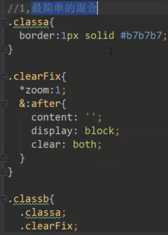
### 混合(@Mixin)
#### 最簡單的混合
```
@border:'border:1px solid #b7b7b7';
.box{
width:@border; //-->width:'border:1px solid #b7b7b7' //不符合要求
}
//--- --- ---
.classa{
border:1px solid #b7b7b7;
}
.classb{
.classa; //最最簡單的混合方式
}
//--- --- ---
```
#### 帶參數混合
```
//帶參數混合
.border{
border:1px solid #b7b7b7;
}
.borderRed{
border:1px solid #f00;
}
//---
.border(@width:1px,@color:#333){ //支持默認參數
border:@width solid @color;
}
.box1{
.border(2px,#b7b7b7);
}
```
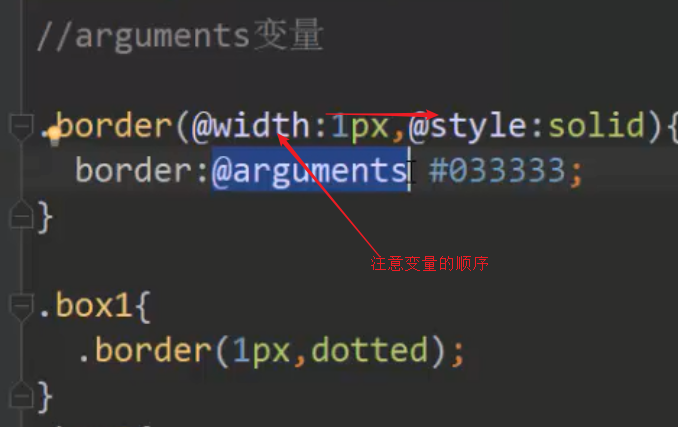
#### arguments
#### 模式匹配
```
.border(top,@width){
border-top:@width solid #333
}
.border(right,@width){
border-right:@width solid #333
}
.border(@_){ //默認匹配 //全部都需要的寫在這里
width:100px;
}
.box1{
.border(top);
}
.box2{
.border(right);
}
```
### 注釋
```
//注釋點什么1 // 此種注釋不會被編譯進css里 通常用于開發環境的注釋
/* 注視點什么2 */
```
### 函數
#### 數學函數
round
```
width:round(5.5)*1px; //6px
```
ceil
floor
percentage
round
sqrt:計算數字的平方根
abs:計算數字的絕對值,原樣保持單位
pow:計算一個數的乘方
#### isnumber
判斷給定的值 是否 是一個數字。
```
isnumber(#ff0); // false
isnumber(blue); // false
isnumber("string"); // false
isnumber(1234); // true
isnumber(56px); // true
isnumber(7.8%); // true
isnumber(keyword); // false
isnumber(url(...)); // false
```
#### iscolor
#### isur
#### 顏色操作
saturate:增加一定數值的顏色飽和度
lighten:增加一定數值的顏色亮度
darken:降低一定數值的顏色亮度
fade:給顏色設定一個數值的透明度
mix:根據比例混合兩種顏色
#### 更多
[點擊查看更多](http://lesscss.cn/functions/)
### 命名空間和作用域
less中的變量聲明和提升都會執行
```
@a:10;
.box{
width:unit(@a,px);
@a:20;
.mark{
width:unit(@a,px);
}
}
```
```
.blue{
.button{
background:blue;
}
}
.red{
.button{
background:red;
}
}
.box{
.red > .button; //red里的button
}
```
### @import
```
>>> global.less
body{
margin:0;
}
a{
text-decoration:none;
color:inherit
}
//--- ---
>>> index
@import "global"
```
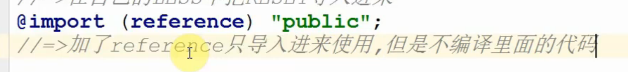
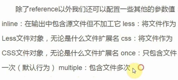
使用`@import`,那么編譯以后的所有文件都會打包在一起(合并成一個css文件)
默認導入的就是.less,so不用添加后綴
### ~避免編譯
結構:` ~' 值 '`
```
/* Less */
#main{
width:~'calc(300px-30px)';
}
/* 生成后的 CSS */
#main{
width:calc(300px-30px);
}
```
## 屬性變量 值變量 變量拼串 url變量 選擇器變量 聲明變量
https://juejin.im/post/5a2bc28f6fb9a044fe464b19#heading-6
### 值變量
```
/* Less */
@color: #999;
@bgColor: skyblue;//不要添加引號
@width: 50%;
#wrap {
color: @color;
background: @bgColor;
width: @width;
}
/* 生成后的 CSS */
#wrap {
color: #999;
background: skyblue;
width: 50%;
}
```
以 @ 開頭 定義變量,并且使用時 直接 鍵入 @名稱。
在平時工作中,我們就可以把 常用的變量 封裝到一個文件中,這樣利于代碼組織維護。
```
@lightPrimaryColor: #c5cae9;
@textPrimaryColor: #fff;
@accentColor: rgb(99, 137, 185);
@primaryTextColor: #646464;
@secondaryTextColor: #000;
@dividerColor: #b6b6b6;
@borderColor: #dadada;
```
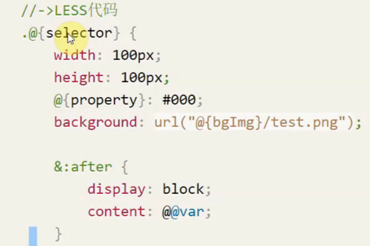
### 選擇變量
讓 選擇器 變成 動態
```
/* Less */
@mySelector: #wrap;
@Wrap: wrap;
@{mySelector}{ //變量名 必須使用大括號包裹
color: #999;
width: 50%;
}
.@{Wrap}{
color:#ccc;
}
#@{Wrap}{
color:#666;
}
/* 生成的 CSS */
#wrap{
color: #999;
width: 50%;
}
.wrap{
color:#ccc;
}
#wrap{
color:#666;
}
```
### 屬性變量
可減少代碼書寫量
```
/* Less */
@borderStyle: border-style;
@Soild:solid;
#wrap{
@{borderStyle}: @Soild;//變量名 必須使用大括號包裹
}
/* 生成的 CSS */
#wrap{
border-style:solid;
}
```
### url 變量
項目結構改變時,修改其變量即可。
```
/* Less */
@images: "../img";//需要加引號
body {
background: url("@{images}/dog.png");//變量名 必須使用大括號包裹
}
/* 生成的 CSS */
body {
background: url("../img/dog.png");
}
```
### 聲明變量
有點類似于 下面的 混合方法
- 結構: @name: { 屬性: 值 ;};
- 使用:@name();
等同于`.class1(){}`
```
/* Less */
@background: {background:red;};
#main{
@background();
}
@Rules:{
width: 200px;
height: 200px;
border: solid 1px red;
};
#con{
@Rules();
}
/* 生成的 CSS */
#main{
background:red;
}
#con{
width: 200px;
height: 200px;
border: solid 1px red;
}
```
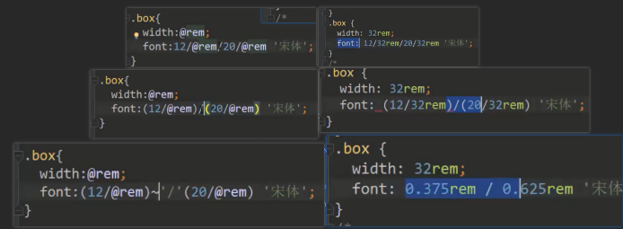
### 變量運算
不得不提的是,Less 的變量運算完全超出我的期望,十分強大。
- 加減法時 以第一個數據的單位為基準
- 乘除法時 注意單位一定要統一
```
/* Less */
@width:300px;
@color:#222;
#wrap{
width:@width-20;
height:@width-20*5;
margin:(@width-20)*5;
color:@color*2;
background-color:@color + #111;
}
/* 生成的 CSS */
#wrap{
width:280px;
height:200px;
margin:1400px;
color:#444;
background-color:#333;
}
```
### 用變量去定義變量
```
/* Less */
@fnord: "I am fnord.";
@var: "fnord";
#wrap::after{
content: @@var; //將@var替換為其值 content:@fnord;
}
/* 生成的 CSS */
#wrap::after{
content: "I am fnord.";
}
```
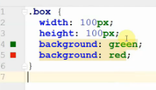
## 繼承與函數
### 繼承
```
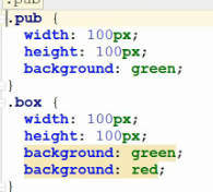
.pub{
width:100px;
height:100px;
background:green;
}
.box{
.pub;
background:red;
}
```
會發現在另外一個css類里調用一個css類的結果就是把原本的copy一份過來
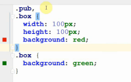
`extend`
less中的繼承并不是copy代碼,而是讓當前的樣式類和繼承的樣式類公用一套樣式(編譯為群組選擇器的方式)
```
/* 第一種寫法 */
.pub{
width:100px;
height:100px;
background:green;
}
.box:extend(.pub){
background:red;
}
/*****************/
/* 第二種寫法 */
.box{
&:extend(.pub);
background:red;
}
```
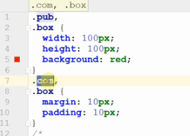
要繼承多個的話可以用逗號分隔傳參
```
.box:extend(.pub,.com){
}
```
```
.box{
.mark{
width:100px;
height:100px;
}
.inner{
&:extend(.mark);
background:red;
}
}
```
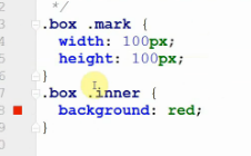
發現并沒有其效果
原因是必須帶上作用域
```
.box{
.mark{
width:100px;
height:100px;
}
.inner{
&:extend(.box .mark);
//.mark //或則直接copy過來
background:red;
}
}
```
真實項目中,如果想使用extend實現繼承,我們一般都把需要繼承的樣式類寫在最外層(而不是里層私有的作用域),如果想繼承當前私有作用域中的某個樣式,需要把前綴都準備好
### 函數
> 語法
> .xxx(@xxx:xxx,@yyy){
> @arguments
> }
再看這樣一個栗子,給一個樣式類加了`()`(那么這就是個函數)
```
.pub(){
width:100px;
height:100px;
background:green;
}
.box{
.pub();
background:red;
}
```
可以發現函數本身是不會被編譯的(So,它才叫函數嘛,執行才有效果)
`@argument`
```
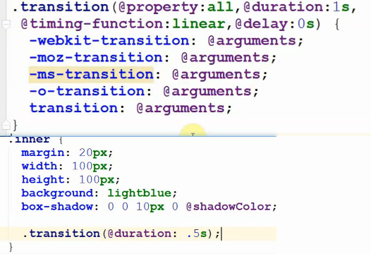
.transition(property:all,@duration,@timing:linear,@delay:0s){
transition:@arguments;
//等同于
// transition:@property @duration @timing @delay;
}
```
`@result`
```
.sum(@n:0,@m:0){
@result:@n+@m;
}
.box{
.sum(10,20);
width:@result+'px';
}
```
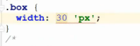
這個`@result`和常規return的區別在于,它其實是給result這個變量賦值,So這個函數并不需要一個變量來接收,它內部自己就創建了個,誰都可以用
上面的例子有個問題,最后輸出的是`30 'px'`,我們希望是`30px`,可以用到`unit`方法
```
.box{
.sum(10,20);
width:unit(@result,px);
}
```
`unit`是less提供的方法
`unit([value],'px')`能給value值設置單位,如果之前已經有單位了,會把原先的單位去掉
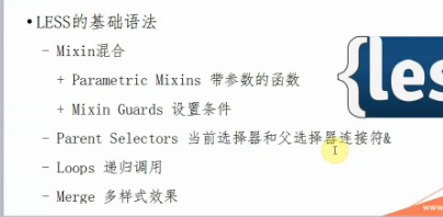
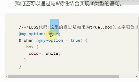
## 流程控制(Mixin Guards)
`when`
```
.pub(@x) when(@x<=10){
width:100px;
height:100px;
}
.pub(@x) when(@x>10){
width:200px;
height:400px;
}
.box{
.pub(10);
}
```
- 滿足多個條件那么都會執行(而不是只匹配一條)
`and/,`
```
.pub(@x) when(@x<=10) and (@a>0){
width:100px;
height:100px;
}
//and === ,
.pub(@x) when(@x<=10) , (@a>0){
width:100px;
height:100px;
}
```
### 遞歸 實現 遍歷
```
.columns(@i) when (@i<=4){
.box@{i}{
width:unit(@i*10,%);
}
.columns(@i+1);
}
.columns(1);
```
## 屬性拼接:`+_`與`+`
+_ 代表的是 空格;+ 代表的是 逗號。
- 逗號
```
/* Less */
.boxShadow() {
box-shadow+: inset 0 0 10px #555;
}
.main {
.boxShadow();
box-shadow+: 0 0 20px black;
}
/* 生成后的 CSS */
.main {
box-shadow: inset 0 0 10px #555, 0 0 20px black;
}
```
- 空格
```
/* Less */
.Animation() {
transform+_: scale(2);
}
.main {
.Animation();
transform+_: rotate(15deg);
}
/* 生成的 CSS */
.main {
transform: scale(2) rotate(15deg);
}
```
### 變量拼串
在平時工作中,這種需求 太常見了。 在下面例子中, 實現了不同的 transtion-delay、animation、@keyframes
結構: `~"字符@{變量}字符"`
```
.judge(@i) when(@i=1){
@size:15px;
}
.judge(@i) when(@i>1){
@size:16px;
}
.loopAnimation(@i) when (@i<16) {
.circle:nth-child(@{i}){
.judeg(@i);
border-radius:@size @size 0 0;
animation: ~"circle-@{i}" @duration infinite @ease;
transition-delay:~"@{i}ms";
}
@keyframes ~"circle-@{i}" {
// do something...
}
.loopAnimation(@i + 1);
}
```
## 附