
Flex 布局教程:實例篇
http://www.ruanyifeng.com/blog/2015/07/flex-examples.html
[上一篇文章](http://www.ruanyifeng.com/blog/2015/07/flex-grammar.html)介紹了Flex布局的語法,今天介紹常見布局的Flex寫法。
你會看到,不管是什么布局,Flex往往都可以幾行命令搞定。
我只列出代碼,詳細的語法解釋請查閱[《Flex布局教程:語法篇》](http://www.ruanyifeng.com/blog/2015/07/flex-grammar.html)。我的主要參考資料是[Landon Schropp](http://davidwalsh.name/flexbox-dice)的文章和[Solved by Flexbox](http://philipwalton.github.io/solved-by-flexbox/)。
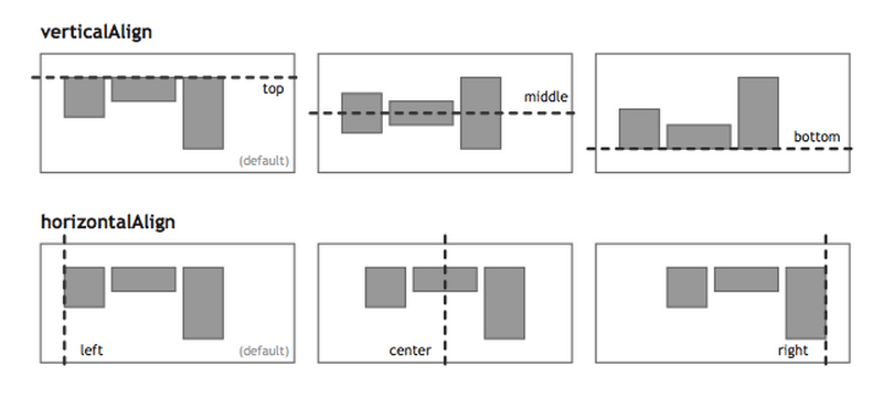
## 一、骰子的布局
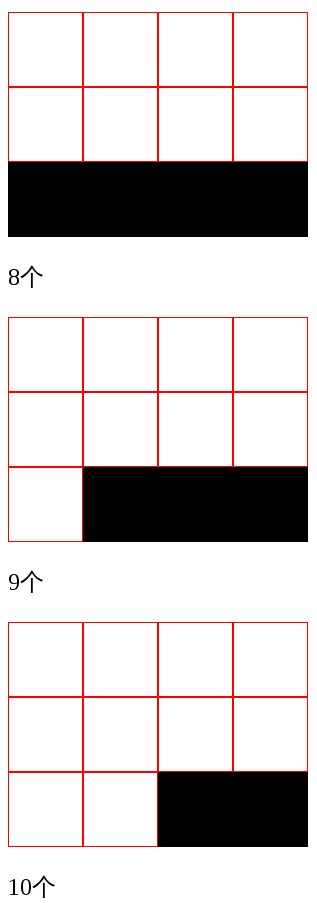
骰子的一面,最多可以放置9個點。
下面,就來看看Flex如何實現,從1個點到9個點的布局。你可以到[codepen](http://codepen.io/LandonSchropp/pen/KpzzGo)查看Demo。
如果不加說明,本節的HTML模板一律如下。
> ~~~
>
> <div class="box">
> <span class="item"></span>
> </div>
>
> ~~~
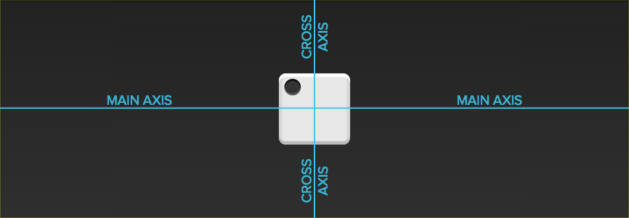
上面代碼中,div元素(代表骰子的一個面)是Flex容器,span元素(代表一個點)是Flex項目。如果有多個項目,就要添加多個span元素,以此類推。
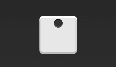
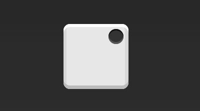
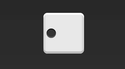
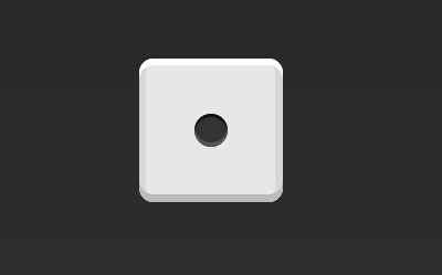
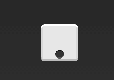
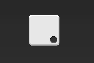
### 1.1 單項目
首先,只有左上角1個點的情況。Flex布局默認就是首行左對齊,所以一行代碼就夠了。
> ~~~
>
> .box {
> display: flex;
> }
>
> ~~~
設置項目的對齊方式,就能實現居中對齊和右對齊。
> ~~~
>
> .box {
> display: flex;
> justify-content: center;
> }
>
> ~~~
> ~~~
>
> .box {
> display: flex;
> justify-content: flex-end;
> }
>
> ~~~
設置交叉軸對齊方式,可以垂直移動主軸。
> ~~~
>
> .box {
> display: flex;
> align-items: center;
> }
>
> ~~~
> ~~~
>
> .box {
> display: flex;
> justify-content: center;
> align-items: center;
> }
>
> ~~~
> ~~~
>
> .box {
> display: flex;
> justify-content: center;
> align-items: flex-end;
> }
>
> ~~~
> ~~~
>
> .box {
> display: flex;
> justify-content: flex-end;
> align-items: flex-end;
> }
>
> ~~~
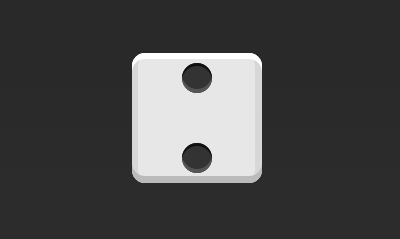
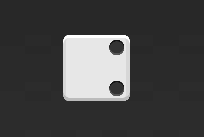
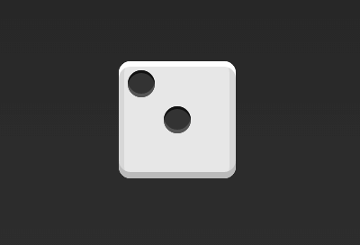
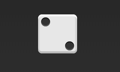
### 1.2 雙項目
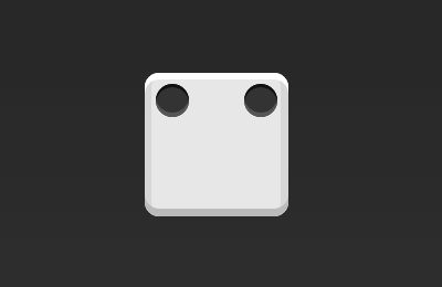
> ~~~
>
> .box {
> display: flex;
> justify-content: space-between;
> }
>
> ~~~
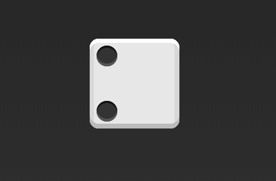
> ~~~
>
> .box {
> display: flex;
> flex-direction: column;
> justify-content: space-between;
> }
>
> ~~~
> ~~~
>
> .box {
> display: flex;
> flex-direction: column;
> justify-content: space-between;
> align-items: center;
> }
>
> ~~~
> ~~~
>
> .box {
> display: flex;
> flex-direction: column;
> justify-content: space-between;
> align-items: flex-end;
> }
>
> ~~~
> ~~~
>
> .box {
> display: flex;
> }
>
> .item:nth-child(2) {
> align-self: center;
> }
>
> ~~~
> ~~~
>
> .box {
> display: flex;
> justify-content: space-between;
> }
>
> .item:nth-child(2) {
> align-self: flex-end;
> }
>
> ~~~
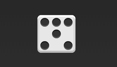
### 1.3 三項目
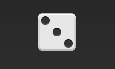
> ~~~
>
> .box {
> display: flex;
> }
>
> .item:nth-child(2) {
> align-self: center;
> }
>
> .item:nth-child(3) {
> align-self: flex-end;
> }
>
> ~~~
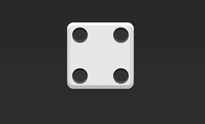
### 1.4 四項目
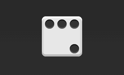
> ~~~
>
> .box {
> display: flex;
> flex-wrap: wrap;
> justify-content: flex-end;
> align-content: space-between;
> }
>
> ~~~
HTML代碼如下。
> ~~~
>
> <div class="box">
> <div class="column">
> <span class="item"></span>
> <span class="item"></span>
> </div>
> <div class="column">
> <span class="item"></span>
> <span class="item"></span>
> </div>
> </div>
>
> ~~~
CSS代碼如下。
> ~~~
>
> .box {
> display: flex;
> flex-wrap: wrap;
> align-content: space-between;
> }
>
> .column {
> flex-basis: 100%;
> display: flex;
> justify-content: space-between;
> }
>
> ~~~
### 1.5 六項目
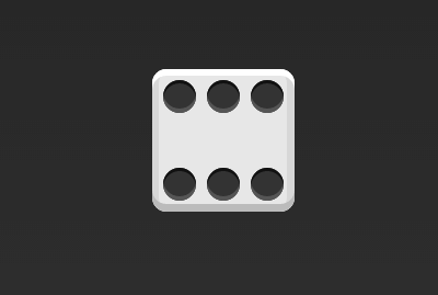
> ~~~
>
> .box {
> display: flex;
> flex-wrap: wrap;
> align-content: space-between;
> }
>
> ~~~
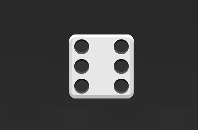
> ~~~
>
> .box {
> display: flex;
> flex-direction: column;
> flex-wrap: wrap;
> align-content: space-between;
> }
>
> ~~~
HTML代碼如下。
> ~~~
>
> <div class="box">
> <div class="row">
> <span class="item"></span>
> <span class="item"></span>
> <span class="item"></span>
> </div>
> <div class="row">
> <span class="item"></span>
> </div>
> <div class="row">
> <span class="item"></span>
> <span class="item"></span>
> </div>
> </div>
>
> ~~~
CSS代碼如下。
> ~~~
>
> .box {
> display: flex;
> flex-wrap: wrap;
> }
>
> .row{
> flex-basis: 100%;
> display:flex;
> }
>
> .row:nth-child(2){
> justify-content: center;
> }
>
> .row:nth-child(3){
> justify-content: space-between;
> }
>
> ~~~
### 1.6 九項目
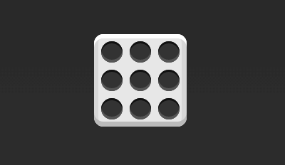
> ~~~
>
> .box {
> display: flex;
> flex-wrap: wrap;
> }
>
> ~~~
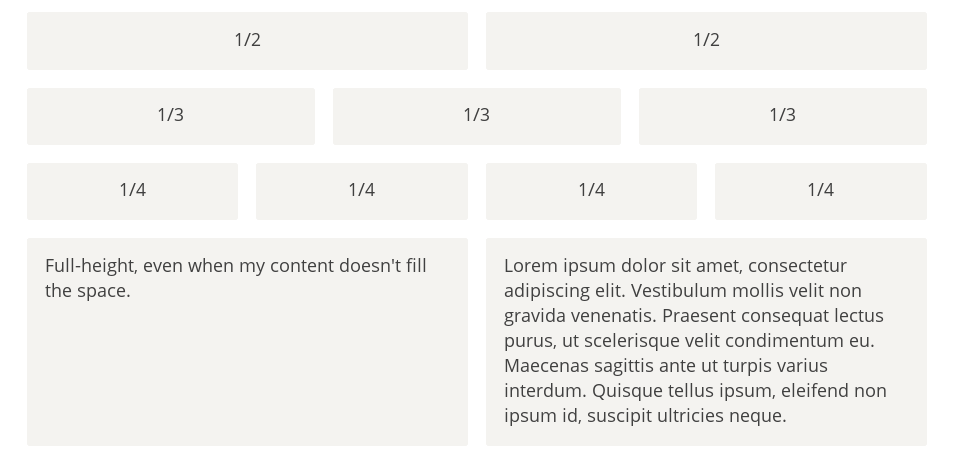
## 二、網格布局
### 2.1 基本網格布局
最簡單的網格布局,就是平均分布。在容器里面平均分配空間,跟上面的骰子布局很像,但是需要設置項目的自動縮放。
HTML代碼如下。
> ~~~
>
> <div class="Grid">
> <div class="Grid-cell">...</div>
> <div class="Grid-cell">...</div>
> <div class="Grid-cell">...</div>
> </div>
>
> ~~~
CSS代碼如下。
> ~~~
>
> .Grid {
> display: flex;
> }
>
> .Grid-cell {
> flex: 1;
> }
>
> ~~~
### 2.2 百分比布局
某個網格的寬度為固定的百分比,其余網格平均分配剩余的空間。
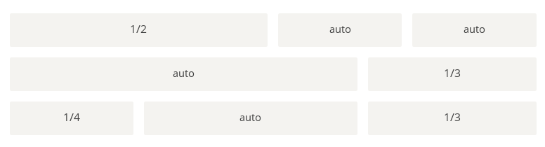
HTML代碼如下。
> ~~~
>
> <div class="Grid">
> <div class="Grid-cell u-1of4">...</div>
> <div class="Grid-cell">...</div>
> <div class="Grid-cell u-1of3">...</div>
> </div>
>
> ~~~
> ~~~
>
> .Grid {
> display: flex;
> }
>
> .Grid-cell {
> flex: 1;
> }
>
> .Grid-cell.u-full {
> flex: 0 0 100%;
> }
>
> .Grid-cell.u-1of2 {
> flex: 0 0 50%;
> }
>
> .Grid-cell.u-1of3 {
> flex: 0 0 33.3333%;
> }
>
> .Grid-cell.u-1of4 {
> flex: 0 0 25%;
> }
>
> ~~~
## 三、圣杯布局
[圣杯布局](https://en.wikipedia.org/wiki/Holy_Grail_(web_design))(Holy Grail Layout)指的是一種最常見的網站布局。頁面從上到下,分成三個部分:頭部(header),軀干(body),尾部(footer)。其中軀干又水平分成三欄,從左到右為:導航、主欄、副欄。
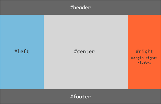
HTML代碼如下。
> ~~~
>
> <body class="HolyGrail">
> <header>...</header>
> <div class="HolyGrail-body">
> <main class="HolyGrail-content">...</main>
> <nav class="HolyGrail-nav">...</nav>
> <aside class="HolyGrail-ads">...</aside>
> </div>
> <footer>...</footer>
> </body>
>
> ~~~
CSS代碼如下。
> ~~~
>
> .HolyGrail {
> display: flex;
> min-height: 100vh;
> flex-direction: column;
> }
>
> header,
> footer {
> flex: 1;
> }
>
> .HolyGrail-body {
> display: flex;
> flex: 1;
> }
>
> .HolyGrail-content {
> flex: 1;
> }
>
> .HolyGrail-nav, .HolyGrail-ads {
> /* 兩個邊欄的寬度設為12em */
> flex: 0 0 12em;
> }
>
> .HolyGrail-nav {
> /* 導航放到最左邊 */
> order: -1;
> }
>
> ~~~
如果是小屏幕,軀干的三欄自動變為垂直疊加。
> ~~~
>
> @media (max-width: 768px) {
> .HolyGrail-body {
> flex-direction: column;
> flex: 1;
> }
> .HolyGrail-nav,
> .HolyGrail-ads,
> .HolyGrail-content {
> flex: auto;
> }
> }
>
> ~~~
## 四、輸入框的布局
我們常常需要在輸入框的前方添加提示,后方添加按鈕。
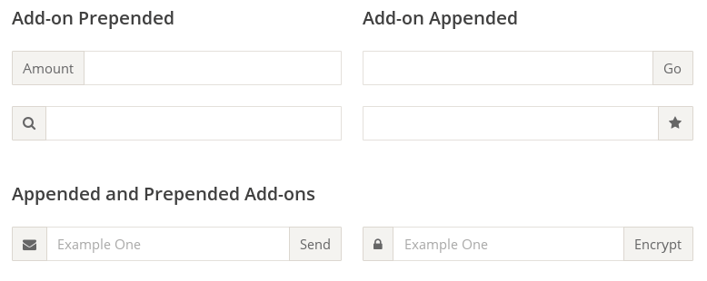
HTML代碼如下。
> ~~~
>
> <div class="InputAddOn">
> <span class="InputAddOn-item">...</span>
> <input class="InputAddOn-field">
> <button class="InputAddOn-item">...</button>
> </div>
>
> ~~~
CSS代碼如下。
> ~~~
>
> .InputAddOn {
> display: flex;
> }
>
> .InputAddOn-field {
> flex: 1;
> }
>
> ~~~
## 五、懸掛式布局
有時,主欄的左側或右側,需要添加一個圖片欄。
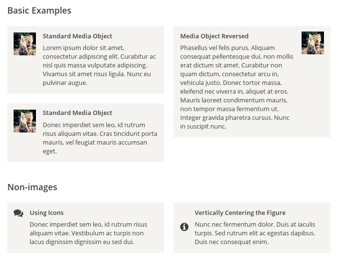
HTML代碼如下。
> ~~~
>
> <div class="Media">
> <img class="Media-figure" src="" alt="">
> <p class="Media-body">...</p>
> </div>
>
> ~~~
CSS代碼如下。
> ~~~
>
> .Media {
> display: flex;
> align-items: flex-start;
> }
>
> .Media-figure {
> margin-right: 1em;
> }
>
> .Media-body {
> flex: 1;
> }
>
> ~~~
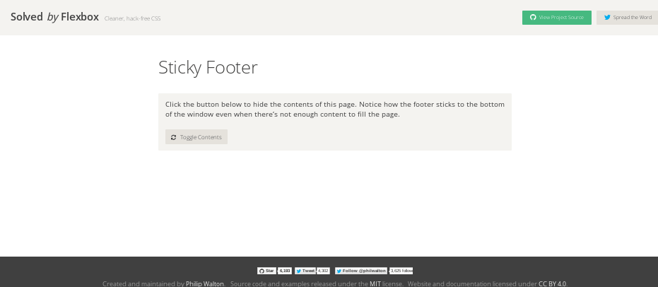
### 六、固定的底欄
有時,頁面內容太少,無法占滿一屏的高度,底欄就會抬高到頁面的中間。這時可以采用Flex布局,讓底欄總是出現在頁面的底部。
HTML代碼如下。
> ~~~
>
> <body class="Site">
> <header>...</header>
> <main class="Site-content">...</main>
> <footer>...</footer>
> </body>
>
> ~~~
CSS代碼如下。
> ~~~
>
> .Site {
> display: flex;
> min-height: 100vh;
> flex-direction: column;
> }
>
> .Site-content {
> flex: 1;
> }
>
> ~~~
### 七,流式布局
每行的項目數固定,會自動分行。
CSS的寫法。
> ~~~
>
> .parent {
> width: 200px;
> height: 150px;
> background-color: black;
> display: flex;
> flex-flow: row wrap;
> align-content: flex-start;
> }
>
> .child {
> box-sizing: border-box;
> background-color: white;
> flex: 0 0 25%;
> height: 50px;
> border: 1px solid red;
> }
>
> ~~~
(完)
- CSS知多少
- css知多少——目錄
- css知多少(1)——我來問你來答
- css知多少(2)——學習css的思路
- css知多少(3)——樣式來源與層疊規則
- css知多少(4)——解讀瀏覽器默認樣式
- css知多少(5)——選擇器
- css知多少(6)——選擇器的優先級
- css知多少(7)——盒子模型
- css知多少(8)——float上篇
- css知多少(9)——float下篇
- css知多少(10)——display
- css知多少(11)——position
- CSS深入理解
- HTML加載順序
- CSS網頁實戰案例
- CSS偽類選擇器
- 重溫css的選擇器
- CSS3的nth-child() 選擇器,表格奇偶行變色
- CSS選擇器演示
- 那些年踩過的坑之:first-child偽類選擇器
- CSS border-image
- CSS3 border-image詳解、應用及jQuery插件
- css3:border-image邊框圖像詳解
- CSS3 Border-image
- Flex布局
- Flex 布局教程:語法篇
- Flex 布局教程:實例篇
- Flex 布局示例