簡介:
- 全局組件無需引入
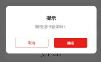
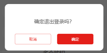
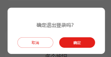
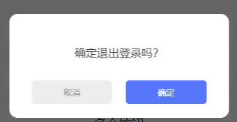
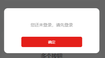
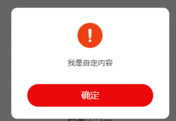
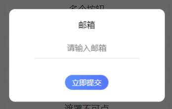
效果:
文件位置:
```
@/components/modal/modal
```
案例:
```
<!-- 在對應頁面使用 -->
<tui-modal :show="modal" @click="handleClick" title="提示" :content="modelContent"></tui-modal>
data () {
return {
modal:false,//模態彈窗狀態
modelContent:'是否確定退出登錄'
}
},
methods: {
handleClick(e){
if(e.index===1){
// 點擊確定
}else{
//點擊取消
this.modal = false
}
}
}
```
參數:
| 參數 | 作用 | 類型 | 默認 | 是否必傳 |
| --- | --- | --- | --- | --- |
| show | 是否顯示 | boolean | false | false |
| width | 寬 | String | 84% | false |
| padding | 邊距 | String | 40rpx 64rpx | false |
| radius | 圓角 | String | 24rpx | false |
| title | 標題 | String | "" | false |
| content | 內容 | String | "" | false |
| color | 內容字體顏色 | String | "" | false |
| size | 內容字體大小 rpx | Number | 28 | false |
| shape | 形狀 circle, square | String | square | false |
| button | 按鈕 | Array | [{text: "取消",type: "red",plain: true //是否空心}, {text: "確定",type: "red",plain: false}] | false |
| maskClosable | 點擊遮罩 是否可關閉 | boolean | true | false |
| custom | 自定義彈窗內容 | boolean | false | false |
| fadein | 淡入效果,自定義彈框插入input輸入框時傳true | boolean | false | false |
事件:
| 事件名 | 作用 | 參數 |
| --- | --- |--- |
| @click | 點擊按鈕 | e |
| @cancel | 取消 | |
平臺兼容性:
| android | H5 | IOS | 微信 | 百度 | 支付寶 | 字節跳動 |
| --- | --- | --- | --- | --- | --- |--- |--- |
| √ | √ | 待測試 | 待測試 | 待測試 | 待測試 |待測試 |
組件負責人:佘威
