[https://book.flutterchina.club/preface.html](https://book.flutterchina.club/preface.html)
## Scaffold
~~~plain
const Scaffold({
Key key,
this.appBar, // 應用欄,顯示在頂部,包括其中的搜索框
this.body, // 頁面的主題顯示內容
this.floatingActionButton, // 設置顯示在上層區域的按鈕,默認位置位于右下角
this.floatingActionButtonLocation, // 設置floatingActionButton的位置
this.floatingActionButtonAnimator, // floatingActionButton動畫
this.persistentFooterButtons, // 在底部導航欄之上的一組操作按鈕
this.drawer, // 左側導航欄
this.endDrawer, // 右側導航欄
this.bottomNavigationBar, // 底部導航欄
this.bottomSheet, // 底部可隱藏導航欄
this.backgroundColor, // 內容區域顏色
this.resizeToAvoidBottomInset, //鍵盤彈出時是否重新繪制,以避免輸入框被遮擋
this.primary = true, // 是否計算手機頂部狀態欄的高度
this.drawerDragStartBehavior = DragStartBehavior.start, // 拖動的處理
this.extendBody = false, // 是否延伸body至底部
this.extendBodyBehindAppBar = false, // 是否延伸body至頂部
this.drawerScrimColor, // 抽屜遮罩層背景色
this.drawerEdgeDragWidth, // 滑動拉出抽屜的生效距離
this.drawerEnableOpenDragGesture = true, // 確定是否可以通過拖動手勢打開Scaffold.drawer, 默認情況下,拖動手勢處于啟用狀態
this.endDrawerEnableOpenDragGesture = true, // 確定是否可以使用拖動手勢打開Scaffold.endDrawer,默認情況下,拖動手勢處于啟用狀態。
})
~~~
### BottomNavigationBar
~~~plain
BottomNavigationBar({
Key key,
@required this.items, // 數組,對應于BottomNavigationBarItem這個組件為菜單欄的每一項,其中包含四個屬性icon、title、activeIcon和backgroundColor
this.onTap, // 點擊觸發邏輯,一般用來觸發頁面的跳轉更新
this.currentIndex = 0, // 當前所在的 items 數組中的位置
this.elevation = 8.0, // 設置陰影效果值
BottomNavigationBarType type, // fixed(固定位置)和shifting(浮動效果)
Color fixedColor, // 代表選中時候的顏色,不能和selectedItemColor一起使用
this.backgroundColor, // 背景顏色
this.iconSize = 24.0, // icon 大小
Color selectedItemColor, // 代表選中的顏色,不能和selectedItemColor一起使用
this.unselectedItemColor, // 未選中時顏色
this.selectedIconTheme = const IconThemeData(), // 當前選中的BottomNavigationBarItem.icon中圖標的大小,不透明度和顏色
this.unselectedIconTheme = const IconThemeData(), // 當前未選中的BottomNavigationBarItem.icon中圖標的大小,不透明度和顏色
this.selectedFontSize = 14.0, // 選中的字體大小
this.unselectedFontSize = 12.0, // 未選中字體大小
this.selectedLabelStyle, // 選中字體樣式
this.unselectedLabelStyle, // 未選中字體樣式
this.showSelectedLabels = true, // 是否開啟選中的樣式
bool showUnselectedLabels, // 是否開啟未選中的樣式
})
~~~
## AppBar
~~~dart
return MaterialApp(
home: Scaffold(
appBar: AppBar(
//導航條左邊的組件
// leading: Icon(Icons.backspace_outlined),
// 這個會把 左側的圖標 設置為黑色
// iconTheme: IconThemeData.fallback(),
// 配合leading使用,false則左側的圖標不顯示
automaticallyImplyLeading: false,
//標題
title: Text("AppBar學習"),
//做折疊效果使用
// flexibleSpace: FlexibleSpaceBar(),
//導航條右邊的一組組件
actions: [
Icon(Icons.settings),
Icon(Icons.search),
Icon(Icons.add_circle)
],
//陰影
elevation: 10,
//陰影顏色
shadowColor: Colors.yellow,
//邊框樣式
shape: RoundedRectangleBorder(
borderRadius: BorderRadius.all(Radius.circular(10))),
//背景色
backgroundColor: Colors.red,
//設置狀態欄模式
brightness: Brightness.dark,
//設置圖標的樣式(顏色,不透明度和大小)
iconTheme: IconThemeData(color: Colors.yellow),
//設置actions圖標的樣式(顏色,不透明度和大小)
actionsIconTheme: IconThemeData(color: Colors.purple),
//設置文字的樣式
textTheme: TextTheme(),
//是否沉浸在狀態欄下,false會沉浸在狀態欄下
primary: true,
//標題是否會顯示在中間
centerTitle: true,
//標題左右兩邊的間距,默認為NavigationToolbar.kMiddleSpacing
titleSpacing: NavigationToolbar.kMiddleSpacing,
//工具欄透明度,值為1.0完全不透明,值為0.0完全透明
toolbarOpacity: 1.0,
//bottom透明度,值為1.0完全不透明,值為0.0完全透明
bottomOpacity: 1.0,
//工具欄高度
toolbarHeight:40,
),
body: Container()),
);
~~~
~~~plain
// 去掉 leading, 也就是頭部首位默認的箭頭
automaticallyImplyLeading: false,
// 設置高度為0 去掉底部陰影
elevation: 0,
// title 組件倆邊的邊距為0,以去掉其padding
titleSpacing: 0,
~~~
### DefaultTabController
實戰中,如果需要 TabBar 和 TabBarView 聯動,通常會創建一個 DefaultTabController 作為它們共同的父級組件
~~~dart
// tabs.length = TabBar 組件的tabs的長度 = TabBarView 的組件數量
length: tabs.length,
// 默認選中 index 為 1的選項卡
initialIndex: 1,
~~~
## TabBar
~~~dart
return MaterialApp(
home: DefaultTabController(
length: 9,
initialIndex: 0,
child: Scaffold(
appBar: AppBar(
title: Text("AppBar學習"),
bottom: TabBar(
//tab組件集合
tabs: [
Tab(text: "1111"),
Tab(text: "2222"),
Tab(text: "3333"),
Tab(text: "4444"),
Tab(text: "5555"),
Tab(text: "6666"),
Tab(text: "7777"),
Tab(text: "8888"),
Tab(text: "9999"),
],
//tab是否可滾動
isScrollable: true,
//指示器顏色
indicatorColor: Colors.red,
//指示器高度
indicatorWeight: 4,
//指示器內邊距
indicatorPadding: EdgeInsets.all(10),
//指示器樣式
indicator: BoxDecoration(
color: Colors.purple,
borderRadius: BorderRadius.all(Radius.circular(20))),
//指示器寬度
indicatorSize: TabBarIndicatorSize.tab,
//文本顏色
labelColor: Colors.amberAccent,
//文本樣式
labelStyle: TextStyle(fontSize: 15),
//文本內邊距
labelPadding:
EdgeInsets.only(left: 10, top: 0, right: 10, bottom: 0),
//未選中文本的顏色
unselectedLabelColor: Colors.orange,
//未選中文本的樣式
unselectedLabelStyle: TextStyle(fontSize: 10),
//回調監聽
onTap: (index) {
print(index);
},
),
),
body: Container()),
));
~~~
## TabBarView
~~~dart
// 禁止滑動
physics: const NeverScrollableScrollPhysics(),
// 拉倒最邊上也可以再拉一拉的效果,實現iOS下彈性效果。
physics: const BouncingScrollPhysics(),
~~~
## Container
~~~dart
Container({
this.alignment,
this.padding, //容器內補白,屬于decoration的裝飾范圍
Color color, // 背景色
Decoration decoration, // 背景裝飾
Decoration foregroundDecoration, //前景裝飾
double width,//容器的寬度
double height, //容器的高度
BoxConstraints constraints, //容器大小的限制條件
this.margin,//容器外補白,不屬于decoration的裝飾范圍
this.transform, //變換
this.child,
...
})
~~~
decoration可以設置邊框、背景色、背景圖片、圓角等屬性,非常實用。
**注意**: deoration 和 color: 不能同時設置,但是可以把color 設置到 deoration中
同時設置會報錯:
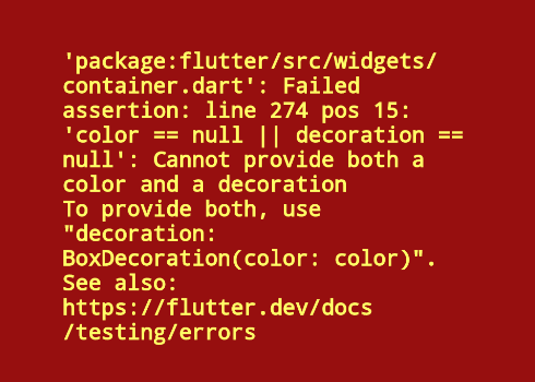
~~~dart
decoration: new BoxDecoration(
border: new Border.all(width: 2.0, color: Colors.red),
color: Colors.grey,
borderRadius: new BorderRadius.all(new Radius.circular(5.0)),
image: new DecorationImage(
image: new NetworkImage(src),
centerSlice: new Rect.fromLTRB(270.0, 180.0, 1360.0, 730.0),
),
),
~~~
## Dialog 對話框
### AlertDialog
~~~dart
const AlertDialog({
Key? key,
this.title, //對話框標題組件
this.titlePadding, // 標題填充
this.titleTextStyle, //標題文本樣式
this.content, // 對話框內容組件
this.contentPadding = const EdgeInsets.fromLTRB(24.0, 20.0, 24.0, 24.0), //內容的填充
this.contentTextStyle,// 內容文本樣式
this.actions, // 對話框操作按鈕組
this.backgroundColor, // 對話框背景色
this.elevation,// 對話框的陰影
this.semanticLabel, //對話框語義化標簽(用于讀屏軟件)
this.shape, // 對話框外形
})
~~~
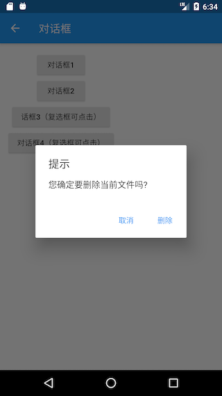
~~~dart
AlertDialog(
title: Text("提示"),
content: Text("您確定要刪除當前文件嗎?"),
actions: <Widget>[
TextButton(
child: Text("取消"),
onPressed: () => Navigator.of(context).pop(), //關閉對話框
),
TextButton(
child: Text("刪除"),
onPressed: () {
// ... 執行刪除操作
Navigator.of(context).pop(true); //關閉對話框
},
),
],
);
~~~
### SimpleDialog
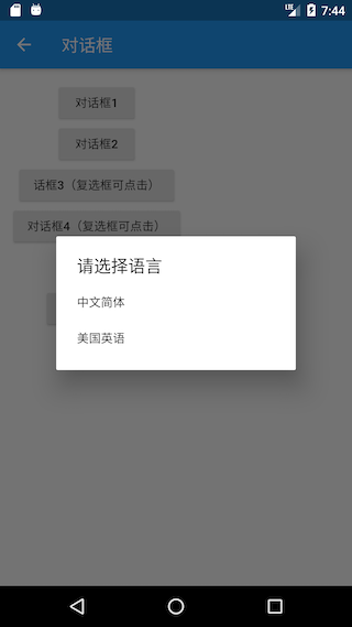
~~~dart
Future<void> changeLanguage() async {
int? i = await showDialog<int>(
context: context,
builder: (BuildContext context) {
return SimpleDialog(
title: const Text('請選擇語言'),
children: <Widget>[
SimpleDialogOption(
onPressed: () {
// 返回1
Navigator.pop(context, 1);
},
child: Padding(
padding: const EdgeInsets.symmetric(vertical: 6),
child: const Text('中文簡體'),
),
),
SimpleDialogOption(
onPressed: () {
// 返回2
Navigator.pop(context, 2);
},
child: Padding(
padding: const EdgeInsets.symmetric(vertical: 6),
child: const Text('美國英語'),
),
),
],
);
});
if (i != null) {
print("選擇了:${i == 1 ? "中文簡體" : "美國英語"}");
}
}
~~~
## ListView
~~~dart
ListView({
Axis scrollDirection = Axis.vertical,
ScrollController controller,
ScrollPhysics physics,
bool shrinkWrap = false,
EdgeInsetsGeometry padding,
this.itemExtent,
double cacheExtent,
List<Widget> children = const <Widget>[],
})
~~~
* **scrollDirection**: 列表的滾動方向,可選值有Axis的horizontal和vertical,可以看到默認是垂直方向上滾動;
* **controller** : 控制器,與列表滾動相關,比如監聽列表的滾動事件;
* **physics**: 列表滾動至邊緣后繼續拖動的物理效果,Android與iOS效果不同。Android會呈現出一個波紋狀(對應ClampingScrollPhysics),而iOS上有一個回彈的彈性效果(對應BouncingScrollPhysics)。如果你想不同的平臺上呈現各自的效果可以使用AlwaysScrollableScrollPhysics,它會根據不同平臺自動選用各自的物理效果。如果你想禁用在邊緣的拖動效果,那可以使用NeverScrollableScrollPhysics;
* **shrinkWrap**: 該屬性將決定列表的長度是否僅包裹其內容的長度。當ListView嵌在一個無限長的容器組件中時,shrinkWrap必須為true,否則Flutter會給出警告;
* **padding**: 列表內邊距;
* **itemExtent**: 子元素長度。當列表中的每一項長度是固定的情況下可以指定該值,有助于提高列表的性能(因為它可以幫助ListView在未實際渲染子元素之前就計算出每一項元素的位置);
* **cacheExtent**: 預渲染區域長度,ListView會在其可視區域的兩邊留一個-cacheExtent長度的區域作為預渲染區域(對于ListView.build或ListView.separated構造函數創建的列表,不在可視區域和預渲染區域內的子元素不會被創建或會被銷毀);
* **children**: 容納子元素的組件數組。
## InkWell
給容器嵌套一些事件, 比如頁面有個搜索框,當單擊搜索框,彈出搜索頁面,這個時候,搜索框其實只是為了彈出搜索頁面。就可以把搜索框禁用掉,然后在其外層嵌套 InkWell ,在InkWell 單擊事件中打開搜索頁面。
~~~dart
const InkWell({
Key key,
Widget child, //子組件
GestureTapCallback onTap, //單擊事件
GestureTapCallback onDoubleTap, //雙擊事件
GestureLongPressCallback onLongPress, //長按事件
GestureTapDownCallback onTapDown, //手指按下
GestureTapCancelCallback onTapCancel, //取消點擊事件
ValueChanged<bool> onHighlightChanged, //突出顯示或停止突出顯示時調用
ValueChanged<bool> onHover, //當指針進入或退出墨水響應區域時調用
MouseCursor mouseCursor,
Color focusColor, //獲取焦點顏色
Color hoverColor, //指針懸停時顏色
Color highlightColor, //按住不放時的顏色
MaterialStateProperty<Color> overlayColor,
Color splashColor, //濺墨顏色
InteractiveInkFeatureFactory splashFactory, //自定義濺墨效果
double radius, //濺墨半徑
BorderRadius borderRadius, //濺墨元素邊框圓角半徑
ShapeBorder customBorder, //覆蓋borderRadius的自定義剪輯邊框
bool enableFeedback = true, //檢測到的手勢是否應該提供聲音和/或觸覺反饋,默認true
bool excludeFromSemantics = false, //是否將此小部件引入的手勢從語義樹中排除。默認false
FocusNode focusNode,
bool canRequestFocus = true,
ValueChanged<bool> onFocusChange,
~~~
## TextField
[https://www.jianshu.com/p/2e28d03d9c03](https://www.jianshu.com/p/2e28d03d9c03)
[https://book.flutterchina.club/chapter3/input\_and\_form.html](https://book.flutterchina.club/chapter3/input_and_form.html)
[
](https://www.jianshu.com/p/2e28d03d9c03)
~~~dart
const TextField({
Key key,
this.controller, //編輯框的控制器,跟文本框的交互一般都通過該屬性完成,如果不創建的話默認會自動創建
this.focusNode, //用于管理焦點
this.decoration = const InputDecoration(), //輸入框的裝飾器,用來修改外觀
TextInputType keyboardType, //設置輸入類型,不同的輸入類型鍵盤不一樣
this.textInputAction, //用于控制鍵盤動作(一般位于右下角,默認是完成)
this.textCapitalization = TextCapitalization.none,
this.style, //輸入的文本樣式
this.textAlign = TextAlign.start, //輸入的文本位置
this.textDirection, //輸入的文字排列方向,一般不會修改這個屬性
this.autofocus = false, //是否自動獲取焦點
this.obscureText = false, //是否隱藏輸入的文字,一般用在密碼輸入框中
this.autocorrect = true, //是否自動校驗
this.maxLines = 1, //最大行
this.maxLength, //能輸入的最大字符個數
this.maxLengthEnforced = true, //配合maxLength一起使用,在達到最大長度時是否阻止輸入
this.onChanged, //輸入文本發生變化時的回調
this.onEditingComplete, //點擊鍵盤完成按鈕時觸發的回調,該回調沒有參數,(){}
this.onSubmitted, //同樣是點擊鍵盤完成按鈕時觸發的回調,該回調有參數,參數即為當前輸入框中的值。(String){}
this.inputFormatters, //對輸入文本的校驗
this.enabled, //輸入框是否可用
this.cursorWidth = 2.0, //光標的寬度
this.cursorRadius, //光標的圓角
this.cursorColor, //光標的顏色
this.keyboardAppearance,
this.scrollPadding = const EdgeInsets.all(20.0),
this.dragStartBehavior = DragStartBehavior.down,
this.enableInteractiveSelection,
this.onTap, //點擊輸入框時的回調(){}
this.buildCounter,
})
~~~
### InputDecoration
~~~dart
InputDecoration({
this.icon, //位于裝飾器外部和輸入框前面的圖片
this.labelText, //用于描述輸入框,例如這個輸入框是用來輸入用戶名還是密碼的,當輸入框獲取焦點時默認會浮動到上方,
this.labelStyle, // 控制labelText的樣式,接收一個TextStyle類型的值
this.helperText, //輔助文本,位于輸入框下方,如果errorText不為空的話,則helperText不會顯示
this.helperStyle, //helperText的樣式
this.hintText, //提示文本,位于輸入框內部
this.hintStyle, //hintText的樣式
this.hintMaxLines, //提示信息最大行數
this.errorText, //錯誤信息提示
this.errorStyle, //errorText的樣式
this.errorMaxLines, //errorText最大行數
this.hasFloatingPlaceholder = true, //labelText是否浮動,默認為true,修改為false則labelText在輸入框獲取焦點時不會浮動且不顯示
this.isDense, //改變輸入框是否為密集型,默認為false,修改為true時,圖標及間距會變小
this.contentPadding, //內間距
this.prefixIcon, //位于輸入框內部起始位置的圖標。
this.prefix, //預先填充的Widget,跟prefixText同時只能出現一個
this.prefixText, //預填充的文本,例如手機號前面預先加上區號等
this.prefixStyle, //prefixText的樣式
this.suffixIcon, //位于輸入框后面的圖片,例如一般輸入框后面會有個眼睛,控制輸入內容是否明文
this.suffix, //位于輸入框尾部的控件,同樣的不能和suffixText同時使用
this.suffixText,//位于尾部的填充文字
this.suffixStyle, //suffixText的樣式
this.counter,//位于輸入框右下方的小控件,不能和counterText同時使用
this.counterText,//位于右下方顯示的文本,常用于顯示輸入的字符數量
this.counterStyle, //counterText的樣式
this.filled, //如果為true,則輸入使用fillColor指定的顏色填充
this.fillColor, //相當于輸入框的背景顏色
this.errorBorder, //errorText不為空,輸入框沒有焦點時要顯示的邊框
this.focusedBorder, //輸入框有焦點時的邊框,如果errorText不為空的話,該屬性無效
this.focusedErrorBorder, //errorText不為空時,輸入框有焦點時的邊框
this.disabledBorder, //輸入框禁用時顯示的邊框,如果errorText不為空的話,該屬性無效
this.enabledBorder, //輸入框可用時顯示的邊框,如果errorText不為空的話,該屬性無效
this.border, //正常情況下的border
this.enabled = true, //輸入框是否可用
this.semanticCounterText,
this.alignLabelWithHint,
})
~~~
[https://www.jianshu.com/p/5760eb783e3e](https://www.jianshu.com/p/5760eb783e3e)
[https://blog.csdn.net/shulianghan/article/details/115341908](https://blog.csdn.net/shulianghan/article/details/115341908)
[https://blog.csdn.net/yuzhiqiang\_1993/article/details/88204031](https://blog.csdn.net/yuzhiqiang_1993/article/details/88204031)
