
## Preview 圖片預覽
預覽縮略圖時使用。
### 代碼示例
```html
<template>
<div class="container">
<cvu-button type="primary" @click.native="handlePreviewShow">預覽圖片</cvu-button>
<cvu-preview
v-model="show"
:currentIndex="currentIndex"
:files="files"
:width="800"
:height="600"
loop
@on-close="handleClose"
@on-visible="handleVisible"
@on-click="handleClick"
></cvu-preview>
</div>
</template>
<script>
export default {
data () {
return {
show: false,
currentIndex: 0,
files: [
{
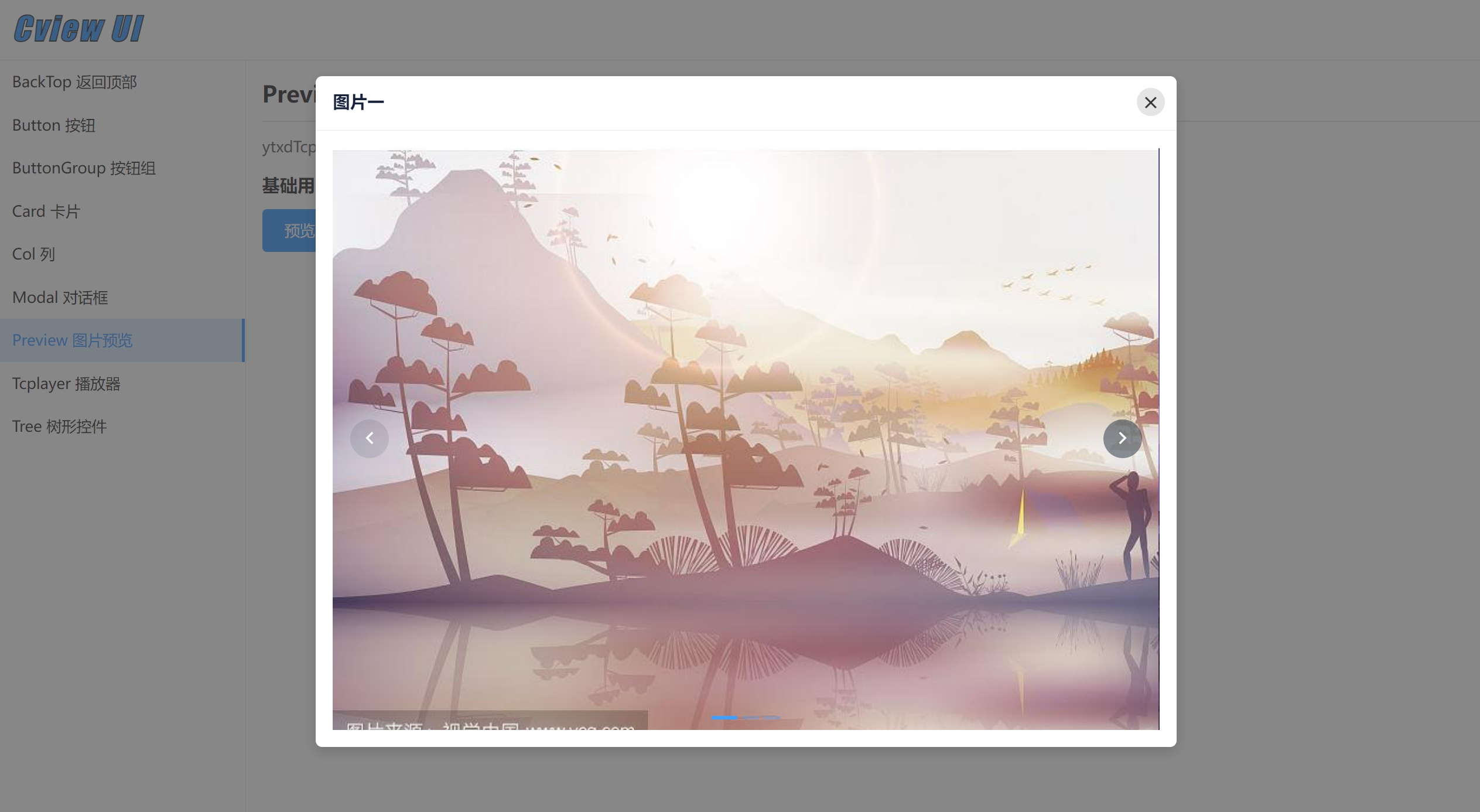
url: 'https://t7.baidu.com/it/u=1819248061,230866778&fm=193&f=GIF',
name: '圖片一'
}, {
url: 'https://t7.baidu.com/it/u=737555197,308540855&fm=193&f=GIF',
name: '圖片二'
}, {
url: 'https://t7.baidu.com/it/u=3652245443,3894439772&fm=193&f=GIF',
name: '圖片三'
}
]
}
},
mounted () {},
methods: {
handlePreviewShow() {
this.show = true
},
handleClose() {
this.currentIndex = 0
},
handleVisible(e) {
console.log(e)
},
handleClick(index) {
console.log(index);
}
}
}
</script>
```
### props
| 屬性 | 說明 | 類型 | 默認值 |
| --- | --- | --- | --- |
| value | 是否顯示,可使用 v-model 雙向綁定數據。 | Boolean | false |
| currentIndex | 當前顯示索引 | Number | 0
| files | 圖片文件地址集合, 格式: [{ url: '', name: '' }] | Array | []
| width| 對話框的寬度,可填 auto 或具體高度數值,單位 px | String \| Number | 520 |
| height | 對話框的高度,可填 auto 或具體高度數值,單位 px | String\|Number | auto |
| fullscreen | 是否全屏顯示 | Boolean | false |
| mask-closable | 是否允許點擊遮罩層關閉 | Boolean | true |
| loop | 是否開啟循環 | Boolean | false |
| autoplay | 是否自動切換 | Boolean | false |
| autoplay-speed | 自動切換的時間間隔,單位為毫秒 | Number | 2000 |
| dots | 指示器的位置,可選值為 inside (內部),outside(外部),none(不顯示) | String | inside |
| radius-dot | 是否顯示圓形指示器 | Boolean | false |
| trigger | 指示器的觸發方式,可選值為 click(點擊),hover(懸停) | String | click |
| arrow | 切換箭頭的顯示時機,可選值為 hover(懸停),always(一直顯示),never(不顯示) | String | hover |
| easing | 動畫效果 | String | ease |
### events
| 事件名 | 說明 | 返回值 |
| --- | --- | --- |
| on-close| 點擊關閉時觸發 | \- |
| on-visible | 顯示 \|隱藏監聽 | { code: true \| false } |
| on-change | 圖片切換時觸發,目前激活的圖片的索引,原圖片的索引 | oldValue, value |
| on-click4.1.0 | 點擊圖片時觸發,返回索引值 | index |
- 介紹
- 安裝
- 快速上手
- 組件
- 基礎
- Button 按鈕
- ButtonGroup 按鈕組
- 布局
- Card 卡片
- Col 列
- Collapse 折疊面板
- Divider 分割線
- Empty 空數據
- Row 行
- 導航
- Paginator 分頁
- PaginatorMini 分頁
- Tab 標簽頁
- 表單
- Cascader 級聯選擇
- PasswordStrength 密碼強度
- Print 局部打印
- Table 表格
- Upload 文件上傳
- 視圖
- Calendar 日歷
- Drawer 抽屜
- Loading 加載
- Message 全局提示
- Modal 對話框
- Notification 通知菜單
- Poptip 氣泡提示
- Preview 圖片預覽
- PreviewPdf pdf文件預覽
- Tooltip 文字提示
- Tree 樹形控件
- 方法
- Copy 復制到剪貼板
- DescNotice 桌面消息通知
- Html2Pdf 導出pdf
- Storage 定時存儲
- 其他
- BackTop 返回頂部
- NumberScroll 數字動畫
- NumberZero 數字前補零
- Spin 局部加載
- Tcplayer 播放器