
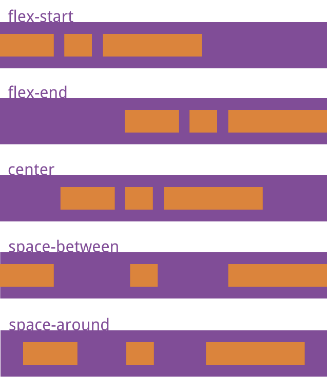
`justify-content`屬性定義了項目在主軸上的對齊方式。它可能取5個值,具體對齊方式與軸的方向有關。下面假設主軸為從左到右。
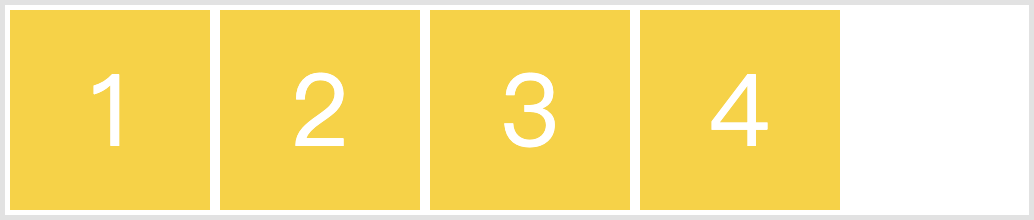
> * `flex-start`(默認值):左對齊
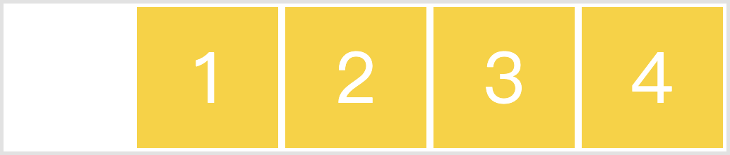
> * `flex-end`:右對齊
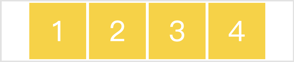
> * `center`: 居中
> * `space-between`:兩端對齊,項目之間的間隔都相等。
> * `space-around`:每個項目兩側的間隔相等。所以,項目之間的間隔比項目與邊框的間隔大一倍。
~~~css
.box {
justify-content: flex-start | flex-end | center | space-between | space-around;
}
~~~
~~~html
<div class="box">
<div class="box-item">1</div>
<div class="box-item">2</div>
<div class="box-item">3</div>
<div class="box-item">4</div>
</div>
~~~
~~~css
.box {
display: flex;
background-color: white;
}
.box-item {
width: 200px;
height: 200px;
line-height: 200px;
vertical-align: middle;
margin: 5px;
background-color: #ffd200;
font-size: 100px;
color: white;
text-align: center;
}
~~~
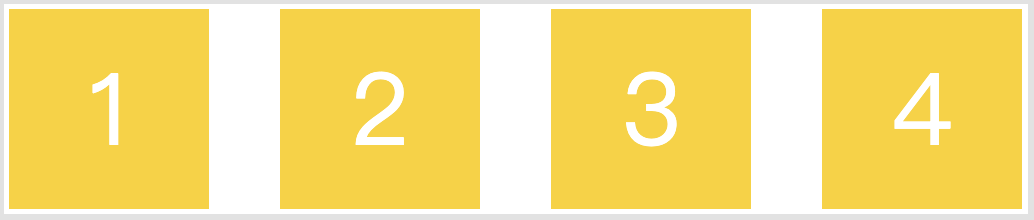
* `flex-start`(默認值):左對齊
~~~css
.box {
justify-content: flex-start;
}
~~~
* `flex-end`:右對齊
~~~css
.box {
justify-content: flex-end;
}
~~~
* `center`: 居中
~~~css
.box {
justify-content: center;
}
~~~
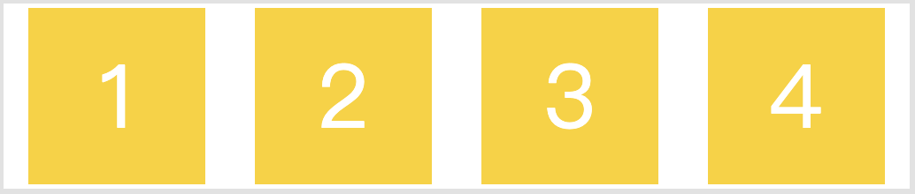
* `space-between`:兩端對齊,項目之間的間隔都相等。
~~~css
.box {
justify-content: space-between;
}
~~~
* `space-around`:每個項目兩側的間隔相等。所以,項目之間的間隔比項目與邊框的間隔大一倍。
~~~css
.box {
justify-content: space-around;
}
~~~
- 第一章:移動開發入門
- 第一節:概述
- 第二節:基礎概念
- 第一課時:像素
- 第二課時:視口
- 第二章:Flex 布局
- 第一節:概述
- 第二節:容器屬性
- 第一課時:flex-direction 屬性
- 第二課時:flex-wrap 屬性
- 第三課時:flex-flow 屬性
- 第四課時:justify-content 屬性
- 第五課時:align-items 屬性
- 第六課時:align-content 屬性
- 第三節:項目屬性
- 第一課時:order 屬性
- 第二課時:flex-grow 屬性
- 第三課時:flex-shrink 屬性
- 第四課時:flex-basis 屬性
- 第五課時:flex 屬性
- 第六課時:align-self 屬性
- 第四節:Flex 實例
- 第一課時:常見頁面布局
- 第三章:響應式布局
- 第一節:概述
- 第二節:媒體查詢
- 第一課時:概述
- 第二課時:響應式設計
- 第三節:柵格系統
- 第一課時:概述
- 第二課時:案例分析
- 第三課時:Bootstrap 簡介
- 第四節:響應式案例
- 第一課時:三星首頁
- 第四章:移動端適配
- 第五章:移動端事件
- 第一節:概述
- 第二節:touch 事件
- 第三節:觸摸事件對象
- 第四節:其他事件
- 第五節:移動端幻燈片
- 第六章:移動端常見問題
- 第一節:瀏覽器兼容性
- 第二節:移動端動畫
- 第三節:300ms 延遲
- 第四節:文字溢出省略
- 第五節:水平居中和垂直居中
- 第七章:項目案例
- 第一節:美團外賣
- 第一課時:首頁
- 第二課時:訂單頁面
- 第三課時:我的頁面
- 第四課時:詳情頁面
- 第五課時:購物車頁