
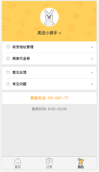
## 一、頁面預覽
## 二、頁面結構
```
<div class="my">
<div class="header">
<img class="avatar"
src="http://i.waimai.meituan.com/static/img/default-avatar.png" />
<p class="nickname">美團小騎手 ></p>
</div>
<div class="content">
<ul class="items">
<li class="address">收貨地址管理</li>
<li class="money">商家代金券</li>
</ul>
<ul class="items">
<li class="email">意見反饋</li>
<li class="question">常見問題</li>
</ul>
<p class="tel">客服電話: 101-097-77</p>
<p class="time">服務時間: 9:00-23:00</p>
</div>
</div>
```
## 三、頁面樣式
```
.header {
width: 100%;
height: 4.266667rem;
background-image: url('../img/header.png');
background-size: cover;
overflow: hidden;
}
.avatar {
width: 1.92rem;
height: 1.92rem;
margin: 0 auto;
display: block;
border: 0.08rem solid rgba(255,255,255,0.4);
border-radius: 50%;
margin-top: 0.666667rem;
}
.nickname {
color: #333;
font-size: 0.426667rem;
text-align: center;
margin-top: 0.4rem;
}
.content {
min-height: 13.52rem;
background-color: #eee;
}
.items {
border-bottom: 0.266667rem solid #eee;
background-color: #fff;
}
.items li {
height: 1.2rem;
font-size: 0.373333rem;
position: relative;
padding-left: 0.693333rem;
margin-left: 0.4rem;
border-bottom: 1px solid #e4e4e4;
line-height: 1.2rem;
}
.items li::before {
content: ' ';
display: block;
width: 0.426667rem;
height: 0.426667rem;
position: absolute;
left: 0.026667rem;
background-size: cover;
top: 0.373333rem;
}
.items li::after {
content: '>';
display: block;
width: 0.426667rem;
height: 0.426667rem;
position: absolute;
top: 0;
right: 0.16rem;
color: #aaa;
}
.items li:last-child {
border: none;
}
.address::before {
background-image: url('../img/address.png');
}
.money::before {
background-image: url('../img/money.png');
}
.email::before {
background-image: url('../img/email.png');
}
.question::before {
background-image: url('../img/question.png');
}
.tel {
font-size: 0.4rem;
color: #ffb000;
text-align: center;
height: 1.226667rem;
line-height: 1.226667rem;
background-color: #fff;
}
.time {
font-size: 0.373333rem;
text-align: center;
margin-top: 0.346667rem;
color: #999;
}
```
- 第一章:移動開發入門
- 第一節:概述
- 第二節:基礎概念
- 第一課時:像素
- 第二課時:視口
- 第二章:Flex 布局
- 第一節:概述
- 第二節:容器屬性
- 第一課時:flex-direction 屬性
- 第二課時:flex-wrap 屬性
- 第三課時:flex-flow 屬性
- 第四課時:justify-content 屬性
- 第五課時:align-items 屬性
- 第六課時:align-content 屬性
- 第三節:項目屬性
- 第一課時:order 屬性
- 第二課時:flex-grow 屬性
- 第三課時:flex-shrink 屬性
- 第四課時:flex-basis 屬性
- 第五課時:flex 屬性
- 第六課時:align-self 屬性
- 第四節:Flex 實例
- 第一課時:常見頁面布局
- 第三章:響應式布局
- 第一節:概述
- 第二節:媒體查詢
- 第一課時:概述
- 第二課時:響應式設計
- 第三節:柵格系統
- 第一課時:概述
- 第二課時:案例分析
- 第三課時:Bootstrap 簡介
- 第四節:響應式案例
- 第一課時:三星首頁
- 第四章:移動端適配
- 第五章:移動端事件
- 第一節:概述
- 第二節:touch 事件
- 第三節:觸摸事件對象
- 第四節:其他事件
- 第五節:移動端幻燈片
- 第六章:移動端常見問題
- 第一節:瀏覽器兼容性
- 第二節:移動端動畫
- 第三節:300ms 延遲
- 第四節:文字溢出省略
- 第五節:水平居中和垂直居中
- 第七章:項目案例
- 第一節:美團外賣
- 第一課時:首頁
- 第二課時:訂單頁面
- 第三課時:我的頁面
- 第四課時:詳情頁面
- 第五課時:購物車頁