
## 一、頁面概覽
## 二、頁面結構
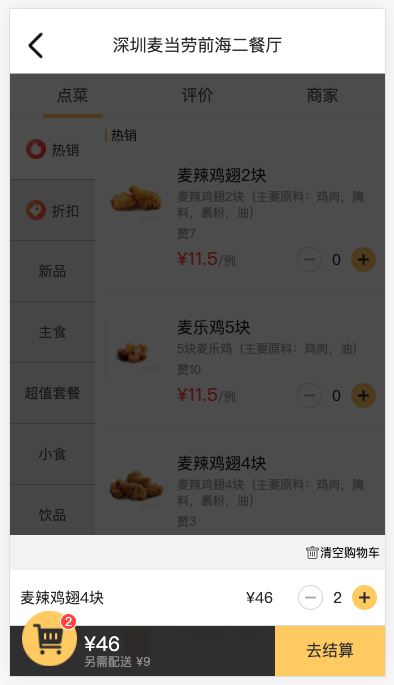
```
<!--購物車區域開始-->
<div class="shop-bar">
<div class="choose-content hide" style="display: block;">
<div class="content-top">
<div class="clear-car">清空購物車</div>
</div>
<div class="choose-item">
<div class="item-name">麥辣雞翅4塊</div>
<div class="price">¥<span class="total">46</span></div>
<div class="select-content">
<div class="minus"></div>
<div class="count">2</div>
<div class="plus"></div>
</div>
</div>
</div>
<div class="bottom-content">
<div class="shop-icon">
<div class="dot-num hide" style="display: block;">2</div>
</div>
<div class="price-content">
<p class="total-price">¥<span class="total-price-span">46</span></p>
<p class="other-price">另需配送 ¥<span class="shipping-fee">9</span></p>
</div>
<div class="submit-btn">去結算</div>
</div>
</div>
<div class="mask hide" style="display: block;"></div>
<!--購物車區域結束-->
```
## 三、頁面樣式
```
.shop-bar {
position: absolute;
bottom: 0;
left: 0;
right: 0;
z-index: 99;
}
.shop-bar .bottom-content {
height: 1.333333rem;
display: flex;
background-color: rgba(51,51,51,0.9);
}
.shop-bar .shop-icon {
width: 1.466667rem;
height: 1.466667rem;
background-image: url('../img/shop-icon.png');
background-size: cover;
margin-top: -0.4rem;
margin-left: 0.32rem;
position: relative;
}
.shop-bar .price-content {
flex: 1;
padding-top: 0.213333rem;
padding-left: 0.186667rem;
}
.shop-bar .total-price {
font-size: 0.533333rem;
color: #fff;
}
.shop-bar .other-price {
font-size: 0.32rem;
color: #999;
margin-top: 0.053333rem;
}
.shop-bar .dot-num {
position: absolute;
background-color: #fb4e44;
width: 0.4rem;
height: 0.4rem;
font-size: 0.32rem;
color: #fff;
border: 1px solid #fff;
border-radius: 50%;
right: 0;
top: 0.053333rem;
text-align: center;
line-height: 0.4rem;
}
.shop-bar .submit-btn {
width: 2.933333rem;
height: 100%;
background-color: #ffd161;
color: #333;
font-size: 0.426667rem;
line-height: 1.333333rem;
text-align: center;
}
.choose-content {
background-color: #fff;
}
.choose-content .content-top {
height: 0.933333rem;
background-color: #f4f4f4;
font-size: 0.293333rem;
display: flex;
align-items: center;
justify-content: flex-end;
}
.choose-content .clear-car {
margin-left: 0.266667rem;
margin-right: 0.133333rem;
float: left;
position: relative;
}
.choose-content .clear-car::after {
content: ' ';
width: 0.346667rem;
height: 0.346667rem;
display: block;
background-image: url('../img/clear.jpeg');
background-size: cover;
position: absolute;
top: -0.026667rem;
left: -0.373333rem;
}
.choose-content .choose-item {
display: flex;
font-size: 0.4rem;
color: #2f2f2f;
height: 0.933333rem;
align-items: center;
padding-top: 0.266667rem;
padding-bottom: 0.266667rem;
border-bottom: 1px solid #ddd;
}
.choose-content .choose-item .price {
margin-left: 0.133333rem;
margin-right: 0.666667rem;
}
.choose-content .choose-item .item-name {
flex: 1;
padding-left: 0.266667rem;
}
.choose-content .select-content {
position: relative;
margin-right: 0.213333rem;
display: flex;
}
.choose-content .plus {
width: 0.666667rem;
height: 0.666667rem;
background-image: url('../img/plus.png');
background-size: cover;
}
.choose-content .minus {
width: 0.666667rem;
height: 0.666667rem;
background-image: url('../img/minus.png');
background-size: cover;
}
.choose-content .count {
font-size: 0.4rem;
color: #2f2f2f;
width: 0.666667rem;
height: 0.666667rem;
line-height: 0.666667rem;
margin-left: 0.053333rem;
margin-right: 0.053333rem;
text-align: center;
}
.mask {
position: fixed;
left: 0;
right: 0;
bottom: 0;
top: 0;
background-color: rgba(0,0,0,0.7);
}
```
## 四、本節作業
* 實現點擊左下角購物車圖標切換顯示購物車內容和隱藏掩膜 mask 層。
* 實現點擊加減按鈕修改購物車物品。
- 第一章:移動開發入門
- 第一節:概述
- 第二節:基礎概念
- 第一課時:像素
- 第二課時:視口
- 第二章:Flex 布局
- 第一節:概述
- 第二節:容器屬性
- 第一課時:flex-direction 屬性
- 第二課時:flex-wrap 屬性
- 第三課時:flex-flow 屬性
- 第四課時:justify-content 屬性
- 第五課時:align-items 屬性
- 第六課時:align-content 屬性
- 第三節:項目屬性
- 第一課時:order 屬性
- 第二課時:flex-grow 屬性
- 第三課時:flex-shrink 屬性
- 第四課時:flex-basis 屬性
- 第五課時:flex 屬性
- 第六課時:align-self 屬性
- 第四節:Flex 實例
- 第一課時:常見頁面布局
- 第三章:響應式布局
- 第一節:概述
- 第二節:媒體查詢
- 第一課時:概述
- 第二課時:響應式設計
- 第三節:柵格系統
- 第一課時:概述
- 第二課時:案例分析
- 第三課時:Bootstrap 簡介
- 第四節:響應式案例
- 第一課時:三星首頁
- 第四章:移動端適配
- 第五章:移動端事件
- 第一節:概述
- 第二節:touch 事件
- 第三節:觸摸事件對象
- 第四節:其他事件
- 第五節:移動端幻燈片
- 第六章:移動端常見問題
- 第一節:瀏覽器兼容性
- 第二節:移動端動畫
- 第三節:300ms 延遲
- 第四節:文字溢出省略
- 第五節:水平居中和垂直居中
- 第七章:項目案例
- 第一節:美團外賣
- 第一課時:首頁
- 第二課時:訂單頁面
- 第三課時:我的頁面
- 第四課時:詳情頁面
- 第五課時:購物車頁