
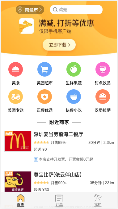
## 一、首頁預覽
## 二、頭部結構
頭部結構可以分為兩個部分:搜索條和背景圖。代碼如下:
```
<!--頭部開始-->
<div class="header">
<div class="search-bar">
<div class="bar-location">
<div class="location-icon"></div>
<div class="location-text">南通市</div>
</div>
<div class="search-btn">
<p class="place-holder">雞翅</p>
</div>
</div>
<img class="header-img"
src="https://app.nihaoshijie.com.cn/upload/bannertemp.e8a6fa63.jpg">
</div>
<!--頭部結束-->
```
## 三、頭部樣式
在編寫功能模塊樣式之前,一般我們會引入重置樣式來對瀏覽器默認樣式進行重置。樣式代碼如下:
```
/* reset.css */
html, body, div, span, applet, object, iframe,
h1, h2, h3, h4, h5, h6, p, blockquote, pre,
a, abbr, acronym, address, big, cite, code,
del, dfn, em, img, ins, kbd, q, s, samp,
small, strike, strong, sub, sup, tt, var,
b, u, i, center,
dl, dt, dd, ol, ul, li,
fieldset, form, label, legend,
table, caption, tbody, tfoot, thead, tr, th, td,
article, aside, canvas, details, embed,
figure, figcaption, footer, header, hgroup,
menu, nav, output, ruby, section, summary,
time, mark, audio, video {
margin: 0;
padding: 0;
border: 0;
font-size: 100%;
font: inherit;
vertical-align: baseline;
}
/* HTML5 display-role reset for older browsers */
article, aside, details, figcaption, figure,
footer, header, hgroup, menu, nav, section {
display: block;
}
body {
line-height: 1;
}
ol, ul {
list-style: none;
}
blockquote, q {
quotes: none;
}
blockquote:before, blockquote:after,
q:before, q:after {
content: '';
content: none;
}
table {
border-collapse: collapse;
border-spacing: 0;
}
.clearfix::after {
content: ' ';
visibility: hidden;
display: block;
height: 0;
clear: both;
}
.one-line {
overflow: hidden;
text-overflow: ellipsis;
white-space: nowrap;
}
.hide {
display: none;
}
```
引入重置樣式之后,我們就可以開始編寫頭部樣式了,樣式代碼如下:
```
.header {
position: relative;
}
.header .header-img {
width: 100%;
height: 4.746667rem;
}
```
在此處我們使用了`rem`單位來設置頭部區域的高度,那么我們就需要設定`1rem`的值,我們將其動態地設置為視口寬度的10分之一。注意:此時1rem的值設置,存在多種方式。
```
(function() {
var docEl = document.documentElement;
function setRemUnit() {
// 獲取到rem的基準值
var rem = docEl.clientWidth / 10;
// 動態設置html根元素的 font-size
docEl.style.fontSize = rem + 'px';
}
setRemUnit();
// 窗口大小變化時 觸發
window.addEventListener('resize', setRemUnit);
// 窗口出現在當前屏幕時 (有瀏覽器兼容性)
window.addEventListener('pageshow', function(e) {
if (e.persisted) {
setRemUnit();
}
});
})();
```
## 四、頭部搜索
```
.search-bar {
width: 100%;
height: 1.066667rem;
position: absolute;
display: flex;
flex-direction: row;
align-items: center;
justify-content: center;
padding-top: 0.213333rem;
}
.search-bar .bar-location {
margin-right: 0.533333rem;
border-radius: 0.346667rem;
background-color: rgba(0,0,0,0.33);
width: 2.453333rem;
height: 0.746667rem;
}
.search-bar .location-icon {
display: inline-block;
width: 0.4rem;
height: 0.533333rem;
vertical-align: 0.213333rem;
margin-left: 0.16rem;
background-image: url('../img/locationIcon.png');
background-size: cover;
}
.search-bar .location-text {
position: relative;
display: inline-block;
font-size: 0.373333rem;
color: #fff;
vertical-align: 0.32rem;
margin-left: -0.08rem;
}
.search-bar .location-text::after {
content: ' ';
display: block;
width: 0.373333rem;
height: 0.373333rem;
background-image: url('../img/arrowIcon.png');
background-size: cover;
position: absolute;
right: -0.4rem;
top: -0.026667rem;
}
.search-bar .search-btn {
position: relative;
width: 4.533333rem;
height: 0.8rem;
background-color: #fff;
border-radius: 0.533333rem;
}
.search-bar .search-btn::before {
content: ' ';
display: block;
width: 0.373333rem;
height: 0.373333rem;
background-image: url('../img/searchIcon.png');
background-size: cover;
top: 0.213333rem;
left: 0.266667rem;
position: absolute;
}
.search-bar .place-holder {
color: #a9a9a9;
font-size: 0.373333rem;
height: 100%;
line-height: 0.8rem;
margin-left: 0.746667rem;
}
```
## 五、類目
首先我們需要編寫類目的 HTML 結構,代碼如下:
```
<!-- 類目開始 -->
<div class="category-content clearfix">
<div class="category-item">
<img class="item-icon"
src="http://p1.meituan.net/jungle/bd3ea637aeaa2fb6120b6938b5e468a13442.png">
<p class="item-name">美食</p>
</div>
<div class="category-item">
<img class="item-icon"
src="http://p0.meituan.net/jungle/6b93ee96be3df7cf2bb6e661280b047d3975.png">
<p class="item-name">美團超市</p>
</div>
<div class="category-item">
<img class="item-icon"
src="http://p0.meituan.net/jungle/f33ed552c52b4466b6308a2c14dbc62d4882.png">
<p class="item-name">生鮮果蔬</p>
</div>
<div class="category-item">
<img class="item-icon"
src="http://p0.meituan.net/jungle/45816fffb346c194d58e961fde7c0fad4901.png">
<p class="item-name">甜點飲品</p>
</div>
<div class="category-item">
<img class="item-icon"
src="http://p0.meituan.net/jungle/f51c34aea31bf3685be15dedde2632bc5391.png">
<p class="item-name">美團專送</p>
</div>
<div class="category-item">
<img class="item-icon"
src="http://p1.meituan.net/jungle/1543bbcb048218424e2420a6934e17b24236.png">
<p class="item-name">正餐優選</p>
</div>
<div class="category-item">
<img class="item-icon"
src="http://p0.meituan.net/jungle/b528beea0749cb18dd34a38bd2439ed43867.png">
<p class="item-name">快餐小吃</p>
</div>
<div class="category-item">
<img class="item-icon"
src="http://p1.meituan.net/jungle/0e63b86b4ff14d214c1999a979fd21d14273.png">
<p class="item-name">漢堡披薩</p>
</div>
</div>
<!-- 類目結束 -->
```
類目的布局樣式采用`flex`布局,代碼如下:
```
.category-content {
padding-bottom: 0.266667rem;
display: flex;
flex-direction: row;
flex-wrap: wrap;
}
.category-content .category-item {
width: 25%;
padding-top: 0.373333rem;
font-size: 0.346667rem;
display: flex;
flex-direction: column;
align-items: center;
}
.category-content .item-icon {
width: 1.253333rem;
}
.category-content .item-name {
margin-top: 0.373333rem;
}
```
## 六、商家列表
我們接著來編寫商家列表的HTML結構,代碼如下:
```
<!-- 商家列表開始 -->
<div class="list-content">
<h4 class="list-title">
<span class="title-line"></span>
<span>附近商家</span>
<span class="title-line"></span>
</h4>
<div class="list-wrap">
<div class="r-item-content">
<img class="item-img"
src="http://p0.meituan.net/xianfu/aa86bc1b9a218ea5e094b861c03b59b94873.jpg">
<div class="brand brand-pin">品牌</div>
<div class="item-info-content">
<p class="item-title">深圳麥當勞前海二餐廳</p>
<div class="item-desc clearfix">
<div class="item-score">
<div class="star-score">
<div class="star fullstar"></div>
<div class="star fullstar"></div>
<div class="star fullstar"></div>
<div class="star fullstar"></div>
<div class="star halfstar"></div>
</div>
</div>
<div class="item-count">月售999+</div>
<div class="item-distance"> 2.3km</div>
<div class="item-time">30分鐘 |</div>
</div>
<div class="item-price">
<div class="item-pre-price">起送 ¥0</div>
</div>
<div class="item-others">
<div class="other-info">
<img class="other-tag"
src="http://p0.meituan.net/xianfu/476ba65ee80b6385bab292c085baed17940.png">
<p class="other-content one-line">本店支持開發票,開票金額0元起</p>
</div>
</div>
</div>
</div>
<div class="r-item-content">
<img class="item-img"
src="http://p1.meituan.net/waimaipoi/a069cda780cfad105f7d34b193f4cd8027807.jpg">
<div class="brand brand-pin">品牌</div>
<div class="item-info-content">
<p class="item-title">尊寶比薩(依云伴山店)</p>
<div class="item-desc clearfix">
<div class="item-score">
<div class="star-score">
<div class="star fullstar"></div>
<div class="star fullstar"></div>
<div class="star fullstar"></div>
<div class="star fullstar"></div>
<div class="star halfstar"></div>
</div>
</div>
<div class="item-count">月售999+</div>
<div class="item-distance"> 231m</div>
<div class="item-time">35分鐘 |</div>
</div>
<div class="item-price">
<div class="item-pre-price">起送 ¥30</div>
</div>
<div class="item-others"></div>
</div>
</div>
</div>
<div class="loading">加載完成</div>
</div>
<!-- 商家列表結束 -->
```
元素布局樣式實現方式較多,我們可以利用多種布局方式一起來完成樣式編寫,代碼如下:
```
.list-content {
overflow: hidden;
padding-bottom: 1.333333rem;
}
.list-content .list-title {
text-align: center;
font-size: 0.426667rem;
margin-top: 0.373333rem;
margin-bottom: 0.133333rem;
}
.list-content .title-line {
display: inline-block;
border-bottom: 0.026667rem solid #949494;
height: 0.026667rem;
width: 0.8rem;
margin-left: 0.106667rem;
margin-right: 0.106667rem;
margin-bottom: 0.106667rem;
}
.loading {
padding-bottom: 0.266667rem;
padding-top: 0.266667rem;
font-size: 0.426667rem;
text-align: center;
color: #ccc;
}
.r-item-content {
display: flex;
padding-top: 0.4rem;
padding-bottom: 0.4rem;
margin-left: 0.266667rem;
margin-right: 0.266667rem;
color: #656565;
position: relative;
}
.r-item-content .item-img {
width: 2.293333rem;
height: 1.733333rem;
border: 0.026667rem solid #e4e4e4;
}
.r-item-content .item-info-content {
flex: 1;
margin-left: 0.186667rem;
overflow: hidden;
}
.r-item-content .brand {
position: absolute;
left: 0.026667rem;
top: 0.426667rem;
font-size: 0.32rem;
padding: 0.053333rem;
color: #fff;
}
.r-item-content .brand-pin {
background-color: #ffa627;
}
.r-item-content .brand-xin {
background-color: #21c56c;
}
.r-item-content .item-title {
margin-top: 0.08rem;
font-size: 0.426667rem;
font-weight: 500;
color: #333;
}
.r-item-content .item-desc {
margin-top: 0.346667rem;
font-size: 0.32rem;
}
.r-item-content .item-count {
float: left;
margin-left: 0.133333rem;
}
.r-item-content .item-time {
float: right;
}
.r-item-content .item-distance {
float: right;
}
.r-item-content .item-score {
float: left;
}
.r-item-content .item-price {
margin-top: 0.266667rem;
font-size: 0.32rem;
height: 0.64rem;
}
.r-item-content .other-info {
color: #898989;
margin-top: 0.186667rem;
font-size: 0.32rem;
display: flex;
}
.r-item-content .other-tag {
width: 0.373333rem;
height: 0.373333rem;
}
.other-content {
margin-left: 0.08rem;
height: 0.373333rem;
width: 6.133333rem;
margin-top: 0.026667rem;
}
```
## 七、星級評分
我們在顯示星級評分的時候,沒有設置樣式,這里我們需要使用一些圖片來來顯示星級。樣式如下:
```
```
## 八、底部菜單
頁面最底部菜單欄如下:
```
<!-- 底部菜單欄開始 -->
<div class="bottom-bar">
<a class="index btn-item active" href="#">
<div class="tab-icon"></div>
<div class="btn-name">首頁</div>
</a>
<a class="order btn-item" href="#">
<div class="tab-icon"></div>
<div class="btn-name">訂單</div>
</a>
<a class="my btn-item" href="#">
<div class="tab-icon"></div>
<div class="btn-name">我的</div>
</a>
</div>
<!-- 底部菜單欄結束 -->
```
底部菜單欄應該使用固定在視口底部,我們應該使用固定定位來完整布局,布局樣式如下:
```
.bottom-bar {
position: fixed;
bottom: 0;
width: 100%;
height: 1.333333rem;
display: flex;
border-top: 1px solid #b6b6b6;
background-color: rgba(246,246,246,0.95);
}
.bottom-bar .btn-item {
flex: 1;
display: flex;
font-size: 0.293333rem;
flex-direction: column;
align-items: center;
justify-content: center;
color: #999;
}
.bottom-bar .tab-icon {
margin-bottom: 0.106667rem;
width: 0.666667rem;
height: 0.666667rem;
background-size: cover;
}
.bottom-bar .index.btn-item .tab-icon {
background-image: url('../img/homeIcon.png');
}
.bottom-bar .my.btn-item .tab-icon {
background-image: url('../img/myIcon.png');
}
.bottom-bar .order.btn-item .tab-icon {
background-image: url('../img/orderIcon.png');
}
.bottom-bar .btn-item.active {
color: #000;
}
.bottom-bar .index.btn-item.active .tab-icon {
background-image: url('../img/homeIconActive.png');
}
.bottom-bar .my.btn-item.active .tab-icon {
background-image: url('../img/myIconActive.png');
}
.bottom-bar .order.btn-item.active .tab-icon {
background-image: url('../img/orderIconActive.png');
}
```
## 九、本節作業
* 商家列表:在真實情況下,我們獲取商家列表數據都是通過請求后端數據來獲得,為了模擬這一情況,新建數據文件`shops.json`,通過`jquery`中`ajax`來讀取商家數據,渲染商家列表頁面。
```
$.get('../data/shops.json', function(data){
console.log(data);
});
```
* 在`shops.json`中我們提供了大量商家數據,但是在實際應用中,都是用戶滾動屏幕來獲取新的數據,我們可以監聽`window`或者`document`的滾動事件,每次新增顯示10條或者20條數據。
```
window.addEventListener('scroll',function(){
var clientHeight = document.documentElement.clientHeight;
var scrollHeight = document.body.scrollHeight;
var scrollTop = document.documentElement.scrollTop || document.body.scrollTop;
// ...
}
```
- 第一章:移動開發入門
- 第一節:概述
- 第二節:基礎概念
- 第一課時:像素
- 第二課時:視口
- 第二章:Flex 布局
- 第一節:概述
- 第二節:容器屬性
- 第一課時:flex-direction 屬性
- 第二課時:flex-wrap 屬性
- 第三課時:flex-flow 屬性
- 第四課時:justify-content 屬性
- 第五課時:align-items 屬性
- 第六課時:align-content 屬性
- 第三節:項目屬性
- 第一課時:order 屬性
- 第二課時:flex-grow 屬性
- 第三課時:flex-shrink 屬性
- 第四課時:flex-basis 屬性
- 第五課時:flex 屬性
- 第六課時:align-self 屬性
- 第四節:Flex 實例
- 第一課時:常見頁面布局
- 第三章:響應式布局
- 第一節:概述
- 第二節:媒體查詢
- 第一課時:概述
- 第二課時:響應式設計
- 第三節:柵格系統
- 第一課時:概述
- 第二課時:案例分析
- 第三課時:Bootstrap 簡介
- 第四節:響應式案例
- 第一課時:三星首頁
- 第四章:移動端適配
- 第五章:移動端事件
- 第一節:概述
- 第二節:touch 事件
- 第三節:觸摸事件對象
- 第四節:其他事件
- 第五節:移動端幻燈片
- 第六章:移動端常見問題
- 第一節:瀏覽器兼容性
- 第二節:移動端動畫
- 第三節:300ms 延遲
- 第四節:文字溢出省略
- 第五節:水平居中和垂直居中
- 第七章:項目案例
- 第一節:美團外賣
- 第一課時:首頁
- 第二課時:訂單頁面
- 第三課時:我的頁面
- 第四課時:詳情頁面
- 第五課時:購物車頁