
## 多平臺開發
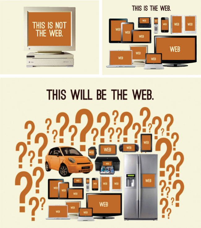
一個網站或應用不僅能運行在各種臺式機, 筆記本電腦, 平板和手機, 還能運行于少部分其它設備(手表, 溫控器, 電冰箱等等). 你將怎么決定支持哪些平臺和為支持這些平臺, 怎么去開發, 這被稱為多平臺開發策略. 接下來, 我會列出常見的多平臺開發策略:
* 創建 [響應式 Web 設計](https://en.wikipedia.org/wiki/Responsive_web_design) (RWD) 網站/APP
* 創建 [RESS](http://www.lukew.com/ff/entry.asp?1392) (基于服務端組件的響應式 Web 設計) 網站/APP
* 創建 [自適應/漸進增強地](https://en.wikipedia.org/wiki/Adaptive_web_design) 網站/APP
* 對每一個或每一組平臺建立一套網站, Web 應用, 本地應用或混合應用
* 嘗試修改你用策略1, 策略2或策略創建的應用. 這可能和點綴與屏幕大小無關的部分 UI 一樣簡單, 也可以試圖完全支持其他平臺與整個 UI.
**入門學習:**
<ul>
<li><a href="http://adaptivewebdesign.info/" target="_blank">Adaptive Web Design</a> [read][$]</li>
<li><a href="https://www.filamentgroup.com/dwpe/" target="_blank">Designing with progressive enhancement</a> [read][$]</li>
<li><a href="Responsive%20Typography">Responsive Typography</a> [watch][$]</li>
<li><a href="https://frontendmasters.com/courses/responsive-web-design/" target="_blank">Responsive Web Design</a> [watch][$]</li>
<li><a href="https://frontendmasters.com/courses/responsive-email/" target="_blank">Responsive HTML Email Design</a> [watch][$]</li>
<li><a href="http://www.amazon.com/Designing-Multi-Device-Experiences-Ecosystem-Approach/dp/1449340385/ref=pd_sim_14_8" target="_blank">Designing Multi-Device Experiences: An Ecosystem Approach to User Experiences across Devices</a> [read][$]</li>
<li><a href="https://www.udacity.com/courses/web-development" target="_blank">Responsive Web Design Fundamentals</a> [watch]</li>
<li><a href="https://www.udacity.com/course/responsive-images--ud882" target="_blank">Responsive Images</a> [watch]</li>
<li><a href="https://www.udacity.com/course/mobile-web-development--cs256" target="_blank">Mobile Web Development</a> [watch]</li>
</ul>
- Introduction
- 什么是前端開發者?
- 第一部分: 前端開發實踐
- 前端的工作職稱
- 常用的網絡技術
- 前端開發技術棧
- 前端開發做什么
- 團隊中的前端
- 全才神話
- 前端的面試問題
- 前端工作版塊
- 前端薪資
- 如何培養前端開發者?
- 第二部分: 前端開發學習
- 自主學習
- Internet/Web
- Web瀏覽器
- DNS
- HTTP/網絡
- Web 主機
- 前端開發綜合學習
- 用戶界面和交互設計
- HTML & CSS
- SEO
- Javascript
- Web 動畫
- DOM, BOM & JQuery
- Web 字體
- 無障礙設計
- Web/瀏覽器 API
- JSON
- 靜態網頁生成器
- 前端應用架構設計
- 接口/API 設計
- Web 開發者工具
- 命令行
- Node.js
- 模塊加載器
- 包管理器
- 版本控制
- 構建 & 任務自動化
- 網站性能優化
- JS 測試
- 無殼瀏覽器
- 離線開發
- 安全
- 多平臺開發
- 指導學習
- 前端指導學習
- 前端開發者從哪里學
- 前端簡報, 資訊 & 博客
- 第三部分: 前端開發工具
- 常用前端開發工具
- DOC/API 瀏覽
- SEO
- 原型和框架
- 圖表
- HTTP/網絡
- 代碼編輯
- 瀏覽器
- HTML
- CSS
- DOM
- JavaScript
- 靜態網頁生成器
- APP(桌面, 移動, 平板等) 管理
- 腳手架
- 模板
- UI 部件 & 組件
- 數據可視化
- 圖形
- 動畫
- JSON
- 測試框架
- 數據存儲
- 模塊/包加載
- 模塊/包倉庫
- Web/云/靜態主機托管
- 項目管理 & 代碼托管
- 合作 & 交流
- CMS 托管/API
- BASS
- 離線
- 安全
- 任務管理
- 部署
- 網站/APP 監控
- JS 錯誤監控
- 性能