
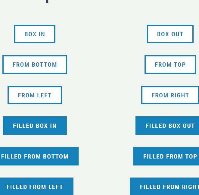
# 效果
```
<!doctype html>
<html>
<head>
<meta charset="UTF-8">
<meta name="viewport" content="width=device-width, user-scalable=no, initial-scale=1.0, maximum-scale=1.0, minimum-scale=1.0">
<meta http-equiv="X-UA-Compatible" content="ie=edge">
<title>Document</title>
<style>
* {
box-sizing: border-box;
}
h1 {
color: #37392e;
font-size: 3.5em;
}
body {
background: #F1F4F1;
font-family: "Roboto Condensed", sans-serif;
text-align: center;
}
.o-display-grid {
display: flex;
flex-wrap: wrap;
max-width: 45em;
margin: 0 auto;
}
.o-display-grid__item {
flex-grow: 1;
flex-basis: 50%;
text-align: center;
padding: 1em 2em;
}
.c-button {
border: 3px solid #1481ba;
border-radius: 0;
color: #1481ba;
background: #fff;
text-transform: uppercase;
font-size: 1em;
line-height: 1.7em;
font-weight: bold;
letter-spacing: .1em;
font-family: "Roboto Condensed", sans-serif;
padding: .5em 1.5em;
cursor: pointer;
transition: all .5s;
}
.c-button--box-in {
box-shadow: inset 0 0 0 0 #1481ba;
}
.c-button--box-in:hover {
box-shadow: inset 0 0 0 100vmax #1481ba;
color: #fff;
}
.c-button--box-out {
box-shadow: inset 0 0 0 100vmax #fff, inset 0 0 0 100vmax #1481ba;
}
.c-button--box-out:hover {
box-shadow: inset 0 0 0 0 #fff, inset 0 0 0 100vmax #1481ba;
color: #fff;
}
.c-button--from-bottom {
box-shadow: inset 0 0 0 0 #1481ba;
}
.c-button--from-bottom:hover {
box-shadow: inset 0 -100vmax 0 0 #1481ba;
color: #fff;
}
.c-button--from-top {
box-shadow: inset 0 0 0 0 #1481ba;
}
.c-button--from-top:hover {
box-shadow: inset 0 100vmax 0 0 #1481ba;
color: #fff;
}
.c-button--from-left {
box-shadow: inset 0 0 0 0 #1481ba;
}
.c-button--from-left:hover {
box-shadow: inset 100vmax 0 0 0 #1481ba;
color: #fff;
}
.c-button--from-right {
box-shadow: inset 0 0 0 0 #1481ba;
}
.c-button--from-right:hover {
box-shadow: inset -100vmax 0 0 0 #1481ba;
color: #fff;
}
.c-button--filled {
background: #1481ba;
color: #fff;
box-shadow: inset 0 0 0 0 #fff;
}
.c-button--filled.c-button--box-in:hover {
box-shadow: inset 0 0 0 100vmax #fff;
color: #1481ba;
}
.c-button--filled.c-button--box-out {
box-shadow: inset 0 0 0 100vmax #1481ba, inset 0 0 0 100vmax #fff;
}
.c-button--filled.c-button--box-out:hover {
box-shadow: inset 0 0 0 0 #1481ba, inset 0 0 0 100vmax #fff;
color: #1481ba;
}
.c-button--filled.c-button--from-bottom:hover {
box-shadow: inset 0 -100vmax 0 0 #fff;
color: #1481ba;
}
.c-button--filled.c-button--from-top:hover {
box-shadow: inset 0 100vmax 0 0 #fff;
color: #1481ba;
}
.c-button--filled.c-button--from-left:hover {
box-shadow: inset 100vmax 0 0 0 #fff;
color: #1481ba;
}
.c-button--filled.c-button--from-right:hover {
box-shadow: inset -15em 0 0 0 #fff;
color: #1481ba;
}
.c-button--disabled {
border-color: #ccc;
}
.c-button--disabled:hover {
cursor: not-allowed;
}
</style>
</head>
<body>
<h1>CSS Namespaced Button Transitions</h1>
<div class="o-display-grid">
<div class="o-display-grid__item">
<button class="c-button c-button--box-in">Box In</button>
</div>
<div class="o-display-grid__item">
<button class="c-button c-button--box-out">Box Out</button>
</div>
<div class="o-display-grid__item">
<button class="c-button c-button--from-bottom">From Bottom</button>
</div>
<div class="o-display-grid__item">
<button class="c-button c-button--from-top">From Top</button>
</div>
<div class="o-display-grid__item">
<button class="c-button c-button--from-left">From Left</button>
</div>
<div class="o-display-grid__item">
<button class="c-button c-button--from-right">From Right</button>
</div>
<div class="o-display-grid__item">
<button class="c-button c-button--box-in c-button--filled">Filled Box In</button>
</div>
<div class="o-display-grid__item">
<button class="c-button c-button--box-out c-button--filled">Filled Box Out</button>
</div>
<div class="o-display-grid__item">
<button class="c-button c-button--from-bottom c-button--filled">Filled From Bottom</button>
</div>
<div class="o-display-grid__item">
<button class="c-button c-button--from-top c-button--filled">Filled From Top</button>
</div>
<div class="o-display-grid__item">
<button class="c-button c-button--from-left c-button--filled">Filled From Left</button>
</div>
<div class="o-display-grid__item">
<button class="c-button c-button--from-right c-button--filled">Filled From Right</button>
</div>
</div>
</body>
</html>
```
- 筆記內容來源
- 你不知道的JavaScript上
- vue
- 環境搭建
- node和npm安裝配置
- 安裝vue-cli并初始化vue項目
- 安裝配置elementUI
- vuex安裝配置
- axios安裝配置
- main.js
- vue基礎入門
- vue-router介紹
- vuex
- vue 原理學習源碼學習
- js正則處理v-bind和語法
- 雙向綁定
- 虛擬dom
- mvvm和render函數
- vue工作項目筆記
- elementUI 表格分頁多選記憶功能
- elementUI表格展開一行
- keepAlive
- vue整合ckeditor5
- this.$router.push 內打開新窗口
- java修改上傳圖片的權限
- 兼容ie11
- 生成二維碼
- base64圖片下載(兼容IE10)
- vue新手引導程序intro.js
- vue插件 devtools
- vue刷新當前頁面
- vue 錨點導航
- axios
- axios與springmvc
- vue-cli 3搭建vue
- git
- git常用命令
- 正則表達式
- 實例demo
- 1
- 新手引導頁
- 純css3從左顯示下劃線動畫導航菜單
- 純css3從中間顯示下劃線動畫導航菜單
- css顯示密碼
- 倒計時時鐘
- 星星評分
- 按鈕懸停效果
- 步驟條
- css動畫按鈕
- input標題獲得焦點上移
- css圖片放大
- css鏡像導航欄
- js
- 通信
- for in 和 for of
- 前端安全問題
- Promise
- 掘金冴羽學習筆記
- 模擬call
- 模擬bind
- 閉包
- 1 作用域
- 2 執行上下文棧
- 3 變量對象
- 4 作用域鏈
- 5 this
- 面向對象
- 基礎知識點
- 渲染機制
- 其他
- 判斷是否為數組
- http
- css
- 基礎知識
- css陰影