
### 多選和單選框
多選框(checkbox)用于選擇列表中的一個或多個選項,而單選框(radio)用于從多個選項中只選擇一個。
Disabled checkboxes and radios are supported, but to provide a "not-allowed" cursor on hover of the parent`<label>`, you'll need to add the`.disabled`class to the parent`.radio`,`.radio-inline`,`.checkbox`, or`.checkbox-inline`.
#### 默認外觀(堆疊在一起)
~~~html
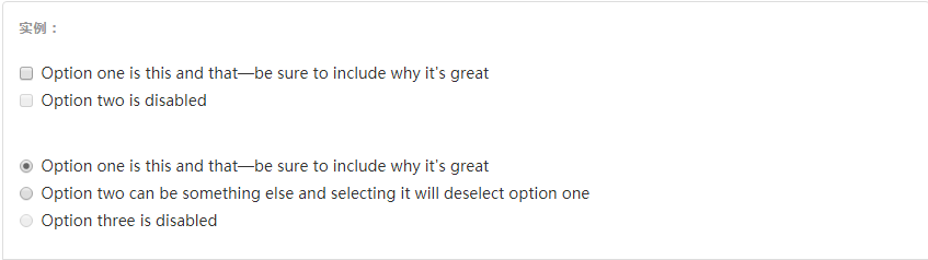
<div class="checkbox">
<label>
<input type="checkbox" value="">
Option one is this and that—be sure to include why it's great
</label>
</div>
<div class="checkbox disabled">
<label>
<input type="checkbox" value="" disabled>
Option two is disabled
</label>
</div>
<div class="radio">
<label>
<input type="radio" name="optionsRadios" id="optionsRadios1" value="option1" checked>
Option one is this and that—be sure to include why it's great
</label>
</div>
<div class="radio">
<label>
<input type="radio" name="optionsRadios" id="optionsRadios2" value="option2">
Option two can be something else and selecting it will deselect option one
</label>
</div>
<div class="radio disabled">
<label>
<input type="radio" name="optionsRadios" id="optionsRadios3" value="option3" disabled>
Option three is disabled
</label>
</div>
~~~
#### 內聯單選和多選框
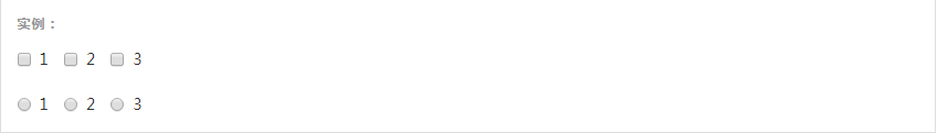
通過將`.checkbox-inline`或`.radio-inline`類應用到一系列的多選框(checkbox)或單選框(radio)控件上,可以使這些控件排列在一行。
~~~html
<label class="checkbox-inline">
<input type="checkbox" id="inlineCheckbox1" value="option1"> 1
</label>
<label class="checkbox-inline">
<input type="checkbox" id="inlineCheckbox2" value="option2"> 2
</label>
<label class="checkbox-inline">
<input type="checkbox" id="inlineCheckbox3" value="option3"> 3
</label>
<label class="radio-inline">
<input type="radio" name="inlineRadioOptions" id="inlineRadio1" value="option1"> 1
</label>
<label class="radio-inline">
<input type="radio" name="inlineRadioOptions" id="inlineRadio2" value="option2"> 2
</label>
<label class="radio-inline">
<input type="radio" name="inlineRadioOptions" id="inlineRadio3" value="option3"> 3
</label>
~~~
#### 不帶label文本的Checkbox 和 radio
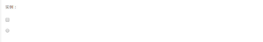
如果需要`<label>`內沒有文字,輸入框(input)正是你所期望的。**目前只適用于非內聯的 checkbox 和 radio。**請記住,仍然需要為使用輔助技術的用戶提供某種形式的 label(例如,使用`aria-label`)。
~~~html
<div class="checkbox">
<label>
<input type="checkbox" id="blankCheckbox" value="option1" aria-label="...">
</label>
</div>
<div class="radio">
<label>
<input type="radio" name="blankRadio" id="blankRadio1" value="option1" aria-label="...">
</label>
</div>
~~~
- 概覽
- 移動設備優先
- 排版與鏈接
- 布局容器
- 柵格系統
- 簡介
- 媒體查詢
- 柵格參數
- 實例:從堆疊到水平排列
- 實例:流式布局容器
- 實例:移動設備和桌面屏幕
- 實例:手機、平板、桌面
- 實例:多余的列(column)將另起一行排列
- 響應式列重置
- 列偏移
- 嵌套列
- 列排序
- Less mixin 和變量
- 排版
- 標題
- 頁面主體
- 內聯文本元素
- 對齊
- 改變大小寫
- 縮略語
- 地址
- 引用
- 列表
- 代碼
- 表格
- 基本表格
- 狀態類
- 響應式表格
- 表單
- 基本表單
- 內聯表單
- 水平排列的表單
- 被支持的控件
- 多選和單選框
- 下拉列表
- 靜態控件
- 焦點、禁用、只讀、校驗狀態
- 添加額外的圖標
- 控件尺寸
- 按鈕
- 圖片
- 響應式圖片
- 圖片形狀
- 輔助類
- 關閉按鈕和三角符號
- 快速浮動
- 讓內容塊居中
- 清除浮動
- 顯示或隱藏內容
- 屏幕閱讀器和鍵盤導航
- 圖片替換