
# 按鈕
## [](https://v3.bootcss.com/css/#buttons-tags)可作為按鈕使用的標簽或元素
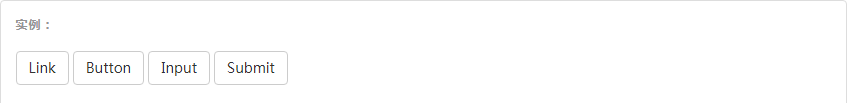
為`<a>`、`<button>`或`<input>`元素添加按鈕類(button class)即可使用 Bootstrap 提供的樣式。
~~~html
<a class="btn btn-default" href="#" role="button">Link</a>
<button class="btn btn-default" type="submit">Button</button>
<input class="btn btn-default" type="button" value="Input">
<input class="btn btn-default" type="submit" value="Submit">
~~~
#### 針對組件的注意事項
雖然按鈕類可以應用到 `<a>` 和 `<button>` 元素上,但是,導航和導航條組件只支持 `<button>` 元素。
#### 鏈接被作為按鈕使用時的注意事項
如果 `<a>` 元素被作為按鈕使用 -- 并用于在當前頁面觸發某些功能 -- 而不是用于鏈接其他頁面或鏈接當前頁面中的其他部分,那么,務必為其設置 `role="button"` 屬性。
#### 跨瀏覽器展現
我們總結的最佳實踐是:**強烈建議盡可能使用 `<button>` 元素**來獲得在各個瀏覽器上獲得相匹配的繪制效果。
另外,我們還發現了 [Firefox <30 版本的瀏覽器上出現的一個 bug](https://bugzilla.mozilla.org/show_bug.cgi?id=697451),其表現是:阻止我們為基于 `<input>` 元素所創建的按鈕設置 `line-height` 屬性,這就導致在 Firefox 瀏覽器上不能完全和其他按鈕保持一致的高度。
## 預定義樣式
使用下面列出的類可以快速創建一個帶有預定義樣式的按鈕。

~~~html
<!-- Standard button -->
<button type="button" class="btn btn-default">(默認樣式)Default</button>
<!-- Provides extra visual weight and identifies the primary action in a set of buttons -->
<button type="button" class="btn btn-primary">(首選項)Primary</button>
<!-- Indicates a successful or positive action -->
<button type="button" class="btn btn-success">(成功)Success</button>
<!-- Contextual button for informational alert messages -->
<button type="button" class="btn btn-info">(一般信息)Info</button>
<!-- Indicates caution should be taken with this action -->
<button type="button" class="btn btn-warning">(警告)Warning</button>
<!-- Indicates a dangerous or potentially negative action -->
<button type="button" class="btn btn-danger">(危險)Danger</button>
<!-- Deemphasize a button by making it look like a link while maintaining button behavior -->
<button type="button" class="btn btn-link">(鏈接)Link</button>
~~~
## 尺寸
需要讓按鈕具有不同尺寸嗎?使用 `.btn-lg`、`.btn-sm` 或 `.btn-xs` 就可以獲得不同尺寸的按鈕。
~~~html
<p>
<button type="button" class="btn btn-primary btn-lg">(大按鈕)Large button</button>
<button type="button" class="btn btn-default btn-lg">(大按鈕)Large button</button>
</p>
<p>
<button type="button" class="btn btn-primary">(默認尺寸)Default button</button>
<button type="button" class="btn btn-default">(默認尺寸)Default button</button>
</p>
<p>
<button type="button" class="btn btn-primary btn-sm">(小按鈕)Small button</button>
<button type="button" class="btn btn-default btn-sm">(小按鈕)Small button</button>
</p>
<p>
<button type="button" class="btn btn-primary btn-xs">(超小尺寸)Extra small button</button>
<button type="button" class="btn btn-default btn-xs">(超小尺寸)Extra small button</button>
</p>
~~~
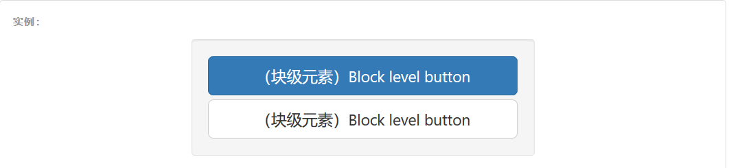
通過給按鈕添加 `.btn-block` 類可以將其拉伸至父元素100%的寬度,而且按鈕也變為了塊級(block)元素。
~~~html
<button type="button" class="btn btn-primary btn-lg btn-block">(塊級元素)Block level button</button>
<button type="button" class="btn btn-default btn-lg btn-block">(塊級元素)Block level button</button>
~~~
## 激活狀態
當按鈕處于激活狀態時,其表現為被按壓下去(底色更深、邊框夜色更深、向內投射陰影)。對于 `<button>` 元素,是通過 `:active` 狀態實現的。對于 `<a>` 元素,是通過 `.active` 類實現的。然而,你還可以將 `.active` 應用到 `<button>` 上(包含 `aria-pressed="true"` 屬性)),并通過編程的方式使其處于激活狀態。
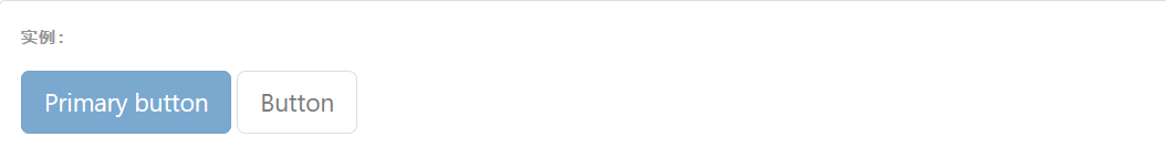
### [](https://v3.bootcss.com/css/#button-元素)button 元素
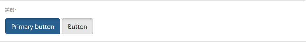
由于 `:active` 是偽狀態,因此無需額外添加,但是在需要讓其表現出同樣外觀的時候可以添加 `.active` 類。
~~~html
<button type="button" class="btn btn-primary btn-lg active">Primary button</button>
<button type="button" class="btn btn-default btn-lg active">Button</button>
~~~
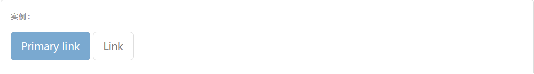
### 鏈接(`<a>`)元素
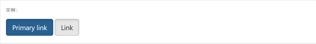
可以為基于 `<a>` 元素創建的按鈕添加 `.active` 類。
~~~html
<a href="#" class="btn btn-primary btn-lg active" role="button">Primary link</a>
<a href="#" class="btn btn-default btn-lg active" role="button">Link</a>
~~~
## 禁用狀態
通過為按鈕的背景設置 `opacity` 屬性就可以呈現出無法點擊的效果。
### [](https://v3.bootcss.com/css/#button-元素-1)button 元素
為 `<button>` 元素添加 `disabled` 屬性,使其表現出禁用狀態。
~~~html
<button type="button" class="btn btn-lg btn-primary" disabled="disabled">Primary button</button>
<button type="button" class="btn btn-default btn-lg" disabled="disabled">Button</button>
~~~
#### 跨瀏覽器兼容性
如果為 `<button>` 元素添加 `disabled` 屬性,Internet Explorer 9 及更低版本的瀏覽器將會把按鈕中的文本繪制為灰色,并帶有惡心的陰影,目前我們還沒有解決辦法。
### [](https://v3.bootcss.com/css/#鏈接()元素-1)鏈接(`<a>`)元素
為基于 `<a>` 元素創建的按鈕添加 `.disabled` 類。
~~~html
<a href="#" class="btn btn-primary btn-lg disabled" role="button">Primary link</a>
<a href="#" class="btn btn-default btn-lg disabled" role="button">Link</a>
~~~
我們把 `.disabled` 作為工具類使用,就像 `.active` 類一樣,因此不需要增加前綴。
#### 鏈接的原始功能不受影響
上面提到的類只是通過設置 `pointer-events: none` 來禁止 `<a>` 元素作為鏈接的原始功能,但是,這一 CSS 屬性并沒有被標準化,并且 Opera 18 及更低版本的瀏覽器并沒有完全支持這一屬性,同樣,Internet Explorer 11 也不支持。In addition, even in browsers that do support `pointer-events: none`, keyboard navigation remains unaffected, meaning that sighted keyboard users and users of assistive technologies will still be able to activate these links. 因此,為了安全起見,建議通過 JavaScript 代碼來禁止鏈接的原始功能。
- 概覽
- 移動設備優先
- 排版與鏈接
- 布局容器
- 柵格系統
- 簡介
- 媒體查詢
- 柵格參數
- 實例:從堆疊到水平排列
- 實例:流式布局容器
- 實例:移動設備和桌面屏幕
- 實例:手機、平板、桌面
- 實例:多余的列(column)將另起一行排列
- 響應式列重置
- 列偏移
- 嵌套列
- 列排序
- Less mixin 和變量
- 排版
- 標題
- 頁面主體
- 內聯文本元素
- 對齊
- 改變大小寫
- 縮略語
- 地址
- 引用
- 列表
- 代碼
- 表格
- 基本表格
- 狀態類
- 響應式表格
- 表單
- 基本表單
- 內聯表單
- 水平排列的表單
- 被支持的控件
- 多選和單選框
- 下拉列表
- 靜態控件
- 焦點、禁用、只讀、校驗狀態
- 添加額外的圖標
- 控件尺寸
- 按鈕
- 圖片
- 響應式圖片
- 圖片形狀
- 輔助類
- 關閉按鈕和三角符號
- 快速浮動
- 讓內容塊居中
- 清除浮動
- 顯示或隱藏內容
- 屏幕閱讀器和鍵盤導航
- 圖片替換