```
<!DOCTYPE html>
<html lang="en">
<head>
<meta charset="UTF-8">
<meta http-equiv="X-UA-Compatible" content="IE=edge">
<meta name="viewport" content="width=device-width, initial-scale=1.0">
<title>Document</title>
</head>
<body>
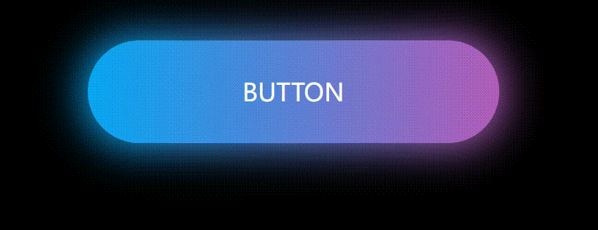
<a href="#">button</a>
<style>
* {
/* 初始化 取消頁面的內外邊距 */
margin: 0;
padding: 0;
}
body {
/* 彈性布局 讓頁面元素水平、垂直居中 */
display: flex;
justify-content: center;
align-items: center;
/* 設置body高度為100%窗口高度 */
height: 100vh;
background-color: #000;
}
a {
position: relative;
width: 400px;
height: 100px;
line-height: 100px;
text-align: center;
text-decoration: none;
text-transform: uppercase;
font-size: 24px;
color: #fff;
/* 背景漸變 */
background: linear-gradient(to right, #03a9f4, #f441a5, #ffeb3b, #09a8f4);
/* 背景漸變色大小 */
background-size: 400%;
/* 圓角 */
border-radius: 50px;
z-index: 1;
}
/* 發光效果 */
a::before {
content: "";
position: absolute;
top: -5px;
left: -5px;
bottom: -5px;
right: -5px;
/* 背景漸變 */
background: linear-gradient(to right, #03a9f4, #f441a5, #ffeb3b, #09a8f4);
/* 背景漸變色大小 */
background-size: 400%;
/* 圓角 */
border-radius: 50px;
z-index: -1;
/* 設置模糊度 顯示發光效果 */
filter: blur(20px);
}
a:hover {
/* 動畫:名稱 時間 infinite是無限次播放 */
animation: streamer 8s infinite;
}
a:hover::before {
/* 動畫:名稱 時間 infinite是無限次播放 */
animation: streamer 8s infinite;
}
/* 定義動畫 */
@keyframes streamer {
100% {
/* 背景位置 */
background-position: -400% 0;
}
}
</style>
<script>
</script>
</body>
</html>
```
