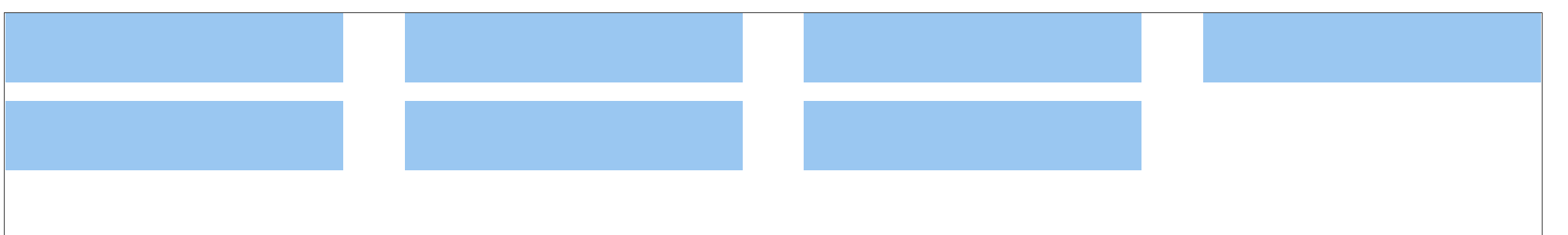
**效果圖:最后一行左對齊**
要求如下:
1. 每行固定元素個數
2. 每行元素都是**space-between**的效果(兩端對齊,項目之間的間隔相等,即剩余空間等分成間隙)
3. 最后一行元素需要靠左對齊
```
<div class="wrapper">
<div class="box"></div>
<div class="box"></div>
<div class="box"></div>
<div class="box"></div>
<div class="box"></div>
<div class="box"></div>
<div class="box"></div>
</div>
```
```
.wrapper{
width: 80vw;
height: 90vh;
display: flex;
flex-wrap: wrap;
justify-content: space-between;
align-content: flex-start;
border: 1px solid #333;
}
.box{
width: 22%;
height: 60px;
margin-bottom: 1em;
background-color: rgb(154, 199, 241);
}
/*重點代碼*/
/* 如果最后一行是3個元素 */
.box:last-child:nth-child(4n - 1) {
margin-right: 26%;
}
/* 如果最后一行是2個元素 */
.box:last-child:nth-child(4n - 2) {
margin-right: 52%;
}
```
