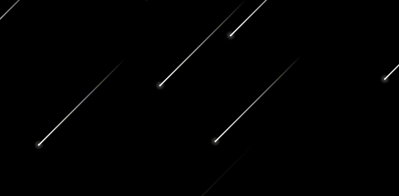
配上合適的背景效果更好
```
<!DOCTYPE html>
<html lang="en">
<head>
<meta charset="UTF-8">
<meta http-equiv="X-UA-Compatible" content="IE=edge">
<meta name="viewport" content="width=device-width, initial-scale=1.0">
<title>Document</title>
</head>
<body>
<div class="container">
<span></span>
<span></span>
<span></span>
<span></span>
<span></span>
<span></span>
<span></span>
<span></span>
<span></span>
<span></span>
</div>
<style>
* {
/* 初始化 */
margin: 0;
padding: 0;
}
body {
/* 100%窗口高度 */
height: 100vh;
/* 溢出隱藏 */
overflow: hidden;
}
.container {
/* 絕對定位 */
position: absolute;
top: 0;
left: 0;
width: 100%;
height: 100%;
background-color: black;
/* 把背景圖像擴展至足夠大,以使背景圖像完全覆蓋背景區域 */
background-size: cover;
/* 定位背景圖像為正中間 */
background-position-x: center;
/* 執行動畫:動畫名稱 時長 線性的 無限次播放 */
animation: animateBg 5s linear infinite;
}
span {
position: absolute;
top: 50%;
left: 50%;
width: 4px;
height: 4px;
background-color: #fff;
border-radius: 50%;
/* 發光效果 */
box-shadow: 0 0 0 4px rgba(255, 255, 255, 0.1),
0 0 0 8px rgba(255, 255, 255, 0.1),
0 0 20px rgba(255, 255, 255, 1);
/* 執行動畫 */
animation: animate 3s linear infinite;
}
/* 拖尾效果 */
span::before {
content: "";
position: absolute;
top: 50%;
transform: translateY(-50%);
width: 300px;
height: 3px;
background: linear-gradient(90deg, #fff, transparent);
}
/* 分別為每一個流星設置位置、動畫延遲時間、動畫時長 */
span:nth-child(1) {
top: 0;
right: 0;
/* initial關鍵字用于設置CSS屬性為它的默認值 */
left: initial;
/* 動畫延遲時間 */
animation-delay: 0s;
/* 動畫時長 */
animation-duration: 1s;
}
span:nth-child(2) {
top: 0;
right: 80px;
left: initial;
animation-delay: 0.2s;
animation-duration: 3s;
}
span:nth-child(3) {
top: 80px;
right: 0;
left: initial;
animation-delay: 0.4s;
animation-duration: 2s;
}
span:nth-child(4) {
top: 0;
right: 180px;
left: initial;
animation-delay: 0.6s;
animation-duration: 1.5s;
}
span:nth-child(5) {
top: 0;
right: 400px;
left: initial;
animation-delay: 0.8s;
animation-duration: 2.5s;
}
span:nth-child(6) {
top: 0;
right: 600px;
left: initial;
animation-delay: 1s;
animation-duration: 3s;
}
span:nth-child(7) {
top: 300px;
right: 0;
left: initial;
animation-delay: 1.2s;
animation-duration: 1.75s;
}
span:nth-child(8) {
top: 0;
right: 700px;
left: initial;
animation-delay: 1.4s;
animation-duration: 1.25s;
}
span:nth-child(9) {
top: 0;
right: 1000px;
left: initial;
animation-delay: 0.75s;
animation-duration: 2.25s;
}
span:nth-child(10) {
top: 0;
right: 450px;
left: initial;
animation-delay: 2.75s;
animation-duration: 2.25s;
}
/* 定義動畫 */
/* 背景縮放動畫 */
@keyframes animateBg {
0%,
100% {
transform: scale(1);
}
50% {
transform: scale(1.2);
}
}
/* 流星墜落動畫 */
@keyframes animate {
0% {
transform: rotate(315deg) translateX(0);
opacity: 1;
}
90% {
opacity: 1;
}
100% {
transform: rotate(315deg) translateX(-1000px);
opacity: 0;
}
}
</style>
<script>
</script>
</body>
</html>
```