使用`backdrop-filter`與`filter`都可以寫出高斯模糊的效果,但是兩者使用起來還是有區別的,而且使用的目標也不同。
**區別:**
backdrop-filter:使背景模糊,不會影響到背景下面的圖片
filter:通常是定義 img的可視效果,修改圖片的模糊效果,值越大越模糊
我們這里實現毛玻璃效果就是使用了`backdrop-filter`屬性。
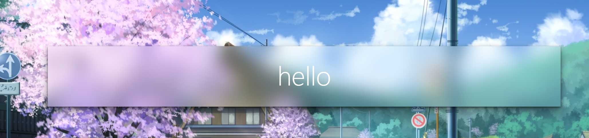
效果圖:
```
<div class="frosted-glass">
<h1 class="title">hello</h1>
</div>
```
```
body {
display: flex;
justify-content: center;
align-items: center;
height: 100vh;
background: url(https://i.loli.net/2019/11/17/GAYyzeKsiWjP5qO.jpg);
background-size: cover;
background-position: center;
}
.frosted-glass {
width: 72vw;
height: 36vh;
display: flex;
justify-content: center;
align-items: center;
box-shadow: 0 0.3px 0.7px rgba(0, 0, 0, 0.126),
0 0.9px 1.7px rgba(0, 0, 0, 0.179), 0 1.8px 3.5px rgba(0, 0, 0, 0.224),
0 3.7px 7.3px rgba(0, 0, 0, 0.277), 0 10px 20px rgba(0, 0, 0, 0.4);
backdrop-filter: blur(20px);
}
.title {
font-size: 3.6em;
font-weight: 200;
color: white;
}
```
