```
<!DOCTYPE html>
<html lang="en">
<head>
<meta charset="UTF-8">
<meta http-equiv="X-UA-Compatible" content="IE=edge">
<meta name="viewport" content="width=device-width, initial-scale=1.0">
<title>Document</title>
</head>
<body>
<div class="container">
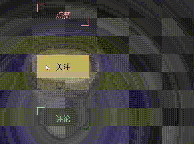
<a href="#" style="--i:1">點贊</a>
<a href="#" style="--i:2">關注</a>
<a href="#" style="--i:3">評論</a>
<a href="#" style="--i:4">分享</a>
<a href="#" style="--i:5">收藏</a>
</div>
<style>
* {
/* 初始化 取消頁面元素的內外邊距 */
margin: 0;
padding: 0;
}
.container {
/* 彈性布局 水平、垂直居中 */
display: flex;
justify-content: center;
align-items: center;
/* 讓子元素垂直排列 */
flex-direction: column;
/* 100%窗口寬度、高度 */
width: 100vw;
height: 100vh;
/* 背景徑向漸變 */
background: radial-gradient(circle at center, #555, #000);
}
.container a {
/* 相對定位 */
position: relative;
/* 將a元素轉為塊級元素,不然無法設置寬和高 */
display: block;
width: 140px;
height: 60px;
line-height: 60px;
text-align: center;
margin: 40px;
color: plum;
text-decoration: none;
font-size: 20px;
/* 動畫過渡 */
transition: all 0.3s ease-in-out;
/* 改變各個元素的顏色【劃重點】 */
/* hue-rotate是顏色濾鏡,可以加不同的度數來改變顏色,這里我們用了calc自動計算函數,以及var函數來調用我們給每一個a設置的不同自定義屬性1~5,然后分別乘以60度,就能夠分別得到不同的度數 */
filter: hue-rotate(calc(var(--i)*60deg));
}
.container a::before,
.container a::after {
/* 將兩個偽元素的相同部分寫在一起 */
content: "";
position: absolute;
width: 20px;
height: 20px;
border: 2px solid plum;
/* 動畫過渡 最后的0.3s是延遲時間 */
transition: all 0.3s ease-in-out 0.3s;
}
.container a::before {
top: 0;
left: 0;
/* 刪除左邊元素的右、下邊框 */
border-right: 0;
border-bottom: 0;
}
.container a::after {
bottom: 0;
right: 0;
/* 刪除右邊元素的左、上邊框 */
border-top: 0;
border-left: 0;
}
.container a:hover {
background-color: plum;
color: #000;
/* 發光效果和倒影 */
box-shadow: 0 0 50px plum;
/* below是下倒影 1px是倒影的元素相隔的距離 最后是個漸變顏色 */
-webkit-box-reflect: below 1px linear-gradient(transparent, rgba(0, 0, 0, 0.3));
/* 設置以上屬性的延遲時間 */
transition-delay: 0.4s;
}
.container a:hover::before,
.container a:hover::after {
width: 138px;
height: 58px;
transition-delay: 0s;
}
</style>
<script>
</script>
</body>
</html>
```
