
[http://www.ruanyifeng.com/blog/2015/07/flex-grammar.html](http://www.ruanyifeng.com/blog/2015/07/flex-grammar.html)
[https://css-tricks.com/snippets/css/a-guide-to-flexbox/](https://css-tricks.com/snippets/css/a-guide-to-flexbox/)
[https://blog.csdn.net/m0\_37058714/article/details/80765562](https://blog.csdn.net/m0_37058714/article/details/80765562)
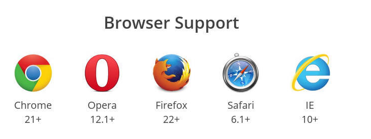
**瀏覽器四大內核**
四大內核分別是:Trident(也稱IE內核)、webkit、Blink、Gecko
* **Firefox** (Gecko內核,俗稱Firefox內核)
* **Chrome谷歌瀏覽器**(統稱為Chromium內核或Chrome內核,以前是Webkit內核,現在是Blink內核)
* **Safari瀏覽器** (Webkit內核)
* **Opera瀏覽器**(最初是自己的Presto內核,后來是Webkit,現在是Blink內核)
* **搜狗、QQ瀏覽器、阿里云**(IE兼容模式+Webkit高速模式)
* **360極速、獵豹瀏覽器**(IE+Chrome雙內核)
* **2345瀏覽器、百度、世界之窗、遨游(3.x為雙內核)**(以前是IE內核,現在也是IE+Chrome雙內核)
### **flex兼容性**
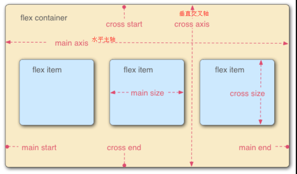
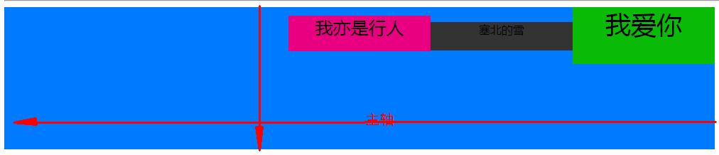
>容器默認存在兩根軸:水平的**主軸**(main axis)和垂直的**交叉軸**(cross axis)。主軸的開始位置(與邊框的交叉點)叫做`main start`,結束位置叫做`main end`;交叉軸的開始位置叫做`cross start`,結束位置叫做`cross end`。
項目默認沿主軸排列。單個項目占據的主軸空間叫做`main size`,占據的交叉軸空間叫做`cross size`。交叉軸根據主軸的方向分向下↓的交叉軸與向右→的交叉軸
~~~
.container{
display: flex;/*行內元素為:online-flex*/
/*Webkit 內核的瀏覽器,必須加上`-webkit`前綴*/
display: -webkit-flex; /* Safari */
}
~~~
>[danger]**注意**.container設為 Flex 布局以后,子元素的`float`、`clear`和`vertical-align`屬性將失效
## container容器的屬性
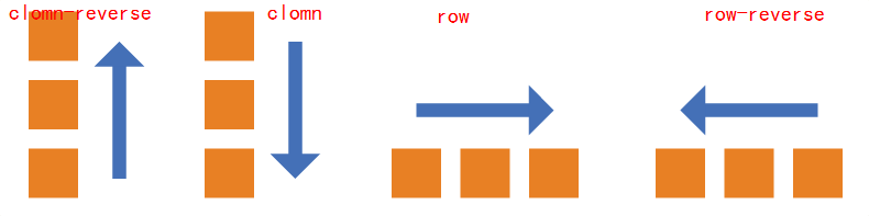
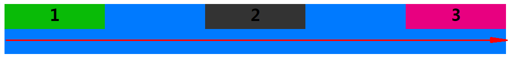
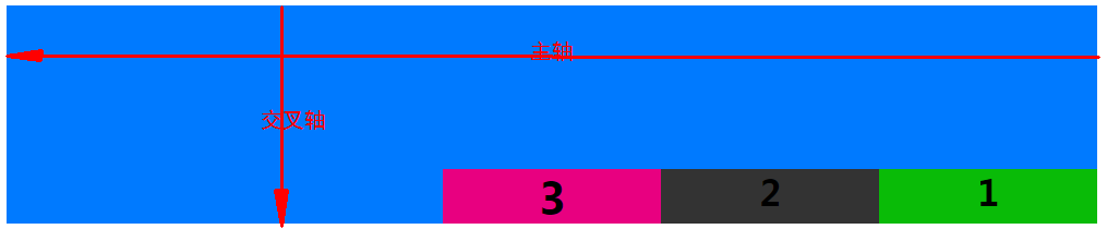
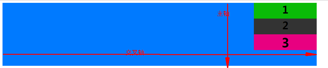
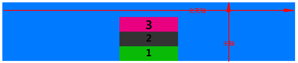
* **flex-direction** 屬性決定項目item**主軸的方向**(決定它的子元素按照什么方向來排列,**即項目item的排列方向**)
row: 默認,主軸方向為→
row-reverse:主軸方向為←
column:主軸方向為↓
column-reverse:主軸方向為↑
如果flex-direction是row或者row-reverse,那么主軸就是justify-contain
如果flex-direction是column或者column-reverse,那么主軸就是align-items
~~~
.container{
flex-direction: row(默認) | row-reverse | column | column-reverse;
}
~~~
* **flex-wrap** 一條軸線排不下,如何換行
~~~
.container{
flex-wrap: nowrap(默認) | wrap | wrap-reverse
}
~~~
(1)`nowrap`(默認):不換行。

(2)`wrap`:換行,第一行在上方。

(3)`wrap-reverse`:換行,第一行在下方。

* **flex-flow** 是`flex-direction`屬性和`flex-wrap`屬性的簡寫形式,默認值為`row nowrap`
flex-flow: \<flex-direction\> || \<flex-wrap\>;
~~~
.container{
flex-flow: row nowrap;
}
~~~
* **justify-content** 項目item在主軸上的對齊方式
從上可知 flex-direction屬性的row 與row-reverse決定主軸的方向
* `flex-start`(默認值):主軸起始方向對齊
* `flex-end`:主軸結束方向對齊
* `center`: 居中
* `space-between`:兩端對齊,項目之間的間隔都相等。
* `space-around`:每個項目兩側的間隔相等。所以,項目之間的間隔比項目與邊框的間隔大一倍。
```
display: flex;
flex-flow:row nowrap;
justify-content:flex-start;
```

```
display: flex;
flex-flow:row nowrap;
justify-content:flex-end;
```

```
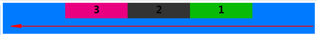
display: flex;
flex-flow:row-reverse nowrap;
justify-content:flex-start;
```

```
display: flex;
flex-flow:row-reverse nowrap;
justify-content:flex-end;
```

```
display: flex;
flex-flow:row nowrap;
justify-content:center;
```

```
display: flex;
flex-flow:row-reverse nowrap;
justify-content:center;
```
```
display: flex;
flex-flow:row nowrap;
justify-content:space-between;
```
```
display: flex;
flex-flow:row-reverse nowrap;
justify-content:space-between;
```

```
display: flex;
flex-flow:row nowrap;
justify-content:space-around;
```

```
display: flex;
flex-flow:row-reverse nowrap;
justify-content:space-around;
```

* **align-items** 定義項目在交叉軸上如何對齊。
* `flex-start`:交叉軸的起點對齊。
* `flex-end`:交叉軸的終點對齊。
* `center`:交叉軸的中點對齊。
* `baseline`: 項目的第一行文字的基線對齊。
* `stretch`(默認值):如果項目未設置高度或設為auto,將占滿整個容器的高度。
flex-start:交叉軸的起點對齊
```
display: flex;
flex-flow:row nowrap;/*默認 主軸方向→*/
justify-content:flex-start;/*默認 item在主軸的對齊方式*/
align-items: flex-start;/*item在交叉軸的對齊方式 */
```

```
display: flex;
flex-flow:row-reverse nowrap;/*主軸方向←*/
justify-content:flex-start;/*默認 item在主軸的對齊方式*/
align-items: flex-start;/*item在交叉軸的對齊方式 */
```

```
display: flex;
flex-flow:column-reverse nowrap;/*主軸方向↑*/
justify-content:flex-start;/*默認 item在主軸的對齊方式*/
align-items: flex-start;/*item在交叉軸的對齊方式 */
```

```
display: flex;
flex-flow:column nowrap;/*主軸方向↓*/
justify-content:flex-start;/*默認 item在主軸的對齊方式*/
align-items: flex-start;/*item在交叉軸的對齊方式 */
```

flex-end:交叉軸的終點對齊
```
display: flex;
flex-flow:row nowrap;/*默認 主軸方向→*/
justify-content:flex-start;/*默認 item在主軸的對齊方式*/
align-items: flex-end;/* item在交叉軸的對齊方式 */
```

```
display: flex;
flex-flow:row-reverse nowrap;/* 主軸方向←*/
justify-content:flex-start;/*默認 item在主軸的對齊方式*/
align-items: flex-end;/* item在交叉軸的對齊方式 */
```
```
display: flex;
flex-flow:column nowrap;/* 主軸方向←*/
justify-content:flex-start;/*默認 item在主軸的對齊方式*/
align-items: flex-end;/* item在交叉軸的對齊方式 */
```
```
display: flex;
flex-flow:column-reverse nowrap;/* 主軸方向↑*/
justify-content:flex-start;/*默認 item在主軸的對齊方式*/
align-items: flex-end;/* item在交叉軸的對齊方式 */
```

center:交叉軸的中點對齊
```
display: flex;
flex-flow:row nowrap;/*默認 主軸方向→*/
justify-content:flex-start;/*默認 item在主軸的對齊方式*/
align-items: center;/* item在交叉軸的對齊方式 */
```

```
display: flex;
flex-flow:row-reverse nowrap;/* 主軸方向←*/
justify-content:flex-start;/*默認 item在主軸的對齊方式*/
align-items: center;/* item在交叉軸的對齊方式 */
```

```
display: flex;
flex-flow:column nowrap;/* 主軸方向↓*/
justify-content:flex-start;/*默認 item在主軸的對齊方式*/
align-items: center;/* item在交叉軸的對齊方式 */
```

```
display: flex;
flex-flow:column-reverse nowrap;/* 主軸方向↑*/
justify-content:flex-start;/*默認 item在主軸的對齊方式*/
align-items: center;/* item在交叉軸的對齊方式 */
```
允許換行時center居中,換行后存在間隙,我們使用align-content: center;替換align-items: center;
```
display: flex;
flex-flow:row wrap;/* 主軸方向→*/
justify-content:flex-start;/*默認 item在主軸的對齊方式*/
align-items: center;/* item在交叉軸的對齊方式 */
```

baseline:項目的第一行文字的基線對齊
```
display: flex;
flex-flow:row nowrap;/*默認 主軸方向→*/
justify-content:flex-start;/*默認 item在主軸的對齊方式*/
align-items: baseline;/* item在交叉軸的對齊方式 */
```

```
display: flex;
flex-flow:row-reverse nowrap;/* 主軸方向←*/
justify-content:flex-start;/*默認 item在主軸的對齊方式*/
align-items: baseline;/* item在交叉軸的對齊方式 */
```
```
display: flex;
flex-flow:column nowrap;/* 主軸方向↓*/
justify-content:flex-start;/*默認 item在主軸的對齊方式*/
align-items: baseline;/* item在交叉軸的對齊方式 */
```

```
display: flex;
flex-flow:column-reverse nowrap;/* 主軸方向↑*/
justify-content:flex-start;/*默認 item在主軸的對齊方式*/
align-items: baseline;/* item在交叉軸的對齊方式 */
```

stretch:如果項目item未設置高度或設為auto,將占滿整個容器的高度
```
display: flex;
flex-flow:row nowrap;/*默認 主軸方向→*/
justify-content:flex-start;/*默認 item在主軸的對齊方式*/
align-items: stretch;/*默認 item在交叉軸的對齊方式 */
```

```
display: flex;
flex-flow:row-reverse nowrap;/* 主軸方向←*/
justify-content:flex-start;/*默認 item在主軸的對齊方式*/
align-items: stretch;/*默認 item在交叉軸的對齊方式 */
```

* **align-content** 用法與align-items一致,定義了多根軸線的對齊方式。如果項目只有一根軸線,該屬性不起作用。 即項目只有一行時無效果
* `flex-start`:與交叉軸的起點對齊。
* `flex-end`:與交叉軸的終點對齊。
* `center`:與交叉軸的中點對齊。
* `space-between`:與交叉軸兩端對齊,軸線之間的間隔平均分布。
* `space-around`:每根軸線兩側的間隔都相等。所以,軸線之間的間隔比軸線與邊框的間隔大一倍。
* `stretch`(默認值):軸線占滿整個交叉軸。
只有一根軸線時
```
display: flex;
flex-flow:row nowrap;/*默認 主軸方向→*/
justify-content:flex-start;/*默認 item在主軸的對齊方式*/
align-content: center;
```
如下圖所示沒有生效

修改代碼初始效果如下
當允許換行時項目就有兩行即兩根軸線align-content: center;生效
```
display: flex;
flex-flow:row wrap;/* 主軸方向→*/
justify-content:flex-start;/*默認 item在主軸的對齊方式*/
align-content: center;
```
html代碼參考,
```
<!DOCTYPE html>
<html lang="zh-cn">
<head>
<style type="text/css">
.container>div{
width: 200px;
height: 50px;
}
.container>.item-1{
background-color: #09BB07;
}
.container>.item-2{
background-color: #333333;
}
.container>.item-3{
background-color: #E80080;
}
.container>.item-4{
background-color: #F76260;
}
.container>.item-5{
background-color: #FFB400;
}
.container>.item-6{
background-color: #8A6DE9;
}
h1{
margin: 0;
}
.container{
width: 1000px;
height: 200px;
text-align: center;
background-color: #007AFF;
display:-webkit-flex;
display: flex;
flex-flow:row-reverse nowrap;/*主軸方向包括 row row-reverse column column-reverse*/
justify-content:flex-start;/*item在主軸的對齊方式 flex-start | flex-end | center | space-between | space-around;*/
align-items: stretch;/*item在交叉軸的對齊方式 flex-start | flex-end | center | baseline | stretch*/
}
.container{
width: 1000px;
height: 200px;
text-align: center;
background-color: #007AFF;
display:-webkit-flex;
display: flex;
flex-flow:row wrap;/*主軸方向包括 row row-reverse column column-reverse*/
justify-content:flex-start;/*item在主軸的對齊方式 flex-start | flex-end | center | space-between | space-around;*/
align-content: center;/*flex-start | flex-end | center | space-between | space-around | stretch*/
}
</style>
</head>
<body>
<div class="container">
<div class="item-1"><h1>1</h1></div>
<div class="item-2"><h1>2</h1></div>
<div class="item-3" style="font-size: 20px;"><h1>3</h1></div>
</div>
<hr>
<div class="container">
<div class="item-1" style="height: 80px;font-size: 36px;">我愛你</div>
<div class="item-2" style="height: 40px">塞北的雪</div>
<div class="item-3" style="font-size: 25px;">我亦是行人</div>
</div>
<hr>
<div class="container">
<div class="item-1" style="height:auto;">item沒設置高度</div>
<div class="item-2" style="height:auto;">或者設置item高度為auto</div>
<div class="item-3" style="height:auto;">則stretch時item高度填滿容器</div>
</div>
<hr>
<div class="container">
<div class="item-1"><h1>1</h1></div>
<div class="item-2"><h1>2</h1></div>
<div class="item-3" style="font-size: 20px;"><h1>3</h1></div>
<div class="item-4"><h1>4</h1></div>
<div class="item-5"><h1>5</h1></div>
<div class="item-6"><h1>6</h1></div>
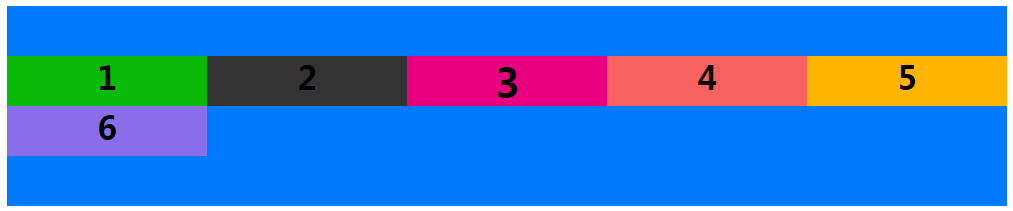
</div>
</body>
</html>
```
## **項目item的屬性**
* **order** 定義項目的排列順序。數值越小,排列越靠前,默認為0
* **flex-grow** 定義項目的放大比例,默認為`0`,即如果存在剩余空間,也不放大
* **flex-shrink**
* **flex-basis**
* **flex**
* **align-self**
**order**:定義項目的排列順序。數值越小,排列越靠前,默認為0
```
<style type="text/css">
.container1>div{
width: 200px;
}
.container1{
display:-webkit-flex;
display: flex;
flex-flow:row nowrap;/*主軸方向包括 row row-reverse column column-reverse*/
justify-content:flex-start;/*item在主軸的對齊方式 flex-start | flex-end | center | space-between | space-around;*/
align-content: flex-start;/*flex-start | flex-end | center | baseline | stretch*/
}
</style>
<div class="container1" style="width: 1000px;height: 200px;text-align: center;background-color: #007AFF;">
<div class="item1" style="background-color: #09BB07;height: 50px;"><h1>1</h1></div>
<div class="item2" style="background-color: #333333;height: 30px;"><h1>2</h1></div>
<div class="item3" style="background-color: #E80080;height: 25px;"><h1>3</h1></div>
<div class="item4" style="background-color: #F76260;height: 10px;"><h1>4</h1></div>
<div class="item5" style="background-color: #FFB400;height: 40px;"><h1>5</h1></div>
<div class="item6" style="background-color: #8A6DE9;height: 45px;"><h1>6</h1></div>
</div>
```
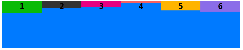
添加order
```
<style type="text/css">
.container1>div{
width: 200px;
}
.container1{
display:-webkit-flex;
display: flex;
flex-flow:row nowrap;/*主軸方向包括 row row-reverse column column-reverse*/
justify-content:flex-start;/*item在主軸的對齊方式 flex-start | flex-end | center | space-between | space-around;*/
align-content: flex-start;/*flex-start | flex-end | center | baseline | stretch*/
}
</style>
<div class="container1" style="width: 1000px;height: 200px;text-align: center;background-color: #007AFF;">
<div class="item1" style="order:3;background-color: #09BB07;height: 50px;"><h1>1</h1></div>
<div class="item2" style="order:2;background-color: #333333;height: 30px;"><h1>2</h1></div>
<div class="item3" style="order:1;background-color: #E80080;height: 25px;"><h1>3</h1></div>
<div class="item4" style="order:4;background-color: #F76260;height: 10px;"><h1>4</h1></div>
<div class="item5" style="order:6;background-color: #FFB400;height: 40px;"><h1>5</h1></div>
<div class="item6" style="order:5;background-color: #8A6DE9;height: 45px;"><h1>6</h1></div>
</div>
```

**flex-grow**:屬性定義項目的放大比例,默認為`0`(父元素的寬度存在剩余寬度,也不放大),當父元素的寬度大于所有子元素的寬度的和時(即父元素會有剩余空間),子元素如何分配父元素的剩余空間。?flex-grow的默認值為0,意思是該元素不索取父元素的剩余空間,如果值大于0,表示索取。值越大,索取的越厲害。
?**舉個例子**:
父元素寬500px,有兩個子元素:A、B和C。A寬為100px,B寬為200px,C寬為100px。 則空余空間為 500-(100+200+100)= 100px。 如果A,B都不索取剩余空間,則有100px的空余空間
```
<style type="text/css">
.container1{
display:-webkit-flex;
display: flex;
flex-flow:row nowrap;/*主軸方向包括 row row-reverse column column-reverse*/
}
</style>
<div class="container1" style="width: 500px;height: 100px;text-align: center;background-color: #007AFF;">
<div class="item1" style="flex-grow:0;order:1;background-color: #E80080;width: 100px;height: 25px;"><h1>A</h1></div>
<div class="item2" style="flex-grow:0;order:6;background-color: #FFB400;width: 200px;height: 40px;"><h1>B</h1></div>
<div class="item3" style="flex-grow:0;order:5;background-color: #8A6DE9;width: 100px;height: 45px;"><h1>C</h1></div>
</div>
```

如果A索取剩余空間:設置item1類元素flex-grow為1,B、C不索取。則最終A的大小為 自身寬度(100px)+ 剩余空間的寬度(100px)= 200px

如果A,B都設索取剩余空間,C不索取,A設置flex-grow為1,B設置flex-grow為2。則最終A的大小為 自身寬度(100px)+ A獲得的剩余空間的寬度(100px?(1/(1+2)))=133.33...,最終B的大小為 自身寬度(200px)+ B獲得的剩余空間的寬度(200px?(2/(1+2)))=266.66...

如果A,B、C都設索取剩余空間,A設置flex-grow為1,B設置flex-grow為2,B設置flex-grow為2。
則最終A的大小為 自身寬度(100px)+ A獲得的剩余空間的寬度(100px?(1/(1+2+2)))=120,
最終B的大小為 自身寬度(200px)+ B獲得剩余寬度為(100px?(2/(1+2+2)))=240,
最終C的大小為 自身寬度(100px)+ C獲得剩余寬度為(100px?(2/(1+2+2)))=140,
```
<style type="text/css">
.container1{
display:-webkit-flex;
display: flex;
flex-flow:row nowrap;/*主軸方向包括 row row-reverse column column-reverse*/
}
</style>
<div class="container1" style="width: 500px;height: 100px;text-align: center;background-color: #007AFF;">
<div class="item1" style="flex-grow:1;order:1;background-color: #E80080;width: 100px;height: 25px;"><h1>A</h1></div>
<div class="item2" style="flex-grow:2;order:6;background-color: #FFB400;width: 200px;height: 40px;"><h1>B</h1></div>
<div class="item3" style="flex-grow:2;order:5;background-color: #8A6DE9;width: 100px;height: 45px;"><h1>C</h1></div>
</div>
```

**flex-shrink**屬性定義了項目的縮小比例,默認為1,即如果空間不足,該項目將縮小。
當父元素的寬度小于所有子元素的寬度的和時(即子元素會超出父元素),子元素如何縮小自己的寬度的。?`flex-shrink`的默認值為1,當父元素的寬度小于所有子元素的寬度的和時,子元素的寬度會減小。值越大,減小的越厲害。如果值為0,表示不減小
```
<style type="text/css">
.container1{
display:-webkit-flex;
display: flex;
flex-flow:row nowrap;/*主軸方向包括 row row-reverse column column-reverse*/
}
</style>
<div class="container1" style="width: 200px;height: 100px;text-align: center;background-color: #007AFF;">
<div class="item1" style="flex-shrink:0;background-color: #E80080;width: 100px;height: 25px;"><h1>A</h1></div>
<div class="item2" style="flex-shrink:0;background-color: #FFB400;width: 100px;height: 40px;"><h1>B</h1></div>
<div class="item3" style="flex-shrink:0;background-color: #8A6DE9;width: 100px;height: 45px;"><h1>C</h1></div>
</div>
```

```
<style type="text/css">
.container1{
display:-webkit-flex;
display: flex;
flex-flow:row nowrap;/*主軸方向包括 row row-reverse column column-reverse*/
}
</style>
<div class="container1" style="width: 200px;height: 100px;text-align: center;background-color: #007AFF;">
<div class="item1" style="flex-shrink:2;background-color: #E80080;width: 100px;height: 25px;"><h1>A</h1></div>
<div class="item2" style="flex-shrink:0;background-color: #FFB400;width: 100px;height: 40px;"><h1>B</h1></div>
<div class="item3" style="flex-shrink:1;background-color: #8A6DE9;width: 100px;height: 45px;"><h1>C</h1></div>
</div>
```

**flex-basis**屬性定義了在分配多余空間之前,項目占據的主軸空間(main size)。瀏覽器根據這個屬性,計算主軸是否有多余空間。它的默認值為`auto`,即項目的本來大小
它可以設為跟`width`或`height`屬性一樣的值(比如350px),則項目將占據固定空間
其實,width也可以設置item寬度。如果元素上同時設置了width和flex-basis,那么width 的值就會被flex-basis覆蓋掉。
如圖 flex-basis替換掉了item2的width
```
<style type="text/css">
.container1{
display:-webkit-flex;
display: flex;
flex-flow:row nowrap;/*主軸方向包括 row row-reverse column column-reverse*/
}
</style>
<div class="container1" style="width: 200px;height: 100px;text-align: center;background-color: #007AFF;">
<div class="item1" style="flex-shrink:0;background-color: #E80080;width: 100px;height: 25px;"><h1>A</h1></div>
<div class="item2" style="flex-shrink:0;flex-basis:200px;background-color: #FFB400;width: 100px;height: 40px;"><h1>B</h1></div>
<div class="item3" style="flex-shrink:0;background-color: #8A6DE9;width: 100px;height: 45px;"><h1>C</h1></div>
</div>
```

### **flex屬性**
`flex`屬性是`flex-grow`,`flex-shrink`和`flex-basis`的簡寫,默認值為`0 1 auto`。后兩個屬性可選。
該屬性有兩個快捷值:`auto`(`1 1 auto`) 和 none (`0 0 auto`)。
建議優先使用這個屬性,而不是單獨寫三個分離的屬性,因為瀏覽器會推算相關值。
### **align-self屬性**
`align-self`屬性允許單個項目有與其他項目不一樣的對齊方式,可覆蓋容器container的`align-items`屬性。默認值為`auto`,表示繼承父元素的`align-items`屬性,如果沒有父元素,則等同于`stretch`。
```
<style type="text/css">
.container1{
display:-webkit-flex;
display: flex;
flex-flow:row nowrap;/*主軸方向包括 row row-reverse column column-reverse*/
}
</style>
<div class="container1" style="width: 1000px;height: 100px;text-align: center;background-color: #007AFF;">
<div class="item1" style="align-self: auto;background-color: #E80080;width: 100px;height: 45px;"><h1>1</h1></div>
<div class="item2" style="align-self: flex-start;background-color: #FFB400;width: 100px;height: 45px;"><h1>2</h1></div>
<div class="item3" style="align-self: flex-end;background-color: #8A6DE9;width: 100px;height: 45px;"><h1>3</h1></div>
<div class="item3" style="align-self: center;background-color: #09BB07;width: 100px;height: 45px;"><h1>4</h1></div>
<div class="item3" style="align-self: baseline;background-color: #333333;width: 100px;height: 45px;"><h1>5</h1></div>
<div class="item3" style="align-self: stretch;background-color: #F76260;width: 100px;height: 45px;"><h1>6</h1></div>
</div>
```

- php更新內容
- PHP PSR 標準規范
- 輔助查詢(*)
- composer項目的創建
- composer安裝及設置
- composer自動加載講解
- phpsdudy的composer操作
- git
- Git代碼同時上傳到GitHub和Gitee(碼云)
- Git - 多人協同開發利器,團隊協作流程規范與注意事項
- 刪除遠程倉庫的文件
- github查詢方法
- 錯誤
- 其他
- php.ini
- php配置可修改范圍
- php超時
- 防跨目錄設置
- 函數可變參數
- 【時間】操作
- 時間函數例子
- Date/Time 函數(不包含別名函數)
- DateTime類別名函數
- 【數字】操作
- 【字符串】操作
- 【數組】操作
- 排序
- 合并案例
- empty、isset、is_null
- echo 輸出bool值
- if真假情況
- 流程控制代替語法【if (條件): endif;】
- 三元運算
- 運算符優先級
- 常量
- define與const(php5.3) 類常量
- 遞歸
- 單元測試
- 面向對象
- 對象(object) 與 數組(array) 的轉換
- php網絡相關
- 支持的協議和封裝協議(如http,php://input)
- php://協議
- file://協議
- http(s)://協議
- ftp(s)://協議
- zip://, bzip2://, zlib://協議
- data://協議
- glob://協議
- expect://協議
- phar://
- ssh2
- rar://
- ogg://
- 上下文(Context)選項和參數
- 過濾器
- http請求及模擬登錄
- 常用的header頭部定義匯總
- HTTP響應頭和請求頭信息對照表
- HTTP請求的返回值含義說明
- content-type對照表
- Cache-Control對照
- curl函數
- 防止頁面刷新
- telnet模擬get、post請求
- 三種方式模擬表單發布留言
- 模擬登陸
- 防盜鏈
- php+mysql模擬隊列發送郵件
- socket
- 使用websocket實現php消息實時推送完整示例
- streams
- Stream函數實現websocket
- swoole
- 網絡編程基本概念
- 全局變量域超全局變量
- 超全局變量
- $_ENV :存儲了一些系統的環境變量
- $_COOKIE
- $_SESSION
- $_FILES
- $_SERVER
- 正則
- php正則函數
- 去除文本中的html、xml的標簽
- 特殊符號
- \r\n
- 模式修正符
- 分組
- 斷言(環視?)
- 條件表達式
- 遞歸表達式 (?R)
- 固化分組
- 正則例子
- 提取類文件的公共方法
- 抓取網頁內容
- 匹配中文字符
- 提取sql日志文件
- 框架
- 文件操作
- 自動加載spl_autoload_register
- 文件加載
- 文件的上傳下載
- 常見的mimi類型
- 文件斷點續傳
- 下載文件防盜鏈
- 破解防盜鏈
- 將字節轉為人可讀的單位
- 無限分類
- 短信驗證碼
- 短信寶
- 視頻分段加載
- 隱藏地址
- MPEG DASH視頻分片技術
- phpDoc注釋
- @錯誤抑制符
- 字符編碼
- PHP CLI模式開發
- CGI、FastCGI和PHP-FPM關系圖解
- No input file specified的解決方法
- SAPI(PHP常見的四種運行模式)
- assert斷言
- 輪詢(Event Loop)
- 異常處理
- 異常分類
- php系統異常
- 錯誤級別
- set_error_handler
- set_exception_handler
- register_shutdown_function
- try catch
- tp5異常處理類解析
- 文件上傳相關設置
- 進程/線程/協程
- 協程
- 什么是協程
- 引用&
- Heredoc和Nowdoc語法
- 類基礎
- 系統預定義類
- pdo
- 類的三大特性:封裝,繼承,多態
- 魔術方法
- extends繼承
- abstract 抽象類
- interface 接口(需要implements實現)
- 抽象類和接口的區別
- 多態
- static
- final
- serialize與unserialize
- instanceof 判斷后代子類
- 類型約束
- clone克隆
- ::的用法
- static::class、self::class
- new self()與new static()
- this、self、static、parent、super
- self、static、parent:后期靜態綁定
- PHP的靜態變量
- php導入
- trait
- 動態調用類方法
- 參數及類型申明
- 方法的重載覆蓋
- return $a && $b
- 類型聲明
- 設計思想
- 依賴注入與依賴倒置
- MVC模式與模板引擎
- 模版引擎
- smarty模版
- 系統變量、全局變量
- 語言切換
- 函數-給函數默認值
- 流程控制-遍歷
- 模版加載
- 模版繼承
- blade
- twig
- Plates
- 創建型模式(創建類對象)--單原二廠建
- (*)單例模式(保證一個類僅有一個實例)
- (*)工廠模式(自動實例化想要的類)
- 原型模式(在指定方法里克隆this)
- 創建者模式(建造者類組裝近似類屬性)
- 結構型模式 --橋(幫)組享外帶裝適
- 適配器模式(Adapter 用于接口兼容)
- 橋接模式(方法相同的不同類之間的快速切換)
- 裝飾模式(動態增加類對象的功能 如游戲角色的裝備)
- 組合模式(用于生成類似DOMDocument這種節點類)
- 外觀模式(門面(Facade)模式 不同類的統一調用)
- 享元模式
- 代理模式
- 行為型模式--觀摩職命狀-備爹在房中潔廁
- (*)觀察者模式
- (*)迭代器模式(Iterator)
- 模板方法模式 Template
- 命令模式(Command)
- 中介者模式(Mediator)
- 狀態模式(State)
- 職責鏈模式 (Chainof Responsibility)
- 策略模式(Strategy)
- 已知模式-備忘錄模式(Memento)
- 深度模式-解釋器模式(Interpreter)
- 深度模式-訪問者模式(Visitor)
- (*)注冊樹(注射器、注冊表)模式
- PHP擴展庫列表
- 函數參考
- 影響 PHP 行為的擴展
- APC擴展(過時)
- APCu擴展
- APD擴展(過時)
- bcompiler擴展(過時)
- BLENC擴展 (代碼加密 實驗型)
- Componere擴展(7.1+)
- Componere\Definition
- Componere\Patch
- Componere \ Method
- Componere\Value
- Componere函數
- 錯誤處理擴展(PHP 核心)
- FFI擴展
- 基本FFI用法
- FFI api
- htscanner擴展
- inclued擴展
- Memtrack擴展
- OPcache擴展(5.5.0內部集成)
- Output Control擴展(核心)
- PHP Options/Info擴展(核心)
- 選項、 信息函數
- phpdbg擴展(5.6+內部集成)
- runkit擴展
- runkit7擴展
- scream擴展
- uopz擴展
- Weakref擴展
- WeakRef
- WeakMap
- WinCache擴展
- Xhprof擴展
- Yac(7.0+)
- 音頻格式操作
- ID3
- KTaglib
- oggvorbis
- OpenAL
- 身份認證服務
- KADM5
- Radius
- 針對命令行的擴展
- Ncurses(暫無人維護)
- Newt(暫無人維護)
- Readline
- 壓縮與歸檔擴展
- Bzip2
- LZF
- Phar
- Rar
- Zip
- Zlib
- 信用卡處理
- 加密擴展
- Crack(停止維護)
- CSPRNG(核心)
- Hash擴展(4.2內置默認開啟、7.4核心)
- Mcrypt(7.2移除)
- Mhash(過時)
- OpenSSL(*)
- 密碼散列算法(核心)
- Sodium(+)
- 數據庫擴展
- 數據庫抽象層
- DBA
- dbx
- ODBC
- PDO(*)
- 針對各數據庫系統對應的擴展
- CUBRID
- DB++(實驗性)
- dBase
- filePro
- Firebird/InterBase
- FrontBase
- IBM DB2
- Informix
- Ingres
- MaxDB
- Mongo(MongoDB老版本)
- MongoDB
- mSQL
- Mssql
- MySQL
- OCI8(Oracle OCI8)
- Paradox
- PostgreSQL
- SQLite
- SQLite3
- SQLSRV(SQL Server)
- Sybase
- tokyo_tyrant
- 日期與時間相關擴展
- Calendar
- 日期/時間(核心)
- HRTime(*)
- 文件系統相關擴展
- Direct IO
- 目錄(核心)
- Fileinfo(內置)
- 文件系統(核心)
- Inotify
- Mimetype(過時)
- Phdfs
- Proctitle
- xattr
- xdiff
- 國際化與字符編碼支持
- Enchant
- FriBiDi
- Gender
- Gettext
- iconv(內置默認開啟)
- intl
- 多字節字符串(mbstring)
- Pspell
- Recode(將要過時)
- 圖像生成和處理
- Cairo
- Exif
- GD(內置)
- Gmagick
- ImageMagick
- 郵件相關擴展
- Cyrus
- IMAP
- Mail(核心)
- Mailparse
- vpopmail(實驗性 )
- 數學擴展
- BC Math
- GMP
- Lapack
- Math(核心)
- Statistics
- Trader
- 非文本內容的 MIME 輸出
- FDF
- GnuPG
- haru(實驗性)
- Ming(實驗性)
- wkhtmltox(*)
- PS
- RPM Reader(停止維護)
- RpmInfo
- XLSWriter Excel操作(*)
- php第三方庫非擴展
- 進程控制擴展
- Eio
- Ev
- Expect
- Libevent
- PCNTL
- POSIX
- 程序執行擴展(核心)
- parallel
- pthreads(*)
- pht
- Semaphore
- Shared Memory
- Sync
- 其它基本擴展
- FANN
- GeoIP(*)
- JSON(內置)
- Judy
- Lua
- LuaSandbox
- Misc(核心)
- Parsekit
- SeasLog(-)
- SPL(核心)
- SPL Types(實驗性)
- Streams(核心)
- stream_wrapper_register
- stream_register_wrapper(同上別名)
- stream_context_create
- stream_socket_client
- stream_socket_server
- stream_socket_accept
- stream_socket_recvfrom
- stream_socket_sendto
- Swoole(*)
- Tidy擴展
- Tokenizer
- URLs(核心)
- V8js(*)
- Yaml
- Yaf
- Yaconf(核心)
- Taint(檢測xss字符串等)
- Data Structures
- Igbinary(7.0+)
- 其它服務
- 網絡(核心)
- Sockets
- socket_create
- socket_bind(服務端即用于監聽的套接字)
- socket_listen(服務端)
- socket_accept(服務端)
- socket_connect(客戶端)
- socket_read
- socket_recv(類似socket_read)
- socket_write
- socket_send
- socket_close
- socket_select
- socket_getpeername
- socket_getsockname
- socket_get_option
- socket_getopt(socket_get_option的別名)
- socket_set_option
- socket_setopt( socket_set_option的別名)
- socket_recvfrom
- socket_sendto
- socket_addrinfo_bind
- socket_addrinfo_connect
- socket_addrinfo_explain
- socket_addrinfo_lookup
- socket_clear_error
- socket_last_error
- socket_strerror
- socket_cmsg_space
- socket_create_listen
- socket_create_pair
- socket_export_stream
- socket_import_stream
- socket_recvmsg
- socket_sendmsg
- socket_set_block
- socket_set_nonblock
- socket_shutdown
- socket_wsaprotocol_info_export
- socket_wsaprotocol_info_import
- socket_wsaprotocol_info_release
- cURL(*)
- curl_setopt
- Event(*)
- chdb
- FAM
- FTP
- Gearman
- Gopher
- Gupnp
- Hyperwave API(過時)
- LDAP(+)
- Memcache
- Memcached(+)
- mqseries
- RRD
- SAM
- ScoutAPM
- SNMP
- SSH2
- Stomp
- SVM
- SVN(試驗性的)
- TCP擴展
- Varnish
- YAZ
- YP/NIS
- 0MQ(ZeroMQ、ZMQ)消息系統
- 0mq例子
- ZooKeeper
- 搜索引擎擴展
- mnoGoSearch
- Solr
- Sphinx
- Swish(實驗性)
- 針對服務器的擴展
- Apache
- FastCGI 進程管理器
- IIS
- NSAPI
- Session 擴展
- Msession
- Sessions
- Session PgSQL
- 文本處理
- BBCode
- CommonMark(markdown解析)
- cmark函數
- cmark類
- Parser
- CQL
- IVisitor接口
- Node基類與接口
- Document
- Heading(#)
- Paragraph
- BlockQuote
- BulletList
- OrderedList
- Item
- Text
- Strong
- Emphasis
- ThematicBreak
- SoftBreak
- LineBreak
- Code
- CodeBlock
- HTMLBlock
- HTMLInline
- Image
- Link
- CustomBlock
- CustomInline
- Parle
- 類函數
- PCRE( 核心)
- POSIX Regex
- ssdeep
- 字符串(核心)
- 變量與類型相關擴展
- 數組(核心)
- 類/對象(核心)
- Classkit(未維護)
- Ctype
- Filter擴展
- 過濾器函數
- 函數處理(核心)
- quickhash擴展
- 反射擴展(核心)
- Variable handling(核心)
- Web 服務
- OAuth
- api
- 例子:
- SCA(實驗性)
- SOAP
- Yar
- XML-RPC(實驗性)
- Windows 專用擴展
- COM
- 額外補充:Wscript
- win32service
- win32ps(停止更新且被移除)
- XML 操作(也可以是html)
- libxml(內置 默認開啟)
- DOM(內置,默認開啟)
- xml介紹
- 擴展類與函數
- DOMNode
- DOMDocument(最重要)
- DOMAttr
- DOMCharacterData
- DOMText(文本節點)
- DOMCdataSection
- DOMComment(節點注釋)
- DOMDocumentFragment
- DOMDocumentType
- DOMElement
- DOMEntity
- DOMEntityReference
- DOMNotation
- DOMProcessingInstruction
- DOMXPath
- DOMException
- DOMImplementation
- DOMNamedNodeMap
- DOMNodeList
- SimpleXML(內置,5.12+默認開啟)
- XMLReader(5.1+內置默認開啟 用于處理大型XML文檔)
- XMLWriter(5.1+內置默認開啟 處理大型XML文檔)
- SDO(停止維護)
- SDO-DAS-Relational(試驗性的)
- SDO DAS XML
- WDDX
- XMLDiff
- XML 解析器(Expat 解析器 默認開啟)
- XSL(內置)
- 圖形用戶界面(GUI) 擴展
- UI
- PHP SPL(PHP 標準庫)
- 數據結構
- SplDoublyLinkedList(雙向鏈表)
- SplStack(棧 先進后出)
- SplQueue(隊列)
- SplHeap(堆)
- SplMaxHeap(最大堆)
- SplMinHeap(最小堆)
- SplPriorityQueue(堆之優先隊列)
- SplFixedArray(陣列【數組】)
- SplObjectStorage(映射【對象存儲】)
- 迭代器
- ArrayIterator
- RecursiveArrayIterator(支持遞歸)
- DirectoryIterator類
- FilesystemIterator
- GlobIterator
- RecursiveDirectoryIterator
- EmptyIterator
- IteratorIterator
- AppendIterator
- CachingIterator
- RecursiveCachingIterator
- FilterIterator(遍歷并過濾出不想要的值)
- CallbackFilterIterator
- RecursiveCallbackFilterIterator
- RecursiveFilterIterator
- ParentIterator
- RegexIterator
- RecursiveRegexIterator
- InfiniteIterator
- LimitIterator
- NoRewindIterator
- MultipleIterator
- RecursiveIteratorIterator
- RecursiveTreeIterator
- 文件處理
- SplFileInfo
- SplFileObject
- SplTempFileObject
- 接口 interface
- Countable
- OuterIterator
- RecursiveIterator
- SeekableIterator
- 異常
- 各種類及接口
- SplSubject
- SplObserver
- ArrayObject(將數組作為對象操作)
- SPL 函數
- 預定義接口
- Traversable(遍歷)接口
- Iterator(迭代器)接口
- IteratorAggregate(聚合式迭代器)接口
- ArrayAccess(數組式訪問)接口
- Serializable 序列化接口
- JsonSerializable
- Closure 匿名函數(閉包)類
- Generator生成器類
- 生成器(php5.5+)
- yield
- 反射
- 一、反射(reflection)類
- 二、Reflector 接口
- ReflectionClass 類報告了一個類的有關信息。
- ReflectionObject 類報告了一個對象(object)的相關信息。
- ReflectionFunctionAbstract
- ReflectionMethod 類報告了一個方法的有關信息
- ReflectionFunction 類報告了一個函數的有關信息。
- ReflectionParameter 獲取函數或方法參數的相關信息
- ReflectionProperty 類報告了類的屬性的相關信息。
- ReflectionClassConstant類報告有關類常量的信息。
- ReflectionZendExtension 類返回Zend擴展相關信息
- ReflectionExtension 報告了一個擴展(extension)的有關信息。
- 三、ReflectionGenerator類用于獲取生成器的信息
- 四、ReflectionType 類用于獲取函數、類方法的參數或者返回值的類型。
- 五、反射的應用場景
- phpRedis
- API
- API詳細
- redis DB 概念:
- 通用命令:rawCommand
- Connection
- Server
- List
- Set
- Zset
- Hash
- string
- Keys
- 事物
- 發布訂閱
- 流streams
- Geocoding 地理位置
- lua腳本
- Introspection 自我檢測
- biMap
- 原生
- php-redis 操作類 封裝
- redis 隊列解決秒殺解決超賣:
- swoole+框架筆記
- 安裝及常用Cli操作
- TCP
- 4種回調函數的寫法
- easyswoole
- 目錄結構
- 配置文件
- Linux+Nginx
- 前置
- linux
- 開源網站鏡像及修改yum源
- 下載linux
- Liunx中安裝PHP7.4 的三種方法(Centos8)
- yum安裝
- 源碼編譯安裝
- LNMP一鍵安裝
- 查看linux版本號
- 設置全局環境變量
- 查看php.ini必須存放的位置
- 防火墻與端口開放
- nohup 后臺運行命令
- linux 查看nginx,php-fpm運行用戶及用戶組
- 網絡配置
- CentOS中執行yum update時報錯
- 關閉防火墻
- 查看端口是否被占用
- 查看文件夾大小
- nginx相關
- 一個典型的nginx配置
- nginx關于多個項目的配置(易于管理)
- nginx.config配置文件的結構
- 1、events
- 2、http
- nginx的location配置詳解
- Nginx相關命令
- Nginx安裝
- 配置偽靜態
- 為靜態配置例子
- apache
- nginx
- pathinfo模式
- Shell腳本
- bash
- shell 語言中 0 代表 true,0 以外的值代表 false。
- 變量
- shell字符串
- shell數組
- shell注釋
- 向Shell腳內傳遞參數
- 運算符
- 顯示命令執行結果
- printf
- test 命令
- 流程控制與循環
- if
- case
- for
- while
- until
- break和continue
- select 結構
- shell函數
- shell函數的全局變量和局部變量
- 將shell輸出寫入文件中(輸出重定向)
- Shell腳本中調用另一個Shell腳本的三種方式
- 定時任務
- PHP實現定時任務的五種方法
- 優化
- ab壓力測試
- 緩存
- opcache
- memcache
- php操作
- 數據庫
- 配置
- 數據庫鎖機制
- 主從分布
- 數據庫設計
- 邏輯設計
- 物理設計
- 字段類型的選擇
- 筆記
- SET FOREIGN_KEY_CHECKS
- 字符集與亂碼
- SQL插入 去除重復記錄的實現
- 分區表
- nginx 主從配置
- nginx 負載均衡的配置
- 手動搭建Redis集群和MySQL主從同步(非Docker)
- Redis Cluster集群
- mysql主從同步
- 用安卓手機搭建 web 服務器
- 軟件選擇
- url重寫
- 大流量高并發解決方案
- 權限設計
- ACL
- RBAC
- RBAC0
- RBAC1(角色上下級分層)
- RBAC2(用戶角色限約束)
- RBAC3
- 例子
- Rbac.class.php
- Rbac2
- Auth.class.php
- fastadmin Auth
- tree1
- ABAC 基于屬性的訪問控制
- 總結:SAAS后臺權限設計案例分析
- casbin-權限管理框架
- 開始使用
- casbinAPI
- casbin管理API
- RBAC API
- Think-Casbin
- 單點登錄(SSO)
- OAuth授權
- OAuth 2.0 的四種方式
- 授權碼
- 隱藏式
- 密碼式
- 憑證式
- 更新令牌
- 例子:第三方登錄
- 微服務架構下的統一身份認證和授權
- 代碼審計
- 漏洞挖掘的思路
- 命令注入
- 代碼注入
- XSS 反射型漏洞
- XSS 存儲型漏洞
- xss過濾
- HTML Purifier文檔
- 開始
- id規則
- class規則
- 過濾分類
- Attr
- AutoFormat
- CSS
- Cache
- Core
- Filter
- html
- Output
- Test
- URI
- 其他
- 嵌入YouTube視頻
- 加快HTML凈化器的速度
- 字符集
- 定制
- Tidy
- URI過濾器
- 在線測試
- xss例子
- 本地包含與遠程包含
- sql注入
- 函數
- 注釋
- 步驟
- information_schema
- sql注入的分類
- 實戰
- 防御
- CSRF 跨站請求偽造
- 計動態函數執行與匿名函數執行
- unserialize反序列化漏洞
- 覆蓋變量漏洞
- 文件管理漏洞
- 文件上傳漏洞
- 跳過登錄
- URL編碼對照表
- XXE
- 前端、移動端
- html5
- meta標簽
- flex布局
- javascript
- jquery
- 選擇器
- 精細分類
- 事件
- on事件無效:
- jquery自定義事件
- 表單操作
- 通用
- select
- checkbox
- radio
- js正則相關
- js中判斷某字符串含有某字符出現的次數
- js匹配指定字符
- $.getjson方法配合在url上傳遞callback=?參數,實現跨域
- pajax入門
- jquery的extend插件制作
- jquery的兼容
- jquery的連續調用:
- $ 和 jQuery 及 $() 的區別
- 頁面響應順序及$(function(){})等使用
- 匿名函數:
- ajax
- 獲取js對象所有方法
- dom加載
- ES6函數寫法
- ES6中如何導入和導出模塊
- 數組的 交集 差集 補集 并集
- phantomjs
- js數組的map()方法操作json數組
- 實用函數
- js精確計算CalcEval 【價格計算】 浮點計算
- js精確計算2
- js數組與對象的遍歷
- bootstrap
- class速查
- 常見data屬性
- data-toggle與data-target的作用
- 組件
- bootstrapTable
- 表選項
- 表選項2
- 示例
- 數據格式(json)
- 用法(row:行,column:列)
- Bootstrap-table使用footerFormatter做統計列功能
- 示例2
- JQuery-Jquery的TreeGrid插件
- 服務器端分頁
- 合并單元格1
- 合并單元格2
- 合并單元格3
- 合并單元格4
- 合并單元格5(插件)
- 列求和
- 添加行,修改行、擴展行數據
- 擴展
- 開源項目
- PhpSpreadsheet
- 實例
- 會員 數據庫表設計
- 程序執行
- 開發總結
- API接口
- API接口設計
- json轉化
- app接口
- 雜項
- 三方插件庫
- 檢測移動設備(包括平板電腦)
- curl封裝
- Websocket
- 與谷歌瀏覽器交互
- Crontab管理器
- 實用小函數
- PHP操作Excel
- SSL證書
- sublime Emmet的快捷語法
- 免費翻譯接口
- 接口封裝
- 免費空間
- 架構師必須知道的26項PHP安全實踐
- 大佬博客
- 個人支付平臺
- RPC(遠程調用)及框架