
[TOC]
## **文本超出寬度折行**
* overflow-warp(老版word-warp) 通用換行控制即溢出換行,如果要換行設置為word-warp
* word-break 換行規則 break-all允許在單詞內換行。keep-all只能在半角空格或連字符處換行。
* [white-space](https://www.runoob.com/cssref/pr-text-white-space.html) 在空白位置是否斷行,經常使用nowarp
* [word-wrap](https://www.runoob.com/cssref/css3-pr-word-wrap.html) 設置瀏覽器是否對過長的單詞進行換行
```
white-space: pre-wrap;
word-wrap:break-word;
word-break:break-all;//允許在單詞內換行
```
## **文本超出寬度省略號**
overflow: hidden;和text-overflow:ellipsis;必須一起
```
overflow: hidden;
white-space: nowrap;//文字超出不換行
text-overflow:ellipsis;//超出省略號
```
[text-overflow:ellipsis 文字超出省略號代替不起作用解決方法](https://blog.csdn.net/HansExploration/article/details/80070530)
導出完美方案
```
.text-ellipsis{
overflow : hidden;
text-overflow: ellipsis;
display: -webkit-box;
-webkit-line-clamp: 2;/* 第二行后超出出現省略號 */
-webkit-box-orient: vertical;
word-break: break-all; /* 追加這一行代碼 */
}
```
## **文本未超出寬度居中,超出寬度后換行且左對齊**
```
#company-product-detail-container > .cate-wrapper .product-name{
width: 437px;
height: 80px;
font-size: 26px;
line-height: 40px;
padding:0 8px 0 2px;
text-align: center;
overflow : hidden;
text-overflow: ellipsis;
display: -webkit-box;
-webkit-line-clamp: 2;/* 第2行后超出出現省略號 */
-webkit-box-orient: vertical;
word-break: break-all; /* 追加這一行代碼 */
}
#company-product-detail-container > .cate-wrapper .product-name>span{
text-align: left;
display: inline-block;
}
```
## **首行文本縮進**
```
text-indent: 2em;
```
## **i圖標與span或者span與span之間(兩行內元素)兩個中間有空隙**
```
<div>
<span>123</span>
<span>123</span>
</div>
解決辦法:兩同輩行內元素不換行
<div>
<span>123</span><span>123</span>
</div>
或者 父容器設置font-size:0;
然后分別在子元素中設置font-size
<div style="font-size:0;">
<span style="font-size:16px;">123</span>
<span style="font-size:16px;">123</span>
</div>
```
## 支持文本的所有CSS屬性
| 屬性 | 描述 |
| -- | -- |
| [ color](#color) | 設置文本顏色 |
| [ direction](#direction) | 設置文本方向。值:ltr(默認,從左至右)、rtl(從右至左) |
| [ letter-spacing](#letter-spacing) | 設置字符間距【IE4】 |
|[ line-height](#line-height) | 設置行高【IE4】,指定行級標簽的高度,塊級標簽的最小高度 |
| [ text-align](#text-align) | 對齊塊級元素中的文本,只有p或者inline-block才生效『IE3(`left`,?`right`,?`center`?和`justify`)』|
| [ text-decoration](#text-decoration) | 向文本添加修飾(none『默認』下劃線『underline』、上劃線『overline』、貫穿線/刪除線『line-through』? 或 閃爍『blink 不兼容不推薦使用』)【IE3】它是[`text-decoration-line`](https://developer.mozilla.org/zh-CN/docs/Web/CSS/text-decoration-line "元素中的文本的修飾類型,如下劃線underline,刪除線line-through"),[`text-decoration-color`](https://developer.mozilla.org/zh-CN/docs/Web/CSS/text-decoration-color "文本修飾線的顏色"),[`text-decoration-style`](https://developer.mozilla.org/zh-CN/docs/Web/CSS/text-decoration-style "線的樣式,如波浪線wavy 實線solid『默認』 虛線dashed"), 和新出現的[`text-decoration-thickness`](https://developer.mozilla.org/zh-CN/docs/Web/CSS/text-decoration-thickness "此頁面仍未被本地化, 期待您的翻譯!")屬性的縮寫 |
| [ text-indent](#text-indent) | 縮進元素中文本的首行『IE3』 |
|[ text-shadow](#text-shadow) | 設置文本陰影『IE10』 |
| [ text-transform](#text-transform) | 控制元素中的字母大小寫『IE4』 |
| [ unicode-bidi](#unicode-bidi) | 設置或返回文本是否被重寫『IE5.5』 |
| [ vertical-align](#vertical-align) | 用來指定行內元素(inline)或表格單元格(table-cell)元素的垂直對齊方式 『IE4』|
| [ white-space](#white-space) | 設置元素中空白的處理方式『IE5.5』 |
|[ word-spacing](#word-spacing) | 設置字間距『IE6』 |
|word-break|怎樣在單詞內斷行【IE5.5支持出事值,IE8 支持其他值需要加-ms-前綴】normal、break-all、keep-all、break-word(不推薦用)|
|**line-break**|可以用來處理如何斷開(break lines)帶有標點符號的中文、日文或韓文(CJK)文本的行【IE5.5】auto(默認)、loose、normal、strict、anywhere、|
|[overflow-wrap](#overflow-wrap)|當一個不能被分開的字符串太長而不能填充其包裹盒時,為防止其溢出,瀏覽器是否允許這樣的單詞中斷換行|
|[text-justify](#text-justify)|當文本的?text-align 屬性被設置為 :justify?時的齊行方法【IE11 谷歌等瀏覽器不支持】none、auto(默認)、inter-word、inter-character|
## <span id="direction" style="font-weight: bold;color:blue">direction</span>設置文本方向
~~~css
blockquote {
direction: rtl;
}
~~~
<span id="letter-spacing" style="font-weight: bold;color:blue">letter-spacing</span>設置字符間距
~~~html
<style>
.normal { letter-spacing: normal; }
.em-wide { letter-spacing: 0.4em; }
.em-wider { letter-spacing: 1em; }
.em-tight { letter-spacing: -0.11em; }
.px-wide { letter-spacing: 6px; }
</style>
<p class="normal">letter spacing</p>
<p class="em-wide">letter spacing</p>
<p class="em-wider">letter spacing</p>
<p class="em-tight">letter spacing</p>
<p class="px-wide">letter spacing</p>
~~~
效果:
<p style="letter-spacing: normal;" >letter spacing</p>
<p style="letter-spacing: 0.4em">letter spacing</p>
<p style="letter-spacing: 1em">letter spacing</p>
<p style="letter-spacing: -0.11em">letter spacing</p>
<p style="letter-spacing: 6px">letter spacing</p>
<span id="line-height" style="font-weight: bold;color:blue">line-height</span>行高
~~~css
line-height: normal;
/* 數字(推薦),最終結果:此數字*該元素的字體大小*/
line-height: 3.5;
/* 長度*/
line-height: 3em;
line-height: 26px;
/* 百分比*/
line-height: 34%;
/* 全局*/
line-height: inherit;/* 繼承*/
line-height: initial;/* 初始*/
line-height: unset;
~~~
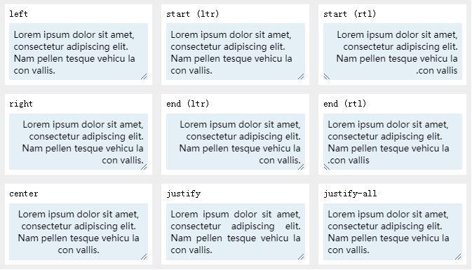
<span id="text-align" style="font-weight: bold;color:blue">text-align</span>塊級元素下文本對齊方式
```
p{
//行內內容向左側邊對齊
text-algin:left;
//行內內容向右側邊對齊
text-algin:right;
//行內內容居中
text-algin:center;
//文字向兩側對齊,對最后一行無效
text-algin:justify;
//和justify一致,但是強制使最后一行兩端對齊
text-algin:justify-all;
}
```
<span id=" text-decoration" style="font-weight: bold;color:blue"> text-decoration</span>
~~~
.under {
text-decoration: underline red;
}
.over {
text-decoration: wavy overline lime;
}
.line {
text-decoration: line-through;
}
.plain {
text-decoration: none;
}
.underover {
text-decoration: dashed underline overline;
}
.blink {
text-decoration: blink;
}
~~~
<span id="text-indent" style="font-weight: bold;color:blue">text-indent:縮進</span>
~~~
p {
text-indent: 5em;
text-indent: 5px;
text-indent: 5cm;
text-indent: 15%;
}
~~~
<span id="text-shadow" style="font-weight: bold;color:blue">text-shadow</span>
X和Y方向的偏移量、模糊半徑和顏色值組成
~~~css
/* offset-x | offset-y | blur-radius | color */
text-shadow: 1px 1px 2px black;
/* color | offset-x | offset-y | blur-radius */
text-shadow: #fc0 1px 0 10px;
/* offset-x | offset-y | color */
text-shadow: 5px 5px #558abb;
/* color | offset-x | offset-y */
text-shadow: white 2px 5px;
/* offset-x | offset-y
/* Use defaults for color and blur-radius */
text-shadow: 5px 10px;
/* Global values */
text-shadow: inherit;
text-shadow: initial;
text-shadow: unset;
多重陰影用,隔開
text-shadow: 1px 1px 2px black, 0 0 1em blue, 0 0 0.2em blue;
~~~
示例:
```
<p style="font-size:28px;">abcdefg</p>
<p style="font-size:28px;text-shadow: 2px 2px 2px red">abcdefg</p>
<p style="font-size:28px;text-shadow: 2px 2px 2px red, 0 0 1em blue">abcdefg</p>
<p style="font-size:28px;text-shadow: 2px 2px 2px red, 0 0 1em blue, 0 0 0.2em blue;">abcdefg</p>
```
效果:
<p style="font-size:28px;">abcdefg</p>
<p style="font-size:28px;text-shadow: 2px 2px 2px red">abcdefg</p>
<p style="font-size:28px;text-shadow: 2px 2px 2px red, 0 0 1em blue">abcdefg</p>
<p style="font-size:28px;text-shadow: 2px 2px 2px red, 0 0 1em blue, 0 0 0.2em blue;">abcdefg</p>
<span id="text-transform" style="font-weight: bold;color:blue">text-transform</span>
none 默認。定義帶有小寫字母和大寫字母的標準的文本。
capitalize 文本中的每個單詞以大寫字母開頭。
uppercase 強制轉換大寫字母。
lowercase 強制轉小寫字母。
inherit 規定應該從父元素繼承 text-transform 屬性的值。
<span id="unicode-bidi" style="font-weight: bold;color:blue">unicode-bidi</span>
CSS unicode-bidi 屬性,和 direction 屬性,決定如何處理文檔中的雙書寫方向文本(bidirectional text)。比如,如果一塊內容同時包含有從左到右書寫和從右到左書寫的文本,那么用戶代理(the user-agent)會使用復雜的 Unicode 算法來決定如何顯示文本。unicode-bidi 屬性會覆蓋此算法,允許開發人員控制文本嵌入(text embedding)
~~~css
/* 關鍵字值 */
unicode-bidi: normal;
unicode-bidi: embed;
unicode-bidi: isolate;
unicode-bidi: bidi-override;
unicode-bidi: isolate-override;
unicode-bidi: plaintext;
/* 全局值 */
unicode-bidi: inherit;
unicode-bidi: initial;
unicode-bidi: unset;
~~~
<span id="vertical-align" style="font-weight: bold;color:blue">vertical-align</span>
>[danger] 注意 vertical-align 只對行內元素、表格單元格元素生效:不能用它垂直對齊塊級元素。
**使元素相對其父元素垂直對齊:**
baseline:默認,使元素的基線與父元素的基線對齊(基線是可以替換的,所以基線的位置因瀏覽器而異)
sub:使元素的基線與父元素的下標基線對齊。
super:使元素的基線與父元素的上標基線對齊。
text-top:使元素的頂部與父元素的字體頂部對齊。
text-bottom:使元素的底部與父元素的字體底部對齊。
middle:使元素的中部與父元素的基線加上父元素x-height(譯注:x高度)的一半對齊。
$length:使元素的基線對齊到父元素的基線之上的給定長度。可以是負數。
$percentage(%):使元素的基線對齊到父元素的基線之上的給定百分比,該百分比是line-height屬性的百分比。可以是負數。
**使元素相對整行垂直對齊:**
top:使元素及其后代元素的頂部與整行的頂部對齊。
bottom:使元素及其后代元素的底部與整行的底部對齊。
沒有基線的元素,使用外邊距的下邊緣替代。
**表格單元格垂直對齊:**
baseline (以及 sub, super, text-top, text-bottom, $length, $percentage)
使單元格的基線,與該行中所有以基線對齊的其它單元格的基線對齊。
top:使單元格內邊距的上邊緣與該行頂部對齊。
middle:使單元格內邊距盒模型在該行內居中對齊。
bottom:使單元格內邊距的下邊緣與該行底部對齊。
可以是負數。
~~~html
<div>An <img src="https://mdn.mozillademos.org/files/12245/frame_image.svg" alt="link" width="32" height="32" /> 默認值.</div>
<div>An <img class="top" src="https://mdn.mozillademos.org/files/12245/frame_image.svg" alt="link" width="32" height="32" style="vertical-align: text-top;" /> 文本頂部對齊的圖像.</div>
<div>An <img class="bottom" src="https://mdn.mozillademos.org/files/12245/frame_image.svg" alt="link" width="32" height="32" style="vertical-align: text-bottom;" />文本底部對齊的圖像.</div>
<div>An <img class="middle" src="https://mdn.mozillademos.org/files/12245/frame_image.svg" alt="link" width="32" height="32" style="vertical-align: middle;" /> 中間對齊的圖像.</div>
~~~
效果:
<div>An <img src="https://mdn.mozillademos.org/files/12245/frame_image.svg" alt="link" width="32" height="32" style="vertical-align: baseline;" /> 默認值.</div>
<div>An <img class="top" src="https://mdn.mozillademos.org/files/12245/frame_image.svg" alt="link" width="32" height="32" style="vertical-align: text-top;" /> 文本頂部對齊的圖像.</div>
<div>An <img class="bottom" src="https://mdn.mozillademos.org/files/12245/frame_image.svg" alt="link" width="32" height="32" style="vertical-align: text-bottom;" />文本底部對齊的圖像.</div>
<div>An <img class="middle" src="https://mdn.mozillademos.org/files/12245/frame_image.svg" alt="link" width="32" height="32" style="vertical-align: middle;" /> 中間對齊的圖像.</div>
圖片是行內元素直接使用的時候由于默認對齊方式是basline基線所以看到圖片下面有空白
```
<div style="border:1px pink solid;vertical-align: top;">
<img src="qrcode.png">
</div>
```
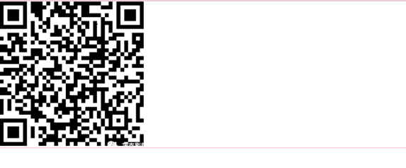
此時給圖片加上vertical-align屬性就ok了
```
<div style="border:1px pink solid;">
<img src="qrcode.png" style="vertical-align: top;">
</div>
```

<span id="white-space" style="font-weight: bold;color:blue">white-space</span>
normal:連續的空白符會被合并,換行符會被當作空白符來處理。換行在填充「行框盒子(line boxes)」時是必要。
nowrap:和 normal 一樣,連續的空白符會被合并。但文本內的換行無效。
pre:【IE6】連續的空白符會被保留。在遇到換行符或者<br>元素時才會換行。
pre-wrap:【IE8】連續的空白符會被保留。在遇到換行符或者<br>元素,或者需要為了填充「行框盒子(line boxes)」時才會換行。
pre-line:【IE8】連續的空白符會被合并。在遇到換行符或者<br>元素,或者需要為了填充「行框盒子(line boxes)」時會換行。
break-spaces:【IE不支持】與 pre-wrap的行為相同,除了:
* 任何保留的空白序列總是占用空間,包括在行尾。
* 每個保留的空格字符后都存在換行機會,包括空格字符之間。
* 這樣保留的空間占用空間而不會掛起,從而影響盒子的固有尺寸(最小內容大小和最大內容大小)。
下面的表格總結了各種 white-space 值的行為:
| | 換行符 | 空格和制表符 | 文字換行 | 行尾空格 |
| --- | --- | --- | --- | --- |
| `normal` | 合并 | 合并 | 換行 | 刪除 |
| `nowrap` | 合并 | 合并 | 不換行 | 刪除 |
| `pre` | 保留 | 保留 | 不換行 | 保留 |
| `pre-wrap` | 保留 | 保留 | 換行 | 掛起 |
| `pre-line` | 保留 | 合并 | 換行 | 刪除 |
| `break-spaces` | 保留 | 保留 | 換行 | 換行 |
## 示例
~~~
p{
????white-space:nowrap;
}
~~~
<span id="word-spacing" style="font-weight: bold;color:blue">word-spacing:字間距</span>
~~~
p{?
word-spacing: normal; /* Keyword value */
word-spacing: 3px; /* <length> values */
word-spacing: 0.3em;
word-spacing: inherit;
}
~~~
## **字體漸變**
實現原理1:
background-image 屬性為該文字區域設置一個漸變的背景色
color:transparent把該區域的文字顏色設置為透明
background-clip:text將背景裁剪成文字的前景色(實驗性)
```
.text-gradient {
background-image: linear-gradient(to right, orange, purple);
-webkit-background-clip: text;
color: transparent;
font-size: 30px;
}
```
實現原理2:mask 屬性
.text-gradient:before生成一個新元素,content:attr(text)使新元素內容與原文本內容相同,color:orange將新元素文本設置為橙色
-webkit-mask: linear-gradient(to right, transparent, orange)為新元素添加了一個從左到右,從透明到橙色的漸變遮罩,before元素中與mask的transparent的重疊部分也變成了透明
before新元素與原div藍色文本疊加,形成了從左至右從藍色到橙色的漸變效果
mask屬性在Chrome、FireFox等瀏覽器的較新版本中得到了支持,IE下不支持。
IE不支持CSS3屬性,只能通過別的方式來實現:IE 下文字漸變色實現
```
.text-gradient {
position: relative;
color: blue;
font-size: 30px;
}
.text-gradient:before {
content: attr(text);
position: absolute;
z-index: 10;
color: orange;
-webkit-mask: linear-gradient(to right, transparent, orange);
}
```
實現原理2:linear-gradient(線性漸變)和radial-gradient(徑向漸變)
**語法:**
>[danger]start point 可以時角度如30deg
**Mozilla**(Firefox,Flock等瀏覽器)
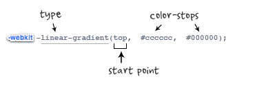
**Webkit**(Safari、Chrome等瀏覽器)
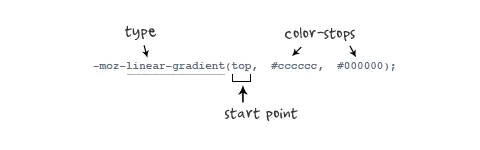
-webkit-linear-gradient( \[ || ,\]? , \[, \]\* )//最新發布書寫語法
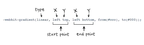
-webkit-gradient(, \[, \]?, \[, \]? \[, \]\*) //老式語法書寫規則
```
-webkit-linear-gradient(top,#ccc,#000);
```
```
background: -webkit-gradient(linear,centertop,centerbottom,from(#ccc), to(#000));
```
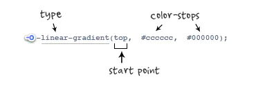
**Opera**(Opera瀏覽器)
```
background: -o-linear-gradient(top,#ccc,#000);
```
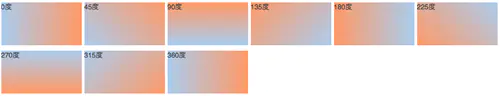
### 漸變角度
```
.deg0{
background: -moz-linear-gradient(0deg,#ace,#f96);
background: -webkit-gradient(linear,050%,100%50%,from(#ace),to(#f96));
background: -webkit-linear-gradient(0deg,#ace,#f96);
background: -o-linear-gradient(0deg,#ace,#f96);
}
.deg45{
background: -moz-linear-gradient(45deg,#ace,#f96);
background: -webkit-gradient(linear,0100%,100%0%,from(#ace),to(#f96));
background: -webkit-linear-gradient(45deg,#ace,#f96);
background: -o-linear-gradient(45deg,#ace,#f96);
}
.deg90{
background: -moz-linear-gradient(90deg,#ace,#f96);
background: -webkit-gradient(linear,50%100%,50%0%,from(#ace),to(#f96));
background: -webkit-linear-gradient(90deg,#ace,#f96);
background: -o-linear-gradient(90deg,#ace,#f96);
}
.deg135{
background: -moz-linear-gradient(135deg,#ace,#f96);
background: -webkit-gradient(linear,100%100%,00,from(#ace),to(#f96));
background: -webkit-linear-gradient(135deg,#ace,#f96);
background: -o-linear-gradient(135deg,#ace,#f96);
}
.deg180{
background: -moz-linear-gradient(180deg,#ace,#f96);
background: -webkit-gradient(linear,100%50%,050%,from(#ace),to(#f96));
background: -webkit-linear-gradient(180deg,#ace,#f96);
background: -o-linear-gradient(180deg,#ace,#f96);
}
.deg225{
background: -moz-linear-gradient(225deg,#ace,#f96);
background: -webkit-gradient(linear,100%0%,0100%,from(#ace),to(#f96));
background: -webkit-linear-gradient(225deg,#ace,#f96);
background: -o-linear-gradient(225deg,#ace,#f96);
}
.deg270{
background: -moz-linear-gradient(270deg,#ace,#f96);
background: -webkit-gradient(linear,50%0%,50%100%,from(#ace),to(#f96));
background: -webkit-linear-gradient(270deg,#ace,#f96);
background: -o-linear-gradient(270deg,#ace,#f96);
}
.deg315{
background: -moz-linear-gradient(315deg,#ace,#f96);
background: -webkit-gradient(linear,0%0%,100%100%,from(#ace),to(#f96));
background: -webkit-linear-gradient(315deg,#ace,#f96);
background: -o-linear-gradient(315deg,#ace,#f96);
}
.deg360{
background: -moz-linear-gradient(360deg,#ace,#f96);
background: -webkit-gradient(linear,050%,100%50%,from(#ace),to(#f96));
background: -webkit-linear-gradient(360deg,#ace,#f96);
background: -o-linear-gradient(360deg,#ace,#f96);
}
```
- CSS
- 達到指定寬度加載css
- 選擇器
- CSS 函數
- @media媒體查詢
- 字體
- 圖標字體
- 文本
- 光標樣式cursor
- 盒子模型
- 溢出(overflow)
- 邊框
- 不透明度opacity
- 背景(background)與漸變xx-gradient
- 輪廓(outline)與 陰影(box-shadow)
- 過渡屬性(Transition)
- 動畫屬性(Animation)
- transform變形效果旋轉,縮放,移動,傾斜等
- 顯示、隱藏與禁用
- box-sizing與resize
- 居中對齊
- css水平居中
- css垂直居中
- 文字與相鄰的元素垂直對齊
- 布局
- 高度塌陷和外邊距重疊最終解決方案
- 解決float布局時高度塌陷的最終方案after偽類元素
- 子/父元素外邊距重疊最終解決方案before偽類元素
- 傳統布局
- position布局
- position水平居中
- position垂直居中
- position水平垂直居中
- 浮動布局
- 高度塌陷和BFC
- clear
- BFC概念及觸發條件
- 表格布局
- 盒子模型布局
- 盒子水平居中布局(如margin:0 auto)
- 盒子垂直居中布局
- 相鄰元素外邊距重疊
- 行內元素的盒子模型
- 彈性伸縮布局flex
- 舊版本(IE不支持)
- 混合過渡版(僅IE10+生效)
- flex布局(新版)
- 多列布局columns
- grid網格布局(實驗性)
- 應用與總結
- 瀑布流布局
- 流式布局(響應式布局又叫百分比布局移動端一般采用)
- 用戶不能鼠標左鍵選擇文本
- 表格
- 表單
- radio
- textarea
- select
- a連接
- ul>li有序列表與ol>li無序列表
- 偽元素
- 容器寬高100%
- 瀏覽器四大內核及前綴
- 移動端開發
- 長度單位與移動端
- css_移動端開發
- rem具體解決方案
- vw具體解決方案
- 兼容性問題
- 瀏覽器默認樣式
- css預處理器
- less
- sass
- stylus
- HTML
- 標簽元素
- head的子標簽
- 文檔元素
- 文本元素
- 嵌入元素
- 分組元素
- 表格元素
- 表單元素
- input
- 標簽元素的屬性
- 全局屬性
- aria-*
- 事件on*
- data-*
- id
- class
- hidden
- style
- title
- draggable
- dropzone(實驗性)
- dir
- autocapitalize
- contenteditable
- lang
- inputmode
- accesskey
- contextmenu(移除)
- exportparts(實驗性)
- is
- itemid
- itemprop
- itemref
- itemscope
- itemtype
- XHTML遺留xml:lang和xml:base
- part(實驗性)
- slot
- spellcheck(實驗性)
- tabindex
- translate
- HTML字符實體
- 行內元素
- iframe和父頁面相互傳值,并兼容跨域問題
- a標簽嵌套解決方案
- JS
- 獲取寬度(offsetParent、clientWidth、clientHeight、offsetWidth、offsetheight、scrollWidth、scrollHeight、offsetTop、offsetLeft、scrollTop、scrollLeft)
- demo
- 全選和反選
- 定時器:
- 哪些HTML元素可以獲得焦點?
- 事件例子
- 鼠標事件
- 注冊條款
- 獲取鼠標坐標
- div跟隨鼠標移動
- 拖拽01
- 鼠標滾動事件
- 鍵盤事件
- 檢查標簽是否含有某個類
- 輪播圖
- 數組的 交集 差集 補集 并集
- 精確計算插件
- 搖獎機
- 移動端跳轉
- 基礎
- js的數據類型
- 基本類型聲明
- 引用類型聲明及用法
- 數組
- 函數
- 對象及函數原型對象
- 繼承
- js的垃圾回收機制
- javascript擴展自定義方法
- 類型轉換
- 作用域(執行上下文)及遞歸調用
- javascript事件
- 連續調用
- 排序
- 內存溢出與內存泄漏
- 系統對象
- 內置對象
- 值屬性
- Infinity
- NaN
- undefined
- globalThis
- Function 屬性
- eval()
- isFinite()
- isNaN()
- parseFloat()
- parseInt()
- decodeURI()
- decodeURIComponent()
- encodeURI()
- encodeURIComponent()
- 基本對象(Object,Function,Boolean,Symbol)
- Object
- defineProperty()
- Function
- Boolean
- Symbol
- 數字和日期對象
- Number
- Date
- BigInt
- Math
- 控制抽象化
- AsyncFunction
- Generator
- GeneratorFunction
- Promise
- Web組裝
- WebAssembly
- 結構化數據(JSON等)
- ArrayBuffer
- Atomics
- DataView
- JSON
- SharedArrayBuffer
- 使用鍵的集合對象
- Map
- Set
- WeakMap
- WeakSet
- 反射
- Reflect
- Proxy
- 可索引的集合對象(數組在這)
- Array數組
- BigInt64Array
- BigUint64Array
- Float32Array
- Float64Array
- Int16Array
- Int32Array
- Int8Array
- Uint8ClampedArray
- Uint8Array
- Uint16Array
- Uint32Array
- 國際化
- Intl
- Intl.Collator
- 文本處理(字符串與正則)
- RegExp
- String
- 錯誤對象
- Error
- InternalError
- AggregateError 實驗性
- EvalError
- RangeError
- ReferenceError
- SyntaxError
- URIError
- TypeError
- null
- TypedArray
- escape()移除但還兼容
- unescape()移除但還生效
- uneval()非標準
- arguments
- 宿主對象(DOM與Browser)
- Browser瀏覽器對象(BOM)
- Window 對象
- History 對象
- Location 對象
- Navigator 對象
- Screen 對象
- 存儲對象(localStorage與sessionStorage)
- DOM 節點對象
- EventTarget
- Node節點對象
- Document文檔節點
- HTMLDocument(HTML對象 )
- HTML 元素接口
- Element元素節點
- Attr屬性對象(與NamedNodeMap )
- DocumentType
- DocumentFragment文檔片段節點
- CharacterData
- Comment
- Text
- CDATASection
- 事件對象Event
- on-event處理器
- CustomEvent
- MouseEvent
- DragEvent
- 手勢(TouchEvent觸摸事件)
- 其他類型事件對象...
- CSSStyleDeclaration 對象
- HTMLCollection
- console對象
- MutationObserver
- 其他重要的對象(FormData與原生Ajax)
- FormData表單對象
- ajax XMLHttpRequest
- 表達式和運算符
- 算術運算符
- 賦值運算符
- 按位操作符
- 逗號操作符
- 比較操作符
- 條件運算符
- 解構賦值
- 函數表達式
- 圓括號運算符
- 邏輯運算符
- Nullish 合并操作符
- 對象初始化
- 運算符優先級
- 可選鏈
- 管道操作符 實驗性
- 屬性訪問器
- 展開語法
- 異步函數表達式
- await
- 類表達式
- delete 操作符
- function* 表達式
- in
- instanceof
- new 運算符
- new.target
- super
- this
- typeof
- void 運算符
- yield
- yield*
- 語句和聲明
- export
- default
- 控制流
- block
- break
- continue
- empty
- if...else
- switch
- throw
- try...catch
- 聲明
- const
- let
- var 描述
- 函數和類
- async function
- class
- function
- function*
- return
- 迭代
- do...while
- for
- for await...of
- for...in
- for...of
- while
- 其他
- debugger
- label
- with 移除但生效
- import
- import.meta
- 函數
- 箭頭函數
- 默認參數值
- 方法的定義
- 剩余參數
- Arguments 對象
- getter
- setter
- 類
- 類私有域
- 類元素
- 構造方法
- extends
- static
- Errors
- 更多
- 已廢棄的特性
- JavaScript 數據結構
- 詞法文法
- 屬性的可枚舉性和所有權
- 迭代協議
- 嚴格模式
- 切換到嚴格模式
- 模板字符串
- ES6(ES2015)
- Es6函數寫法
- 類class
- 導入導出模塊
- 兼容ES5
- 變量聲明
- Symbol新數據類型
- 迭代器(自定義遍歷數組)
- 生成器
- Promise異步編程
- set(集合)
- Map
- 數組新增4個方法
- 手機端事件
- bootstrap手冊
- 代碼壓縮打包
- Webpack
- 五個核心概念
- 開始
- loader
- 插件
- webpack開發環境配置
- 打包含css文件的項目
- 打包html資源
- 打包圖片資源
- 打包其他文件
- devServer(實時自動化打包)
- 總結:開發環境配置
- webpack生產環境配置
- 提取css成單獨文件
- css兼容性處理
- 壓縮css
- js語法檢查
- js兼容性處理
- js壓縮
- html壓縮
- 總結:生產環境配置
- webpack優化環境配置
- HMR( 模塊熱替換)
- source-map
- oneOf
- 緩存
- tree shaking
- code split
- demo1
- demo2
- demo3
- lazy loading
- pwa
- 多進程打包
- externals
- dll
- webpack配置詳解
- entry
- output
- module
- resolve
- dev server
- optimization
- vite
- 技能
- 前端學習路線
- 調試
- 多個版本IE瀏覽器(調試用)
- 手機端調試
- vueJS
- Element UI(一個vuejs組件)
- 瀏覽器插件開發
- 插件推薦
- 擴展文件manifest.json
- 不可視的background(常駐)頁面
- 可視頁面browser actions與page actions及八種展示方式
- 使用chrome.xxx API
- Google Chrome擴展與Web頁面/服務器之間的交互
- Google Chrome擴展中的頁面之間的數據通信
- inject-script
- chromeAPI
- pageAction
- alarms
- chrome.tabs
- chrome.runtime
- chrome.webRequest
- chrome.window
- chrome.storage
- chrome.contextMenus
- chrome.devtools
- chrome.extension
- 分類
- homepage_url 開發者或者插件主頁
- 5種類型的JS對比及消息通信
- 其它補充
- 谷歌瀏覽器截屏
- 框架及工具
- 前端UI設計網站
- 網頁中使用Unicode字符