
[TOC]
## **Flex布局**
## **display:flex|inline-flex** 開啟布局
~~~
-webkit-box-flex: auto;
-moz-box-flex: auto;
-webkit-flex: auto;
-ms-flex: auto;
flex: auto;
~~~
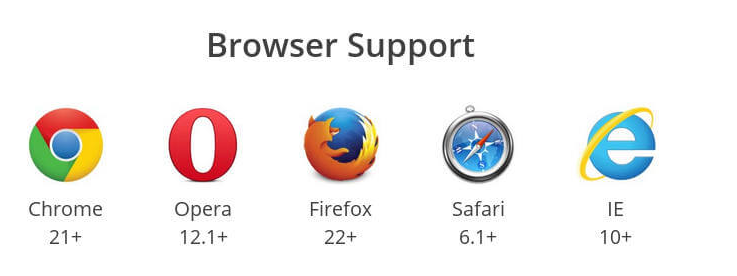
|**屬性**|**IE**|**Firefox**|**Chrome**|**Opera**|**Safari**|
| --- | --- | --- | --- | --- | --- |
| 帶前綴 | 無 | 無 | 21 ~ 28 | 無 | 7.0 |
| 不帶前綴 | 11+ | 20+ | 29+ | 12.1 | 無 |
[http://www.ruanyifeng.com/blog/2015/07/flex-grammar.html](http://www.ruanyifeng.com/blog/2015/07/flex-grammar.html)
[https://css-tricks.com/snippets/css/a-guide-to-flexbox/](https://css-tricks.com/snippets/css/a-guide-to-flexbox/)
[https://blog.csdn.net/m0\_37058714/article/details/80765562](https://blog.csdn.net/m0_37058714/article/details/80765562)
### **flex兼容性**
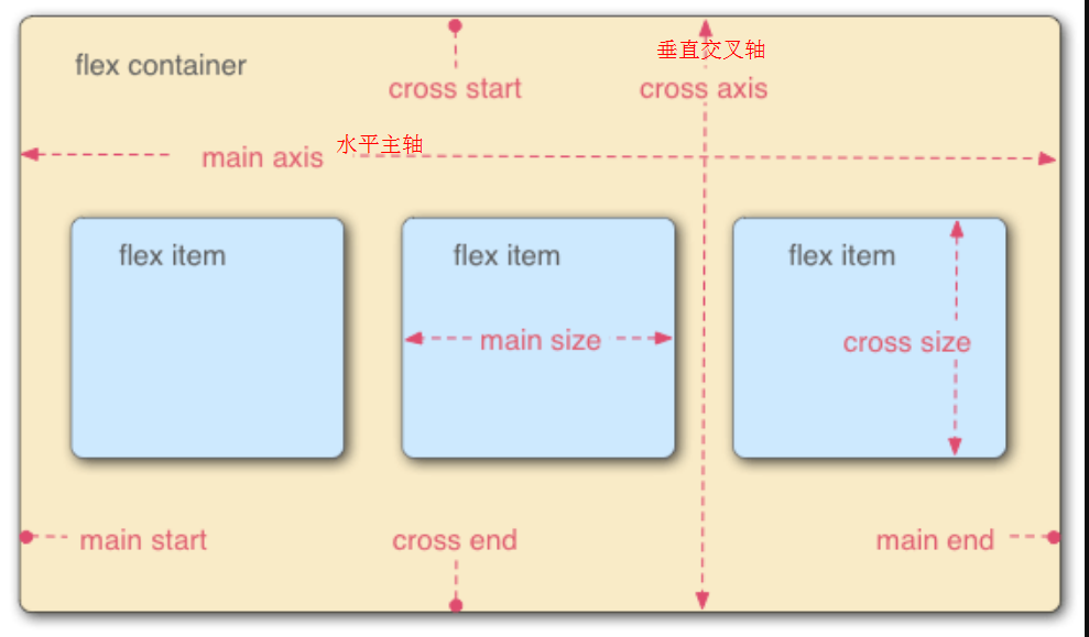
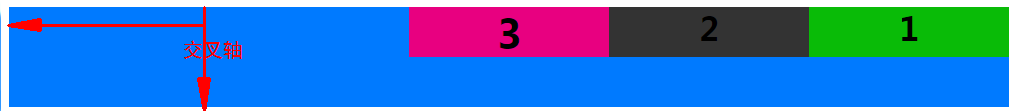
> 容器默認存在兩根軸:水平的**主軸**(main axis)和垂直的**交叉軸**(cross axis)。主軸的開始位置(與邊框的交叉點)叫做`main start`,結束位置叫做`main end`;交叉軸的開始位置叫做`cross start`,結束位置叫做`cross end`。
項目默認沿主軸排列。單個項目占據的主軸空間叫做`main size`,占據的交叉軸空間叫做`cross size`。交叉軸根據主軸的方向分向下↓的交叉軸與向右→的交叉軸
~~~
.container{
display: flex;/*行內元素為:online-flex*/
/*Webkit 內核的瀏覽器,必須加上`-webkit`前綴*/
display: -webkit-flex; /* Safari */
}
~~~
>[danger] **注意**.container設為 Flex 布局以后,子元素的`float`、`clear`和`vertical-align`屬性將失效
## **container容器的屬性**
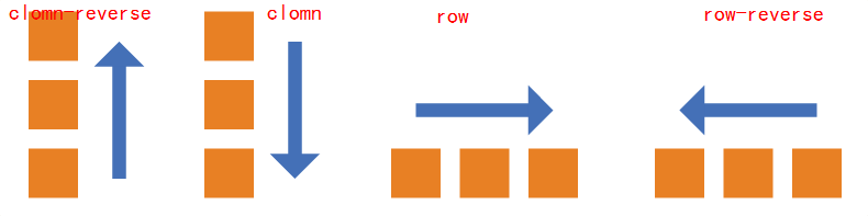
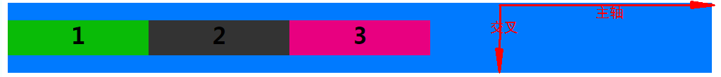
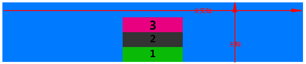
### **flex-direction**:決定項目item**主軸的方向**
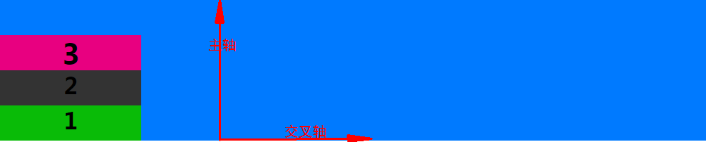
* **flex-direction** 屬性決定項目item**主軸的方向**(決定它的子元素按照什么方向來排列,**即項目item的排列方向**)
#### row: 水平左向右排列 默認,主軸方向為→
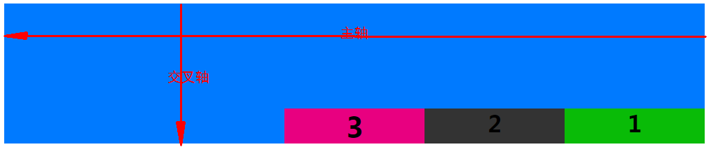
#### row-reverse:水平反向右從左排列主軸方向為←
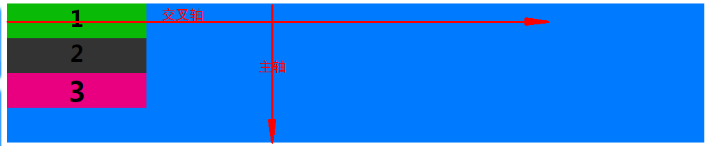
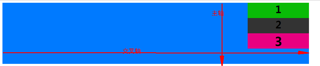
#### column:垂直上從下排列,主軸方向為↓
#### column-reverse:垂直下從上排列,主軸方向為↑
>[danger]如果flex-direction是row或者row-reverse,那么主軸就是justify-contain
如果flex-direction是column或者column-reverse,那么主軸就是align-items
~~~
.container{
flex-direction: row(默認) | row-reverse | column | column-reverse;
}
~~~
### **flex-wrap** 如何換行
* **flex-wrap** 一條軸線排不下,如何換行
~~~
.container{
flex-wrap: nowrap(默認) | wrap | wrap-reverse
}
~~~
#### (1)`nowrap`(默認):不換行。
#### (2)`wrap`:換行,第一行在上方。
#### (3)`wrap-reverse`:換行,第一行在下方。
### **flex-flow** `flex-direction`和`flex-wrap`的簡寫,默認值`row nowrap`
* **flex-flow** 是`flex-direction`屬性和`flex-wrap`屬性的簡寫形式,默認值為`row nowrap`
flex-flow: || ;
~~~
.container{
flex-flow: row nowrap;
}
~~~
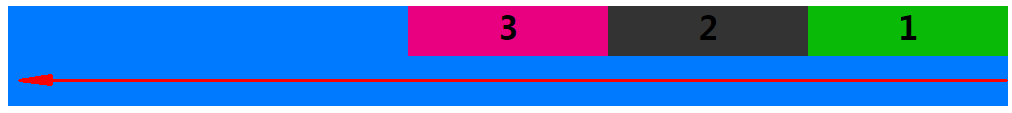
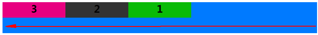
### **justify-content** 子容器item在主軸上的對齊方式
* **justify-content** 項目item在主軸上的對齊方式
從上可知 flex-direction屬性的row 與row-reverse決定主軸的方向
* `flex-start`(默認值):主軸起始方向對齊
* `flex-end`:主軸結束方向對齊
* `center`: 居中(默認時可做水平居中)
* `space-between`:兩端對齊,項目之間的間隔都相等。
* `space-around`:每個項目兩側的間隔相等。所以,項目之間的間隔比項目與邊框的間隔大一倍。
~~~
display: flex;
flex-flow:row nowrap;
justify-content:flex-start;
~~~

~~~
display: flex;
flex-flow:row nowrap;
justify-content:flex-end;
~~~

~~~
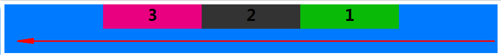
display: flex;
flex-flow:row-reverse nowrap;
justify-content:flex-start;
~~~
~~~
display: flex;
flex-flow:row-reverse nowrap;
justify-content:flex-end;
~~~
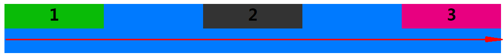
~~~
display: flex;
flex-flow:row nowrap;
justify-content:center;
~~~

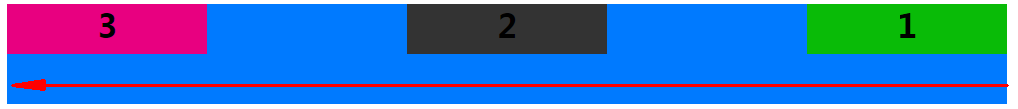
~~~
display: flex;
flex-flow:row-reverse nowrap;
justify-content:center;
~~~
~~~
display: flex;
flex-flow:row nowrap;
justify-content:space-between;
~~~
~~~
display: flex;
flex-flow:row-reverse nowrap;
justify-content:space-between;
~~~
~~~
display: flex;
flex-flow:row nowrap;
justify-content:space-around;
~~~

~~~
display: flex;
flex-flow:row-reverse nowrap;
justify-content:space-around;
~~~

### **align-items** 項目在交叉軸上如何對齊
* **align-items** 定義項目在交叉軸上如何對齊。
* `flex-start`:交叉軸的起點對齊。
* `flex-end`:交叉軸的終點對齊。
* `center`:交叉軸的中點對齊。(默認可做垂直居中)
* `baseline`: 項目的第一行文字的基線對齊。
* `stretch`(默認值):如果項目未設置高度或設為auto,將占滿整個容器的高度。
flex-start:交叉軸的起點對齊
~~~
display: flex;
flex-flow:row nowrap;/*默認 主軸方向→*/
justify-content:flex-start;/*默認 item在主軸的對齊方式*/
align-items: flex-start;/*item在交叉軸的對齊方式 */
~~~

~~~
display: flex;
flex-flow:row-reverse nowrap;/*主軸方向←*/
justify-content:flex-start;/*默認 item在主軸的對齊方式*/
align-items: flex-start;/*item在交叉軸的對齊方式 */
~~~
~~~
display: flex;
flex-flow:column-reverse nowrap;/*主軸方向↑*/
justify-content:flex-start;/*默認 item在主軸的對齊方式*/
align-items: flex-start;/*item在交叉軸的對齊方式 */
~~~
~~~
display: flex;
flex-flow:column nowrap;/*主軸方向↓*/
justify-content:flex-start;/*默認 item在主軸的對齊方式*/
align-items: flex-start;/*item在交叉軸的對齊方式 */
~~~
flex-end:交叉軸的終點對齊
~~~
display: flex;
flex-flow:row nowrap;/*默認 主軸方向→*/
justify-content:flex-start;/*默認 item在主軸的對齊方式*/
align-items: flex-end;/* item在交叉軸的對齊方式 */
~~~

~~~
display: flex;
flex-flow:row-reverse nowrap;/* 主軸方向←*/
justify-content:flex-start;/*默認 item在主軸的對齊方式*/
align-items: flex-end;/* item在交叉軸的對齊方式 */
~~~
~~~
display: flex;
flex-flow:column nowrap;/* 主軸方向←*/
justify-content:flex-start;/*默認 item在主軸的對齊方式*/
align-items: flex-end;/* item在交叉軸的對齊方式 */
~~~
~~~
display: flex;
flex-flow:column-reverse nowrap;/* 主軸方向↑*/
justify-content:flex-start;/*默認 item在主軸的對齊方式*/
align-items: flex-end;/* item在交叉軸的對齊方式 */
~~~

center:交叉軸的中點對齊
~~~
display: flex;
flex-flow:row nowrap;/*默認 主軸方向→*/
justify-content:flex-start;/*默認 item在主軸的對齊方式*/
align-items: center;/* item在交叉軸的對齊方式 */
~~~
~~~
display: flex;
flex-flow:row-reverse nowrap;/* 主軸方向←*/
justify-content:flex-start;/*默認 item在主軸的對齊方式*/
align-items: center;/* item在交叉軸的對齊方式 */
~~~

~~~
display: flex;
flex-flow:column nowrap;/* 主軸方向↓*/
justify-content:flex-start;/*默認 item在主軸的對齊方式*/
align-items: center;/* item在交叉軸的對齊方式 */
~~~

~~~
display: flex;
flex-flow:column-reverse nowrap;/* 主軸方向↑*/
justify-content:flex-start;/*默認 item在主軸的對齊方式*/
align-items: center;/* item在交叉軸的對齊方式 */
~~~
允許換行時center居中,換行后存在間隙,我們使用align-content: center;替換align-items: center;
~~~
display: flex;
flex-flow:row wrap;/* 主軸方向→*/
justify-content:flex-start;/*默認 item在主軸的對齊方式*/
align-items: center;/* item在交叉軸的對齊方式 */
~~~

baseline:項目的第一行文字的基線對齊
~~~
display: flex;
flex-flow:row nowrap;/*默認 主軸方向→*/
justify-content:flex-start;/*默認 item在主軸的對齊方式*/
align-items: baseline;/* item在交叉軸的對齊方式 */
~~~

~~~
display: flex;
flex-flow:row-reverse nowrap;/* 主軸方向←*/
justify-content:flex-start;/*默認 item在主軸的對齊方式*/
align-items: baseline;/* item在交叉軸的對齊方式 */
~~~
~~~
display: flex;
flex-flow:column nowrap;/* 主軸方向↓*/
justify-content:flex-start;/*默認 item在主軸的對齊方式*/
align-items: baseline;/* item在交叉軸的對齊方式 */
~~~
~~~
display: flex;
flex-flow:column-reverse nowrap;/* 主軸方向↑*/
justify-content:flex-start;/*默認 item在主軸的對齊方式*/
align-items: baseline;/* item在交叉軸的對齊方式 */
~~~
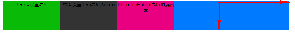
stretch:如果項目item未設置高度或設為auto,將占滿整個容器的高度
~~~
display: flex;
flex-flow:row nowrap;/*默認 主軸方向→*/
justify-content:flex-start;/*默認 item在主軸的對齊方式*/
align-items: stretch;/*默認 item在交叉軸的對齊方式 */
~~~
~~~
display: flex;
flex-flow:row-reverse nowrap;/* 主軸方向←*/
justify-content:flex-start;/*默認 item在主軸的對齊方式*/
align-items: stretch;/*默認 item在交叉軸的對齊方式 */
~~~

### **align-content** 定義了多根軸線(項目有多行時)與交叉軸的對齊方式
* **align-content** 用法與align-items一致,定義了多根軸線的對齊方式。如果項目只有一根軸線,該屬性不起作用。 即項目只有一行時無效果
* `flex-start`:與交叉軸的起點對齊。
* `flex-end`:與交叉軸的終點對齊。
* `center`:與交叉軸的中點對齊。
* `space-between`:與交叉軸兩端對齊,軸線之間的間隔平均分布。
* `space-around`:每根軸線兩側的間隔都相等。所以,軸線之間的間隔比軸線與邊框的間隔大一倍。
* `stretch`(默認值):軸線占滿整個交叉軸。
只有一根軸線時
~~~
display: flex;
flex-flow:row nowrap;/*默認 主軸方向→*/
justify-content:flex-start;/*默認 item在主軸的對齊方式*/
align-content: center;
~~~
如下圖所示沒有生效

修改代碼初始效果如下
當允許換行時項目就有兩行即兩根軸線align-content: center;生效
~~~
display: flex;
flex-flow:row wrap;/* 主軸方向→*/
justify-content:flex-start;/*默認 item在主軸的對齊方式*/
align-content: center;
~~~
html代碼參考,
~~~
<!DOCTYPE html>
<html lang="zh-cn">
<head>
<style type="text/css">
.container>div{
width: 200px;
height: 50px;
}
.container>.item-1{
background-color: #09BB07;
}
.container>.item-2{
background-color: #333333;
}
.container>.item-3{
background-color: #E80080;
}
.container>.item-4{
background-color: #F76260;
}
.container>.item-5{
background-color: #FFB400;
}
.container>.item-6{
background-color: #8A6DE9;
}
h1{
margin: 0;
}
.container{
width: 1000px;
height: 200px;
text-align: center;
background-color: #007AFF;
display:-webkit-flex;
display: flex;
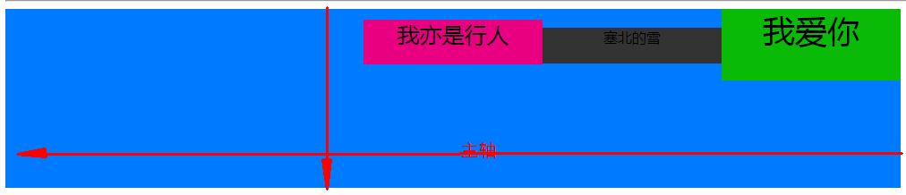
flex-flow:row-reverse nowrap;/*主軸方向包括 row row-reverse column column-reverse*/
justify-content:flex-start;/*item在主軸的對齊方式 flex-start | flex-end | center | space-between | space-around;*/
align-items: stretch;/*item在交叉軸的對齊方式 flex-start | flex-end | center | baseline | stretch*/
}
.container{
width: 1000px;
height: 200px;
text-align: center;
background-color: #007AFF;
display:-webkit-flex;
display: flex;
flex-flow:row wrap;/*主軸方向包括 row row-reverse column column-reverse*/
justify-content:flex-start;/*item在主軸的對齊方式 flex-start | flex-end | center | space-between | space-around;*/
align-content: center;/*flex-start | flex-end | center | space-between | space-around | stretch*/
}
</style>
</head>
<body>
<div class="container">
<div class="item-1"><h1>1</h1></div>
<div class="item-2"><h1>2</h1></div>
<div class="item-3" style="font-size: 20px;"><h1>3</h1></div>
</div>
<hr>
<div class="container">
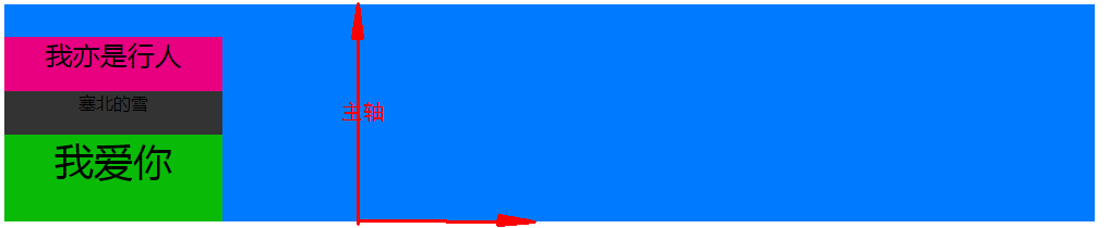
<div class="item-1" style="height: 80px;font-size: 36px;">我愛你</div>
<div class="item-2" style="height: 40px">塞北的雪</div>
<div class="item-3" style="font-size: 25px;">我亦是行人</div>
</div>
<hr>
<div class="container">
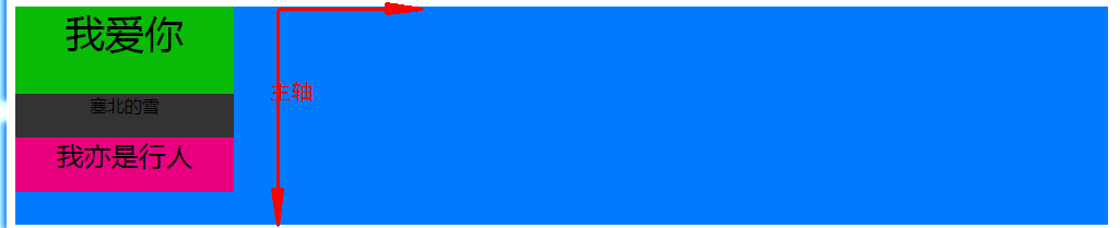
<div class="item-1" style="height:auto;">item沒設置高度</div>
<div class="item-2" style="height:auto;">或者設置item高度為auto</div>
<div class="item-3" style="height:auto;">則stretch時item高度填滿容器</div>
</div>
<hr>
<div class="container">
<div class="item-1"><h1>1</h1></div>
<div class="item-2"><h1>2</h1></div>
<div class="item-3" style="font-size: 20px;"><h1>3</h1></div>
<div class="item-4"><h1>4</h1></div>
<div class="item-5"><h1>5</h1></div>
<div class="item-6"><h1>6</h1></div>
</div>
</body>
</html>
~~~
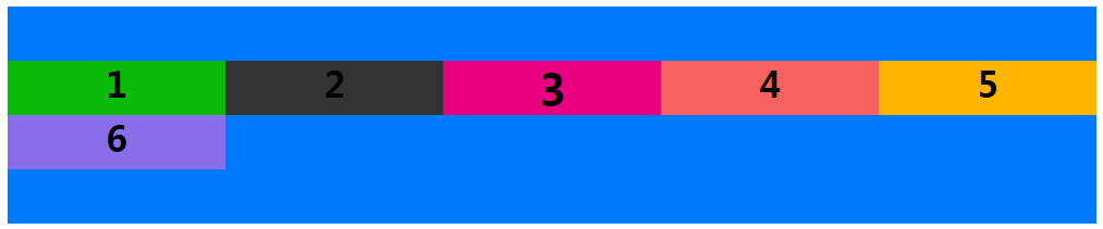
## **項目item的屬性**
* **order** 定義項目的排列順序。數值越小,排列越靠前,默認為0
* **flex-grow** 定義項目的放大比例,默認為`0`,即如果存在剩余空間,也不放大
* **flex-shrink**
* **flex-basis**
* **flex**
* **align-self**
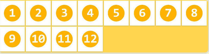
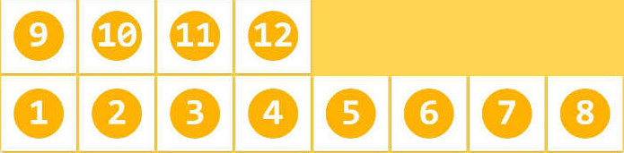
### **order** 項目的排列順序
**order**:定義項目的排列順序。數值越小,排列越靠前,默認為0
~~~
<style type="text/css">
.container1>div{
width: 200px;
}
.container1{
display:-webkit-flex;
display: flex;
flex-flow:row nowrap;/*主軸方向包括 row row-reverse column column-reverse*/
justify-content:flex-start;/*item在主軸的對齊方式 flex-start | flex-end | center | space-between | space-around;*/
align-content: flex-start;/*flex-start | flex-end | center | baseline | stretch*/
}
</style>
<div class="container1" style="width: 1000px;height: 200px;text-align: center;background-color: #007AFF;">
<div class="item1" style="background-color: #09BB07;height: 50px;"><h1>1</h1></div>
<div class="item2" style="background-color: #333333;height: 30px;"><h1>2</h1></div>
<div class="item3" style="background-color: #E80080;height: 25px;"><h1>3</h1></div>
<div class="item4" style="background-color: #F76260;height: 10px;"><h1>4</h1></div>
<div class="item5" style="background-color: #FFB400;height: 40px;"><h1>5</h1></div>
<div class="item6" style="background-color: #8A6DE9;height: 45px;"><h1>6</h1></div>
</div>
~~~
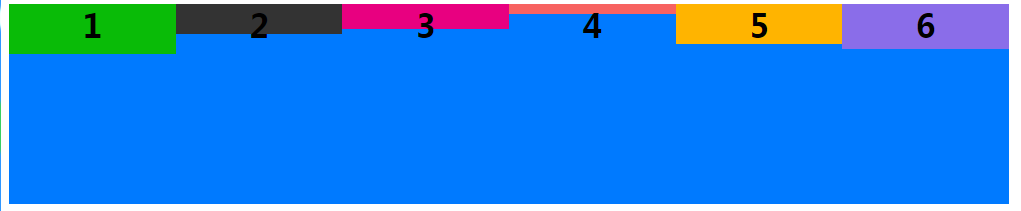
添加order
~~~
<style type="text/css">
.container1>div{
width: 200px;
}
.container1{
display:-webkit-flex;
display: flex;
flex-flow:row nowrap;/*主軸方向包括 row row-reverse column column-reverse*/
justify-content:flex-start;/*item在主軸的對齊方式 flex-start | flex-end | center | space-between | space-around;*/
align-content: flex-start;/*flex-start | flex-end | center | baseline | stretch*/
}
</style>
<div class="container1" style="width: 1000px;height: 200px;text-align: center;background-color: #007AFF;">
<div class="item1" style="order:3;background-color: #09BB07;height: 50px;"><h1>1</h1></div>
<div class="item2" style="order:2;background-color: #333333;height: 30px;"><h1>2</h1></div>
<div class="item3" style="order:1;background-color: #E80080;height: 25px;"><h1>3</h1></div>
<div class="item4" style="order:4;background-color: #F76260;height: 10px;"><h1>4</h1></div>
<div class="item5" style="order:6;background-color: #FFB400;height: 40px;"><h1>5</h1></div>
<div class="item6" style="order:5;background-color: #8A6DE9;height: 45px;"><h1>6</h1></div>
</div>
~~~

### **flex-grow** 項目的放大比例
**flex-grow**:屬性定義項目的放大比例,默認為`0`(父元素的寬度存在剩余寬度,也不放大),當父元素的寬度大于所有子元素的寬度的和時(即父元素會有剩余空間),子元素如何分配父元素的剩余空間。?flex-grow的默認值為0,意思是該元素不索取父元素的剩余空間,如果值大于0,表示索取。值越大,索取的越厲害。
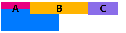
**舉個例子**:
父元素寬500px,有兩個子元素:A、B和C。A寬為100px,B寬為200px,C寬為100px。 則空余空間為 500-(100+200+100)= 100px。 如果A,B都不索取剩余空間,則有100px的空余空間
~~~
<style type="text/css">
.container1{
display:-webkit-flex;
display: flex;
flex-flow:row nowrap;/*主軸方向包括 row row-reverse column column-reverse*/
}
</style>
<div class="container1" style="width: 500px;height: 100px;text-align: center;background-color: #007AFF;">
<div class="item1" style="flex-grow:0;order:1;background-color: #E80080;width: 100px;height: 25px;"><h1>A</h1></div>
<div class="item2" style="flex-grow:0;order:6;background-color: #FFB400;width: 200px;height: 40px;"><h1>B</h1></div>
<div class="item3" style="flex-grow:0;order:5;background-color: #8A6DE9;width: 100px;height: 45px;"><h1>C</h1></div>
</div>
~~~
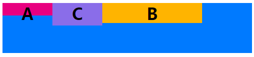
如果A索取剩余空間:設置item1類元素flex-grow為1,B、C不索取。則最終A的大小為 自身寬度(100px)+ 剩余空間的寬度(100px)= 200px

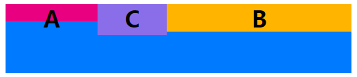
如果A,B都設索取剩余空間,C不索取,A設置flex-grow為1,B設置flex-grow為2。則最終A的大小為 自身寬度(100px)+ A獲得的剩余空間的寬度(100px?(1/(1+2)))=133.33...,最終B的大小為 自身寬度(200px)+ B獲得的剩余空間的寬度(200px?(2/(1+2)))=266.66...
如果A,B、C都設索取剩余空間,A設置flex-grow為1,B設置flex-grow為2,B設置flex-grow為2。
則最終A的大小為 自身寬度(100px)+ A獲得的剩余空間的寬度(100px?(1/(1+2+2)))=120,
最終B的大小為 自身寬度(200px)+ B獲得剩余寬度為(100px?(2/(1+2+2)))=240,
最終C的大小為 自身寬度(100px)+ C獲得剩余寬度為(100px?(2/(1+2+2)))=140,
~~~
<style type="text/css">
.container1{
display:-webkit-flex;
display: flex;
flex-flow:row nowrap;/*主軸方向包括 row row-reverse column column-reverse*/
}
</style>
<div class="container1" style="width: 500px;height: 100px;text-align: center;background-color: #007AFF;">
<div class="item1" style="flex-grow:1;order:1;background-color: #E80080;width: 100px;height: 25px;"><h1>A</h1></div>
<div class="item2" style="flex-grow:2;order:6;background-color: #FFB400;width: 200px;height: 40px;"><h1>B</h1></div>
<div class="item3" style="flex-grow:2;order:5;background-color: #8A6DE9;width: 100px;height: 45px;"><h1>C</h1></div>
</div>
~~~

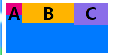
### **flex-shrink** 目的縮小比例
**flex-shrink**屬性定義了項目的縮小比例,默認為1,即如果空間不足,該項目將縮小。
當父元素的寬度小于所有子元素的寬度的和時(即子元素會超出父元素),子元素如何縮小自己的寬度的。?`flex-shrink`的默認值為1,當父元素的寬度小于所有子元素的寬度的和時,子元素的寬度會減小。值越大,減小的越厲害。如果值為0,表示不減小
~~~
<style type="text/css">
.container1{
display:-webkit-flex;
display: flex;
flex-flow:row nowrap;/*主軸方向包括 row row-reverse column column-reverse*/
}
</style>
<div class="container1" style="width: 200px;height: 100px;text-align: center;background-color: #007AFF;">
<div class="item1" style="flex-shrink:0;background-color: #E80080;width: 100px;height: 25px;"><h1>A</h1></div>
<div class="item2" style="flex-shrink:0;background-color: #FFB400;width: 100px;height: 40px;"><h1>B</h1></div>
<div class="item3" style="flex-shrink:0;background-color: #8A6DE9;width: 100px;height: 45px;"><h1>C</h1></div>
</div>
~~~
~~~
<style type="text/css">
.container1{
display:-webkit-flex;
display: flex;
flex-flow:row nowrap;/*主軸方向包括 row row-reverse column column-reverse*/
}
</style>
<div class="container1" style="width: 200px;height: 100px;text-align: center;background-color: #007AFF;">
<div class="item1" style="flex-shrink:2;background-color: #E80080;width: 100px;height: 25px;"><h1>A</h1></div>
<div class="item2" style="flex-shrink:0;background-color: #FFB400;width: 100px;height: 40px;"><h1>B</h1></div>
<div class="item3" style="flex-shrink:1;background-color: #8A6DE9;width: 100px;height: 45px;"><h1>C</h1></div>
</div>
~~~
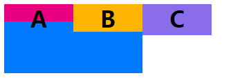
### **flex-basis** 在分配多余空間之前,項目占據的主軸空間
**flex-basis**屬性定義了在分配多余空間之前,項目占據的主軸空間(main size)。瀏覽器根據這個屬性,計算主軸是否有多余空間。它的默認值為`auto`,即項目的本來大小
它可以設為跟`width`或`height`屬性一樣的值(比如350px),則項目將占據固定空間
其實,width也可以設置item寬度。如果元素上同時設置了width和flex-basis,那么width 的值就會被flex-basis覆蓋掉。
如圖 flex-basis替換掉了item2的width
~~~
<style type="text/css">
.container1{
display:-webkit-flex;
display: flex;
flex-flow:row nowrap;/*主軸方向包括 row row-reverse column column-reverse*/
}
</style>
<div class="container1" style="width: 200px;height: 100px;text-align: center;background-color: #007AFF;">
<div class="item1" style="flex-shrink:0;background-color: #E80080;width: 100px;height: 25px;"><h1>A</h1></div>
<div class="item2" style="flex-shrink:0;flex-basis:200px;background-color: #FFB400;width: 100px;height: 40px;"><h1>B</h1></div>
<div class="item3" style="flex-shrink:0;background-color: #8A6DE9;width: 100px;height: 45px;"><h1>C</h1></div>
</div>
~~~
### **flex屬性** `flex-grow`,`flex-shrink`和`flex-basis`的簡寫,默認值為`0 1 auto`
`flex`屬性是`flex-grow`,`flex-shrink`和`flex-basis`的簡寫,默認值為`0 1 auto`。后兩個屬性可選。
該屬性有兩個快捷值:`auto`(`1 1 auto`) 和 none (`0 0 auto`)。
建議優先使用這個屬性,而不是單獨寫三個分離的屬性,因為瀏覽器會推算相關值。
### **align-self屬性** 許單個項目有與其他項目不一樣的對齊方式
`align-self`屬性允許單個項目有與其他項目不一樣的對齊方式,可覆蓋容器container的`align-items`屬性。默認值為`auto`,表示繼承父元素的`align-items`屬性,如果沒有父元素,則等同于`stretch`。
~~~
<style type="text/css">
.container1{
display:-webkit-flex;
display: flex;
flex-flow:row nowrap;/*主軸方向包括 row row-reverse column column-reverse*/
}
</style>
<div class="container1" style="width: 1000px;height: 100px;text-align: center;background-color: #007AFF;">
<div class="item1" style="align-self: auto;background-color: #E80080;width: 100px;height: 45px;"><h1>1</h1></div>
<div class="item2" style="align-self: flex-start;background-color: #FFB400;width: 100px;height: 45px;"><h1>2</h1></div>
<div class="item3" style="align-self: flex-end;background-color: #8A6DE9;width: 100px;height: 45px;"><h1>3</h1></div>
<div class="item3" style="align-self: center;background-color: #09BB07;width: 100px;height: 45px;"><h1>4</h1></div>
<div class="item3" style="align-self: baseline;background-color: #333333;width: 100px;height: 45px;"><h1>5</h1></div>
<div class="item3" style="align-self: stretch;background-color: #F76260;width: 100px;height: 45px;"><h1>6</h1></div>
</div>
~~~

## **解決justify-content: space-between;最有一行列不足時,向兩邊擴散的問題**
justify-content: space-between;
解決方案:使用after偽類,解決最后一排數量不夠兩端分布的情況。寬度就是每張圖片的寬度
~~~
.list:after { content: ""; width: 1.87rem; }
~~~
## **解決flex布局的元素會有默認間隙(垂直間隙)**
解決辦法 align-content: flex-start;

```
.list {
width: 100%;
display: flex;
justify-content: space-between;
flex-flow: row wrap;
margin: 0 0.53rem;
padding-bottom: 0.67rem;
align-content: flex-start; // 解決flex布局的元素會有默認間隙(垂直間隙)
li {
img {
width: 1.87rem;
height: 1.87rem;
margin-top: 0.67rem;
}
}
}
.list:after {
content: "";
width: 1.87rem;
}
}
```
- CSS
- 達到指定寬度加載css
- 選擇器
- CSS 函數
- @media媒體查詢
- 字體
- 圖標字體
- 文本
- 光標樣式cursor
- 盒子模型
- 溢出(overflow)
- 邊框
- 不透明度opacity
- 背景(background)與漸變xx-gradient
- 輪廓(outline)與 陰影(box-shadow)
- 過渡屬性(Transition)
- 動畫屬性(Animation)
- transform變形效果旋轉,縮放,移動,傾斜等
- 顯示、隱藏與禁用
- box-sizing與resize
- 居中對齊
- css水平居中
- css垂直居中
- 文字與相鄰的元素垂直對齊
- 布局
- 高度塌陷和外邊距重疊最終解決方案
- 解決float布局時高度塌陷的最終方案after偽類元素
- 子/父元素外邊距重疊最終解決方案before偽類元素
- 傳統布局
- position布局
- position水平居中
- position垂直居中
- position水平垂直居中
- 浮動布局
- 高度塌陷和BFC
- clear
- BFC概念及觸發條件
- 表格布局
- 盒子模型布局
- 盒子水平居中布局(如margin:0 auto)
- 盒子垂直居中布局
- 相鄰元素外邊距重疊
- 行內元素的盒子模型
- 彈性伸縮布局flex
- 舊版本(IE不支持)
- 混合過渡版(僅IE10+生效)
- flex布局(新版)
- 多列布局columns
- grid網格布局(實驗性)
- 應用與總結
- 瀑布流布局
- 流式布局(響應式布局又叫百分比布局移動端一般采用)
- 用戶不能鼠標左鍵選擇文本
- 表格
- 表單
- radio
- textarea
- select
- a連接
- ul>li有序列表與ol>li無序列表
- 偽元素
- 容器寬高100%
- 瀏覽器四大內核及前綴
- 移動端開發
- 長度單位與移動端
- css_移動端開發
- rem具體解決方案
- vw具體解決方案
- 兼容性問題
- 瀏覽器默認樣式
- css預處理器
- less
- sass
- stylus
- HTML
- 標簽元素
- head的子標簽
- 文檔元素
- 文本元素
- 嵌入元素
- 分組元素
- 表格元素
- 表單元素
- input
- 標簽元素的屬性
- 全局屬性
- aria-*
- 事件on*
- data-*
- id
- class
- hidden
- style
- title
- draggable
- dropzone(實驗性)
- dir
- autocapitalize
- contenteditable
- lang
- inputmode
- accesskey
- contextmenu(移除)
- exportparts(實驗性)
- is
- itemid
- itemprop
- itemref
- itemscope
- itemtype
- XHTML遺留xml:lang和xml:base
- part(實驗性)
- slot
- spellcheck(實驗性)
- tabindex
- translate
- HTML字符實體
- 行內元素
- iframe和父頁面相互傳值,并兼容跨域問題
- a標簽嵌套解決方案
- JS
- 獲取寬度(offsetParent、clientWidth、clientHeight、offsetWidth、offsetheight、scrollWidth、scrollHeight、offsetTop、offsetLeft、scrollTop、scrollLeft)
- demo
- 全選和反選
- 定時器:
- 哪些HTML元素可以獲得焦點?
- 事件例子
- 鼠標事件
- 注冊條款
- 獲取鼠標坐標
- div跟隨鼠標移動
- 拖拽01
- 鼠標滾動事件
- 鍵盤事件
- 檢查標簽是否含有某個類
- 輪播圖
- 數組的 交集 差集 補集 并集
- 精確計算插件
- 搖獎機
- 移動端跳轉
- 基礎
- js的數據類型
- 基本類型聲明
- 引用類型聲明及用法
- 數組
- 函數
- 對象及函數原型對象
- 繼承
- js的垃圾回收機制
- javascript擴展自定義方法
- 類型轉換
- 作用域(執行上下文)及遞歸調用
- javascript事件
- 連續調用
- 排序
- 內存溢出與內存泄漏
- 系統對象
- 內置對象
- 值屬性
- Infinity
- NaN
- undefined
- globalThis
- Function 屬性
- eval()
- isFinite()
- isNaN()
- parseFloat()
- parseInt()
- decodeURI()
- decodeURIComponent()
- encodeURI()
- encodeURIComponent()
- 基本對象(Object,Function,Boolean,Symbol)
- Object
- defineProperty()
- Function
- Boolean
- Symbol
- 數字和日期對象
- Number
- Date
- BigInt
- Math
- 控制抽象化
- AsyncFunction
- Generator
- GeneratorFunction
- Promise
- Web組裝
- WebAssembly
- 結構化數據(JSON等)
- ArrayBuffer
- Atomics
- DataView
- JSON
- SharedArrayBuffer
- 使用鍵的集合對象
- Map
- Set
- WeakMap
- WeakSet
- 反射
- Reflect
- Proxy
- 可索引的集合對象(數組在這)
- Array數組
- BigInt64Array
- BigUint64Array
- Float32Array
- Float64Array
- Int16Array
- Int32Array
- Int8Array
- Uint8ClampedArray
- Uint8Array
- Uint16Array
- Uint32Array
- 國際化
- Intl
- Intl.Collator
- 文本處理(字符串與正則)
- RegExp
- String
- 錯誤對象
- Error
- InternalError
- AggregateError 實驗性
- EvalError
- RangeError
- ReferenceError
- SyntaxError
- URIError
- TypeError
- null
- TypedArray
- escape()移除但還兼容
- unescape()移除但還生效
- uneval()非標準
- arguments
- 宿主對象(DOM與Browser)
- Browser瀏覽器對象(BOM)
- Window 對象
- History 對象
- Location 對象
- Navigator 對象
- Screen 對象
- 存儲對象(localStorage與sessionStorage)
- DOM 節點對象
- EventTarget
- Node節點對象
- Document文檔節點
- HTMLDocument(HTML對象 )
- HTML 元素接口
- Element元素節點
- Attr屬性對象(與NamedNodeMap )
- DocumentType
- DocumentFragment文檔片段節點
- CharacterData
- Comment
- Text
- CDATASection
- 事件對象Event
- on-event處理器
- CustomEvent
- MouseEvent
- DragEvent
- 手勢(TouchEvent觸摸事件)
- 其他類型事件對象...
- CSSStyleDeclaration 對象
- HTMLCollection
- console對象
- MutationObserver
- 其他重要的對象(FormData與原生Ajax)
- FormData表單對象
- ajax XMLHttpRequest
- 表達式和運算符
- 算術運算符
- 賦值運算符
- 按位操作符
- 逗號操作符
- 比較操作符
- 條件運算符
- 解構賦值
- 函數表達式
- 圓括號運算符
- 邏輯運算符
- Nullish 合并操作符
- 對象初始化
- 運算符優先級
- 可選鏈
- 管道操作符 實驗性
- 屬性訪問器
- 展開語法
- 異步函數表達式
- await
- 類表達式
- delete 操作符
- function* 表達式
- in
- instanceof
- new 運算符
- new.target
- super
- this
- typeof
- void 運算符
- yield
- yield*
- 語句和聲明
- export
- default
- 控制流
- block
- break
- continue
- empty
- if...else
- switch
- throw
- try...catch
- 聲明
- const
- let
- var 描述
- 函數和類
- async function
- class
- function
- function*
- return
- 迭代
- do...while
- for
- for await...of
- for...in
- for...of
- while
- 其他
- debugger
- label
- with 移除但生效
- import
- import.meta
- 函數
- 箭頭函數
- 默認參數值
- 方法的定義
- 剩余參數
- Arguments 對象
- getter
- setter
- 類
- 類私有域
- 類元素
- 構造方法
- extends
- static
- Errors
- 更多
- 已廢棄的特性
- JavaScript 數據結構
- 詞法文法
- 屬性的可枚舉性和所有權
- 迭代協議
- 嚴格模式
- 切換到嚴格模式
- 模板字符串
- ES6(ES2015)
- Es6函數寫法
- 類class
- 導入導出模塊
- 兼容ES5
- 變量聲明
- Symbol新數據類型
- 迭代器(自定義遍歷數組)
- 生成器
- Promise異步編程
- set(集合)
- Map
- 數組新增4個方法
- 手機端事件
- bootstrap手冊
- 代碼壓縮打包
- Webpack
- 五個核心概念
- 開始
- loader
- 插件
- webpack開發環境配置
- 打包含css文件的項目
- 打包html資源
- 打包圖片資源
- 打包其他文件
- devServer(實時自動化打包)
- 總結:開發環境配置
- webpack生產環境配置
- 提取css成單獨文件
- css兼容性處理
- 壓縮css
- js語法檢查
- js兼容性處理
- js壓縮
- html壓縮
- 總結:生產環境配置
- webpack優化環境配置
- HMR( 模塊熱替換)
- source-map
- oneOf
- 緩存
- tree shaking
- code split
- demo1
- demo2
- demo3
- lazy loading
- pwa
- 多進程打包
- externals
- dll
- webpack配置詳解
- entry
- output
- module
- resolve
- dev server
- optimization
- vite
- 技能
- 前端學習路線
- 調試
- 多個版本IE瀏覽器(調試用)
- 手機端調試
- vueJS
- Element UI(一個vuejs組件)
- 瀏覽器插件開發
- 插件推薦
- 擴展文件manifest.json
- 不可視的background(常駐)頁面
- 可視頁面browser actions與page actions及八種展示方式
- 使用chrome.xxx API
- Google Chrome擴展與Web頁面/服務器之間的交互
- Google Chrome擴展中的頁面之間的數據通信
- inject-script
- chromeAPI
- pageAction
- alarms
- chrome.tabs
- chrome.runtime
- chrome.webRequest
- chrome.window
- chrome.storage
- chrome.contextMenus
- chrome.devtools
- chrome.extension
- 分類
- homepage_url 開發者或者插件主頁
- 5種類型的JS對比及消息通信
- 其它補充
- 谷歌瀏覽器截屏
- 框架及工具
- 前端UI設計網站
- 網頁中使用Unicode字符