
[TOC]
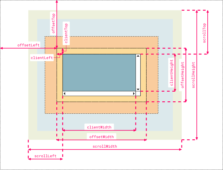
>[warning] 黃色為border
## **1、element.clientWidth:** 返回元素的可見寬度(元素內容區with值+padding)
* element.clientHeight = height + CSS padding - 水平滾動條高度 (如果存在)
* element.clientWith = with+ CSS padding - 垂直滾動條寬度 (如果存在)
* **document.body.clientWidth:**
* **谷歌、火狐得出的寬度:body的內容區+padding**
* **ie得出的寬度:body的內容區-border**
## **2、clientTop:** 一個元素頂部邊框的寬度(以像素表示)。嗯。。就只是??border-top-width
## **3、element.offsetWidth:** 返回元素的整個實際寬度(元素內容區with值+padding+border)
* **document.body.offsetWidth:**
* **谷歌、火狐得出的寬度:body的內容區+padding+border**
* **ie得出的寬度:body的內容區**
## **4、offsetLeft:** 當前元素針對于其定位父元素的水平偏移量,父元素沒設置默認一直向上直到定位到html
```
<body>
<style type="text/css">
html,body{
padding: 0;
margin: 0;
}
#box1{
width: 100px;
height: 100px;
margin: 25px;
padding: 20px;
border:5px solid red;
/*position: relative;*/
overflow: scroll;
}
#box2{
width: 200px;
height: 200px;
margin: 25px;
padding: 20px;
border:55px solid blue;
}
</style>
<div id="box1">
<div id="box2">
</div>
</div>
</div>
<script type="text/javascript">
var box1Div = document.getElementById("box2");
var text="offsetLeft: " + box1Div.offsetLeft + "<br>offsetTop: " + box1Div.offsetTop;
console.log(text);//offsetLeft: 75<br>offsetTop: 75 去掉box1注釋則是offsetLeft: 45<br>offsetTop: 45
</script>
</body>
```
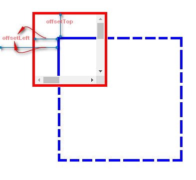
## **5、offsetTop:** 當前元素針對于其定位父元素的垂直偏移量
>[danger]**注:在css設置body為2400px時body的實際寬度為2400+border+padding;而**谷歌、火狐為2400px
## **6、element.scrollWidth:** 獲取整個滾動區域的寬度(內容區+padding)
box2元素網頁正文全文寬度(內容區+padding):
* **document.body.scrollWidth:**
* **谷歌、火狐得出的寬度:body的內容區+padding**
* **ie得出的寬度:body的實際可用寬度-border**
* **正文全文高度是element.scrollHeight**
## **7、scrollLeft:** 水平滾動條 滾動的距離(當滾動到底時可簡單理解為就是多出視口的部分)
設置或獲取位于對象左邊界和窗口中目前可見內容的最左端之間的距離
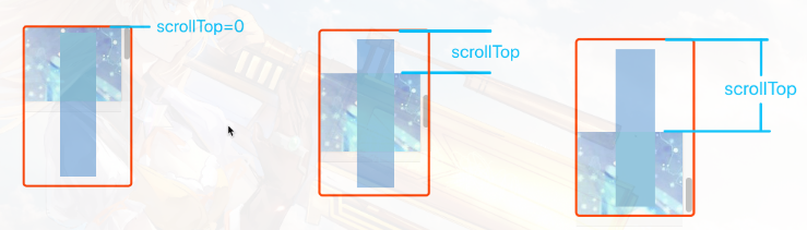
## **8、scrollTop:** 垂直滾動條 滾動的距離(當滾動到底時可簡單理解為就是多出視口的部分)
設置或獲取位于對象最頂端和窗口中可見內容的最頂端之間的距離
## **offsetParent:** 獲取當前元素的開啟了position定位的最近祖先元素,如果祖先元素沒有設置定位,那么返回的是body
## **事件中獲取坐標**
event.clientX?相對文檔的水平座標
event.clientY?相對文檔的垂直座標
event.offsetX?相對容器的水平坐標
event.offsetY?相對容器的垂直坐標
```
<div id="box1">
<div id="box2" style="position: relative;">
<div id="box3">
<div id="box4"></div>
</div>
</div>
</div>
<script type="text/javascript">
var box4=document.getElementById("box4");
var box=box4.offsetParent;
console.log(box);//返回box2節點對象
</script>
```
## **window.screen.width**:瀏覽設備的分辨率(電腦、手機、平板等)
~~~
console.log(window.screen.width );//瀏覽設備的分辨率(電腦、手機、平板等) 1920
~~~
## **window.screen.availWidth**:瀏覽設備的實際可用寬度(電腦、手機、平板等)
~~~
console.log(window.screen.availWidth );//瀏覽設備的實際可用寬度(電腦、手機、平板等) 1920
~~~
## **window.innerWidth**瀏覽器的可用(內部)寬度(包括滾動條等)\[ie不支持\]
~~~
console.log(window.innerWidth);//瀏覽器的可用(內部)寬度(包括滾動條等)\[ie不支持\]
~~~
## **其他**
~~~
console.log($("#div2").height());//(內容區) 1000
console.log($("#div2").innerHeight());//(內容區+padding) 1040
console.log($("#div2").outerHeight());//(內容區+padding+border)1060
console.log($("#div2").offset());//匹配元素在當前視口的相對偏移 {top: 640, left: 160}
console.log($("#div2").position());//返回匹配元素相對于父元素的位置(偏移) {top: 610, left: 130}
console.log($("#div2").scrollTop());//返回或設置匹配元素的滾動條的垂直位置(匹配的元素必須設置overflow-y: scroll;) 0
console.log($("#div2").scrollLeft());//返回或設置匹配元素的滾動條的水平位置(匹配的元素必須設置overflow-y: scroll;) 0
~~~
## **示例:**
**示例1:元素可見寬/高(clientWidth/clientHeight)與實際寬/高(offsetWidth/offsetHeight)**
```
<!DOCTYPE html>
<html>
<head>
<meta charset="utf-8">
<title>菜鳥教程(runoob.com)</title>
<style>
body{
font-size:12px;
}
#myDIV {
height: 250px;
width: 400px;
padding: 10px;
margin: 15px;
border: 5px solid red;
background-color: lightblue;
overflow: auto;
}
#myDIV2 {
height: 250px;
width: 400px;
padding: 10px;
margin: 15px;
border: 5px solid red;
background-color: lightblue;
}
#content {
height: 800px;
width: 2000px;
background-color: lightyellow;
}
</style>
</head>
<body>
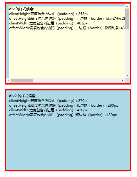
<p>在這個實例中,子 div 元素 (#content) 插入到第一個 div 中,由子 div 元素 比第父 div元素 (#myDIV) 大,
(子元素為 800x2500 ,父元素為 250x400), 所以我們使用了滾動條。</p>
<p>點擊按鈕獲取 div 元素的 clientHeight, offsetHeight, clientWidth 和 offsetWidth 屬性值。</p>
<button onclick="myFunction()">點我</button>
<p>請注意父 div 中的滾動條“得到”子 div 的右側和底部內邊距(padding),這導致父 div 中 clientHeight 和 clientWidth 的返回值低于另一個,而 offsetHeight 和 offsetWidth 不受此影響。
<div id="myDIV">
<div id="content"></div>
</div>
<div id="myDIV2">
<div id="content2"></div>
</div>
<script>
function myFunction() {
var elmnt = document.getElementById("myDIV");
var txt = "";
txt += "<b>div 的樣式信息:</b><br>";
txt += "clientHeight:高度包含內邊距(padding): " + elmnt.clientHeight + "px<br>";
txt += "offsetHeight:高度包含內邊距(padding)、邊框(border)及滾動條: " + elmnt.offsetHeight + "px<br>";
txt += "clientWidth:寬度包含內邊距(padding): " + elmnt.clientWidth + "px<br>";
txt += "offsetWidth:寬度包含內邊距(padding)、邊框(border)及滾動條: " + elmnt.offsetWidth + "px";
document.getElementById("content").innerHTML = txt;
var elmnt2 = document.getElementById("myDIV2");
var txt2 = "";
txt2 += "<b>div2 的樣式信息:</b><br>";
txt2 += "clientHeight:高度包含內邊距(padding): " + elmnt2.clientHeight + "px<br>";
txt2 += "offsetHeight:高度包含內邊距(padding)和邊框(border): " + elmnt2.offsetHeight + "px<br>";
txt2 += "clientWidth:寬度包含內邊距(padding): " + elmnt2.clientWidth + "px<br>";
txt2 += "offsetWidth:寬度包含內邊距(padding)和邊框(border): " + elmnt2.offsetWidth + "px";
document.getElementById("content2").innerHTML = txt2;
}
</script>
</body>
</html>
```
**示例2:偏移量**
```
<!DOCTYPE html>
<html>
<head>
<meta http-equiv="Content-Type" content="text/html; charset=utf-8" />
<title>定位功能</title>
<script src="http://libs.baidu.com/jquery/1.9.0/jquery.js"></script>
<script src="http://libs.baidu.com/underscore/1.3.3/underscore.js"></script>
<style type="text/css">
html,body{
margin: 20px;
padding: 20px;
border: 10px solid red;
height: 2500px;
width: auto;
}
html{
}
body{
height: 100%;
width: auto;
border: 10px solid yellow;
/*position: relative;*/
}
</style>
</head>
<body>
<style type="text/css">
#box1{
margin: 100px;
}
#box2{
width: 100px;
height:100px;
background-color:darkgray;
overflow: scroll;
/*position: relative;*/
}
#box3{
width: 400px;
height:400px;
background-color: aquamarine;
border:5px solid darkred;
padding: 20px;
margin: 25px;
}
</style>
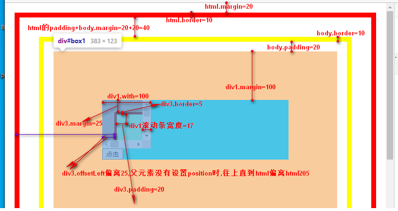
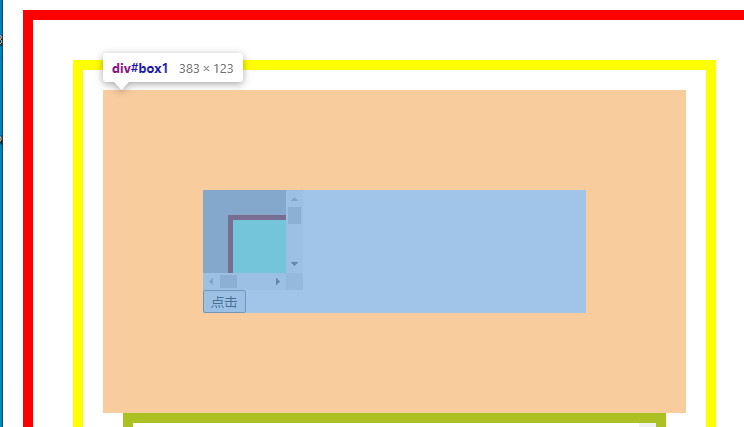
<div id="box1" style="">
<div id="box2" style="">
<div id="box3" style="">
</div>
</div>
<button type="button" id="button">點擊</button>
</div>
<script type="text/javascript">
var button=document.getElementById("button");
button.onclick=function(){
var box2=document.getElementById("box2");//100*100
var box3=document.getElementById("box3");// 400*400 +padding 20px + border 5px + margin 25px
//---------滾動條子容器常用-----------
//元素的可見寬度(元素內容區+padding)
var clientWidth=box3.clientWidth;//440
//元素的整個實際寬度(元素內容區+padding+border)
var offsetWidth=box3.offsetWidth;//450
//當前元素針對于其定位父元素的水平偏移量
var offsetLeft=box3.offsetLeft;//205
//當前元素針對于其定位父元素的垂直偏移量
var offsetTop=box3.offsetTop;//205
//元素頂部border的寬度,即border-top-width
var clientTop=box3.clientTop;//5
//---------滾動條子容器不常用-----------
var box3_scrollWidth=box3.scrollWidth;//440
var box3_scrollLeft=box3.scrollLeft;//0
var box3_scrollTop=box3.scrollTop;//0
console.log("box3.clientWidth:"+clientWidth)
console.log("box3.offsetWidth:"+offsetWidth)
console.log("box3.offsetLeft:"+offsetLeft)
console.log("box3.offsetTop:"+offsetTop)
console.log("box3.clientTop:"+clientTop)
console.log("box3.scrollWidth:"+box3_scrollWidth)
console.log("box3.scrollLeft:"+box3_scrollLeft)
console.log("box3.scrollTop:"+box3_scrollTop)
//----------滾動條容器常用----------
//元素的可見寬度(元素內容區+padding)
var box2_clientWidth=box2.clientWidth;//83設置的100 但是這里的滾動條寬度有17px
//box2元素網頁正文全文高度, 即整個滾動區域的寬度(內容區+padding):
var scrollWidth=box2.scrollWidth;//500
//水平滾動條 滾動的距離
var scrollLeft=box2.scrollLeft;//(0 ~ 417)
//垂直滾動條 滾動的距離
var scrollTop=box2.scrollTop;//(0 ~ 417)
//----------滾動條容器不常用----------
var box2_offsetWidth=box2.offsetWidth;//100
var box2_offsetLeft=box2.offsetLeft;//180
var box2_offsetTop=box2.offsetTop;//180
var box2_clientTop=box2.clientTop;//0
console.log("box2.clientWidth:"+box2_clientWidth)
console.log("box2.scrollWidth:"+scrollWidth)
console.log("box2.scrollLeft:"+scrollLeft)
console.log("box2.scrollTop:"+scrollTop)
console.log("box2.offsetWidth:"+box2_offsetWidth)
console.log("box2.offsetLeft:"+box2_offsetLeft)
console.log("box2.offsetTop:"+box2_offsetTop)
console.log("box2.clientTop:"+box2_clientTop)
if(scrollWidth-scrollLeft==box2_clientWidth){
console.log("水平滾動條滾到底了")
}
}
</script>
</body>
</html>
```
**示例3**
```
<!DOCTYPE html>
<html>
<head>
<meta http-equiv="Content-Type" content="text/html; charset=utf-8" />
<title>定位功能</title>
<script src="http://libs.baidu.com/jquery/1.9.0/jquery.js"></script>
<script src="http://libs.baidu.com/underscore/1.3.3/underscore.js"></script>
<style type="text/css">
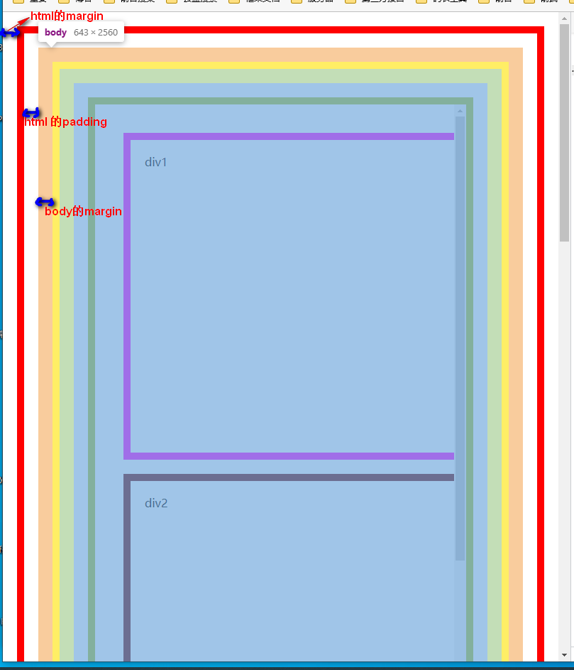
html,body{
margin: 20px;
padding: 20px;
border: 10px solid red;
height: 2500px;
width: auto;
}
body{
height: 100%;
width: auto;
border: 10px solid yellow;
}
#scroll_container{
width:auto;
height:1000px;
border:1px solid gray;
margin: 20px;
padding: 20px;
border: 10px solid #abc123;
overflow: scroll;
}
#div1{
width: 800px;
height: 400px;
margin: 20px;
padding: 20px;
border: 10px solid #f0f;
}
#div2{
width: 800px;
height: 1000px;
margin: 20px;
padding: 20px;
border: 10px solid #600;
}
</style>
</head>
<body>
<div style="" id="scroll_container">
<div id="div1">div1</div>
<div id="div2">div2</div>
</div>
</body>
</html>
<script type="text/javascript">
$(document).ready(function(){
$(window).scroll(function(e){
var scrollTop = document.documentElement.scrollTop || document.body.scrollTop;
console.log("滾動距離" + scrollTop);
})
$("#scroll_container").scroll(function(e){
console.log($("#scroll_container").scrollTop());
})
})
function a(){
document.write(
"屏幕分辨率為:"+screen.width+"*"+screen.height
+"<br />"+
"屏幕可用大小:"+screen.availWidth+"*"+screen.availHeight
+"<br />"+
"網頁可見區域寬(內容區+padding):"+document.body.clientWidth
+"<br />"+
"網頁可見區域高(內容區+padding):"+document.body.clientHeight
+"<br />"+
"網頁可見區域寬(內容區+padding+border):"+document.body.offsetWidth
+"<br />"+
"網頁可見區域高(內容區+padding+border):"+document.body.offsetHeight
+"<br />"+
"網頁正文全文寬(內容區+padding):"+document.body.scrollWidth
+"<br />"+
"網頁正文全文高(內容區+padding):"+document.body.scrollHeight
+"<br />"+
"網頁被卷去的高:"+document.body.scrollTop
+"<br />"+
"網頁被卷去的左:"+document.body.scrollLeft
+"<br />"+
"網頁正文部分上:"+window.screenTop
+"<br />"+
"網頁正文部分左:"+window.screenLeft
+"<br />"+
"屏幕分辨率的高:"+window.screen.height
+"<br />"+
"屏幕分辨率的寬:"+window.screen.width
+"<br />"+
"屏幕可用工作區高度(不含下方任務欄):"+window.screen.availHeight
+"<br />"+
"屏幕可用工作區寬度:"+window.screen.availWidth
);
};
a();
/*
屏幕分辨率為:1920*1080
屏幕可用大小:1920*1040
網頁可見區域寬(內容區+padding):623
網頁可見區域高(內容區+padding):2540
網頁可見區域寬(包括border邊線的寬):643
網頁可見區域高(包括border邊線的寬):2560
網頁正文全文寬(內容區+padding):623
網頁正文全文高(內容區+padding):2540
網頁被卷去的高:0
網頁被卷去的左:0
網頁正文部分上:6
網頁正文部分左:78
屏幕分辨率的高:1080
屏幕分辨率的寬:1920
屏幕可用工作區高度(不含下方任務欄):1040
屏幕可用工作區寬度:1920
*/
// 800 * 914
//750 * 864
// jquery:
// 高
console.log($(window).height()); //瀏覽器當前窗口可視區域高度 914
console.log($(document).height()); //瀏覽器當前窗口文檔的高度 2630
console.log($(document.body).height()); //瀏覽器當前窗口文檔body的高度 2500
console.log($(document.body).outerHeight(true)); //瀏覽器當前窗口文檔body的總高度 包括border padding margin 2600
// 寬
console.log($(window).width()); //瀏覽器當前窗口可視區域寬度 783(不包含滾動條)
console.log($(document).width()); //瀏覽器當前窗口文檔對象寬度 783
console.log($(document.body).width()); //瀏覽器當前窗口文檔body的寬度 583
console.log($(document.body).outerWidth(true)); //瀏覽器當前窗口文檔body的總寬度 包括border padding margin 683
console.log(window.screen.width );//瀏覽設備的分辨率(電腦、手機、平板等) 1920
console.log(window.screen.availWidth );//瀏覽設備的實際可用寬度(電腦、手機、平板等) 1920
console.log(window.innerWidth);//瀏覽器的可用(內部)寬度(包括滾動條等)\[ie不支持\] 800
console.log(document.documentElement.clientWidth || document.body.clientWidth);//瀏覽器實際的可用文檔寬度【兼容ie】 783
console.log($("#div2").height());//(內容區) 1000
console.log($("#div2").innerHeight());//(內容區+padding) 1040
console.log($("#div2").outerHeight());//(內容區+padding+border)1060
console.log($("#div2").offset());//匹配元素在當前視口的相對偏移 {top: 640, left: 160}
console.log($("#div2").position());//返回匹配元素相對于父元素的位置(偏移) {top: 610, left: 130}
console.log($("#div2").scrollTop());//返回或設置匹配元素的滾動條的垂直位置(匹配的元素必須設置overflow-y: scroll;) 0
console.log($("#div2").scrollLeft());//返回或設置匹配元素的滾動條的水平位置(匹配的元素必須設置overflow-y: scroll;) 0
</script>
```
## **以下是收集其他作者的總結:**
原文鏈接:http://www.cnblogs.com/lshabest/p/6429219.html
**1.對于IE9+、chrome、firefox、Opera、Safari:**
window.innerHeight瀏覽器窗口的內部高度;
window.innerWidth瀏覽器窗口的內部寬度;
**2.對于IE8.7.6.5:**
document.documentElement.clientHeight:表示HTML文檔所在窗口的當前高度;
document.documentElement.clientWidth:表示HTML文檔所在窗口的當前寬度;
或者,因為document對象的body屬性對應HTML文檔的標簽,所以也可表示為:
document.body.clientHeight:表示HTML文檔所在窗口的當前高度;
document.body.clientWidth:表示HTML文檔所在窗口的當前寬度;
**結論:**
document.body.clientWidth/Height:的寬高偏小,高甚至默認200;
document.documentElement.clientWidth/Height 和 window.innerWidth/Height 的寬高始終相等。
所以在不同瀏覽器都實用的的Javascripit方案:
**二:網頁正文全文寬高**
scrollWidth和scrollHeight獲取網頁內容高度和寬度
**1.針對IE.Opera:** scrollHeight是網頁內容實際高度,可以小于clientHeight;
**2.針對NS.firefox:** scrollHeight是網頁內容高度,不過最小值是clientHeight;也就是說網頁內容實際高度小于clientHeight的時候,scrollHeight返回clientHeight;
**3.瀏覽器兼容代碼:**
**二:網頁可見區域寬高,包括滾動條等邊線(會隨窗口的顯示大小改變)**
**1.值:**?? offsetWidth = scrollWidth + 左右滾動條 +左右邊框;
offsetHeight = scrollHeight + 上下滾動條 + 上下邊框;
**2.瀏覽器兼容代碼:**
**三:網頁卷去的距離與偏移量**
**1.scrollLeft:** 設置或獲取位于給定對象左邊界與窗口中目前可見內容的最左端之間的距離;
**2.scrollTop:** 設置或獲取位于給定對象最頂端與窗口中目前可見內容的最左端之間的距離;
**3.offsetLeft:** 設置或獲取位于給定對象相對于版面或由offsetParent屬性指定的父坐標的計算左側位置;
**4.offsetTop:** 設置或獲取位于給定對象相對于版面或由offsetParent屬性指定的父坐標的計算頂端位置;
- CSS
- 達到指定寬度加載css
- 選擇器
- CSS 函數
- @media媒體查詢
- 字體
- 圖標字體
- 文本
- 光標樣式cursor
- 盒子模型
- 溢出(overflow)
- 邊框
- 不透明度opacity
- 背景(background)與漸變xx-gradient
- 輪廓(outline)與 陰影(box-shadow)
- 過渡屬性(Transition)
- 動畫屬性(Animation)
- transform變形效果旋轉,縮放,移動,傾斜等
- 顯示、隱藏與禁用
- box-sizing與resize
- 居中對齊
- css水平居中
- css垂直居中
- 文字與相鄰的元素垂直對齊
- 布局
- 高度塌陷和外邊距重疊最終解決方案
- 解決float布局時高度塌陷的最終方案after偽類元素
- 子/父元素外邊距重疊最終解決方案before偽類元素
- 傳統布局
- position布局
- position水平居中
- position垂直居中
- position水平垂直居中
- 浮動布局
- 高度塌陷和BFC
- clear
- BFC概念及觸發條件
- 表格布局
- 盒子模型布局
- 盒子水平居中布局(如margin:0 auto)
- 盒子垂直居中布局
- 相鄰元素外邊距重疊
- 行內元素的盒子模型
- 彈性伸縮布局flex
- 舊版本(IE不支持)
- 混合過渡版(僅IE10+生效)
- flex布局(新版)
- 多列布局columns
- grid網格布局(實驗性)
- 應用與總結
- 瀑布流布局
- 流式布局(響應式布局又叫百分比布局移動端一般采用)
- 用戶不能鼠標左鍵選擇文本
- 表格
- 表單
- radio
- textarea
- select
- a連接
- ul>li有序列表與ol>li無序列表
- 偽元素
- 容器寬高100%
- 瀏覽器四大內核及前綴
- 移動端開發
- 長度單位與移動端
- css_移動端開發
- rem具體解決方案
- vw具體解決方案
- 兼容性問題
- 瀏覽器默認樣式
- css預處理器
- less
- sass
- stylus
- HTML
- 標簽元素
- head的子標簽
- 文檔元素
- 文本元素
- 嵌入元素
- 分組元素
- 表格元素
- 表單元素
- input
- 標簽元素的屬性
- 全局屬性
- aria-*
- 事件on*
- data-*
- id
- class
- hidden
- style
- title
- draggable
- dropzone(實驗性)
- dir
- autocapitalize
- contenteditable
- lang
- inputmode
- accesskey
- contextmenu(移除)
- exportparts(實驗性)
- is
- itemid
- itemprop
- itemref
- itemscope
- itemtype
- XHTML遺留xml:lang和xml:base
- part(實驗性)
- slot
- spellcheck(實驗性)
- tabindex
- translate
- HTML字符實體
- 行內元素
- iframe和父頁面相互傳值,并兼容跨域問題
- a標簽嵌套解決方案
- JS
- 獲取寬度(offsetParent、clientWidth、clientHeight、offsetWidth、offsetheight、scrollWidth、scrollHeight、offsetTop、offsetLeft、scrollTop、scrollLeft)
- demo
- 全選和反選
- 定時器:
- 哪些HTML元素可以獲得焦點?
- 事件例子
- 鼠標事件
- 注冊條款
- 獲取鼠標坐標
- div跟隨鼠標移動
- 拖拽01
- 鼠標滾動事件
- 鍵盤事件
- 檢查標簽是否含有某個類
- 輪播圖
- 數組的 交集 差集 補集 并集
- 精確計算插件
- 搖獎機
- 移動端跳轉
- 基礎
- js的數據類型
- 基本類型聲明
- 引用類型聲明及用法
- 數組
- 函數
- 對象及函數原型對象
- 繼承
- js的垃圾回收機制
- javascript擴展自定義方法
- 類型轉換
- 作用域(執行上下文)及遞歸調用
- javascript事件
- 連續調用
- 排序
- 內存溢出與內存泄漏
- 系統對象
- 內置對象
- 值屬性
- Infinity
- NaN
- undefined
- globalThis
- Function 屬性
- eval()
- isFinite()
- isNaN()
- parseFloat()
- parseInt()
- decodeURI()
- decodeURIComponent()
- encodeURI()
- encodeURIComponent()
- 基本對象(Object,Function,Boolean,Symbol)
- Object
- defineProperty()
- Function
- Boolean
- Symbol
- 數字和日期對象
- Number
- Date
- BigInt
- Math
- 控制抽象化
- AsyncFunction
- Generator
- GeneratorFunction
- Promise
- Web組裝
- WebAssembly
- 結構化數據(JSON等)
- ArrayBuffer
- Atomics
- DataView
- JSON
- SharedArrayBuffer
- 使用鍵的集合對象
- Map
- Set
- WeakMap
- WeakSet
- 反射
- Reflect
- Proxy
- 可索引的集合對象(數組在這)
- Array數組
- BigInt64Array
- BigUint64Array
- Float32Array
- Float64Array
- Int16Array
- Int32Array
- Int8Array
- Uint8ClampedArray
- Uint8Array
- Uint16Array
- Uint32Array
- 國際化
- Intl
- Intl.Collator
- 文本處理(字符串與正則)
- RegExp
- String
- 錯誤對象
- Error
- InternalError
- AggregateError 實驗性
- EvalError
- RangeError
- ReferenceError
- SyntaxError
- URIError
- TypeError
- null
- TypedArray
- escape()移除但還兼容
- unescape()移除但還生效
- uneval()非標準
- arguments
- 宿主對象(DOM與Browser)
- Browser瀏覽器對象(BOM)
- Window 對象
- History 對象
- Location 對象
- Navigator 對象
- Screen 對象
- 存儲對象(localStorage與sessionStorage)
- DOM 節點對象
- EventTarget
- Node節點對象
- Document文檔節點
- HTMLDocument(HTML對象 )
- HTML 元素接口
- Element元素節點
- Attr屬性對象(與NamedNodeMap )
- DocumentType
- DocumentFragment文檔片段節點
- CharacterData
- Comment
- Text
- CDATASection
- 事件對象Event
- on-event處理器
- CustomEvent
- MouseEvent
- DragEvent
- 手勢(TouchEvent觸摸事件)
- 其他類型事件對象...
- CSSStyleDeclaration 對象
- HTMLCollection
- console對象
- MutationObserver
- 其他重要的對象(FormData與原生Ajax)
- FormData表單對象
- ajax XMLHttpRequest
- 表達式和運算符
- 算術運算符
- 賦值運算符
- 按位操作符
- 逗號操作符
- 比較操作符
- 條件運算符
- 解構賦值
- 函數表達式
- 圓括號運算符
- 邏輯運算符
- Nullish 合并操作符
- 對象初始化
- 運算符優先級
- 可選鏈
- 管道操作符 實驗性
- 屬性訪問器
- 展開語法
- 異步函數表達式
- await
- 類表達式
- delete 操作符
- function* 表達式
- in
- instanceof
- new 運算符
- new.target
- super
- this
- typeof
- void 運算符
- yield
- yield*
- 語句和聲明
- export
- default
- 控制流
- block
- break
- continue
- empty
- if...else
- switch
- throw
- try...catch
- 聲明
- const
- let
- var 描述
- 函數和類
- async function
- class
- function
- function*
- return
- 迭代
- do...while
- for
- for await...of
- for...in
- for...of
- while
- 其他
- debugger
- label
- with 移除但生效
- import
- import.meta
- 函數
- 箭頭函數
- 默認參數值
- 方法的定義
- 剩余參數
- Arguments 對象
- getter
- setter
- 類
- 類私有域
- 類元素
- 構造方法
- extends
- static
- Errors
- 更多
- 已廢棄的特性
- JavaScript 數據結構
- 詞法文法
- 屬性的可枚舉性和所有權
- 迭代協議
- 嚴格模式
- 切換到嚴格模式
- 模板字符串
- ES6(ES2015)
- Es6函數寫法
- 類class
- 導入導出模塊
- 兼容ES5
- 變量聲明
- Symbol新數據類型
- 迭代器(自定義遍歷數組)
- 生成器
- Promise異步編程
- set(集合)
- Map
- 數組新增4個方法
- 手機端事件
- bootstrap手冊
- 代碼壓縮打包
- Webpack
- 五個核心概念
- 開始
- loader
- 插件
- webpack開發環境配置
- 打包含css文件的項目
- 打包html資源
- 打包圖片資源
- 打包其他文件
- devServer(實時自動化打包)
- 總結:開發環境配置
- webpack生產環境配置
- 提取css成單獨文件
- css兼容性處理
- 壓縮css
- js語法檢查
- js兼容性處理
- js壓縮
- html壓縮
- 總結:生產環境配置
- webpack優化環境配置
- HMR( 模塊熱替換)
- source-map
- oneOf
- 緩存
- tree shaking
- code split
- demo1
- demo2
- demo3
- lazy loading
- pwa
- 多進程打包
- externals
- dll
- webpack配置詳解
- entry
- output
- module
- resolve
- dev server
- optimization
- vite
- 技能
- 前端學習路線
- 調試
- 多個版本IE瀏覽器(調試用)
- 手機端調試
- vueJS
- Element UI(一個vuejs組件)
- 瀏覽器插件開發
- 插件推薦
- 擴展文件manifest.json
- 不可視的background(常駐)頁面
- 可視頁面browser actions與page actions及八種展示方式
- 使用chrome.xxx API
- Google Chrome擴展與Web頁面/服務器之間的交互
- Google Chrome擴展中的頁面之間的數據通信
- inject-script
- chromeAPI
- pageAction
- alarms
- chrome.tabs
- chrome.runtime
- chrome.webRequest
- chrome.window
- chrome.storage
- chrome.contextMenus
- chrome.devtools
- chrome.extension
- 分類
- homepage_url 開發者或者插件主頁
- 5種類型的JS對比及消息通信
- 其它補充
- 谷歌瀏覽器截屏
- 框架及工具
- 前端UI設計網站
- 網頁中使用Unicode字符