
[TOC]
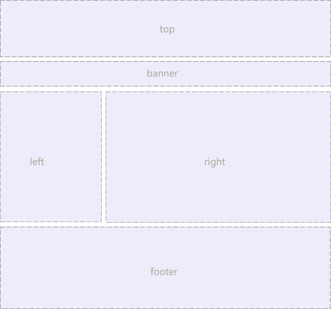
## 1. 一列固定寬度且居中

代碼如下:
**`html\12 一列固定寬度且居中(頁面布局).html`**
```html
<!DOCTYPE html>
<html lang="en">
<head>
<meta charset="UTF-8">
<title>Document</title>
<style>
.box {
width: 900px;
background-color: #eee;
border: 1px dashed #ccc;
margin: 0 auto;
}
.top {
height: 80px;
}
.banner {
height: 120px;
/*margin: 0 auto;*/
margin: 5px auto;
}
.main {
height: 500px;
}
.footer {
height: 100px;
/*margin: 0 auto;
margin-top:5px;*/
margin: 5px auto 0;
}
</style>
</head>
<body>
<div class="top box">top</div>
<div class="banner box">banner</div>
<div class="main box"></div>
<div class="footer box"></div>
</body>
</html>
```
<br/>
## 2. 兩列左窄右寬型
代碼如下:
**`html\12 左右型結構(頁面布局).html`**
```html
<!DOCTYPE html>
<html lang="en">
<head>
<meta charset="UTF-8">
<title>Document</title>
<style>
.top {
width: 900px;
height: 80px;
background-color: pink;
margin: 0 auto;
}
.banner {
width: 900px;
height: 150px;
background-color: purple;
margin: 0 auto;
}
.main {
width: 900px;
height: 500px;
background-color: skyblue;
margin: 0 auto;
}
.left {
width: 288px;
height: 500px;
background-color: yellow;
float: left;
border: 1px solid red;
}
.right {
width: 600px;
height: 500px;
background-color: deeppink;
float: right;
}
.footer {
width: 900px;
height: 120px;
background-color: black;
margin: 0 auto;
}
</style>
</head>
<body>
<div class="top"></div>
<div class="banner"></div>
<div class="main">
<div class="left">left</div>
<div class="right">right</div>
</div>
<div class="footer"></div>
</body>
</html>
```
<br/>
## 3. 通欄平均分布型
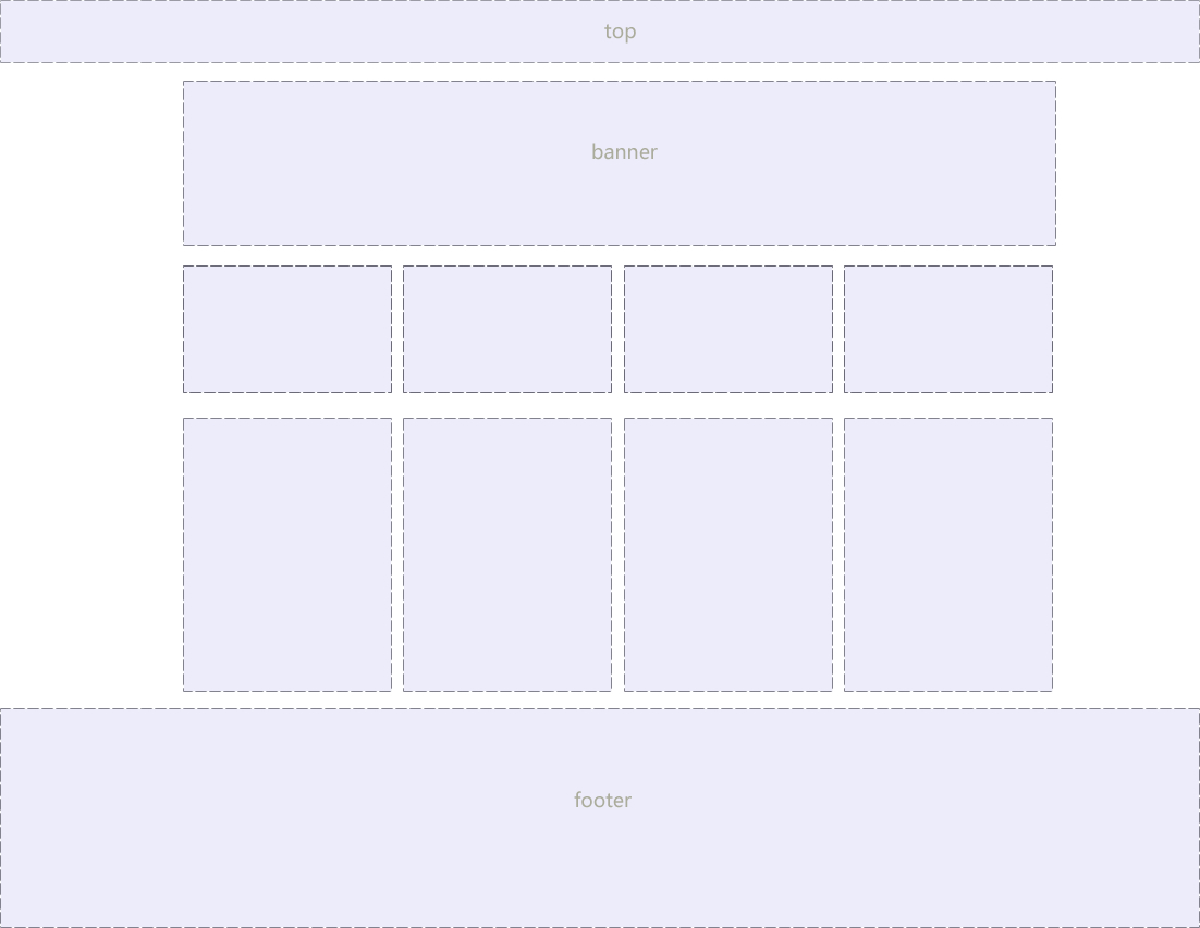
代碼如下:
**`html\12 通欄結構(頁面布局).html`**
```html
<!DOCTYPE html>
<html lang="en">
<head>
<meta charset="UTF-8">
<title>Document</title>
<style>
* {
margin: 0;
padding: 0;
}
.top {
height: 80px;
background-color: pink;
}
.top-inner {
width: 900px;
height: 80px;
background-color: #ababab;
margin: 0 auto;
}
.banner {
width: 900px;
height: 150px;
/*background-color: purple;*/
margin: 0 auto;
}
.banner li {
float: left;
width: 217px;
height: 150px;
margin-right: 10px;
}
.one {
background-color: purple;
}
.two {
background-color: blue;
}
.three {
background-color: red;
}
.banner .four {
background-color: green;
margin-right: 0;
float: right;
}
.main {
width: 900px;
height: 500px;
background-color: skyblue;
margin: 0 auto;
}
.left {
width: 288px;
height: 500px;
background-color: yellow;
float: left;
border: 1px solid red;
}
.right {
width: 600px;
height: 500px;
background-color: deeppink;
float: right;
}
.footer {
width: 900px;
height: 120px;
background-color: black;
margin: 0 auto;
}
</style>
</head>
<body>
<div class="top">
<!--<div class="top-inner">123</div>-->
</div>
<div class="banner">
<ul>
<li class="one">1</li>
<li class="two">2</li>
<li class="three">3</li>
<li class="four">4</li>
</ul>
</div>
<div class="main">
<div class="left">left</div>
<div class="right">right</div>
</div>
<div class="footer"></div>
</body>
</html>
```
- 0 學前必讀
- CSS是什么?
- 如何引用CSS
- 內聯樣式表
- 行內式
- 外部樣式表
- 三種引用方式的比較
- CSS語法規范
- 選擇器
- 基礎選擇器
- 復合選擇器
- CSS注釋
- 字體樣式font屬性
- 標簽顯示模式display屬性
- 塊級元素
- 行內元素
- 行內塊元素
- 三種顯示模式的轉換
- 行高line-height屬性
- CSS三大特性
- 背景background屬性
- 盒子模型
- 邊框border
- 內邊距padding
- 外邊距margin
- 外邊距的合并
- content的高度和寬度
- 盒子模型布局的穩定性
- 圓角邊框border-radius
- 盒子陰影box-shadow
- 浮動float
- 普通流
- 浮動float
- 版心和布局
- 布局流程
- 常見布局方式
- 清除浮動
- 定位postion
- 定位屬性
- 疊放次序z-index
- 元素的顯示與隱藏
- 用戶界面樣式
- 溢出的文字隱藏
- CSS精靈技術
- 什么是精靈技術?
- 精靈技術的使用
- 滑動門
- web字體
- 字體圖標
- icon圖標
- BFC
- 優雅降級和漸進增強
- HTML5新增的元素和特性
- CSS3盒模型
- 過渡、變形、動畫
- 彈性布局
- 對齊
- 網站優化三大標簽