
## 20.7.1.基本概念和語法
動畫效果其實可以看著過渡效果的升華版:
過渡效果是實現元素在某個(或某些)屬性的兩個不同值之間的狀態變化效果;
動畫效果是預先定義好某個(或某些)屬性的多個不同值之間的狀態變化效果,并對之命名,而后可多次應用在不同的元素上。
簡單說就是:
過渡效果是“實現某元素的某種狀態變化效果”,
動畫效果是“定義某種狀態變化效果,并可拿來用”。
動畫效果的基本語法如下:
```
<style>
@keyframes 動畫名{
0% {屬性設置。。。} /*表示動畫的起始處/*
...... {屬性設置。。。} /*這表示還可以設置中間的若干狀態*/
100% {屬性設置。。。} /*表示動畫的結束處/*
}
選擇器{
animation:動畫名 動畫播放設置; /*動畫播放設置有若干項控制項*/
}
</style>
```
說明:
1,可以設置(定義)若干個動畫(取不同名稱),后續都可以用在不同的元素上(選擇器所決定);
2,每個動畫可以定義若干個關鍵狀態(百分比決定),通常至少需要0%和100%;
3,每個狀態可以定義若干個屬性值,表示動畫播放到該時刻時的元素外觀表現;
4,屬性的設置跟通常css的屬性設置一樣,比如:color:red; width:200px; transform:rotate(90deg);
5,動畫播放設置中可以設置若干項,比如:持續時間,播放方式,延遲時間,是否循環,等等;
## 20.7.2.主要屬性
* animation-name:動畫名;
* animation-duration:動畫持續時間;
* animation-timing-function:動畫播放播放方式(效果),也有如下幾個常用的效果名:
linear:線性過渡,就是勻速進行
ease:平滑過渡,這是默認值
ease-in:由慢到快。
ease-out:由快到慢。
ease-in-out:由慢到快再到慢。
* animation-delay:動畫播放前的延遲時間;
* animation-iteration-count:動畫播放循環次數,使用數字或infinite(無限);
* animation-direction:動畫播放方向(正向還是反向),可用的值有:
normal:常規(就是從前往后播放)
reverse:反向(就是從后往前播放)
alternate:交替(就是先從前往后,再從后往前),播放次數大于1次才有意義
alternate-reverse:反向交替(就是先從后往前,再從前往后),播放次數大于1次才有意義
* animation-fill-mode:動畫停止(播放結束)時元素停留的狀態,可用的值有:
forwards: 停留在前面(動畫播放的結尾處);
backwards: 停留在后面(動畫播放的開時處);
both: 兩邊都可停(動畫停在哪邊就哪邊);
* animation-play-state:設置動畫啟動或暫停,有兩個可用的值:
running: 運行狀態(默認值),也就是運行動畫效果;
paused: 暫停狀態,也就是動畫效果運行中停下來(此時如果需要還可以繼續運行);
* animation:上述屬性的綜合屬性,并依次按該順序列出(不需要的項直接省略);
舉例1:
```
@keyframes ani1{
0%{ background:red; transform:rotate(0deg);}
100%{ background:blue; transform:rotate(360deg);}
}
.c1{
animation-name: ani1;
animation-duration: 3s;
animation-timing-function: ease-in-out;
animation-iteration-count:infinite;
}
```
舉例2:
```
(本例跟上面例1的效果一樣,無非是用了綜合屬性animation)
$keyframes ani1{
0%{ background:red; transform:rotate(0deg);}
100%{ background:blue; transform:rotate(360deg);}
}
.c1{
animation: ani1 3s ease-in-out infinite;
}
```
代碼示例:
演示animation-direction,和animation-fill-mode:
```
<style>
@keyframes moveLeft2Right{
0%{
left:0px;
}
100%{
left:800px;
}
}
div{
border:solid 1px red;
width: 100px;
height:50px;
margin:5px;
position:relative;
left:0px;
animation-name:moveLeft2Right;
animation-timing-function:linear;
animation-duration: 5s;
animation-iteration-count:3;
}
.box1{
animation-direction: normal;
animation-fill-mode: forwards;
}
.box1:hover{
animation-play-state:paused;
}
.box2{
animation-direction: reverse;
animation-fill-mode: backwards;
}
.box3{
animation-direction: alternate;
animation-fill-mode: both;
}
.box4{
animation-direction: alternate-reverse;
animation-fill-mode: both;
}
</style>
</head>
<body>
<div class="box1">normal, forwards</div>
<div class="box2">reverse, backwards</div>
<div class="box3">alternate, both</div>
<div class="box4">alternate-reverse, both</div>
</body>
```
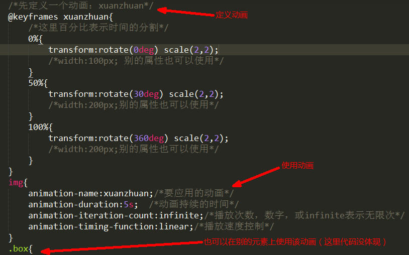
## 20.7.3.案例
### 連續播放效果的代碼:
```
<style>
@keyframes xuanzhuan{
0%{
transform:rotatex(-15deg) rotatey(0deg);
}
100%{
transform:rotatex(-15deg) rotatey(360deg);
}
}
.box{
border:solid 0px red;
width:960px;
margin:50px auto 10px;
perspective: 1200px;
perspective-origin: center center;
}
.box>.container{
border:solid 0px blue;
width:200px;
height:300px;
position: relative;
left:50%;
margin-left:-100px;
transform-style:preserve-3d;
transform:rotatex(-15deg);
animation-name: xuanzhuan;
animation-duration: 6s;
animation-timing-function: linear;
animation-iteration-count: infinite;
}
.box>.container:hover{
animation-play-state: paused;
}
.box>.container>img{
width:200px;
height:300px;
position: absolute;
left:0;
top:0;
transform-origin: center center;
}
.box>.container>img:nth-child(1){transform: rotatey(0deg) translatez(300px)}
.box>.container>img:nth-child(2){transform: rotatey(40deg) translatez(300px)}
.box>.container>img:nth-child(3){transform: rotatey(80deg) translatez(300px)}
.box>.container>img:nth-child(4){transform: rotatey(120deg) translatez(300px)}
.box>.container>img:nth-child(5){transform: rotatey(160deg) translatez(300px)}
.box>.container>img:nth-child(6){transform: rotatey(200deg) translatez(300px)}
.box>.container>img:nth-child(7){transform: rotatey(240deg) translatez(300px)}
.box>.container>img:nth-child(8){transform: rotatey(280deg) translatez(300px)}
.box>.container>img:nth-child(9){transform: rotatey(320deg) translatez(300px)}
</style>
</head>
<body>
<div class="box" title="場景,舞臺">
<div class="container" title="容器">
<img src="images/girl1.jpg" alt="">
<img src="images/girl2.jpg" alt="">
<img src="images/girl3.jpg" alt="">
<img src="images/girl4.jpg" alt="">
<img src="images/girl5.jpg" alt="">
<img src="images/girl6.jpg" alt="">
<img src="images/girl7.jpg" alt="">
<img src="images/girl8.jpg" alt="">
<img src="images/girl9.jpg" alt="">
</div>
</div>
</body>
```
### 一走一停播放效果的關鍵代碼:
```
@keyframes xuanzhuan{
0%{transform:rotatex(-15deg) rotatey(0deg);}
/*表示從0%時間到2%時間,旋轉從0到40deg,下同*/
2%{transform:rotatex(-15deg) rotatey(40deg);}
/*表示從2%時間到11%時間,旋轉不變,即不旋轉,下同*/
11%{transform:rotatex(-15deg) rotatey(40deg);}
13%{transform:rotatex(-15deg) rotatey(80deg);}
22%{transform:rotatex(-15deg) rotatey(80deg);}
24%{transform:rotatex(-15deg) rotatey(120deg);}
33%{transform:rotatex(-15deg) rotatey(120deg);}
35%{transform:rotatex(-15deg) rotatey(160deg);}
44%{transform:rotatex(-15deg) rotatey(160deg);}
46%{transform:rotatex(-15deg) rotatey(200deg);}
55%{transform:rotatex(-15deg) rotatey(200deg);}
57%{transform:rotatex(-15deg) rotatey(240deg);}
66%{transform:rotatex(-15deg) rotatey(240deg);}
68%{transform:rotatex(-15deg) rotatey(280deg);}
77%{transform:rotatex(-15deg) rotatey(280deg);}
79%{transform:rotatex(-15deg) rotatey(320deg);}
88%{transform:rotatex(-15deg) rotatey(320deg);}
90%{transform:rotatex(-15deg) rotatey(360deg);}
99%{transform:rotatex(-15deg) rotatey(360deg);}
}
```
### 補充案例1:
```
<style>
ul{
margin:0 auto;
padding:8px 0 0;
height:42px;
background: url(images/滑動門bg1.png) repeat-x;
}
ul>li{
list-style: none;
float:left;
height:50px;
padding:0 10px;
}
ul>li>a{
line-height: 33px;
height:33px;
display: inline-block;
color:white;
padding-left:15px;
background: url(images/滑動門bg2.png) left -48px no-repeat;
}
ul>li>a:hover{
background-position: left top;
}
ul>li>a>span{
line-height: 33px;
display: inline-block;
height:33px;
padding-right:15px;
background: url(images/滑動門bg2.png) right -48px no-repeat;
}
ul>li>a:hover>span{
background-position: right top;
}
</style>
</head>
<body>
<ul>
<li><a href=""><span>首頁</span></a></li>
<li><a href=""><span> 三個字</span></a></li>
<li><a href=""><span>在線詞典</span></a></li>
<li><a href=""><span>五個字標題</span></a></li>
</ul>
```
### 補充案例2(滑動門):
```
<style>
.nav{
display:flex;
}
.nav>a{
display: inline-block;
height:35px;
padding-left:7px;
background: url(images/bg_r1_c1.png) left top no-repeat;
}
.nav>a:hover{
background-image: url(images/blue_r1_c1.png);
}
.nav>a>span{
display: inline-block;
height:35px;
line-height: 35px;
padding-right:25px;
background: url(images/bg_r1_c2.png) right top no-repeat;
}
.nav>a:hover>span{
background-image: url(images/blue_r1_c2.png);
}
</style>
</head>
<body>
<div class="nav">
<a href=""><span>首頁</span></a>
<a href=""><span>三個字</span></a>
<a href=""><span>四字標題</span></a>
<a href=""><span>五個字標題</span></a>
</div>
```
### 補充案例3(手風琴效果):
```
<meta charset="UTF-8">
<title>Document</title>
<style>
.box{
display: flex;
border:solid 1px red;
width:600px;
margin:0 auto;
}
.box>div{
/*下一行表示,如果容器盒子放下子盒子的設置寬度還有剩余,就去按該比例“分配”
這里,因為所有div都是1,所以就是均分剩余空隙*/
flex:1;
height:240px;
width:100px;
margin:1px;
border:solid 1px blue;
transition:flex 1s, background 1s;
}
.box>div:hover{
flex:1.5;
background: yellow;
}
</style>
</head>
<body>
<div class="box">
<div>內容1內容1內容1內容1內容1內容1內容1內容1內容1內容1內容1內容1內容1內容1內容1內容1內容1</div>
<div>內容2內容2內容2內容2內容2內容2內容2內容2內容2內容2</div>
<div>內容3內容3內容3內容3內容3內容3內容3內容3內容3內容3內容3內容3內容3內容3內容3內容3內容3內容3內容3內容3內容3</div>
<div>內容4內容4內容4內容4內容4內容4</div>
<div>內容5內容5內容5內容5內容5內容5內容5內容5內容5內容5內容5內容5內容5內容5內容5內容5內容5內容5內容5內容5內容5內容5</div>
</div>
</body>
```
- 1、相關介紹
- 1.1.關于全棧學科
- 1.2.全棧工程師與全棧開發
- 1.3.基本技能
- 1.4.學習方法
- 2、html初步
- 2.1.什么是網頁和網站
- 2.2.網頁瀏覽原理
- 2.3.什么是html
- 2.4.html基本知識
- 2.5.綜合案例
- 3、html結構標簽
- 3.1.文檔級結構標簽
- 3.2.內容級結構標簽
- 3.3.塊標簽和行內標簽
- 4、html文本標簽
- 5、html列表標簽
- 5.1.無序列表ul>li
- 5.2.有序列表ol>li
- 5.3.定義列表dl>dt,dd
- 6、html圖像標簽
- 6.1.網頁路徑問題
- 7、html鏈接標簽
- 7.1.超鏈接
- 7.2.錨鏈接
- 7.3.link標簽
- 8、html表格標簽
- 8.1.表格初步
- 8.2.表格高級
- 8.3.表格案例
- 9、html表單標簽
- 9.1.表單初步
- 9.2.表單標簽詳解
- 9.3.表單和表格綜合案例
- 10、html5新增標簽與屬性
- 10.1.一些新增標簽
- 10.2.一些新增input類型
- 10.3.一些新增屬性
- 11、其他零碎及相關知識
- 11.1.meta標簽(元信息標簽)
- 11.2.網頁的字符編碼問題
- 11.3.特殊字符——字符實體
- 11.4.文檔類型(了解)
- 11.5.內嵌框架標簽iframe(了解)
- 12、CSS的引入
- 12.1.CSS引入
- 12.2.什么是css?
- 12.3.為什么需要css?
- 13、css入門
- 13.1.css樣式分類(根據css代碼位置分)
- 13.2.css基本語法
- 13.3.css簡單的選擇器
- 13.4.css屬性
- 13.5.css入門綜合案例
- 14、選擇器詳解
- 14.1.選擇器綜述
- 14.2.基礎選擇器
- 14.3.關系選擇器
- 14.4.屬性選擇器
- 14.5.偽類選擇器
- 14.6.偽元素選擇器
- 14.7.常見選擇器的組合
- 14.8.css樣式的特性
- 15、有關文字的屬性
- 15.1.字體屬性
- 15.2.文本屬性
- 16、有關盒子的屬性
- 16.1.盒子概述
- 16.2.盒子的寬高屬性width和height
- 16.3.邊框屬性border
- 16.4.內邊距屬性padding
- 16.5.外邊距屬性margin
- 16.6.背景屬性background
- 16.7.輪廓屬性outline
- 16.8.盒子綜合案例
- 17、有關布局的屬性
- 17.1.布局屬性
- 17.2.頁面布局應用
- 18、定位屬性
- 19、列表與表格樣式
- 19.1.列表樣式
- 19.2.表格樣式
- 20、CSS3高級特性
- 20.1.盒子新特性
- 20.2.多欄布局column
- 20.3.彈性布局flex
- 20.4.2D變換transform(2D)
- 20.5.3D變換transform(3D)
- 20.6.過渡效果transition
- 20.7.動畫效果animation
- 21、零碎或補遺或經驗
- 21.1.光標形狀設置cursor
- 21.2.盒子縮放zoom
- 21.3.文字陰影text-shadow
- 21.4.文字溢出text-overflow
- 21.5.盒子模型box-sizing
- 21.6.css初始化
- 21.7.css精靈技術
- 21.8.自定義字體