
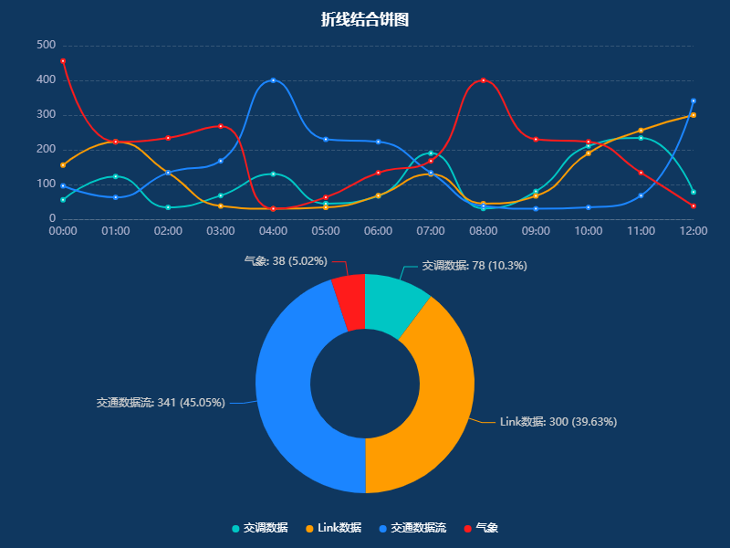
>#### 折線結合餅圖
~~~
option = {
color: ['#00c6c4', '#ff9c00', '#1b85FF', '#ff1b1b', '#7a32ff'],
backgroundColor: "#0f375f",
title: [{
text: '折線結合餅圖',
left: 'center',
top: '10',
textStyle: {
fontSize: 16,
fontWeight: 'bolder',
color: '#fff',
padding: [10, 0]
}
}],
toolbox: {
feature: {
saveAsImage: {}
}
},
tooltip: {
//提示框組件
backgroundColor: 'rgba(73, 84, 123, .9)',
borderColor: 'rgba(73, 84, 123, .9)',
padding: 10,
textStyle: {
color: '#fff',
},
formatter: function (params, ticket, callback) {
if (!Array.isArray(params)) {
// 非數組,是一個對象
// 單個圖表為餅圖數據
const {
data,
name,
marker,
percent,
dimensionNames
} = params;
let index = params.encode.value[0];
return name + '<br />' + marker + ' ' + dimensionNames[index] + ':' + data[index] +
`(${percent}%)`;
}
let showHtm = ``;
for (let i = 0; i < params.length; i++) {
const {
data,
marker,
seriesName
} = params[i];
let value = data[params[i].encode.y[0]];
showHtm += marker + ' ' + seriesName + ':' + value + '<br>';
}
showHtm = params[0].axisValue + '<br>' + showHtm;
return showHtm;
},
},
legend: {
//圖例組件
x: 'center',
bottom: '10',
right: '200',
itemGap: 20,
itemWidth: 8,
itemHeight: 8,
icon: 'circle',
textStyle: {
color: '#fff', //字體顏色
},
tooltip: {
show: true,
}
},
grid: [{
left: '40',
top: '50',
bottom: '10',
height: 210,
width: '90%',
containLabel: true,
tooltip: {
trigger: 'axis',
},
},
{
top: '300',
bottom: '10',
height: 210,
width: '90%',
containLabel: true,
tooltip: {
trigger: 'item',
formatter: 'hello',
},
},
],
xAxis: {
//X軸
type: 'category',
boundaryGap: false,
axisLabel: {
//坐標軸刻度標簽
textStyle: {
color: '#ABB0CC',
},
},
axisLine: {
//x軸
show: true,
lineStyle: {
color: 'rgba(230, 230, 230, 0.18)',
},
},
axisTick: {
//x軸刻度線
show: false,
},
},
yAxis: {
type: 'value',
axisLabel: {
textStyle: {
color: '#ABB0CC',
},
formatter: '{value}',
},
nameTextStyle: {
color: '#93A6BB',
},
splitLine: {
//網格線
show: true,
lineStyle: {
type: 'dashed',
color: 'rgba(230, 230, 230, 0.18)',
},
},
axisLine: {
//y軸
show: false,
lineStyle: {
color: '#ABB0CC',
},
},
axisTick: {
//y軸刻度線
show: false,
},
},
dataset: {
sourceHeader: true,
source: [
[
'metrics',
'00:00',
'01:00',
'02:00',
'03:00',
'04:00',
'05:00',
'06:00',
'07:00',
'08:00',
'09:00',
'10:00',
'11:00',
'12:00',
],
['交調數據', 56, 123, 34, 68, 130, 45, 67, 190, 31, 80, 211, 234, 78],
['Link數據', 156, 223, 134, 38, 30, 34, 68, 130, 45, 67, 190, 256, 300],
['交通數據流', 96, 63, 134, 168, 400, 230, 223, 134, 38, 30, 34, 68, 341],
['氣象', 456, 223, 234, 268, 30, 63, 134, 168, 400, 230, 223, 134, 38],
],
},
series: [{
name: '交調數據',
type: 'line',
smooth: true,
seriesLayoutBy: 'row',
},
{
name: 'Link數據',
type: 'line',
smooth: true,
seriesLayoutBy: 'row',
},
{
name: '交通數據流',
type: 'line',
smooth: true,
seriesLayoutBy: 'row',
},
{
name: '氣象',
type: 'line',
smooth: true,
seriesLayoutBy: 'row',
},
{
type: 'pie',
id: 'pie-chart',
radius: ['20%', '40%'],
center: ['50%', '70%'],
label: {
show: true,
formatter: '{b}\n {@00:00} ({d})',
},
labelLine: {
show: true,
},
encode: {
itemName: 'metrics',
value: '00:00',
},
},
],
};
myChart.on('updateAxisPointer', function (event) {
var xAxisInfo = event.axesInfo[0];
if (xAxisInfo) {
var dimension = xAxisInfo.value + 1;
myChart.setOption({
series: {
id: 'pie-chart',
encode: {
value: dimension,
tooltip: dimension,
},
label: {
formatter: '{b}: {@[' + dimension + ']} ({d}%)',
},
},
});
}
});
~~~
>#### 效果圖
<hr>
- html
- 頭部標簽
- canvas
- md
- DOM
- git常用命令
- css
- 網站
- 默認
- 前綴
- 文本
- 圖片
- 選擇器
- 滾動條
- 強制橫屏
- 響應式
- 動畫
- animation(動畫)
- transition(過渡)
- transform(變形)
- translate(移動)
- 漸變
- 鼠標
- 自定義 Web 字體
- 可視化
- echarts
- 折線圖
- 區域顏色標識
- 分段顯示不同顏色
- 柱狀圖
- 子彈圖
- 分組、柱體寬度、指示器寬度
- 圓角
- 頂部顯示文字
- 雙軸柱狀折線圖
- 雙軸雙列柱狀圖
- 單個柱狀圖
- 多縱向坐標
- 走勢圖
- 橫向百分比
- 最大值和最小值
- 餅圖
- 嵌套
- 分組顯示
- 餅圖結合柱狀圖
- 折線結合餅圖
- 關系圖
- 樹圖
- 地圖
- 標點
- 選中
- 常用
- 圖片超出可拖拽
- 百度導航
- 短信驗證碼倒計時
- video
- TS
- 未整理
- 消失的邊界線問題
- 跟隨
- js
- 兼容
- 數組去重
- 解析 URL 參數為對象
- 圖片懶加載
- 正則
- Photoshop
- 快捷鍵
- 混合模式
- vscode
- vue
- 指令