
# 3. 單元格尺寸常用單位
[toc]
## 3.1 單位
| 序號 | 單位 | 描述 |
| ---- | --------------------- | ---------------------------------- |
| 1 | 固定寬度`px` | 固定大小 |
| 2 | 百分比`%` | 以容器大小為依據來計算 |
| 3 | 自動計算`auto` | 由瀏覽器決定長度 |
| 4 | 比例`fr` | 將容器空間按比例分配給每一個單元格 |
| 5 | 區間`minmax(min,max)` | 設置單元格尺寸變化范圍 |
---
## 3.2 重復生成單元格
| 序號 | 函數 | 描述 |
| ---- | ------------------- | --------------------------------------------------------- |
| 1 | 重復生成`repeat()` | 快速生成相同大小單元格的 |
| 2 | 自動填充`auto-fill` | 單元格固定,但容器不確定時,可以讓一行/列容納盡可能多的項目 |
---
## 3.3 示例
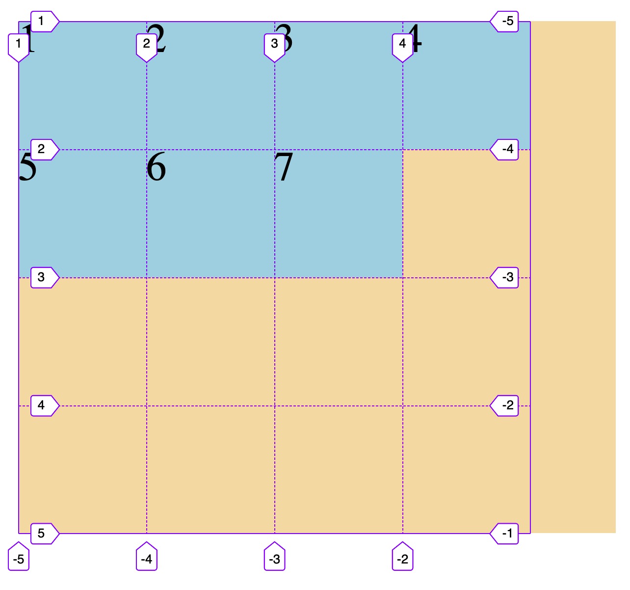
```html
<!DOCTYPE html>
<html lang="en">
<head>
<meta charset="UTF-8" />
<meta name="viewport" content="width=device-width, initial-scale=1.0" />
<title>設置單元格數量與尺寸</title>
<style>
.container {
width: 400px;
height: 400px;
background-color: wheat;
display: grid;
/* 1. 固定值
/* 固定三列三行 */
grid-template-columns: 100px 100px 100px;
grid-template-rows: 100px 100px 100px;
/* 2.百分比 */
grid-template-columns: 20% 30% auto;
grid-template-rows: 100px auto 100px;
/* 3. 按比例劃分: fr */
grid-template-columns: 1fr 2fr 2fr;
/* (400-100)/3=100,1fr=100px, 2fr=200px */
grid-template-rows: 1fr 100px 2fr;
/* 4. 重復設置: repeat() */
grid-template-columns: repeat(3, 100px);
grid-template-rows: repeat(3, 100px);
/* 按(50px 100px)分組重復排列 */
grid-template-columns: repeat(2, 50px 100px);
grid-template-columns: repeat(3, 1fr);
grid-template-rows: repeat(3, 1fr);
/* 5. 彈性設置: minmax() */
/* 最大寬度僅100px,導致容器寬度出現未分配空間 */
grid-template-columns: repeat(3, minmax(50px, 100px));
/* 最小高度150px,導致超出容器高度 */
grid-template-rows: repeat(3, minmax(150px, 1fr));
/* 6. 自動填充: auto-fill */
/* 自動填充,直到填滿整個容器, 注意如何使用fr和auto,會自動使用最近設置的值 */
width: auto;
grid-template-columns: repeat(auto-fill, 100px);
grid-template-rows: repeat(auto-fill, 100px);
}
.item {
background-color: lightblue;
font-size: 2rem;
}
</style>
</head>
<body>
<!-- .container>.item.item$*3{$} -->
<div class="container">
<span class="item item1">1</span>
<span class="item item2">2</span>
<span class="item item3">3</span>
<span class="item item3">4</span>
<span class="item item3">5</span>
<span class="item item3">6</span>
<span class="item item3">7</span>
</div>
</body>
</html>
```
- 教學大綱
- HTML5基礎
- 1-html基礎知識
- 2-語義化結構元素
- 3-語義化文本元素
- 4-鏈接/列表/圖像元素
- 5-表格元素
- 6-表單與控件元素[重點]
- CSS3基礎
- 1-css與html文檔
- 2-css選擇器
- 3-細說盒模型
- Flex布局[精簡版]
- 1-Flex概論
- 2-Flex布局是什么
- 3-Flex基本概念
- 4-Flex容器屬性
- 5-Flex項目屬性
- Flex布局[細說版]
- 1-flex 布局概述
- 2-flex 容器與項目
- 3-flex 容器主軸方向
- 4-flex 容器主軸項目換行
- 5-flex 容器主軸與項目換行簡寫
- 6-flex 容器主軸項目對齊
- 7-flex 容器交叉軸項目對齊
- 8-flex 多行容器交叉軸項目對齊
- 9-flex 項目主軸排列順序
- 10-flex 項目交叉軸單獨對齊
- 11-flex 項目放大因子
- 12-flex 項目收縮因子
- 13-flex 項目計算尺寸
- 14-flex 項目縮放的簡寫
- Flex布局[案例版]
- 1-調整項目順序
- Grid布局[精簡版]
- 1. 常用術語
- 2. 容器屬性
- 3. 項目屬性
- 4. 布局實例
- 1. 經典三列布局
- 2. 媒體查詢
- Grid布局[細說版]
- 1-必知術語
- 2-容器創建與行列劃分
- 3-單元格常用單位
- 4-項目填充到單元格
- 5-項目填充到網格區域
- 6-對齊容器中的所有項目
- 7-對齊單元格中所有項目
- 8-對齊單元格中某個項目
- 9-容器中行與列之間的間距