
# flex 項目放大因子
## 1. `flex-grow`屬性
- 在容器主軸上存在剩余空間時, `flex-grow`才有意義
- 該屬性的值,稱為**放大因子**, 常見的屬性值如下:
| 序號 | 屬性值 | 描述 |
| ---- | --------- | -------------------- |
| 1 | `0`默認值 | 不放大,保持初始值 |
| 2 | `initial` | 設置默認值,與`0`等效 |
| 3 | `n` | 放大因子: 正數 |
---
## 2. 示例
```html
<!DOCTYPE html>
<html lang="en">
<head>
<meta charset="UTF-8" />
<meta name="viewport" content="width=device-width, initial-scale=1.0" />
<title>flex 項目放大因子</title>
<style>
/* 容器尺寸 */
.container {
width: 300px;
height: 150px;
}
/* flex容器 */
.container {
display: flex;
}
/* flex項目 */
.item {
width: 50px;
height: 50px;
background-color: lightcyan;
font-size: 1.5rem;
/* flex-grow默認值: 不放大 */
flex-grow: initial;
/* 與0等效 */
flex-grow: 0;
/* 允許項目放大,將剩余空間平均分配給每一個項目 */
flex-grow: 1;
}
/* 自定義項目放大因子 */
.item:first-of-type {
background-color: lightgreen;
flex-grow: 1;
}
.item:nth-of-type(2) {
background-color: yellow;
flex-grow: 2;
}
.item:last-of-type {
background-color: lightskyblue;
flex-grow: 3;
}
/*
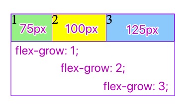
項目放大的計算方法(以主軸水平,寬度增長為例)
1. 主軸剩余空間寬度: 300 - (50 * 3 ) = 150px
2. 增長因子之和: 1 + 2 + 3 = 6
3. 每個增長因子對應的增長量是: 150 / 6 = 25px
4. 每個項目根據自身增長因子計算增長量:
4.1 第一個項目: 1 * 25 = 25px
4.2 第一個項目: 2 * 25 = 50px
4.3 第三個項目: 3 * 25 = 75px
5. 計算每個項目最終寬度:
5.1 第一個項目: 50 + 25 = 75px
5.2 第二個項目: 50 + 50 = 100px
5.3 第三個項目: 50 + 75 = 125px
6. 更換主軸方向后, 計算方式完全一樣,請自行測試
*/
</style>
</head>
<body>
<div class="container">
<div class="item">1</div>
<div class="item">2</div>
<div class="item">3</div>
</div>
</body>
</html>
```
- 教學大綱
- HTML5基礎
- 1-html基礎知識
- 2-語義化結構元素
- 3-語義化文本元素
- 4-鏈接/列表/圖像元素
- 5-表格元素
- 6-表單與控件元素[重點]
- CSS3基礎
- 1-css與html文檔
- 2-css選擇器
- 3-細說盒模型
- Flex布局[精簡版]
- 1-Flex概論
- 2-Flex布局是什么
- 3-Flex基本概念
- 4-Flex容器屬性
- 5-Flex項目屬性
- Flex布局[細說版]
- 1-flex 布局概述
- 2-flex 容器與項目
- 3-flex 容器主軸方向
- 4-flex 容器主軸項目換行
- 5-flex 容器主軸與項目換行簡寫
- 6-flex 容器主軸項目對齊
- 7-flex 容器交叉軸項目對齊
- 8-flex 多行容器交叉軸項目對齊
- 9-flex 項目主軸排列順序
- 10-flex 項目交叉軸單獨對齊
- 11-flex 項目放大因子
- 12-flex 項目收縮因子
- 13-flex 項目計算尺寸
- 14-flex 項目縮放的簡寫
- Flex布局[案例版]
- 1-調整項目順序
- Grid布局[精簡版]
- 1. 常用術語
- 2. 容器屬性
- 3. 項目屬性
- 4. 布局實例
- 1. 經典三列布局
- 2. 媒體查詢
- Grid布局[細說版]
- 1-必知術語
- 2-容器創建與行列劃分
- 3-單元格常用單位
- 4-項目填充到單元格
- 5-項目填充到網格區域
- 6-對齊容器中的所有項目
- 7-對齊單元格中所有項目
- 8-對齊單元格中某個項目
- 9-容器中行與列之間的間距