
# 5. 將項目填充到網格區域中
[toc]
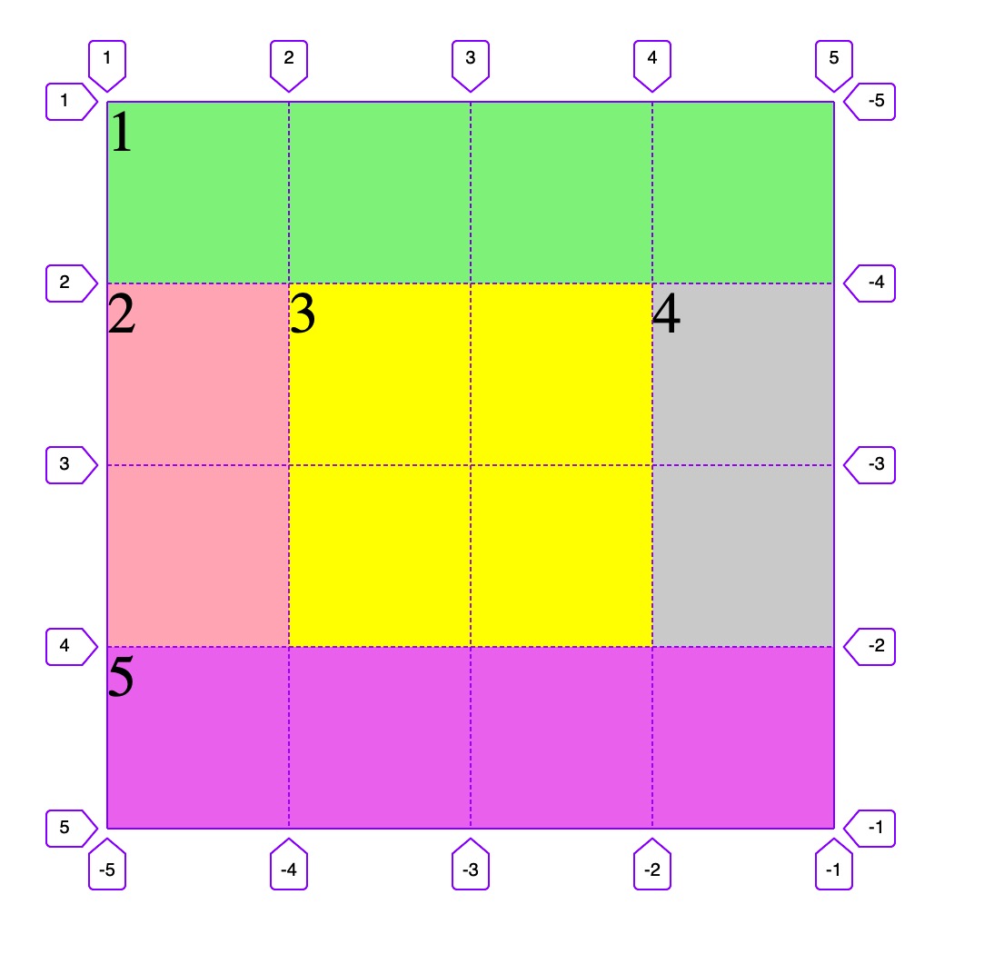
## 5.1 默認網格區域
- 設置項目屬性`grid-area`: 將項目填充到指定容器的區域中
- 語法: `grid-area: 起始行 / 起始列 / 結束行 / 結束列`
- 示例:
```html
<!DOCTYPE html>
<html lang="en">
<head>
<meta charset="UTF-8" />
<meta name="viewport" content="width=device-width, initial-scale=1.0" />
<title>默認網格區域</title>
<style>
.container {
width: 400px;
height: 400px;
background-color: wheat;
display: grid;
grid-template-columns: repeat(4, 1fr);
grid-template-rows: repeat(4, 1fr);
}
.item {
font-size: 2rem;
}
/* 第1個項目占滿第一行 */
.item1 {
background-color: lightgreen;
/* 語法: grid-area: row-start / col-start / row-end / col-end */
/* grid-area: 1 / 1 / 2 / 5; */
/* 簡化 */
grid-area: span 1 / span 4;
}
/* 第2個項目占據左側2行1列 */
.item2 {
background-color: lightpink;
grid-area: 2 / 1 / 4 / 2;
/* 列偏移超過1,手工設置,其它都取默認值 */
grid-area: span 2;
}
/* 第3個項目占據容器正中間四個單元格 */
.item3 {
background-color: yellow;
grid-area: 2 / 2 / 4 / 4;
/* 起始是當前位置可省略,變化偏移量都超過了1, 需要手工設置 */
grid-area: span 2 / span 2;
}
/* 第4個項目占據右側2行1列 */
.item4 {
background-color: lightgrey;
grid-area: 2 / 4 / 4 / 5;
/* 變化只有行, 其它取默認值 */
grid-area: span 2;
}
/* 第5個項目占滿最后一行 */
.item5 {
background-color: violet;
grid-area: 4 / 1 / 5 / 5;
grid-area: span 1 / span 4;
}
</style>
</head>
<body>
<div class="container">
<span class="item item1">1</span>
<span class="item item2">2</span>
<span class="item item3">3</span>
<span class="item item4">4</span>
<span class="item item5">5</span>
</div>
</body>
</html>
```
---
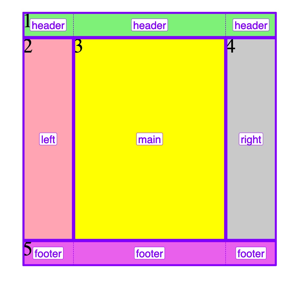
## 5.2 命名網格區域
- 可以為每一個網格區域設置一個語義化的名稱
- 具有名稱的網絡區域稱之為**命名區域**
- 名稱相同的網格區域會合并, 形成更大的區域空間
- 項目設置的區域名稱后,會自動填充到容器中應對的命名區域中
- 示例:
```html
<!DOCTYPE html>
<html lang="en">
<head>
<meta charset="UTF-8" />
<meta name="viewport" content="width=device-width, initial-scale=1.0" />
<title>命名網格區域</title>
<style>
.container {
width: 400px;
height: 400px;
background-color: wheat;
display: grid;
grid-template-columns: 80px 1fr 80px;
grid-template-rows: 40px 1fr 40px;
/* 設置命名區域: 相鄰的相同名稱,會導致單元格合并 */
grid-template-areas:
"header header header"
"left main right"
"footer footer footer";
}
.item {
font-size: 2rem;
}
/* 第1個項目占滿第一行 */
.item1 {
background-color: lightgreen;
/* 設置項目填充的區域名稱 */
grid-area: header;
}
/* 第2個項目占據左側2行1列 */
.item2 {
background-color: lightpink;
/* 設置項目填充的區域名稱 */
grid-area: left;
}
/* 第3個項目占據容器正中間四個單元格 */
.item3 {
background-color: yellow;
/* 設置項目填充的區域名稱 */
grid-area: main;
}
/* 第4個項目占據右側2行1列 */
.item4 {
background-color: lightgrey;
/* 設置項目填充的區域名稱 */
grid-area: right;
}
/* 第5個項目占滿最后一行 */
.item5 {
background-color: violet;
/* 設置項目填充的區域名稱 */
grid-area: footer;
}
</style>
</head>
<body>
<div class="container">
<span class="item item1">1</span>
<span class="item item2">2</span>
<span class="item item3">3</span>
<span class="item item4">4</span>
<span class="item item5">5</span>
</div>
</body>
</html>
```
---
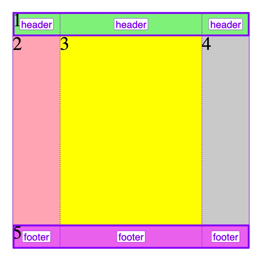
## 5.3 網格區域占位符
- 當項目默認已到填充到正確的區域中,無需設置時,可使用"."做為占位符
- 示例:
```html
<!DOCTYPE html>
<html lang="en">
<head>
<meta charset="UTF-8" />
<meta name="viewport" content="width=device-width, initial-scale=1.0" />
<title>網格區域占位符</title>
<style>
.container {
width: 400px;
height: 400px;
background-color: wheat;
display: grid;
grid-template-columns: 80px 1fr 80px;
grid-template-rows: 40px 1fr 40px;
/* 當項目1設置頭部填充完成后,中間三個項目已經自動填充完成,不需要單獨設置了 */
/* 所以中間三列,可使用占位符: 點(.), 替代之前的命名區域 */
grid-template-areas:
"header header header"
". . ."
"footer footer footer";
}
.item {
font-size: 2rem;
}
/* 第1個項目占滿第一行 */
.item1 {
background-color: lightgreen;
/* 設置項目填充的區域名稱 */
grid-area: header;
}
/* 第2個項目占據左側2行1列 */
.item2 {
background-color: lightpink;
}
/* 第3個項目占據容器正中間四個單元格 */
.item3 {
background-color: yellow;
}
/* 第4個項目占據右側2行1列 */
.item4 {
background-color: lightgrey;
}
/* 第5個項目占滿最后一行 */
.item5 {
background-color: violet;
/* 設置項目填充的區域名稱 */
grid-area: footer;
}
</style>
</head>
<body>
<div class="container">
<span class="item item1">1</span>
<span class="item item2">2</span>
<span class="item item3">3</span>
<span class="item item4">4</span>
<span class="item item5">5</span>
</div>
</body>
</html>
```
---
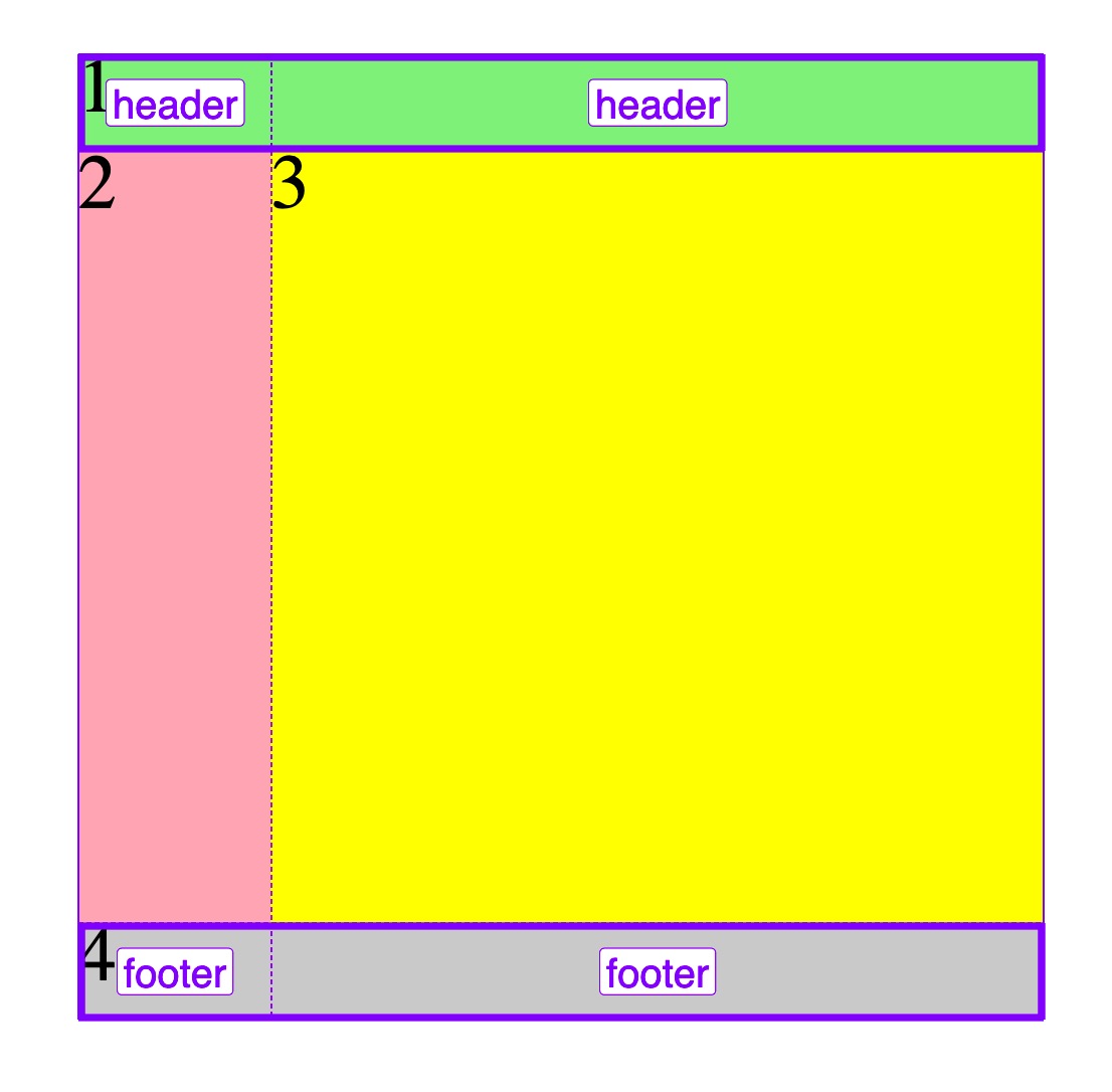
## 5.4 命名網格區域線默認名稱
- 區域起始行/列: `區域名稱-start`, 如`header-start / header-start`,表示區域起始行/區域起始列
- 區域結束行/列: `區域名稱-end`,如`header-end / header-end`,表示區域結束行/區域結束列
- 示例:
```html
<!DOCTYPE html>
<html lang="en">
<head>
<meta charset="UTF-8" />
<meta name="viewport" content="width=device-width, initial-scale=1.0" />
<title>網格區域線默認名稱</title>
<style>
.container {
width: 400px;
height: 400px;
background-color: wheat;
display: grid;
/* 與前面不同,改為二列三行 */
grid-template-columns: 80px 1fr;
grid-template-rows: 40px 1fr 40px;
grid-template-areas:
"header header"
". ."
"footer footer";
}
.item {
font-size: 2rem;
}
/* 第1個項目占滿第一行 */
.item1 {
background-color: lightgreen;
/* 命名區域起始行 / 命名區域起始列 / 命名區域結束行 / 命名區域結束列 */
grid-area: header-start / header-start / header-end / header-end;
/* 簡寫 */
grid-area: header-start / span 3;
}
/* 第2個項目占據左側第1列 */
.item2 {
background-color: lightpink;
/* 第2個項目已經填充到正確區域,不必設置 */
}
/* 第3個項目占據中間右側剩余空間 */
.item3 {
background-color: yellow;
/* 第3個項目已經填充到正確區域,不必設置 */
}
/* 第4個項目占據最后一行 */
.item4 {
background-color: lightgrey;
grid-area: footer-start / footer-start / footer-end / footer-end;
/* 或者 */
grid-area: footer-start / span 2;
}
</style>
</head>
<body>
<div class="container">
<span class="item item1">1</span>
<span class="item item2">2</span>
<span class="item item3">3</span>
<span class="item item4">4</span>
</div>
</body>
</html>
```
- 教學大綱
- HTML5基礎
- 1-html基礎知識
- 2-語義化結構元素
- 3-語義化文本元素
- 4-鏈接/列表/圖像元素
- 5-表格元素
- 6-表單與控件元素[重點]
- CSS3基礎
- 1-css與html文檔
- 2-css選擇器
- 3-細說盒模型
- Flex布局[精簡版]
- 1-Flex概論
- 2-Flex布局是什么
- 3-Flex基本概念
- 4-Flex容器屬性
- 5-Flex項目屬性
- Flex布局[細說版]
- 1-flex 布局概述
- 2-flex 容器與項目
- 3-flex 容器主軸方向
- 4-flex 容器主軸項目換行
- 5-flex 容器主軸與項目換行簡寫
- 6-flex 容器主軸項目對齊
- 7-flex 容器交叉軸項目對齊
- 8-flex 多行容器交叉軸項目對齊
- 9-flex 項目主軸排列順序
- 10-flex 項目交叉軸單獨對齊
- 11-flex 項目放大因子
- 12-flex 項目收縮因子
- 13-flex 項目計算尺寸
- 14-flex 項目縮放的簡寫
- Flex布局[案例版]
- 1-調整項目順序
- Grid布局[精簡版]
- 1. 常用術語
- 2. 容器屬性
- 3. 項目屬性
- 4. 布局實例
- 1. 經典三列布局
- 2. 媒體查詢
- Grid布局[細說版]
- 1-必知術語
- 2-容器創建與行列劃分
- 3-單元格常用單位
- 4-項目填充到單元格
- 5-項目填充到網格區域
- 6-對齊容器中的所有項目
- 7-對齊單元格中所有項目
- 8-對齊單元格中某個項目
- 9-容器中行與列之間的間距