
# 7. 對齊單元格/區域中所有項目
[toc]
## 7.1 屬性
| 序號 | 屬性 | 描述 |
| ---- | --------------- | ------------------------------------------------- |
| 1 | `justify-items` | 設置所有項目在單元格/網格區域中水平方向的對齊方式 |
| 2 | `align-items` | 設置所有項目在單元格/網格區域中垂直方向的對齊方式 |
| 3 | `place-items` | 簡寫, `place-items: 垂直對齊方式 水平對齊方式` |
---
## 7.2 示例 1: 對齊單元格中所有項目
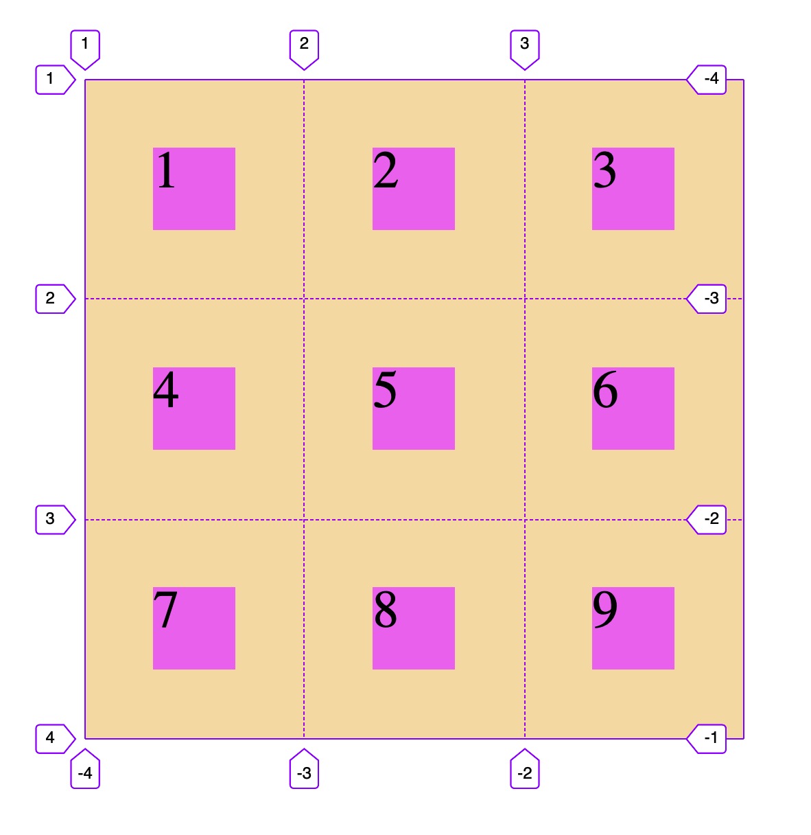
```html
<!DOCTYPE html>
<html lang="en">
<head>
<meta charset="UTF-8" />
<meta name="viewport" content="width=device-width, initial-scale=1.0" />
<title>對齊單元格中所有項目</title>
<style>
.container {
width: 400px;
height: 400px;
background-color: wheat;
display: grid;
grid-template-columns: repeat(3, 1fr);
grid-template-rows: repeat(3, 1fr);
/* 項目在單元格的對齊方式,默認是拉伸,除非設置了項目大小,否則會占據單元格全部空間 */
justify-items: stretch;
align-items: stretch;
/* 水平居左,垂直居中 */
justify-items: start;
align-items: center;
/* 水平居右, 垂直居下 */
justify-items: end;
align-items: end;
/* 水平垂直居中 */
justify-items: center;
align-items: center;
/* 這二個屬性與flex彈性布局中的屬性相同,為了區別, 建議使用簡寫語法 */
/* 簡寫語法: place-items: 垂直對齊 水平對齊 */
/* 垂直靠上,水平居右 */
place-items: start end;
/* 垂直靠下, 水平居左 */
place-items: end start;
/* 垂直居中, 水平居中 */
place-items: center center;
/* 二個值一樣,同樣可以簡寫成一個值 */
place-items: center;
}
.item {
width: 50px;
height: 50px;
background-color: violet;
font-size: 2rem;
}
</style>
</head>
<body>
<div class="container">
<span class="item item1">1</span>
<span class="item item2">2</span>
<span class="item item3">3</span>
<span class="item item4">4</span>
<span class="item item5">5</span>
<span class="item item6">6</span>
<span class="item item7">7</span>
<span class="item item8">8</span>
<span class="item item9">9</span>
</div>
</body>
</html>
```
---
## 7.3 示例 2: 對齊網格區域中所有項目
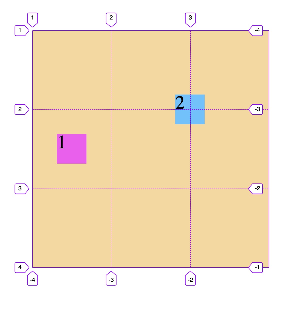
```html
<!DOCTYPE html>
<html lang="en">
<head>
<meta charset="UTF-8" />
<meta name="viewport" content="width=device-width, initial-scale=1.0" />
<title>對齊網格區域中所有項目</title>
<style>
.container {
width: 400px;
height: 400px;
background-color: wheat;
display: grid;
grid-template-columns: repeat(3, 1fr);
grid-template-rows: repeat(3, 1fr);
/* 所有項目在網格區域中垂直水平對齊 */
place-items: center;
}
.item {
width: 50px;
height: 50px;
background-color: violet;
font-size: 2rem;
}
.item1 {
/* 跨3行,占據最左一列 */
grid-row-end: span 3;
}
.item2 {
background-color: lightskyblue;
/* 水平跨2行,垂直跨2列,占據一塊四個單元格組成的矩形網格區域 */
grid-row-end: span 2;
grid-column-end: span 2;
}
</style>
</head>
<body>
<div class="container">
<span class="item item1">1</span>
<span class="item item2">2</span>
</div>
</body>
</html>
```
- 教學大綱
- HTML5基礎
- 1-html基礎知識
- 2-語義化結構元素
- 3-語義化文本元素
- 4-鏈接/列表/圖像元素
- 5-表格元素
- 6-表單與控件元素[重點]
- CSS3基礎
- 1-css與html文檔
- 2-css選擇器
- 3-細說盒模型
- Flex布局[精簡版]
- 1-Flex概論
- 2-Flex布局是什么
- 3-Flex基本概念
- 4-Flex容器屬性
- 5-Flex項目屬性
- Flex布局[細說版]
- 1-flex 布局概述
- 2-flex 容器與項目
- 3-flex 容器主軸方向
- 4-flex 容器主軸項目換行
- 5-flex 容器主軸與項目換行簡寫
- 6-flex 容器主軸項目對齊
- 7-flex 容器交叉軸項目對齊
- 8-flex 多行容器交叉軸項目對齊
- 9-flex 項目主軸排列順序
- 10-flex 項目交叉軸單獨對齊
- 11-flex 項目放大因子
- 12-flex 項目收縮因子
- 13-flex 項目計算尺寸
- 14-flex 項目縮放的簡寫
- Flex布局[案例版]
- 1-調整項目順序
- Grid布局[精簡版]
- 1. 常用術語
- 2. 容器屬性
- 3. 項目屬性
- 4. 布局實例
- 1. 經典三列布局
- 2. 媒體查詢
- Grid布局[細說版]
- 1-必知術語
- 2-容器創建與行列劃分
- 3-單元格常用單位
- 4-項目填充到單元格
- 5-項目填充到網格區域
- 6-對齊容器中的所有項目
- 7-對齊單元格中所有項目
- 8-對齊單元格中某個項目
- 9-容器中行與列之間的間距