
# 可視化數據集的分布
> 譯者:[alohahahaha](https://github.com/alohahahaha)
在處理一組數據時,您通常想做的第一件事就是了解變量的分布情況。本教程的這一章將簡要介紹 seaborn 中用于檢查單變量和雙變量分布的一些工具。 您可能還需要查看[categorical.html](categorical.html #categical-tutorial)章節中的函數示例,這些函數可以輕松地比較變量在其他變量級別上的分布。
```py
import seaborn as sns
import matplotlib.pyplot as plt
from scipy import stats
sns.set(color_codes=True)
```
## 繪制單變量分布
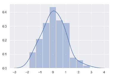
在 seaborn 中想要快速查看單變量分布的最方便的方法是使用[`distplot()`](../generated/seaborn.distplot.html#seaborn.distplot "seaborn.distplot")函數。默認情況下,該方法將會繪制直方圖[histogram](https://en.wikipedia.org/wiki/Histogram)并擬合[內核密度估計] [kernel density estimate](https://en.wikipedia.org/wiki/Kernel_density_estimation) (KDE).
```py
x = np.random.normal(size=100)
sns.distplot(x);
```
### 直方圖
對于直方圖我們可能很熟悉,而且 matplotlib 中已經存在`hist`函數。 直方圖首先確定數據區間,然后觀察數據落入這些區間中的數量來繪制柱形圖以此來表征數據的分布情況。
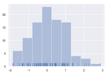
為了說明這一點,讓我們刪除密度曲線并添加一個 rug plot,它在每個觀察值上畫一個小的垂直刻度。您可以使用[`rugplot()`](../generated/seaborn.rugplot.html#seaborn.rugplot "seaborn.rugplot") 函數來創建 rugplot 本身,但是也可以在 [`distplot()`](../generated/seaborn.distplot.html#seaborn.distplot "seaborn.distplot")中使用:
```py
sns.distplot(x, kde=False, rug=True);
```
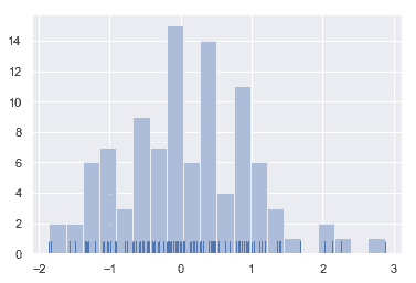
在繪制柱狀圖時,您的主要選擇是要使用的“桶”的數量和放置它們的位置。 [`distplot()`](../generated/seaborn.distplot.html#seaborn.distplot "seaborn.distplot") 使用一個簡單的規則來很好地猜測默認情況下正確的數字是多少,但是嘗試更多或更少的“桶”可能會揭示數據中的其他特性:
```py
sns.distplot(x, bins=20, kde=False, rug=True);
```
### 核密度估計
可能你對核密度估計不太熟悉,但它可以是繪制分布形狀的有力工具。和直方圖一樣,KDE 圖沿另一個軸的高度,編碼一個軸上的觀測密度:
```py
sns.distplot(x, hist=False, rug=True);
```
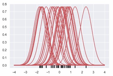
繪制 KDE 比繪制直方圖更需要計算。每個觀測值首先被一個以該值為中心的正態(高斯)曲線所取代:
```py
x = np.random.normal(0, 1, size=30)
bandwidth = 1.06 * x.std() * x.size ** (-1 / 5.)
support = np.linspace(-4, 4, 200)
kernels = []
for x_i in x:
kernel = stats.norm(x_i, bandwidth).pdf(support)
kernels.append(kernel)
plt.plot(support, kernel, color="r")
sns.rugplot(x, color=".2", linewidth=3);
```
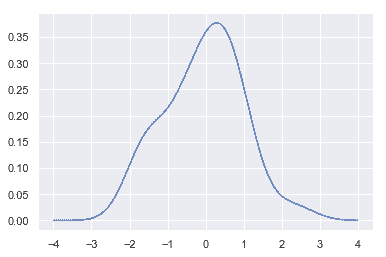
接下來,對這些曲線求和,計算支持網格(support grid)中每個點的密度值。然后對得到的曲線進行歸一化,使曲線下的面積等于 1:
```py
from scipy.integrate import trapz
density = np.sum(kernels, axis=0)
density /= trapz(density, support)
plt.plot(support, density);
```
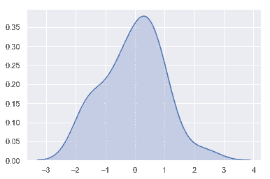
我們可以看到,如果在 seaborn 中使用[`kdeplot()`](../generated/seaborn.kdeplot.html#seaborn.kdeplot "seaborn.kdeplot") 函數, 我們可以得到相同的曲線。這個函數也被[`distplot()`](../generated/seaborn.distplot.html#seaborn.distplot "seaborn.distplot")所使用, 但是當您只想要密度估計時,它提供了一個更直接的接口,可以更容易地訪問其他選項:
```py
sns.kdeplot(x, shade=True);
```
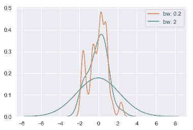
KDE 的帶寬(`bw`)參數控制估計與數據的擬合程度,就像直方圖中的 bin 大小一樣。 它對應于我們在上面繪制的內核的寬度。 默認行為嘗試使用常用參考規則猜測一個好的值,但嘗試更大或更小的值可能會有所幫助:
```py
sns.kdeplot(x)
sns.kdeplot(x, bw=.2, label="bw: 0.2")
sns.kdeplot(x, bw=2, label="bw: 2")
plt.legend();
```
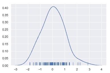
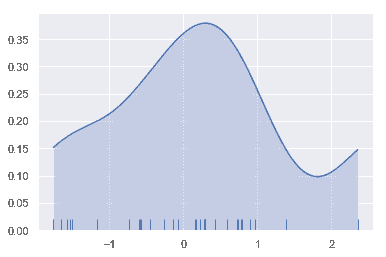
正如您在上面所看到的,高斯 KDE 過程的本質意味著估計超出了數據集中最大和最小的值。有可能控制超過極值多遠的曲線是由'cut'參數繪制的;然而,這只影響曲線的繪制方式,而不影響曲線的擬合方式:
```py
sns.kdeplot(x, shade=True, cut=0)
sns.rugplot(x);
```
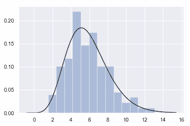
### 擬合參數分布
您還可以使用 [`distplot()`](../generated/seaborn.distplot.html#seaborn.distplot "seaborn.distplot")
將參數分布擬合到數據集上,并直觀地評估其與觀測數據的對應程度:
```py
x = np.random.gamma(6, size=200)
sns.distplot(x, kde=False, fit=stats.gamma);
```
## 繪制二元分布
它對于可視化兩個變量的二元分布也很有用。在 seaborn 中,最簡單的方法就是使用[`jointplot()`](../generated/seaborn.jointplot.html#seaborn.jointplot "seaborn.jointplot")函數,它創建了一個多面板圖形,顯示了兩個變量之間的二元(或聯合)關系,以及每個變量在單獨軸上的一元(或邊際)分布。
```py
mean, cov = [0, 1], [(1, .5), (.5, 1)]
data = np.random.multivariate_normal(mean, cov, 200)
df = pd.DataFrame(data, columns=["x", "y"])
```
### 散點圖
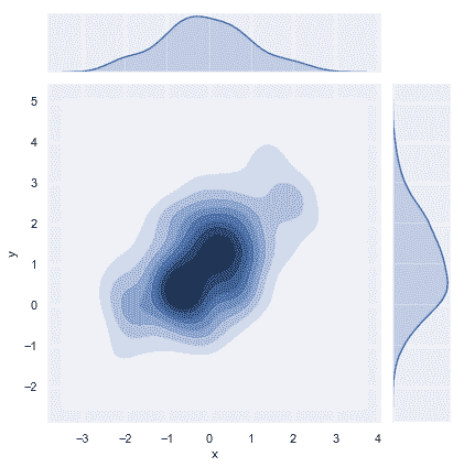
可視化二元分布最常見的方法是散點圖,其中每個觀察點都以 _x_ 和 _y_ 值表示。 這類似于二維 rug plot。 您可以使用 matplotlib 的`plt.scatter` 函數繪制散點圖, 它也是 [`jointplot()`](../generated/seaborn.jointplot.html#seaborn.jointplot "seaborn.jointplot")函數顯示的默認類型的圖:
```py
sns.jointplot(x="x", y="y", data=df);
```
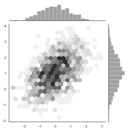
### 六邊形“桶”(Hexbin)圖
類似于單變量的直方圖,用于描繪二元變量關系的圖稱為 “hexbin” 圖,因為它顯示了落入六邊形“桶”內的觀察計數。 此圖對于相對較大的數據集最有效。它可以通過調用 matplotlib 中的 `plt.hexbin`函數獲得并且在[`jointplot()`](../generated/seaborn.jointplot.html#seaborn.jointplot "seaborn.jointplot")作為一種樣式。當使用白色作為背景色時效果最佳。
```py
x, y = np.random.multivariate_normal(mean, cov, 1000).T
with sns.axes_style("white"):
sns.jointplot(x=x, y=y, kind="hex", color="k");
```
### 核密度估計
也可以使用上面描述的核密度估計過程來可視化二元分布。在 seaborn 中,這種圖用等高線圖表示, 在[`jointplot()`](../generated/seaborn.jointplot.html#seaborn.jointplot "seaborn.jointplot")中被當作一種樣式:
```py
sns.jointplot(x="x", y="y", data=df, kind="kde");
```
您還可以使用[`kdeplot()`](../generated/seaborn.kdeplot.html#seaborn.kdeplot "seaborn.kdeplot")函數繪制二維核密度圖。這允許您在一個特定的(可能已經存在的)matplotlib 軸上繪制這種圖,而 [`jointplot()`](../generated/seaborn.jointplot.html#seaborn.jointplot "seaborn.jointplot") 函數能夠管理它自己的圖:
```py
f, ax = plt.subplots(figsize=(6, 6))
sns.kdeplot(df.x, df.y, ax=ax)
sns.rugplot(df.x, color="g", ax=ax)
sns.rugplot(df.y, vertical=True, ax=ax);
```
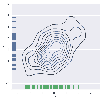
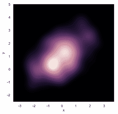
如果希望更連續地顯示雙變量密度,可以簡單地增加輪廓層的數量:
```py
f, ax = plt.subplots(figsize=(6, 6))
cmap = sns.cubehelix_palette(as_cmap=True, dark=0, light=1, reverse=True)
sns.kdeplot(df.x, df.y, cmap=cmap, n_levels=60, shade=True);
```
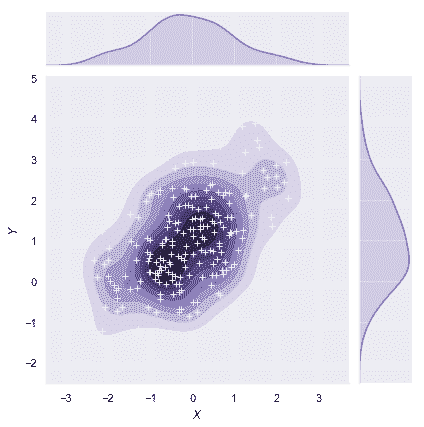
[`jointplot()`](../generated/seaborn.jointplot.html#seaborn.jointplot "seaborn.jointplot")函數使用[`JointGrid`](../generated/seaborn.JointGrid.html#seaborn.JointGrid "seaborn.JointGrid")來管理圖形。為了獲得更大的靈活性,您可能想直接使用[`JointGrid`](../generated/seaborn.JointGrid.html#seaborn.JointGrid "seaborn.JointGrid")來繪制圖形。[`jointplot()`](../generated/seaborn.jointplot.html#seaborn.jointplot "seaborn.jointplot")在繪圖后返回[`JointGrid`](../generated/seaborn.JointGrid.html#seaborn.JointGrid "seaborn.JointGrid")對象,您可以使用它添加更多圖層或調整可視化的其他方面:
```py
g = sns.jointplot(x="x", y="y", data=df, kind="kde", color="m")
g.plot_joint(plt.scatter, c="w", s=30, linewidth=1, marker="+")
g.ax_joint.collections[0].set_alpha(0)
g.set_axis_labels("$X$", "$Y$");
```
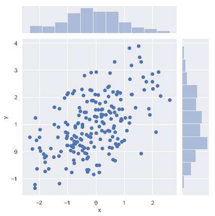
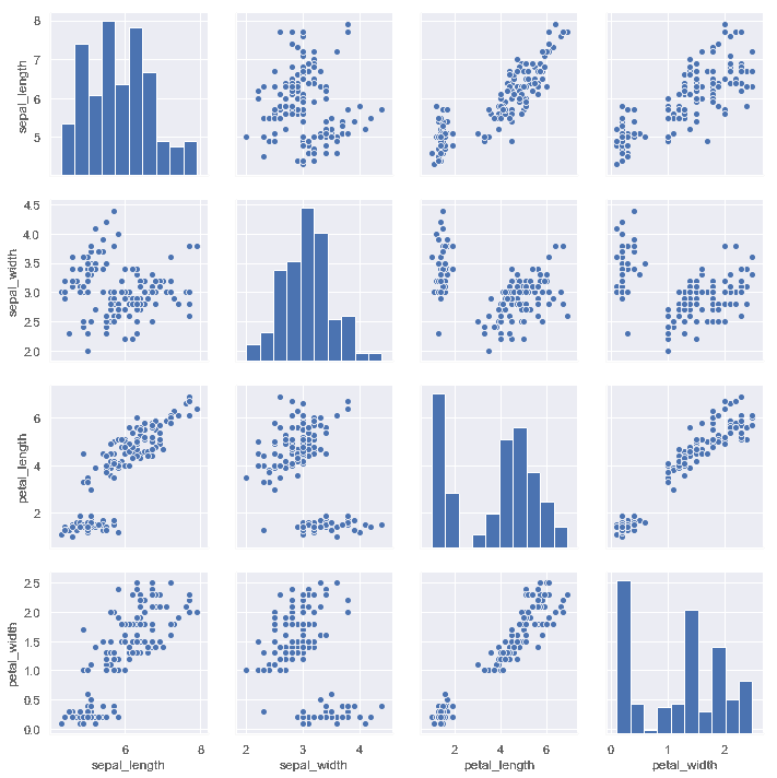
## 可視化數據集中的成對關系
要在數據集中繪制多個成對的雙變量分布,您可以使用[`pairplot()`](../generated/seaborn.pairplot.html#seaborn.pairplot "seaborn.pairplot")函數。 這將創建一個軸矩陣并顯示 DataFrame 中每對列的關系,默認情況下,它還繪制對角軸上每個變量的單變量分布:
```py
iris = sns.load_dataset("iris")
sns.pairplot(iris);
```
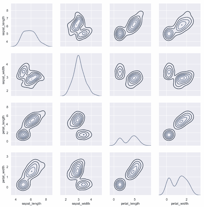
與[`jointplot()`](../generated/seaborn.jointplot.html#seaborn.jointplot "seaborn.jointplot")和[`JointGrid`](../generated/seaborn.JointGrid.html#seaborn.JointGrid "seaborn.JointGrid")之間的關系非常類似, [`pairplot()`](../generated/seaborn.pairplot.html#seaborn.pairplot "seaborn.pairplot")函數構建在[`PairGrid`](../generated/seaborn.PairGrid.html#seaborn.PairGrid "seaborn.PairGrid")對象之上, 可以直接使用它來獲得更大的靈活性:
```py
g = sns.PairGrid(iris)
g.map_diag(sns.kdeplot)
g.map_offdiag(sns.kdeplot, n_levels=6);
```
- seaborn 0.9 中文文檔
- Seaborn 簡介
- 安裝和入門
- 可視化統計關系
- 可視化分類數據
- 可視化數據集的分布
- 線性關系可視化
- 構建結構化多圖網格
- 控制圖像的美學樣式
- 選擇調色板
- seaborn.relplot
- seaborn.scatterplot
- seaborn.lineplot
- seaborn.catplot
- seaborn.stripplot
- seaborn.swarmplot
- seaborn.boxplot
- seaborn.violinplot
- seaborn.boxenplot
- seaborn.pointplot
- seaborn.barplot
- seaborn.countplot
- seaborn.jointplot
- seaborn.pairplot
- seaborn.distplot
- seaborn.kdeplot
- seaborn.rugplot
- seaborn.lmplot
- seaborn.regplot
- seaborn.residplot
- seaborn.heatmap
- seaborn.clustermap
- seaborn.FacetGrid
- seaborn.FacetGrid.map
- seaborn.FacetGrid.map_dataframe
- seaborn.PairGrid
- seaborn.PairGrid.map
- seaborn.PairGrid.map_diag
- seaborn.PairGrid.map_offdiag
- seaborn.PairGrid.map_lower
- seaborn.PairGrid.map_upper
- seaborn.JointGrid
- seaborn.JointGrid.plot
- seaborn.JointGrid.plot_joint
- seaborn.JointGrid.plot_marginals
- seaborn.set
- seaborn.axes_style
- seaborn.set_style
- seaborn.plotting_context
- seaborn.set_context
- seaborn.set_color_codes
- seaborn.reset_defaults
- seaborn.reset_orig
- seaborn.set_palette
- seaborn.color_palette
- seaborn.husl_palette
- seaborn.hls_palette
- seaborn.cubehelix_palette
- seaborn.dark_palette
- seaborn.light_palette
- seaborn.diverging_palette
- seaborn.blend_palette
- seaborn.xkcd_palette
- seaborn.crayon_palette
- seaborn.mpl_palette
- seaborn.choose_colorbrewer_palette
- seaborn.choose_cubehelix_palette
- seaborn.choose_light_palette
- seaborn.choose_dark_palette
- seaborn.choose_diverging_palette
- seaborn.load_dataset
- seaborn.despine
- seaborn.desaturate
- seaborn.saturate
- seaborn.set_hls_values