
# seaborn.barplot
> 譯者:[melon-bun](https://github.com/melon-bun)
```py
seaborn.barplot(x=None, y=None, hue=None, data=None, order=None, hue_order=None, estimator=<function mean>, ci=95, n_boot=1000, units=None, orient=None, color=None, palette=None, saturation=0.75, errcolor='.26', errwidth=None, capsize=None, dodge=True, ax=None, **kwargs)
```
條形圖以矩形條的方式展示數據的點估值和置信區間
條形圖用每個矩形的高度來表示數值變量的集中趨勢的估計值,并提供誤差條來顯示估計值得不確定度。條形圖的縱軸是從零開始的,這對于 0 值是有意義的情況是非常好的。
對于數據集中的 0 值沒有實際意義的情況,散點圖可以讓您專注于一個或多個分類變量之間的差異。
要注意的是,條形圖只顯示平均值(或者其他的估計值),但是在大部分情況下,展示數值在不同分類變量上的分布會更有用。如果要表示出數據的分布,用箱型圖或者小提琴圖會更恰當。
輸入數據的格式可以不同,包括:
* 以列表,numpy array 或者 pandas 中的 Series object 表示的向量。這些向量可以直接傳入 `x`, `y`, 以及 `hue` 參數。
* 長表, x 值,y 值和色相變量決定了數據是如何繪制的。
* 寬表,每個列的數值都會被繪制出來.
* 數組或者列表的向量。
大多數情況下,您可以使用 numpy 的對象或者 python 的對象,但是用 pandas 對象更好,因為相關的列名會被標注在圖標上。 另外,為了控制繪圖元素 您也可以可以用分類類型來組合不同的變量。
這個函數始終把一個變量當做分類變量,即使這個數據是數值類型或者日期類型,并且按照序數順序繪制在相關的軸上。
詳情請看[教程](http://seaborn.pydata.org/tutorial/categorical.html#categorical-tutorial)。
參數:`x, y, hue`:`data` 中的變量名詞或者向量, optional
> 用于繪制 long-form 數據的變量名稱.
`data`:DataFrame, 數組, 數組列表, optional
> 用于繪圖的數據集。如果數據集有 x 和 y,數據集會被認為是 long-form,否則會被認為是 wide-form。
`order, hue_order`:字符串列表, optional
> 繪制類別變量的順序,如果沒有,則從數據對象中推斷繪圖順序。
`estimator`:映射向量 -> 標量, optional
> 統計函數用于估計每個分類紙條中的值。.
`ci`:float or “sd” or None, optional
> 估計值周圍的置信區間大小。如果輸入的是 “sd”(標準差),會跳過 bootstrapping 的過程,只繪制數據的標準差。 如果輸入是的是`None`, 不會執行 botstrapping,而且錯誤條也不會繪制。
`n_boot`:int, optional
> 計算置信區間需要的 Boostrap 迭代次數。
`units`:name of variable in `data` or vector data, optional
> 采樣單元的標識符,用于執行多級 bootstrap 并解釋重復測量設計。
`orient`:“v” | “h”, optional
> 繪圖的方向(垂直或水平)。這通常是從輸入變量的數據類型推斷出來的,但是可以用來指定“分類”變量是數字還是寬格式數據。
`color`:matplotlib color, optional
> 作用于所有元素的顏色,或者漸變色的種子。
`palette`:palette name, list, or dict, optional
> 不同級別的 `hue` 變量的顏色。 顏色要能被 [`color_palette()`]解釋(seaborn.color_palette.html#seaborn.color_palette "seaborn.color_palette"), 或者一個能映射到 matplotlib 顏色的字典。
`saturation`:float, optional
> Proportion of the original saturation to draw colors at. Large patches often look better with slightly desaturated colors, but set this to `1` if you want the plot colors to perfectly match the input color spec.
`errcolor`:matplotlib color
> 表示置信區間的線的顏色。
`errwidth`:float, optional
> 誤差條的線的厚度。
`capsize`:float, optional
> 誤差條端部的寬度。
**dodge** : 布爾型, optional
> When hue nesting is used, whether elements should be shifted along the categorical axis.
`ax`:matplotlib Axes, optional
> 指定一個 Axes 用于繪圖,如果不指定,則使用當前的 Axes。
`kwargs`:key, value mappings
> 其他的關鍵詞參數在繪圖時通過 `plt.bar` 傳入。
返回值:`ax`:matplotlib Axes
> 返回有圖表繪制的 Axes 對象。
See also
顯示每個分類 bin 中的觀察計數。使用散點圖圖示符顯示點估計和置信區間。將分類圖與類相結合:<cite>FacetGrid</cite>.
Examples
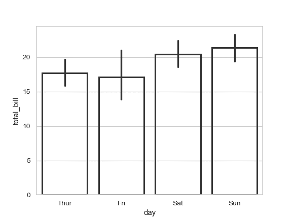
繪制一組按類別變量分組的垂直條形圖:
```py
>>> import seaborn as sns
>>> sns.set(style="whitegrid")
>>> tips = sns.load_dataset("tips")
>>> ax = sns.barplot(x="day", y="total_bill", data=tips)
```

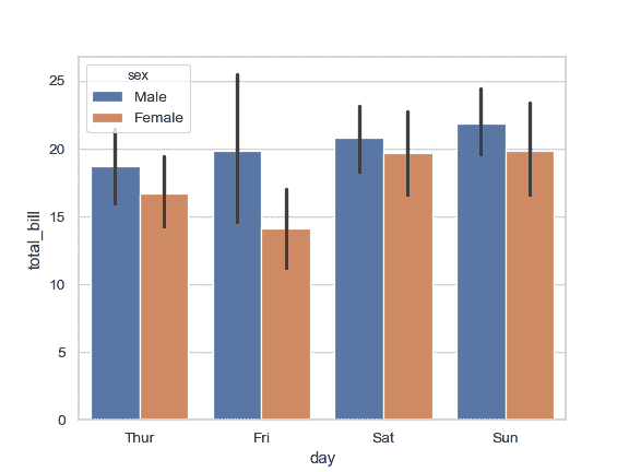
繪制一組由兩個變量嵌套分組的垂直條形圖:
```py
>>> ax = sns.barplot(x="day", y="total_bill", hue="sex", data=tips)
```
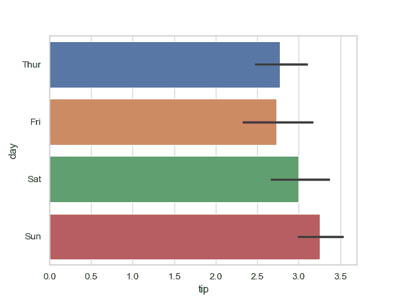
繪制一組水平條形圖:
```py
>>> ax = sns.barplot(x="tip", y="day", data=tips)
```
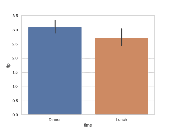
通過傳入一個顯式的順序來控制條柱的順序:
```py
>>> ax = sns.barplot(x="time", y="tip", data=tips,
... order=["Dinner", "Lunch"])
```
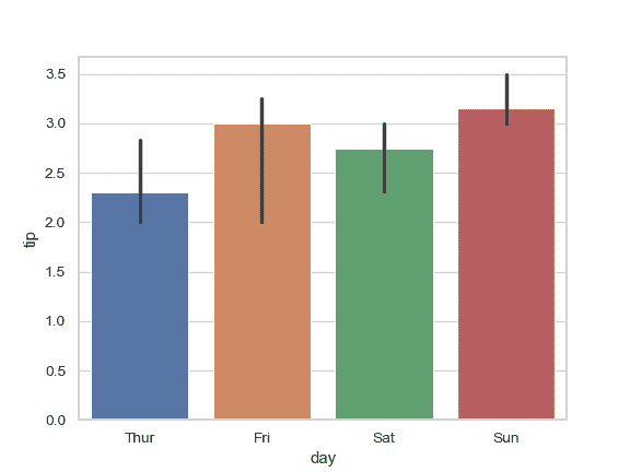
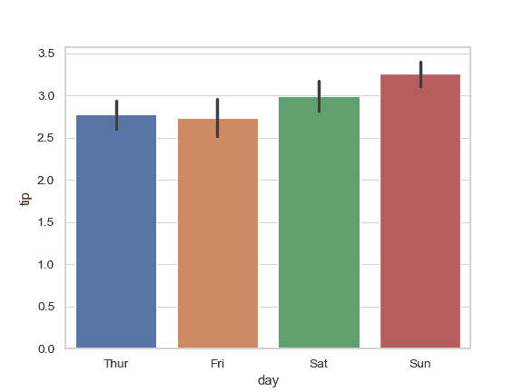
用中值來評估數據的集中趨勢:
```py
>>> from numpy import median
>>> ax = sns.barplot(x="day", y="tip", data=tips, estimator=median)
```
用誤差條顯示平均值的標準誤差:
```py
>>> ax = sns.barplot(x="day", y="tip", data=tips, ci=68)
```
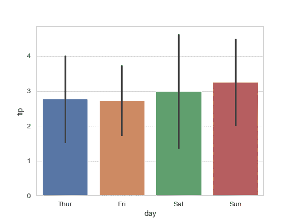
展示數據的標準差:
```py
>>> ax = sns.barplot(x="day", y="tip", data=tips, ci="sd")
```
給誤差條增加“端點”:
```py
>>> ax = sns.barplot(x="day", y="tip", data=tips, capsize=.2)
```

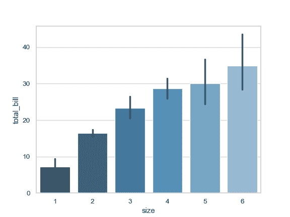
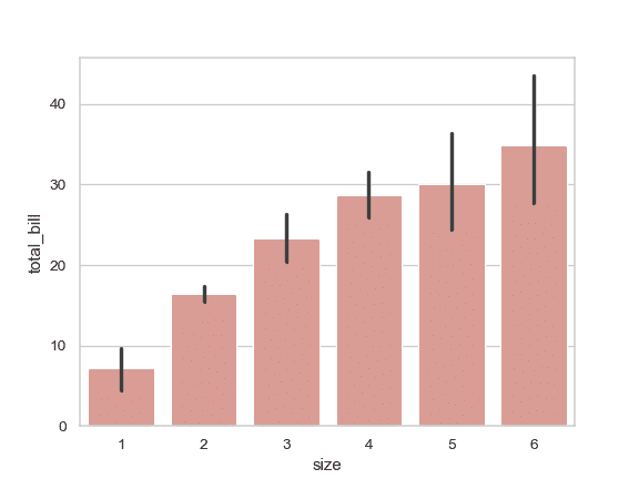
使用一個不同的調色盤來繪制圖案:
```py
>>> ax = sns.barplot("size", y="total_bill", data=tips,
... palette="Blues_d")
```
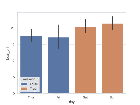
在不改變條柱的位置或者寬度的前提下,使用 `hue` :
```py
>>> tips["weekend"] = tips["day"].isin(["Sat", "Sun"])
>>> ax = sns.barplot(x="day", y="total_bill", hue="weekend",
... data=tips, dodge=False)
```
用同一種顏色繪制所有條柱:
```py
>>> ax = sns.barplot("size", y="total_bill", data=tips,
... color="salmon", saturation=.5)
```
用 `plt.bar` 關鍵字參數進一步改變圖表的樣式:
```py
>>> ax = sns.barplot("day", "total_bill", data=tips,
... linewidth=2.5, facecolor=(1, 1, 1, 0),
... errcolor=".2", edgecolor=".2")
```
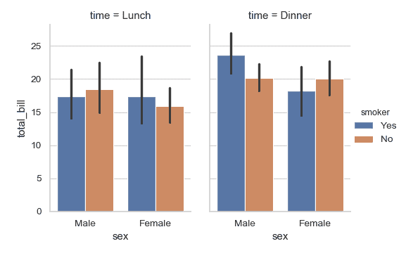
使用 [`catplot()`](seaborn.catplot.html#seaborn.catplot "seaborn.catplot") 來結合 [`barplot()`](#seaborn.barplot "seaborn.barplot") 和 [`FacetGrid`](seaborn.FacetGrid.html#seaborn.FacetGrid "seaborn.FacetGrid"). 這允許數據根據額外的類別變量分組。使用 [`catplot()`](seaborn.catplot.html#seaborn.catplot "seaborn.catplot") 比直接使用 [`FacetGrid`](seaborn.FacetGrid.html#seaborn.FacetGrid "seaborn.FacetGrid") 更安全, 因為它可以確保變量在不同的 facet 之間保持同步:
```py
>>> g = sns.catplot(x="sex", y="total_bill",
... hue="smoker", col="time",
... data=tips, kind="bar",
... height=4, aspect=.7);
```
- seaborn 0.9 中文文檔
- Seaborn 簡介
- 安裝和入門
- 可視化統計關系
- 可視化分類數據
- 可視化數據集的分布
- 線性關系可視化
- 構建結構化多圖網格
- 控制圖像的美學樣式
- 選擇調色板
- seaborn.relplot
- seaborn.scatterplot
- seaborn.lineplot
- seaborn.catplot
- seaborn.stripplot
- seaborn.swarmplot
- seaborn.boxplot
- seaborn.violinplot
- seaborn.boxenplot
- seaborn.pointplot
- seaborn.barplot
- seaborn.countplot
- seaborn.jointplot
- seaborn.pairplot
- seaborn.distplot
- seaborn.kdeplot
- seaborn.rugplot
- seaborn.lmplot
- seaborn.regplot
- seaborn.residplot
- seaborn.heatmap
- seaborn.clustermap
- seaborn.FacetGrid
- seaborn.FacetGrid.map
- seaborn.FacetGrid.map_dataframe
- seaborn.PairGrid
- seaborn.PairGrid.map
- seaborn.PairGrid.map_diag
- seaborn.PairGrid.map_offdiag
- seaborn.PairGrid.map_lower
- seaborn.PairGrid.map_upper
- seaborn.JointGrid
- seaborn.JointGrid.plot
- seaborn.JointGrid.plot_joint
- seaborn.JointGrid.plot_marginals
- seaborn.set
- seaborn.axes_style
- seaborn.set_style
- seaborn.plotting_context
- seaborn.set_context
- seaborn.set_color_codes
- seaborn.reset_defaults
- seaborn.reset_orig
- seaborn.set_palette
- seaborn.color_palette
- seaborn.husl_palette
- seaborn.hls_palette
- seaborn.cubehelix_palette
- seaborn.dark_palette
- seaborn.light_palette
- seaborn.diverging_palette
- seaborn.blend_palette
- seaborn.xkcd_palette
- seaborn.crayon_palette
- seaborn.mpl_palette
- seaborn.choose_colorbrewer_palette
- seaborn.choose_cubehelix_palette
- seaborn.choose_light_palette
- seaborn.choose_dark_palette
- seaborn.choose_diverging_palette
- seaborn.load_dataset
- seaborn.despine
- seaborn.desaturate
- seaborn.saturate
- seaborn.set_hls_values