
# seaborn.FacetGrid
> 譯者:[hyuuo](https://github.com/hyuuo)
```py
class seaborn.FacetGrid(data, row=None, col=None, hue=None, col_wrap=None, sharex=True, sharey=True, height=3, aspect=1, palette=None, row_order=None, col_order=None, hue_order=None, hue_kws=None, dropna=True, legend_out=True, despine=True, margin_titles=False, xlim=None, ylim=None, subplot_kws=None, gridspec_kws=None, size=None)
```
用于繪制條件關系的多圖網格。
```py
__init__(data, row=None, col=None, hue=None, col_wrap=None, sharex=True, sharey=True, height=3, aspect=1, palette=None, row_order=None, col_order=None, hue_order=None, hue_kws=None, dropna=True, legend_out=True, despine=True, margin_titles=False, xlim=None, ylim=None, subplot_kws=None, gridspec_kws=None, size=None)
```
初始化 matplotlib 畫布和 FacetGrid 對象。
該類將數據集映射到由行和列組成的網格中的多個軸上,這些軸與數據集中變量的級別對應。它產生的圖通常被稱為“lattice”,“trellis”或“small-multiple”圖形。
它還可以用`hue`參數表示第三個變量的級別,該參數繪制不同顏色的不同數據子集。它使用顏色來解析第三維度上的元素,但是只繪制相互重疊的子集,并且不會像接受“hue”的坐標軸級函數那樣為特定的可視化定制“hue”參數。
當使用從數據集推斷語義映射的 seaborn 函數時,必須注意在各個方面之間同步這些映射。在大多數情況下,使用圖形級函數(例如[`relplot()`](seaborn.relplot.html#seaborn.relplot "seaborn.relplot")或[`catplot()`](seaborn.catplot.html#seaborn.catplot "seaborn.catplot"))比直接使用[`FacetGrid`](seaborn.FacetGrid.html#seaborn.FacetGrid "seaborn.FacetGrid")更好。
基本工作流程是使用數據集和用于構造網格的變量初始化 FacetGrid 對象。然后,通過調用[`FacetGrid.map()`](seaborn.FacetGrid.map.html#seaborn.FacetGrid.map "seaborn.FacetGrid.map")或[`FacetGrid.map_dataframe()`](seaborn.FacetGrid.map_dataframe.html#seaborn.FacetGrid.map_dataframe "seaborn.FacetGrid.map_dataframe"),可以將一個或多個繪圖函數應用于每個子集。最后,可以使用其他方法調整繪圖,以執行更改軸標簽、使用不同刻度或添加圖例等操作。有關詳細信息,請參閱下面的詳細代碼示例。
更多相關信息請參閱[`教程`](http://seaborn.pydata.org/tutorial/axis_grids.html#grid-tutorial)。
參數:`data`:DataFrame 數據。
> 整潔的(“長形式”)dataframe 數據,其中每一列是一個變量,每一行是一個觀察實例。
`row, col, hue`:字符串。
> 定義數據子集的變量,這些變量將在網格的不同方面繪制。請參閱`*_order`參數以控制此變量的級別順序。
`col_wrap`:整形數值,可選參數。
> 以此參數值來限制網格的列維度,以便列面跨越多行。與`row`面不兼容。
`share{x,y}`:布爾值,'col' 或 'row'可選
> 如果為 true,則跨列共享 y 軸或者跨行共享 x 軸。
`height`:標量,可選參數。
> 每個圖片的高度設定(以英寸為單位)。另見:*aspect*
`aspect`:標量,可選參數。
> 每個圖片的縱橫比,因此 aspect * height 給出每個圖片的寬度,單位為英寸。
`palette`:調色板名稱,列表或字典,可選參數。
> 用于色調變量的不同級別的顏色。應為[`color_palette()`](seaborn.color_palette.html#seaborn.color_palette "seaborn.color_palette")可以解釋的參數,或者是將色調級別映射到 matplotlib 顏色的字典。
`{row,col,hue}_order`:列表,可選參數。
> 對所給命令級別進行排序。默認情況下,這將是在數據中顯示的級別,或者,如果變量是 pandas 分類,則為類別順序。
`hue_kws`:參數-列表值的映射字典
> 插入到繪圖調用中的其他關鍵字參數,使得其他繪圖屬性在色調變量的級別上有所不同(例如散點圖中的標記)。
`legend_out`:布爾值,可選參數。
> 如果為 True,則圖形尺寸將被擴展,圖例將繪制在中間右側的圖形之外。
`despine`:布爾值,可選參數。
> 從圖中移除頂部和右側邊緣框架。
`margin_titles`:布爾值,可選參數。
> 如果為 True,則行變量的標題將繪制在最后一列的右側。此選項是實驗性的,可能無法在所有情況下使用。
`{x, y}lim`:元組,可選參數。
> 每個圖片上每個軸的限制(僅當 share {x,y}為 True 時才相關)。
`subplot_kws`:字典,可選參數。
> 傳遞給 matplotlib subplot(s)方法的關鍵字參數字典。
`gridspec_kws`:字典,可選參數。
> 傳遞給 matplotlib 的`gridspec`模塊(通過`plt.subplots`)的關鍵字參數字典。需要 matplotlib> = 1.4,如果`col_wrap`不是`None`,則忽略它。
**另請參見**
用于繪制成對關系的子圖網格。
[`relplot`](#seaborn.relplot "seaborn.relplot")
結合關系圖和[`FacetGrid`](#seaborn.FacetGrid "seaborn.FacetGrid")。
[`catplot`](#seaborn.catplot "seaborn.catplot")
結合分類圖和[`FacetGrid`](#seaborn.FacetGrid "seaborn.FacetGrid")。
[`lmplot`](#seaborn.lmplot "seaborn.lmplot")
結合回歸圖和[`FacetGrid`](#seaborn.FacetGrid "seaborn.FacetGrid")。
范例
使用 tips 數據集初始化 2x2 網格圖:
```py
>>> import seaborn as sns; sns.set(style="ticks", color_codes=True)
>>> tips = sns.load_dataset("tips")
>>> g = sns.FacetGrid(tips, col="time", row="smoker")
```
在每個子圖繪制一個單變量圖:
```py
>>> import matplotlib.pyplot as plt
>>> g = sns.FacetGrid(tips, col="time", row="smoker")
>>> g = g.map(plt.hist, "total_bill")
```
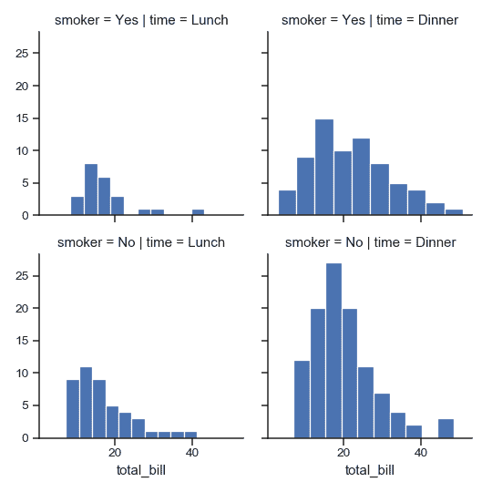
(注意,沒有必要重新捕獲返回的變量;它是相同的對象,但在示例中這樣做使得處理 doctests 更加方便)。
將其他關鍵字參數傳遞給映射函數:
```py
>>> import numpy as np
>>> bins = np.arange(0, 65, 5)
>>> g = sns.FacetGrid(tips, col="time", row="smoker")
>>> g = g.map(plt.hist, "total_bill", bins=bins, color="r")
```

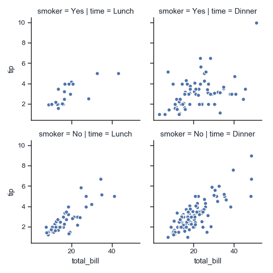
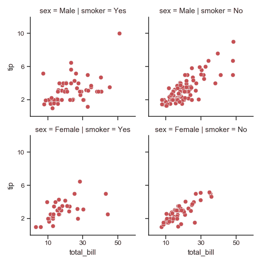
在每個子圖繪制一個雙變量函數:
```py
>>> g = sns.FacetGrid(tips, col="time", row="smoker")
>>> g = g.map(plt.scatter, "total_bill", "tip", edgecolor="w")
```
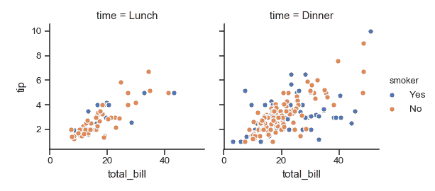
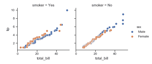
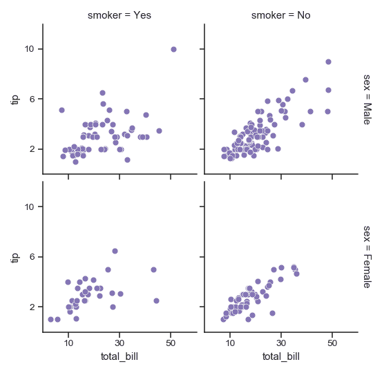
將其中一個變量分配給繪圖元素的顏色:
```py
>>> g = sns.FacetGrid(tips, col="time", hue="smoker")
>>> g = (g.map(plt.scatter, "total_bill", "tip", edgecolor="w")
... .add_legend())
```
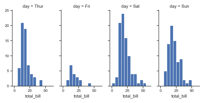
更改每個子圖的高度和縱橫比:
```py
>>> g = sns.FacetGrid(tips, col="day", height=4, aspect=.5)
>>> g = g.map(plt.hist, "total_bill", bins=bins)
```
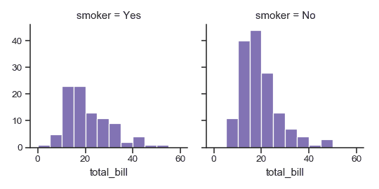
指定繪圖元素的順序:
```py
>>> g = sns.FacetGrid(tips, col="smoker", col_order=["Yes", "No"])
>>> g = g.map(plt.hist, "total_bill", bins=bins, color="m")
```
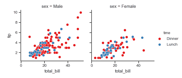
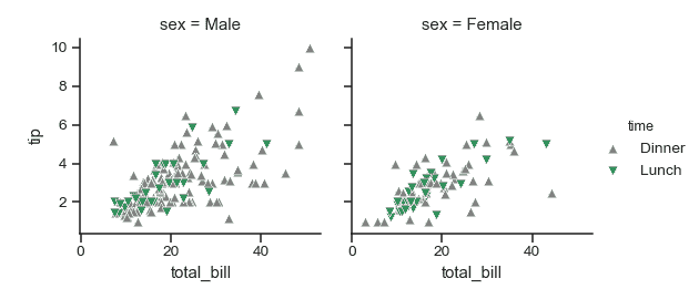
使用不同的調色板:
```py
>>> kws = dict(s=50, linewidth=.5, edgecolor="w")
>>> g = sns.FacetGrid(tips, col="sex", hue="time", palette="Set1",
... hue_order=["Dinner", "Lunch"])
>>> g = (g.map(plt.scatter, "total_bill", "tip", **kws)
... .add_legend())
```
使用字典將色調級別映射到顏色:
```py
>>> pal = dict(Lunch="seagreen", Dinner="gray")
>>> g = sns.FacetGrid(tips, col="sex", hue="time", palette=pal,
... hue_order=["Dinner", "Lunch"])
>>> g = (g.map(plt.scatter, "total_bill", "tip", **kws)
... .add_legend())
```
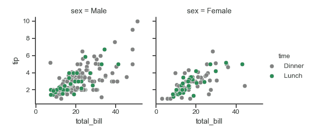
另外,為色調級別使用不同的標記:
```py
>>> g = sns.FacetGrid(tips, col="sex", hue="time", palette=pal,
... hue_order=["Dinner", "Lunch"],
... hue_kws=dict(marker=["^", "v"]))
>>> g = (g.map(plt.scatter, "total_bill", "tip", **kws)
... .add_legend())
```
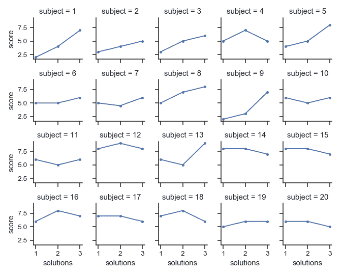
將包含多個級別的列變量“換行”到行中:
```py
>>> att = sns.load_dataset("attention")
>>> g = sns.FacetGrid(att, col="subject", col_wrap=5, height=1.5)
>>> g = g.map(plt.plot, "solutions", "score", marker=".")
```
定義一個自定義雙變量函數來映射到網格:
```py
>>> from scipy import stats
>>> def qqplot(x, y, **kwargs):
... _, xr = stats.probplot(x, fit=False)
... _, yr = stats.probplot(y, fit=False)
... plt.scatter(xr, yr, **kwargs)
>>> g = sns.FacetGrid(tips, col="smoker", hue="sex")
>>> g = (g.map(qqplot, "total_bill", "tip", **kws)
... .add_legend())
```
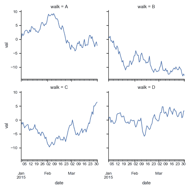
定義一個使用`DataFrame`對象的自定義函數,并接受列名作為位置變量:
```py
>>> import pandas as pd
>>> df = pd.DataFrame(
... data=np.random.randn(90, 4),
... columns=pd.Series(list("ABCD"), name="walk"),
... index=pd.date_range("2015-01-01", "2015-03-31",
... name="date"))
>>> df = df.cumsum(axis=0).stack().reset_index(name="val")
>>> def dateplot(x, y, **kwargs):
... ax = plt.gca()
... data = kwargs.pop("data")
... data.plot(x=x, y=y, ax=ax, grid=False, **kwargs)
>>> g = sns.FacetGrid(df, col="walk", col_wrap=2, height=3.5)
>>> g = g.map_dataframe(dateplot, "date", "val")
```
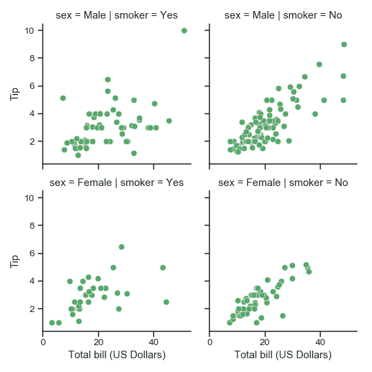
繪圖后使用不同的軸標簽:
```py
>>> g = sns.FacetGrid(tips, col="smoker", row="sex")
>>> g = (g.map(plt.scatter, "total_bill", "tip", color="g", **kws)
... .set_axis_labels("Total bill (US Dollars)", "Tip"))
```
設置每個子圖共享的其他屬性:
```py
>>> g = sns.FacetGrid(tips, col="smoker", row="sex")
>>> g = (g.map(plt.scatter, "total_bill", "tip", color="r", **kws)
... .set(xlim=(0, 60), ylim=(0, 12),
... xticks=[10, 30, 50], yticks=[2, 6, 10]))
```
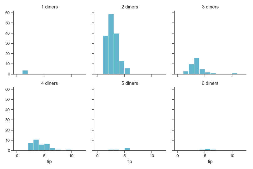
為子圖標題使用不同的模板:
```py
>>> g = sns.FacetGrid(tips, col="size", col_wrap=3)
>>> g = (g.map(plt.hist, "tip", bins=np.arange(0, 13), color="c")
... .set_titles("{col_name} diners"))
```
收緊每個子圖:
```py
>>> g = sns.FacetGrid(tips, col="smoker", row="sex",
... margin_titles=True)
>>> g = (g.map(plt.scatter, "total_bill", "tip", color="m", **kws)
... .set(xlim=(0, 60), ylim=(0, 12),
... xticks=[10, 30, 50], yticks=[2, 6, 10])
... .fig.subplots_adjust(wspace=.05, hspace=.05))
```
方法
| [`__init__`](#seaborn.FacetGrid.__init__ "seaborn.FacetGrid.__init__")(data[, row, col, hue, col_wrap, …]) | 初始化 matplotlib 畫布和 FacetGrid 對象。 |
| `add_legend`([legend_data, title, label_order]) | 繪制一個圖例,可能將其放在軸外并調整圖形大小。|
| `despine`(\**kwargs) | 從子圖中移除軸的邊緣框架。 |
| `facet_axis`(row_i, col_j) | 使這些索引識別的軸處于活動狀態并返回。 |
| `facet_data`() | 用于每個子圖的名稱索引和數據子集的生成器。 |
| [`map`](seaborn.FacetGrid.map.html#seaborn.FacetGrid.map "seaborn.FacetGrid.map")(func, *args, \**kwargs) | 將繪圖功能應用于每個子圖的數據子集。 |
| [`map_dataframe`](seaborn.FacetGrid.map_dataframe.html#seaborn.FacetGrid.map_dataframe "seaborn.FacetGrid.map_dataframe")(func, *args, \**kwargs) | 像`.map`一樣,但是將 args 作為字符串傳遞并在 kwargs 中插入數據。 |
| `savefig`(*args, \**kwargs) | 保存圖片。 |
| `set`(\**kwargs) | 在每個子圖集坐標軸上設置屬性。|
| `set_axis_labels`([x_var, y_var]) | 在網格的左列和底行設置軸標簽。 |
| `set_titles`([template, row_template, …]) | 在每個子圖上方或網格邊緣繪制標題。 |
| `set_xlabels`([label]) | 在網格的底行標記 x 軸。 |
| `set_xticklabels`([labels, step]) | 在網格的底行設置 x 軸刻度標簽。 |
| `set_ylabels`([label]) | 在網格的左列標記 y 軸。 |
| `set_yticklabels`([labels]) | 在網格的左列上設置 y 軸刻度標簽。 |
屬性
| `ax` | 輕松訪問單個坐標軸。 |
- seaborn 0.9 中文文檔
- Seaborn 簡介
- 安裝和入門
- 可視化統計關系
- 可視化分類數據
- 可視化數據集的分布
- 線性關系可視化
- 構建結構化多圖網格
- 控制圖像的美學樣式
- 選擇調色板
- seaborn.relplot
- seaborn.scatterplot
- seaborn.lineplot
- seaborn.catplot
- seaborn.stripplot
- seaborn.swarmplot
- seaborn.boxplot
- seaborn.violinplot
- seaborn.boxenplot
- seaborn.pointplot
- seaborn.barplot
- seaborn.countplot
- seaborn.jointplot
- seaborn.pairplot
- seaborn.distplot
- seaborn.kdeplot
- seaborn.rugplot
- seaborn.lmplot
- seaborn.regplot
- seaborn.residplot
- seaborn.heatmap
- seaborn.clustermap
- seaborn.FacetGrid
- seaborn.FacetGrid.map
- seaborn.FacetGrid.map_dataframe
- seaborn.PairGrid
- seaborn.PairGrid.map
- seaborn.PairGrid.map_diag
- seaborn.PairGrid.map_offdiag
- seaborn.PairGrid.map_lower
- seaborn.PairGrid.map_upper
- seaborn.JointGrid
- seaborn.JointGrid.plot
- seaborn.JointGrid.plot_joint
- seaborn.JointGrid.plot_marginals
- seaborn.set
- seaborn.axes_style
- seaborn.set_style
- seaborn.plotting_context
- seaborn.set_context
- seaborn.set_color_codes
- seaborn.reset_defaults
- seaborn.reset_orig
- seaborn.set_palette
- seaborn.color_palette
- seaborn.husl_palette
- seaborn.hls_palette
- seaborn.cubehelix_palette
- seaborn.dark_palette
- seaborn.light_palette
- seaborn.diverging_palette
- seaborn.blend_palette
- seaborn.xkcd_palette
- seaborn.crayon_palette
- seaborn.mpl_palette
- seaborn.choose_colorbrewer_palette
- seaborn.choose_cubehelix_palette
- seaborn.choose_light_palette
- seaborn.choose_dark_palette
- seaborn.choose_diverging_palette
- seaborn.load_dataset
- seaborn.despine
- seaborn.desaturate
- seaborn.saturate
- seaborn.set_hls_values