
# 線性關系可視化
> 譯者:[cancan233](https://github.com/cancan233)
許多數據集包含多定量變量,并且分析的目的通常是將這些變量聯系起來。我們[之前討論](#/docs/5)可以通過顯示兩個變量相關性的來實現此目的的函數。但是,使用統計模型來估計兩組噪聲觀察量之間的簡單關系可能會非常有效。本章討論的函數將通過線性回歸的通用框架實現。
本著圖凱(Tukey)精神,seaborn 中的回歸圖主要用于添加視覺指南,以助于在探索性數據分析中強調存在于數據集的模式。換而言之,seaborn 本身不是為統計分析而生。要獲得與回歸模型擬合相關定量度量,你應當使用 [statsmodels](https://www.statsmodels.org/). 然而,seaborn 的目標是通過可視化快速簡便地 3 探索數據集,因為這樣做,如果說不上更,是與通過統計表探索數據集一樣重要。
``` python
import numpy as np
import seaborn as sns
import matplotlib.pyplot as plt
```
``` python
sns.set(color_codes=True)
```
``` python
tips = sns.load_dataset("tips")
```
## 繪制線性回歸模型的函數
seaborn 中兩個主要函數主要用于顯示回歸確定的線性關系。這些函數,[`regplot()`](../generated/seaborn.regplot.html#seaborn.regplot"seaborn.regplot") 和 [`lmplot()`](../generated/seaborn.lmplot.html#seaborn.lmplot"seaborn.lmplot"), 之間密切關聯,并且共享核心功能。但是,了解它們的不同之處非常重要,這樣你就可以快速為特定工作選擇正確的工具。
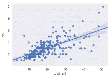
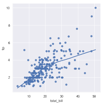
在最簡單的調用中,兩個函數都繪制了兩個變量,`x`和`y`,然后擬合回歸模型`y~x`并繪制得到回歸線和該回歸的 95%置信區間:
```python
sns.regplot(x="total_bill", y="tip", data=tips);
```
```python
sns.lmplot(x="total_bill", y="tip", data=tips);
```
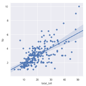
你應當注意到,除了圖形形狀不同,兩幅結果圖是完全一致的。我們會在后面解釋原因。目前,要了解的另一個主要區別是[`regplot()`](../generated/seaborn.regplot.html#seaborn.regplot"seaborn.regplot")接受多種格式的`x`和`y`變量,包括簡單的 numpy 數組,pandas `Series`對象,或者作為對傳遞給`data`的 pandas `DataFrame`對象。相反,[`lmplot()`](../generated/seaborn.lmplot.html#seaborn.lmplot"seaborn.lmplot")將`data`作為必須參數,`x`和`y`變量必須被指定為字符串。這種數據格式被稱為"長格式"或["整齊"](https://vita.had.co.nz/papers/tidy-data.pdf)數據。 除了這種輸入的靈活性之外,[`regplot()`](../ generated / seaborn.regplot.html#seaborn.regplot"seaborn.regplot")擁有[`lmplot()`](../generated/seaborn.lmplot.html#seaborn.lmplot"seaborn.lmplot")一個子集的功能,所以我們將使用后者來演示它們。
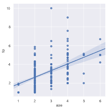
當其中一個變量采用離散值時,可以擬合線性回歸。但是,這種數據集生成的簡單散點圖通常不是最優的:
```python
sns.lmplot(x="size", y="tip", data=tips);
```
一種選擇是向離散值添加隨機噪聲("抖動"),以使這些值分布更清晰。需要注意的是,抖動僅用于散點圖數據,而不會影響回歸線本身擬合:
```python
sns.lmplot(x="size", y="tip", data=tips, x_jitter=.05);
```

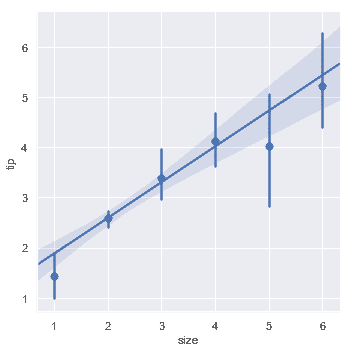
第二種選擇是綜合每個離散箱中的觀測值,以繪制集中趨勢的估計值和置信區間:
```python
sns.lmplot(x="size", y="tip", data=tips, x_estimator=np.mean);
```
## 擬合不同模型
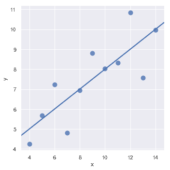
上面使用的簡單線性回歸模型非常容易擬合,但是它不適合某些類型的數據集。[Anscombe 的四重奏](https://en.wikipedia.org/wiki/Anscombe%27s_quartet)數據集展示了一些實例,其中簡單線性回歸提供了相同的關系估計,然而簡單的視覺檢查清楚地顯示了差異。例如,在第一種情況下,線性回歸是一個很好的模型:
```python
anscombe = sns.load_dataset("anscombe")
```
```python
sns.lmplot(x="x", y="y", data=anscombe.query("dataset == 'I'"),
ci=None, scatter_kws={"s": 80});
```
第二個數據集的線性關系是相同的,但是圖表清楚地表明這并不是一個好的模型:
```python
sns.lmplot(x="x", y="y", data=anscombe.query("dataset == 'II'"),
ci=None, scatter_kws={"s": 80});
```

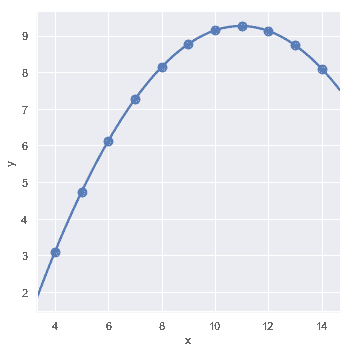
在這些存在高階關系的情況下,[`regplot()`](../generated/seaborn.regplot.html#seaborn.regplot"seaborn.regplot")和[`lmplot()`](./generated/seaborn.regplot.html#seaborn.regplot"seaborn.regplot")可以擬合多項式回歸模型來探索數據集中的簡單非線性趨勢:
```python
sns.lmplot(x="x", y="y", data=anscombe.query("dataset == 'II'"),
order=2, ci=None, scatter_kws={"s": 80});
```
"離群值"觀察引起的另一個問題是,除了研究中的主要關系之外,由于某種原因導致的偏離:
```python
sns.lmplot(x="x", y="y", data=anscombe.query("dataset == 'III'"),
ci=None, scatter_kws={"s": 80});
```

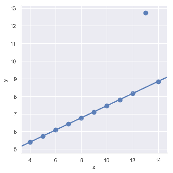
在存在異常值的情況下,擬合穩健回歸可能會很有用,該回歸使用了一種不同的損失函數來降低相對較大的殘差的權重:
```python
sns.lmplot(x="x", y="y", data=anscombe.query("dataset == 'III'"),
robust=True, ci=None, scatter_kws={"s": 80});
```
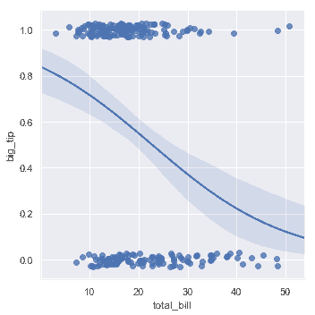
當`y`變量是二進制時,簡單線性回歸也"有效",但提供了難以置信的預測:
```python
tips["big_tip"] = (tips.tip / tips.total_bill) > .15
sns.lmplot(x="total_bill", y="big_tip", data=tips,
y_jitter=.03);
```
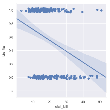
在這種情況下的解決方案是擬合邏輯回歸,使得回歸線對給定值`x`顯示的估計概率`y=1`。
```python
sns.lmplot(x="total_bill", y="big_tip", data=tips,
logistic=True, y_jitter=.03);
```
請注意,邏輯回歸估計比簡單回歸計算密集程度更高(穩健回歸也是如此),并且由于回歸線周圍的置信區間是使用自舉程度計算,你可能希望關閉它來達到更快的迭代(使用`ci=None`)。
一種完全不同的方法是使用[lowess smoother](https://en.wikipedia.org/wiki/Local_regression)擬合非參數回歸。盡管它是計算密集型的,這種方法的假設最少,因此目前置信區間根本沒有計算:
```python
sns.lmplot(x="total_bill", y="tip", data=tips,
lowess=True);
```
[`residplot()`](../generated/seaborn.residplot.html#seaborn.residplot "seaborn.residplot") 函數可以用作檢查簡單回歸模型是否適合數據集的有效工具。它擬合并刪除簡單的線性回歸,然后繪制每個觀察值的殘差值。理想情況下,這些值應隨機散步在`y=0`周圍:
```python
sns.residplot(x="x", y="y", data=anscombe.query("dataset == 'I'"),
scatter_kws={"s": 80});
```

如果殘差中存在結構形狀,則表明簡單的線性回歸不合適:
```python
sns.residplot(x="x", y="y", data=anscombe.query("dataset == 'II'"),
scatter_kws={"s": 80});
```

## 其他變量關系
上面的圖顯示了探索一對變量之間關系的許多方法。然而,通常,一個更有趣的問題是"這兩個變量之間的關系如何隨第三個變量的變化而變化?"這就是[`regplot()`](../generated/seaborn.regplot.html#seaborn.regplot "seaborn.regplot")和[`lmplot()`](../generated/seaborn.lmplot.html#seaborn.lmplot "seaborn.lmplot")的區別所在。[`regplot()`](../generated/seaborn.regplot.html#seaborn.regplot "seaborn.regplot")總是表現單一關系, [`lmplot()`](../generated/seaborn.lmplot.html#seaborn.lmplot "seaborn.lmplot")把[`regplot()`](../generated/seaborn.regplot.html#seaborn.regplot "seaborn.regplot")和 [`FacetGrid`](../generated/seaborn.FacetGrid.html#seaborn.FacetGrid "seaborn.FacetGrid")結合,以提供一個簡單的界面,顯示"facet"圖的線性回歸,使你可以探索與最多三個其他分類變量的交互。
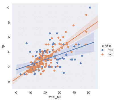
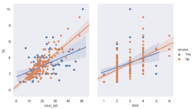
分離關系的最佳方法是在同一軸上繪制兩個級別并使用顏色來區分它們:
```python
sns.lmplot(x="total_bill", y="tip", hue="smoker", data=tips);
```
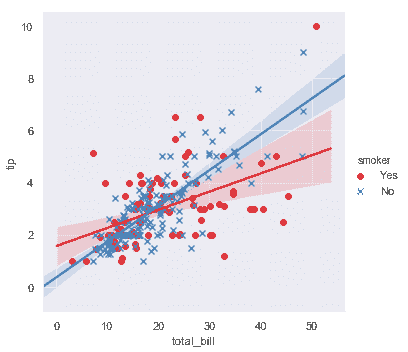
除了顏色之外,還可以使用不同的散點圖標記來使繪圖更好地再現為黑白。你還可以完全控制使用的顏色:
```python
sns.lmplot(x="total_bill", y="tip", hue="smoker", data=tips,
markers=["o", "x"], palette="Set1");
```
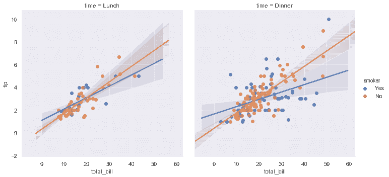
要添加另一個變量,你可以繪制多個"facet",其中每個級別的變量出現在網絡的行或列中:
```python
sns.lmplot(x="total_bill", y="tip", hue="smoker", col="time", data=tips);
```
```python
sns.lmplot(x="total_bill", y="tip", hue="smoker",
col="time", row="sex", data=tips);
```

## 控制繪圖的大小和形狀
在之前,我們注意到[`regplot()`](../generated/seaborn.regplot.html#seaborn.regplot "seaborn.regplot")和[`lmplot()`](../generated/seaborn.lmplot.html#seaborn.lmplot "seaborn.lmplot")生成的默認圖看起來相同,但卻具有不同的大小和形狀。這是因為[`regplot()`](../generated/seaborn.regplot.html#seaborn.regplot "seaborn.regplot")是一個"軸級"函數,它繪制在特定的軸上。這意味著你可以自己制作多面板圖形并精確控制回歸圖的位置。如果沒有明確提供軸對象,它只使用"當前活動"軸,這就是默認繪圖與大多數其他 matplotlib 函數具有相同大小和形狀的原因。要控制大小,你需要自己創建一個圖形對象。
```python
f, ax = plt.subplots(figsize=(5, 6))
sns.regplot(x="total_bill", y="tip", data=tips, ax=ax);
```

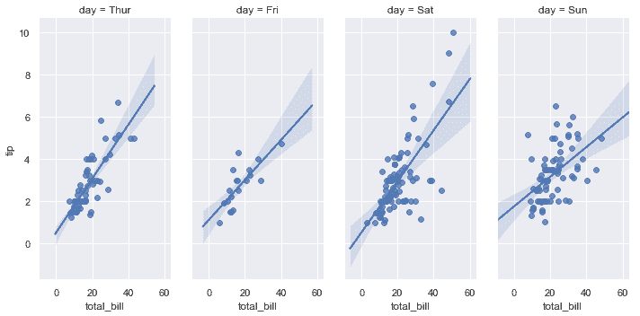
相比之下,[`lmplot()`](../generated/seaborn.lmplot.html#seaborn.lmplot "seaborn.lmplot")圖的大小和形狀是通過[`lmplot()`](http://typora-app/generated/seaborn.lmplot.html#seaborn.lmplot)接口,使用`size`和`aspect`參數控制,這些參數適用于繪圖中的每個`facet`,而不是整個圖形本身:
```python
sns.lmplot(x="total_bill", y="tip", col="day", data=tips,
col_wrap=2, height=3);
```
```python
sns.lmplot(x="total_bill", y="tip", col="day", data=tips,
aspect=.5);
```
## 在其他情境中繪制回歸
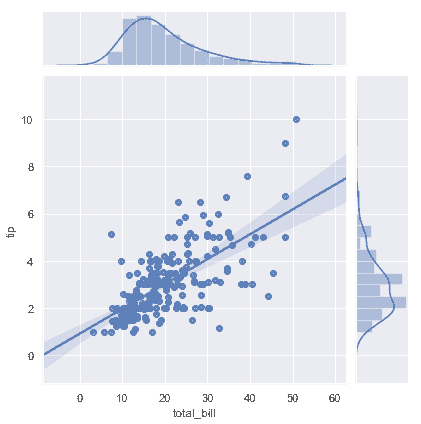
其他一些 seaborn 函數在更大,更復雜的圖中使用[`regplot()`](../generated/seaborn.regplot.html#seaborn.regplot "seaborn.regplot")。第一個是我們在[發行教程](distributions.html#distribution-tutorial)中引入的[`jointplot()`](../generated/seaborn.jointplot.html#seaborn.jointplot "seaborn.jointplot")。除了前面討論的繪制風格,[`jointplot()`](../generated/seaborn.jointplot.html#seaborn.jointplot "seaborn.jointplot") 可以使用[`regplot()`](../generated/seaborn.regplot.html#seaborn.regplot "seaborn.regplot")通過傳遞`kind="reg"`來顯示軸上的線性回歸擬合:
```python
sns.jointplot(x="total_bill", y="tip", data=tips, kind="reg");
```
使用[`pairplot()`](../generated/seaborn.pairplot.html#seaborn.pairplot "seaborn.pairplot")函數與`kind="reg"`將 [`regplot()`](../generated/seaborn.regplot.html#seaborn.regplot "seaborn.regplot")和[`PairGrid`](../generated/seaborn.PairGrid.html#seaborn.PairGrid "seaborn.PairGrid") 結合起來,來顯示數據集中變量的線性關系。請注意這與[`lmplot()`](../generated/seaborn.lmplot.html#seaborn.lmplot "seaborn.lmplot")的不同之處。在下圖中,兩個軸在第三變量上的兩個級別上沒有顯示相同的關系;相反,[`PairGrid()`](../generated/seaborn.PairGrid.html#seaborn.PairGrid "seaborn.PairGrid")用于顯示數據集中變量的不同配對之間的多個關系。
```python
sns.pairplot(tips, x_vars=["total_bill", "size"], y_vars=["tip"],
height=5, aspect=.8, kind="reg");
```

像[`lmplot()`](../generated/seaborn.lmplot.html#seaborn.lmplot "seaborn.lmplot"),但不像[`jointplot()`](../generated/seaborn.jointplot.html#seaborn.jointplot "seaborn.jointplot"),額外的分類變量調節是通過`hue`參數內置在函數[`pairplot()`](../generated/seaborn.pairplot.html#seaborn.pairplot "seaborn.pairplot")中:
```python
sns.pairplot(tips, x_vars=["total_bill", "size"], y_vars=["tip"],
hue="smoker", height=5, aspect=.8, kind="reg");
```
- seaborn 0.9 中文文檔
- Seaborn 簡介
- 安裝和入門
- 可視化統計關系
- 可視化分類數據
- 可視化數據集的分布
- 線性關系可視化
- 構建結構化多圖網格
- 控制圖像的美學樣式
- 選擇調色板
- seaborn.relplot
- seaborn.scatterplot
- seaborn.lineplot
- seaborn.catplot
- seaborn.stripplot
- seaborn.swarmplot
- seaborn.boxplot
- seaborn.violinplot
- seaborn.boxenplot
- seaborn.pointplot
- seaborn.barplot
- seaborn.countplot
- seaborn.jointplot
- seaborn.pairplot
- seaborn.distplot
- seaborn.kdeplot
- seaborn.rugplot
- seaborn.lmplot
- seaborn.regplot
- seaborn.residplot
- seaborn.heatmap
- seaborn.clustermap
- seaborn.FacetGrid
- seaborn.FacetGrid.map
- seaborn.FacetGrid.map_dataframe
- seaborn.PairGrid
- seaborn.PairGrid.map
- seaborn.PairGrid.map_diag
- seaborn.PairGrid.map_offdiag
- seaborn.PairGrid.map_lower
- seaborn.PairGrid.map_upper
- seaborn.JointGrid
- seaborn.JointGrid.plot
- seaborn.JointGrid.plot_joint
- seaborn.JointGrid.plot_marginals
- seaborn.set
- seaborn.axes_style
- seaborn.set_style
- seaborn.plotting_context
- seaborn.set_context
- seaborn.set_color_codes
- seaborn.reset_defaults
- seaborn.reset_orig
- seaborn.set_palette
- seaborn.color_palette
- seaborn.husl_palette
- seaborn.hls_palette
- seaborn.cubehelix_palette
- seaborn.dark_palette
- seaborn.light_palette
- seaborn.diverging_palette
- seaborn.blend_palette
- seaborn.xkcd_palette
- seaborn.crayon_palette
- seaborn.mpl_palette
- seaborn.choose_colorbrewer_palette
- seaborn.choose_cubehelix_palette
- seaborn.choose_light_palette
- seaborn.choose_dark_palette
- seaborn.choose_diverging_palette
- seaborn.load_dataset
- seaborn.despine
- seaborn.desaturate
- seaborn.saturate
- seaborn.set_hls_values