
# seaborn.violinplot
> 譯者:[FindNorthStar](https://github.com/FindNorthStar)
```py
seaborn.violinplot(x=None, y=None, hue=None, data=None, order=None, hue_order=None, bw='scott', cut=2, scale='area', scale_hue=True, gridsize=100, width=0.8, inner='box', split=False, dodge=True, orient=None, linewidth=None, color=None, palette=None, saturation=0.75, ax=None, **kwargs)
```
結合箱型圖與核密度估計繪圖。
小提琴圖的功能與箱型圖類似。 它顯示了一個(或多個)分類變量多個屬性上的定量數據的分布,從而可以比較這些分布。與箱形圖不同,其中所有繪圖單元都與實際數據點對應,小提琴圖描述了基礎數據分布的核密度估計。
小提琴圖可以是一種單次顯示多個數據分布的有效且有吸引力的方式,但請記住,估計過程受樣本大小的影響,相對較小樣本的小提琴可能看起來非常平滑,這種平滑具有誤導性。
輸入數據可以通過多種格式傳入,包括:
* 格式為列表,numpy 數組或 pandas Series 對象的數據向量可以直接傳遞給`x`,`y`和`hue`參數。
* 對于長格式的 DataFrame,`x`,`y`,和`hue`參數會決定如何繪制數據。
* 對于寬格式的 DataFrame,每一列數值列都會被繪制。
* 一個數組或向量的列表。
在大多數情況下,可以使用 numpy 或 Python 對象,但更推薦使用 pandas 對象,因為與數據關聯的列名/行名可以用于標注橫軸/縱軸的名稱。此外,您可以使用分類類型對變量進行分組以控制繪圖元素的順序。
此函數始終將其中一個變量視為分類,并在相關軸上的序數位置(0,1,... n)處繪制數據,即使數據屬于數值類型或日期類型也是如此。
更多信息請參閱 [tutorial](http://seaborn.pydata.org/tutorial/categorical.html#categorical-tutorial)。
參數:`x, y, hue`:`數據`或向量數據中的變量名稱,可選
> 用于繪制長格式數據的輸入。查看樣例以進一步理解。
`data`:DataFrame,數組,數組列表,可選
> 用于繪圖的數據集。如果`x`和`y`都缺失,那么數據將被視為寬格式。否則數據被視為長格式。
`order, hue_order`:字符串列表,可選
> 控制分類變量(對應的條形圖)的繪制順序,若缺失則從數據中推斷分類變量的順序。
`bw`:{‘scott’, ‘silverman’, float},可選
> 內置變量值或浮點數的比例因子都用來計算核密度的帶寬。實際的核大小由比例因子乘以每個分箱內數據的標準差確定。
`cut`:float,可選
> 以帶寬大小為單位的距離,以控制小提琴圖外殼延伸超過內部極端數據點的密度。設置為 0 以將小提琴圖范圍限制在觀察數據的范圍內。(例如,在 `ggplot` 中具有與 `trim=True` 相同的效果)
`scale`:{“area”, “count”, “width”},可選
> 該方法用于縮放每張小提琴圖的寬度。若為 `area` ,每張小提琴圖具有相同的面積。若為 `count` ,小提琴的寬度會根據分箱中觀察點的數量進行縮放。若為 `width` ,每張小提琴圖具有相同的寬度。
`scale_hue`:bool,可選
> 當使用色調參數 `hue` 變量繪制嵌套小提琴圖時,該參數決定縮放比例是在主要分組變量(`scale_hue=True`)的每個級別內還是在圖上的所有小提琴圖(`scale_hue=False`)內計算出來的。
`gridsize`:int,可選
> 用于計算核密度估計的離散網格中的數據點數目。
`width`:float,可選
> 不使用色調嵌套時的完整元素的寬度,或主要分組變量的一個級別的所有元素的寬度。
`inner`:{“box”, “quartile”, “point”, “stick”, None},可選
> 控制小提琴圖內部數據點的表示。若為`box`,則繪制一個微型箱型圖。若為`quartiles`,則顯示四分位數線。若為`point`或`stick`,則顯示具體數據點或數據線。使用`None`則繪制不加修飾的小提琴圖。
`split`:bool,可選
> 當使用帶有兩種顏色的變量時,將`split`設置為 True 則會為每種顏色繪制對應半邊小提琴。從而可以更容易直接的比較分布。
`dodge`:bool,可選
> 使用色調嵌套時,元素是否應沿分類軸移動。
`orient`:“v” | “h”,可選
> 控制繪圖的方向(垂直或水平)。這通常是從輸入變量的 dtype 推斷出來的,但是當“分類”變量為數值型或繪制寬格式數據時可用于指定繪圖的方向。
`linewidth`:float,可選
> 構圖元素的灰線寬度。
`color`:matplotlib 顏色,可選
> 所有元素的顏色,或漸變調色板的種子顏色。
`palette`:調色板名稱,列表或字典,可選
> 用于`hue`變量的不同級別的顏色。可以從 [`color_palette()`](seaborn.color_palette.html#seaborn.color_palette "seaborn.color_palette") 得到一些解釋,或者將色調級別映射到 matplotlib 顏色的字典。
`saturation`:float,可選
> 控制用于繪制顏色的原始飽和度的比例。通常大幅填充在輕微不飽和的顏色下看起來更好,如果您希望繪圖顏色與輸入顏色規格完美匹配可將其設置為`1`。
`ax`:matplotlib 軸,可選
> 繪圖時使用的 Axes 軸對象,否則使用當前 Axes 軸對象。
返回值:`ax`:matplotlib 軸
> 返回 Axes 對軸象,并在其上繪制繪圖。
亦可參見
一個傳統的箱型圖具有類似的 API。當一個變量是分類變量的散點圖。可以與其他圖表結合使用以展示各自的觀測結果。分類散點圖的特點是其中數據點互不重疊。可以與其他圖表結合使用以展示各自的觀測結果。
示例
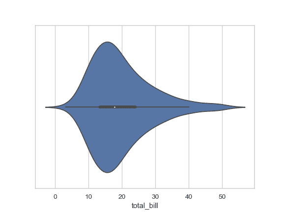
繪制一個單獨的橫向小提琴圖:
```py
>>> import seaborn as sns
>>> sns.set(style="whitegrid")
>>> tips = sns.load_dataset("tips")
>>> ax = sns.violinplot(x=tips["total_bill"])
```
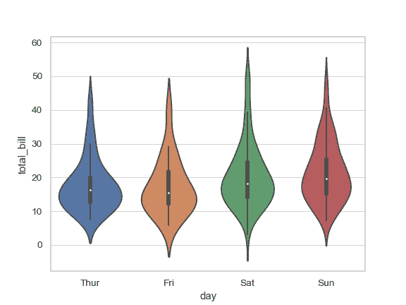
根據分類變量分組繪制一個縱向的小提琴圖:
```py
>>> ax = sns.violinplot(x="day", y="total_bill", data=tips)
```
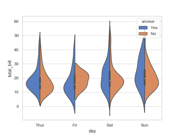
根據 2 個分類變量嵌套分組繪制一個小提琴圖:
```py
>>> ax = sns.violinplot(x="day", y="total_bill", hue="smoker",
... data=tips, palette="muted")
```

繪制分割的小提琴圖以比較不同的色調變量:
```py
>>> ax = sns.violinplot(x="day", y="total_bill", hue="smoker",
... data=tips, palette="muted", split=True)
```
通過顯式傳入參數指定順序控制小提琴圖的顯示順序:
```py
>>> ax = sns.violinplot(x="time", y="tip", data=tips,
... order=["Dinner", "Lunch"])
```

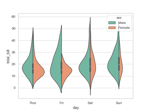
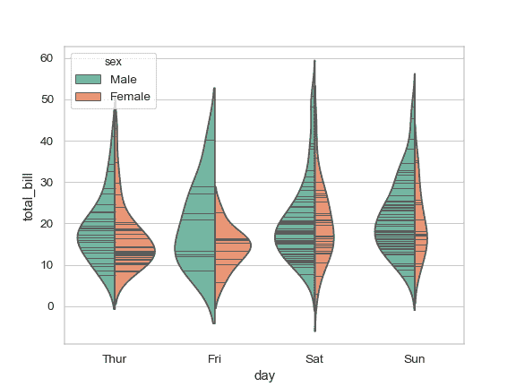
將小提琴寬度縮放為每個分箱中觀察到的數據點數目:
```py
>>> ax = sns.violinplot(x="day", y="total_bill", hue="sex",
... data=tips, palette="Set2", split=True,
... scale="count")
```
將四分位數繪制為水平線而不是迷你箱型圖:
```py
>>> ax = sns.violinplot(x="day", y="total_bill", hue="sex",
... data=tips, palette="Set2", split=True,
... scale="count", inner="quartile")
```

用小提琴圖內部的橫線顯示每個觀察到的數據點:
```py
>>> ax = sns.violinplot(x="day", y="total_bill", hue="sex",
... data=tips, palette="Set2", split=True,
... scale="count", inner="stick")
```
根據所有分箱的數據點數目對密度進行縮放:
```py
>>> ax = sns.violinplot(x="day", y="total_bill", hue="sex",
... data=tips, palette="Set2", split=True,
... scale="count", inner="stick", scale_hue=False)
```

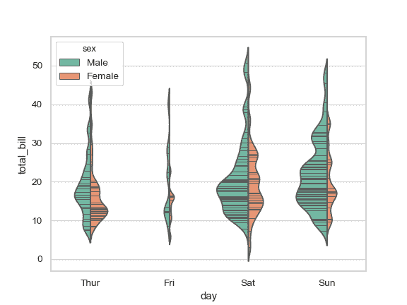
使用窄帶寬來減少平滑量:
```py
>>> ax = sns.violinplot(x="day", y="total_bill", hue="sex",
... data=tips, palette="Set2", split=True,
... scale="count", inner="stick",
... scale_hue=False, bw=.2)
```
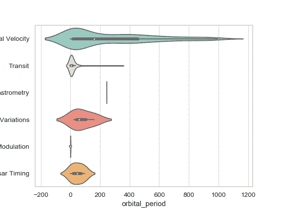
繪制橫向小提琴圖:
```py
>>> planets = sns.load_dataset("planets")
>>> ax = sns.violinplot(x="orbital_period", y="method",
... data=planets[planets.orbital_period < 1000],
... scale="width", palette="Set3")
```
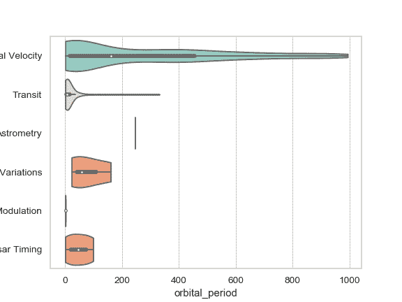
不要讓密度超出數據中的極端數值:
```py
>>> ax = sns.violinplot(x="orbital_period", y="method",
... data=planets[planets.orbital_period < 1000],
... cut=0, scale="width", palette="Set3")
```
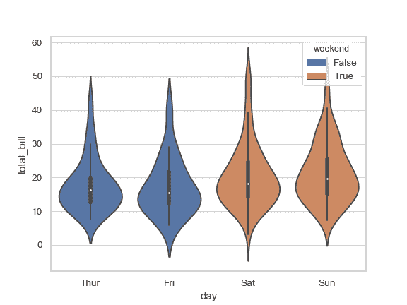
使用 `hue` 而不改變小提琴圖的位置或寬度:
```py
>>> tips["weekend"] = tips["day"].isin(["Sat", "Sun"])
>>> ax = sns.violinplot(x="day", y="total_bill", hue="weekend",
... data=tips, dodge=False)
```
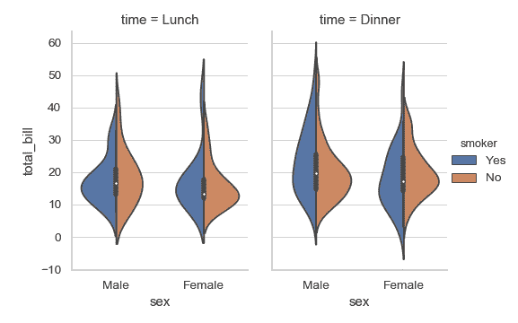
把 [`catplot()`](seaborn.catplot.html#seaborn.catplot "seaborn.catplot") 與 [`violinplot()`](#seaborn.violinplot "seaborn.violinplot") 以及 [`FacetGrid`](seaborn.FacetGrid.html#seaborn.FacetGrid "seaborn.FacetGrid") 結合起來使用。這允許您通過額外的分類變量進行分組。使用 [`catplot()`](seaborn.catplot.html#seaborn.catplot "seaborn.catplot") 比直接使用 [`FacetGrid`](seaborn.FacetGrid.html#seaborn.FacetGrid "seaborn.FacetGrid") 更為安全,因為它保證了不同切面上變量同步的順序:
```py
>>> g = sns.catplot(x="sex", y="total_bill",
... hue="smoker", col="time",
... data=tips, kind="violin", split=True,
... height=4, aspect=.7);
```
- seaborn 0.9 中文文檔
- Seaborn 簡介
- 安裝和入門
- 可視化統計關系
- 可視化分類數據
- 可視化數據集的分布
- 線性關系可視化
- 構建結構化多圖網格
- 控制圖像的美學樣式
- 選擇調色板
- seaborn.relplot
- seaborn.scatterplot
- seaborn.lineplot
- seaborn.catplot
- seaborn.stripplot
- seaborn.swarmplot
- seaborn.boxplot
- seaborn.violinplot
- seaborn.boxenplot
- seaborn.pointplot
- seaborn.barplot
- seaborn.countplot
- seaborn.jointplot
- seaborn.pairplot
- seaborn.distplot
- seaborn.kdeplot
- seaborn.rugplot
- seaborn.lmplot
- seaborn.regplot
- seaborn.residplot
- seaborn.heatmap
- seaborn.clustermap
- seaborn.FacetGrid
- seaborn.FacetGrid.map
- seaborn.FacetGrid.map_dataframe
- seaborn.PairGrid
- seaborn.PairGrid.map
- seaborn.PairGrid.map_diag
- seaborn.PairGrid.map_offdiag
- seaborn.PairGrid.map_lower
- seaborn.PairGrid.map_upper
- seaborn.JointGrid
- seaborn.JointGrid.plot
- seaborn.JointGrid.plot_joint
- seaborn.JointGrid.plot_marginals
- seaborn.set
- seaborn.axes_style
- seaborn.set_style
- seaborn.plotting_context
- seaborn.set_context
- seaborn.set_color_codes
- seaborn.reset_defaults
- seaborn.reset_orig
- seaborn.set_palette
- seaborn.color_palette
- seaborn.husl_palette
- seaborn.hls_palette
- seaborn.cubehelix_palette
- seaborn.dark_palette
- seaborn.light_palette
- seaborn.diverging_palette
- seaborn.blend_palette
- seaborn.xkcd_palette
- seaborn.crayon_palette
- seaborn.mpl_palette
- seaborn.choose_colorbrewer_palette
- seaborn.choose_cubehelix_palette
- seaborn.choose_light_palette
- seaborn.choose_dark_palette
- seaborn.choose_diverging_palette
- seaborn.load_dataset
- seaborn.despine
- seaborn.desaturate
- seaborn.saturate
- seaborn.set_hls_values