
# **seaborn.lineplot**
> 譯者:[cancan233](https://github.com/cancan233)
```python
seaborn.lineplot(x=None, y=None, hue=None, size=None, style=None, data=None, palette=None, hue_order=None, hue_norm=None, sizes=None, size_order=None, size_norm=None, dashes=True, markers=None, style_order=None, units=None, estimator='mean', ci=95, n_boot=1000, sort=True, err_style='band', err_kws=None, legend='brief', ax=None, **kwargs)
```
用不同語義分組繪制線型圖
`x`和`y`之間的關系可以使用`hue`,`size`和`style`參數為數據的不同子集顯示。這些參數控制用于識別不同子集的視覺語義。通過使用所有三種語義類型,可以獨立地顯示三個維度,但是這種畫圖樣式可能難以解釋并且通常是無效的。使用冗余語義(即同一變量的`hue`和`style`)有助于使圖形更易于理解。
請查看[指南](http://seaborn.pydata.org/tutorial/relational.html#relational-tutoria)獲取更多信息。
默認情況下,圖標在每個`x`值處匯總多個`y`值,并顯示集中趨勢的估計值和該估計值的置信區間。
參數:`x,y`: `data`或向量數據中變量的名稱,可選擇。
> 輸入數據變量;必須是數字。可以直接傳遞數據或引用`data`中的列。
`hue`: `data`或向量數據中的變量名,可選。
> 分組變量,將生成具有不同顏色的線條的變量。可以是分類或數字,但顏色映射在后一種情況下的行為會有所不同。
`size`: `data`或向量數據中的變量名,可選。
> 分組變量,將生成具有不同粗細的線條的變量。可以是分類或數字,但大小映射在后一種情況下的行為會有所不同。
`style`: `data`或向量數據中的變量名,可選。
> 分組變量,將生成具有不同樣式和/或標記的線條的變量。可以是一種數字形式,但是始終會被視為分類。
`data`: 數據框架。
> 整潔(“長形式”)數據框,其中每列是變量,每行是觀察量。
`palette`: 調色板名稱,列表或字典,可選。
> 用于`hue`變量的不同級別的顏色。應該是[`color_palette()`](seaborn.color_palette.html#seaborn.color_palette "seaborn.color_palette")可以解釋的東西,或者是將色調級別映射到 matplotlib 顏色的字典。
`hue_order`:列表,可選。
> 指定`hue`變量級別的出現順序,否則它們是根據數據確定的。當`hue`變量是數字時不相關。
`hue_norm`: 原則或者時歸一化對象,可選。
> 當數值為數字時,應用于`hue`變量的顏色圖數據單元的歸一化。 如果是分類的,則不相關。
`sizes`:列表,字典,或者元組。可選。
> 確定在使用`size`時如何選擇大小的對象。它始終可以是大小值列表或`size`變量與大小的字典映射級別。當`size`是數字時,它也可以是一個元組,指定要使用的最小和最大大小,以便在此范圍內對其他值進行規范化。
`size_norm`:原則或者時歸一化對象,可選。
> 當`size`變量是數字時,用于縮放繪圖對象的數據單元中的歸一化。
`dashes`: 布爾值,列表或字典,可選。
> 確定如何為`style`變量的不同級別繪制線條的對象。設置為`True`將使用默認的短劃線代碼,或者您可以將短劃線代碼列表或`style`變量的字典映射級別傳遞給短劃線代碼。設置為`False`將對所有子集使用實線。線段在 matplotlib 中指定: `(segment, gap)`長度的元組,或用于繪制實線的空字符串。
`markers`: 布爾值,列表或字典,可選。
> 確定如何為`style`變量的不同級別繪制標記的對象。 設置為“True”將使用默認標記,或者您可以傳遞標記列表或將`style`變量的字典映射到標記。 設置為“False”將繪制無標記線。 標記在 matplotlib 中指定。
`style_order`:列表,可選。
> 指定`style`變量級別的出現順序,否則它們是從數據中確定的。`style`變量時數字不相關的。
`units`: {long_form_var}
> 對變量識別抽樣單位進行分組。使用時,將為每個單元繪制一個單獨的行,并使用適當的語義。但不會添加任何圖里條目。當不需要確切的身份時,可用于顯示實驗重復的分布。
`estimator`:pandas 方法的名稱或可調用或無,可選。
> 在相同的`x`級別上聚合`y`變量的多個觀察值的方法。如果`None`,將繪制所有觀察結果。
`ci`:整數或`sd`或 None。可選。
> 與`estimator`聚合時繪制的置信區間大小。`sd`表示繪制數據的標準偏差。設置為`None`將跳過 bootstrap。
`n_boot`:整數,可選。
> 用于計算置信區間的 bootstrap 數。
`sort`:布爾值,可選。
> 如果為真,則數據將按 x 與 y 變量排序,否則行將按照它們在數據集中出現的順序連接點。
`err_style`: `band`或`bars`,可選。
> 是否用半透明誤差帶或離散誤差棒繪制置信區間。
`err_band`:關鍵字參數字典。
> 用于控制誤差線美觀的附加參數。 `kwargs`傳遞給`ax.fill_between`或`ax.errorbar`,具體取決于`err_style`。
`legend`: `brief`,`full`,或`False`。可選。
> 如何繪制圖例。如果`brief`,則數字`hue`和`size`變量將用均勻間隔值的樣本表示。如果`full`,則每個組都會在圖例中輸入一個條目。如果為`False`,則不添加圖例數據且不繪制圖例。
`ax`:matplotlib 軸。可選。
> 將繪圖繪制到的 Axes 對象,否則使用當前軸。
`kwargs`:關鍵,價值映射。
> 其他關鍵字參數在繪制時傳遞給`plt.plot`。
返回值:`ax`:matplotlib 軸
> 返回 Axes 對象,并在其上繪制繪圖。
也可以看看
顯示兩個變量之間的關系,而不強調`x`變量的連續性。當兩個變量時分類時,顯示兩個變量之間的關系。
例子
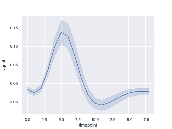
繪制單線圖,其中錯誤帶顯示執行區間:
```py
>>> import seaborn as sns; sns.set()
>>> import matplotlib.pyplot as plt
>>> fmri = sns.load_dataset("fmri")
>>> ax = sns.lineplot(x="timepoint", y="signal", data=fmri)
```
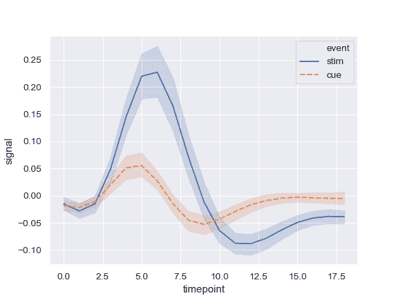
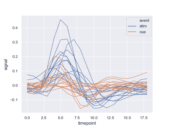
按另一個變量分組并顯示具有不同顏色的組:
```py
>>> ax = sns.lineplot(x="timepoint", y="signal", hue="event",
... data=fmri)
```

使用顏色和線條劃線顯示分組變量:
```py
>>> ax = sns.lineplot(x="timepoint", y="signal",
... hue="event", style="event", data=fmri)
```
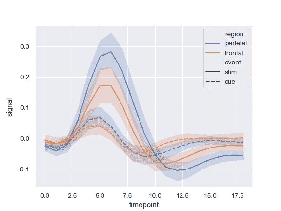
使用顏色和線條劃線來表示兩個不同的分組變量:
```py
>>> ax = sns.lineplot(x="timepoint", y="signal",
... hue="region", style="event", data=fmri)
```
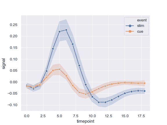
使用標記而不是破折號來標識組:
```py
>>> ax = sns.lineplot(x="timepoint", y="signal",
... hue="event", style="event",
... markers=True, dashes=False, data=fmri)
```
顯示錯誤條而不是錯誤帶并繪制標準錯誤:
```py
>>> ax = sns.lineplot(x="timepoint", y="signal", hue="event",
... err_style="bars", ci=68, data=fmri)
```

顯示實驗性重復而不是聚合:
```py
>>> ax = sns.lineplot(x="timepoint", y="signal", hue="event",
... units="subject", estimator=None, lw=1,
... data=fmri.query("region == 'frontal'"))
```
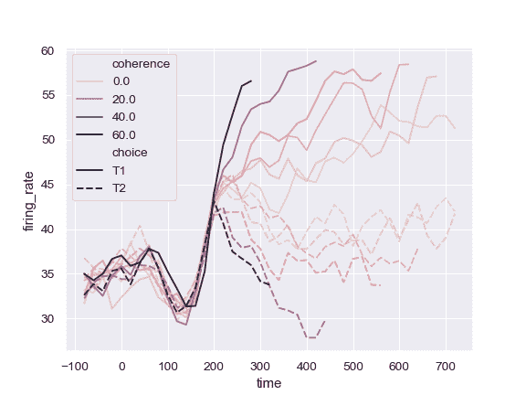
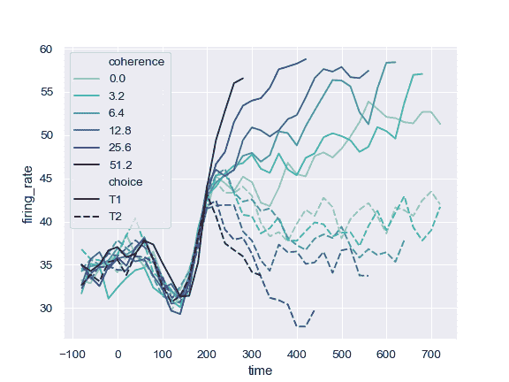
使用定量顏色映射:
```py
>>> dots = sns.load_dataset("dots").query("align == 'dots'")
>>> ax = sns.lineplot(x="time", y="firing_rate",
... hue="coherence", style="choice",
... data=dots)
```
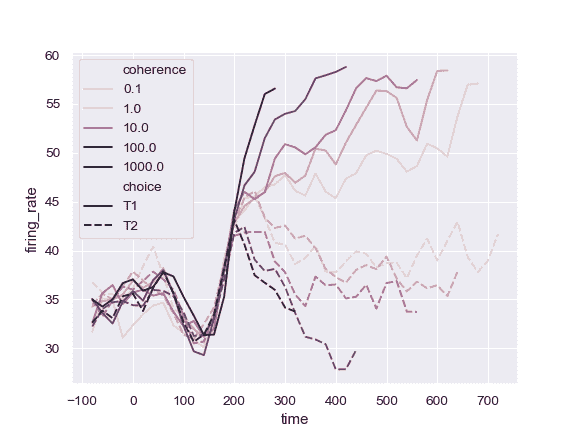
對 colormap 使用不同的歸一化:
```py
>>> from matplotlib.colors import LogNorm
>>> ax = sns.lineplot(x="time", y="firing_rate",
... hue="coherence", style="choice",
... hue_norm=LogNorm(), data=dots)
```
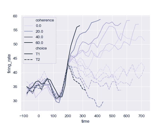
使用不同的調色板:
```py
>>> ax = sns.lineplot(x="time", y="firing_rate",
... hue="coherence", style="choice",
... palette="ch:2.5,.25", data=dots)
```
使用特定顏色值,將 hue 變量視為分類:
```py
>>> palette = sns.color_palette("mako_r", 6)
>>> ax = sns.lineplot(x="time", y="firing_rate",
... hue="coherence", style="choice",
... palette=palette, data=dots)
```
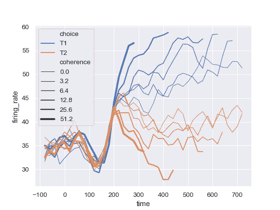
使用定量變量更改線條的寬度:
```py
>>> ax = sns.lineplot(x="time", y="firing_rate",
... size="coherence", hue="choice",
... legend="full", data=dots)
```
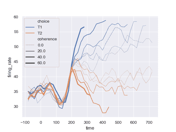
更改用于規范化 size 變量的線寬范圍:
```py
>>> ax = sns.lineplot(x="time", y="firing_rate",
... size="coherence", hue="choice",
... sizes=(.25, 2.5), data=dots)
```
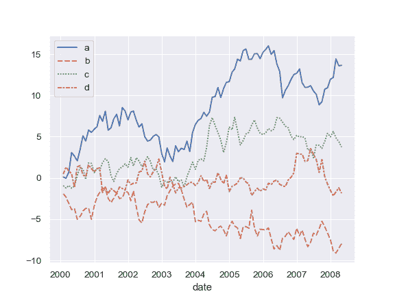
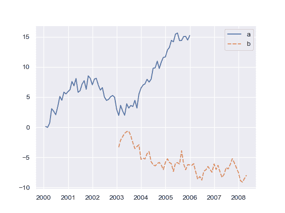
DataFrame 繪制:
```py
>>> import numpy as np, pandas as pd; plt.close("all")
>>> index = pd.date_range("1 1 2000", periods=100,
... freq="m", name="date")
>>> data = np.random.randn(100, 4).cumsum(axis=0)
>>> wide_df = pd.DataFrame(data, index, ["a", "b", "c", "d"])
>>> ax = sns.lineplot(data=wide_df)
```
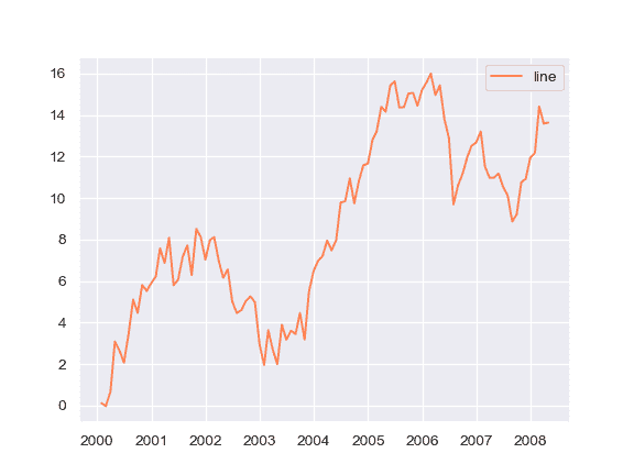
系列列表中繪制:
```py
>>> list_data = [wide_df.loc[:"2005", "a"], wide_df.loc["2003":, "b"]]
>>> ax = sns.lineplot(data=list_data)
```
繪制單個系列,將 kwargs 傳遞給`plt.plot`:
```py
>>> ax = sns.lineplot(data=wide_df["a"], color="coral", label="line")
```
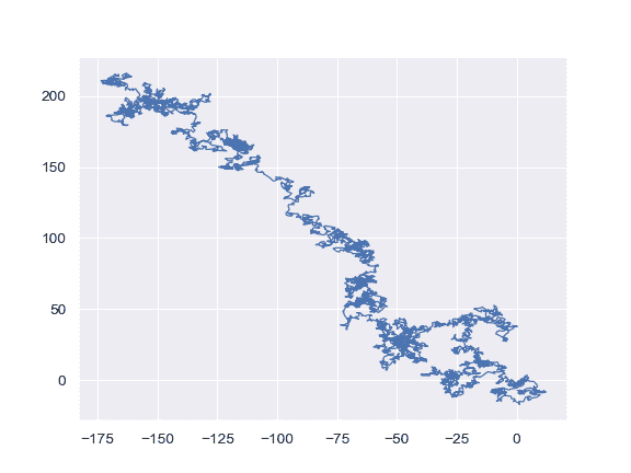
在數據集中出現的點處繪制線條:
```py
>>> x, y = np.random.randn(2, 5000).cumsum(axis=1)
>>> ax = sns.lineplot(x=x, y=y, sort=False, lw=1)
```
- seaborn 0.9 中文文檔
- Seaborn 簡介
- 安裝和入門
- 可視化統計關系
- 可視化分類數據
- 可視化數據集的分布
- 線性關系可視化
- 構建結構化多圖網格
- 控制圖像的美學樣式
- 選擇調色板
- seaborn.relplot
- seaborn.scatterplot
- seaborn.lineplot
- seaborn.catplot
- seaborn.stripplot
- seaborn.swarmplot
- seaborn.boxplot
- seaborn.violinplot
- seaborn.boxenplot
- seaborn.pointplot
- seaborn.barplot
- seaborn.countplot
- seaborn.jointplot
- seaborn.pairplot
- seaborn.distplot
- seaborn.kdeplot
- seaborn.rugplot
- seaborn.lmplot
- seaborn.regplot
- seaborn.residplot
- seaborn.heatmap
- seaborn.clustermap
- seaborn.FacetGrid
- seaborn.FacetGrid.map
- seaborn.FacetGrid.map_dataframe
- seaborn.PairGrid
- seaborn.PairGrid.map
- seaborn.PairGrid.map_diag
- seaborn.PairGrid.map_offdiag
- seaborn.PairGrid.map_lower
- seaborn.PairGrid.map_upper
- seaborn.JointGrid
- seaborn.JointGrid.plot
- seaborn.JointGrid.plot_joint
- seaborn.JointGrid.plot_marginals
- seaborn.set
- seaborn.axes_style
- seaborn.set_style
- seaborn.plotting_context
- seaborn.set_context
- seaborn.set_color_codes
- seaborn.reset_defaults
- seaborn.reset_orig
- seaborn.set_palette
- seaborn.color_palette
- seaborn.husl_palette
- seaborn.hls_palette
- seaborn.cubehelix_palette
- seaborn.dark_palette
- seaborn.light_palette
- seaborn.diverging_palette
- seaborn.blend_palette
- seaborn.xkcd_palette
- seaborn.crayon_palette
- seaborn.mpl_palette
- seaborn.choose_colorbrewer_palette
- seaborn.choose_cubehelix_palette
- seaborn.choose_light_palette
- seaborn.choose_dark_palette
- seaborn.choose_diverging_palette
- seaborn.load_dataset
- seaborn.despine
- seaborn.desaturate
- seaborn.saturate
- seaborn.set_hls_values