
# 構建結構化多圖網格
> 譯者:[keyianpai](https://github.com/keyianpai)
在探索中等維度數據時,經常需要在數據集的不同子集上繪制同一類型圖的多個實例。這種技術有時被稱為“網格”或“格子”繪圖,它與[“多重小圖”](https://en.wikipedia.org/wiki/Small_multiple)的概念有關。這種技術使查看者從復雜數據中快速提取大量信息。 Matplotlib 為繪制這種多軸圖提供了很好的支持; seaborn 構建于此之上,可直接將繪圖結構和數據集結構關系起來。
要使用網格圖功能,數據必須在 Pandas 數據框中,并且必須采用 Hadley Whickam 所謂的 [“整潔”數據](https://vita.had.co.nz/papers/tidy-data.pdf)的形式。簡言之,用來畫圖的數據框應該構造成每列一個變量,每一行一個觀察的形式。
至于高級用法,可以直接使用本教程中討論的對象,以提供最大的靈活性。一些 seaborn 函數(例如`lmplot()`,`catplot()`和`pairplot()`)也在后臺使用它們。與其他在沒有操縱圖形的情況下繪制到特定的(可能已經存在的)matplotlib `Axes`上的“Axes-level” seaborn 函數不同,這些更高級別的函數在調用時會創建一個圖形,并且通常對圖形的設置方式更加嚴格。在某些情況下,這些函數或它們所依賴的類構造函數的參數將提供不同的接口屬性,如`lmplot()`中的圖形大小,你可以設置每個子圖的高和寬高比。但是,使用這些對象的函數在繪圖后都會返回它,并且這些對象大多都有方便簡單的方法來改變圖的繪制方式。
```py
import seaborn as sns
import matplotlib.pyplot as plt
```
```py
sns.set(style="ticks")
```
## 基于一定條件的多重小圖
當你想在數據集的不同子集中分別可視化變量分布或多個變量之間的關系時,[`FacetGrid`](../generated/seaborn.FacetGrid.html#seaborn.FacetGrid "seaborn.FacetGrid")類非常有用。 `FacetGrid`最多有三個維:`row`,`col`和`hue`。前兩個與軸(axes)陣列有明顯的對應關系;將色調變量`hue`視為沿深度軸的第三個維度,不同的級別用不同的顏色繪制。
首先,使用數據框初始化`FacetGrid`對象并指定將形成網格的行,列或色調維度的變量名稱。這些變量應是離散的,然后對應于變量的不同取值的數據將用于沿該軸的不同小平面的繪制。例如,假設我們想要在`tips`數據集中檢查午餐和晚餐小費分布的差異。
此外,`relplot()`,`catplot()`和`lmplot()`都在內部使用此對象,并且它們在完成時返回該對象,以便進一步調整。
```py
tips = sns.load_dataset("tips")
```
```py
g = sns.FacetGrid(tips, col="time")
```

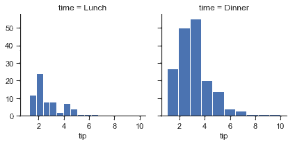
如上初始化網格會設置 matplotlib 圖形和軸,但不會在其上繪制任何內容。
在網格上可視化數據的主要方法是 FacetGrid.map()。為此方法提供繪圖函數以及要繪制的數據框變量名作為參數。我們使用直方圖繪制每個子集中小費金額的分布。
```py
g = sns.FacetGrid(tips, col="time")
g.map(plt.hist, "tip");
```
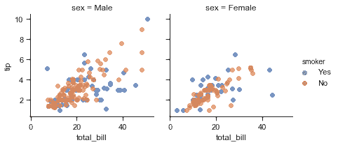
`map`函數繪制圖形并注釋軸,生成圖。要繪制關系圖,只需傳遞多個變量名稱。還可以提供關鍵字參數,這些參數將傳遞給繪圖函數:
```py
g = sns.FacetGrid(tips, col="sex", hue="smoker")
g.map(plt.scatter, "total_bill", "tip", alpha=.7)
g.add_legend();
```
有幾個傳遞給類構造函數的選項可用于控制網格外觀。
```py
g = sns.FacetGrid(tips, row="smoker", col="time", margin_titles=True)
g.map(sns.regplot, "size", "total_bill", color=".3", fit_reg=False, x_jitter=.1);
```
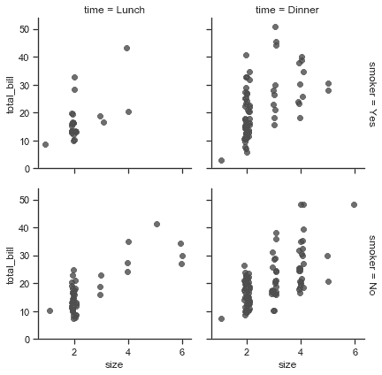
注意,matplotlib API 并未正式支持`margin_titles`,此選項在一些情況下可能無法正常工作。特別是,它目前不能與圖之外的圖例同時使用。
通過提供每個面的高度以及縱橫比來設置圖形的大小:
```py
g = sns.FacetGrid(tips, col="day", height=4, aspect=.5)
g.map(sns.barplot, "sex", "total_bill");
```
```py
/Users/mwaskom/code/seaborn/seaborn/axisgrid.py:715: UserWarning: Using the barplot function without specifying order is likely to produce an incorrect plot.
warnings.warn(warning)
```

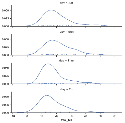
小圖的默認排序由 DataFrame 中的信息確定的。如果用于定義小圖的變量是類別變量,則使用類別的順序。否則,小圖將按照各類的出現順序排列。但是,可以使用適當的`* _order`參數指定任意構面維度的順序:
```py
ordered_days = tips.day.value_counts().index
g = sns.FacetGrid(tips, row="day", row_order=ordered_days,
height=1.7, aspect=4,)
g.map(sns.distplot, "total_bill", hist=False, rug=True);
```
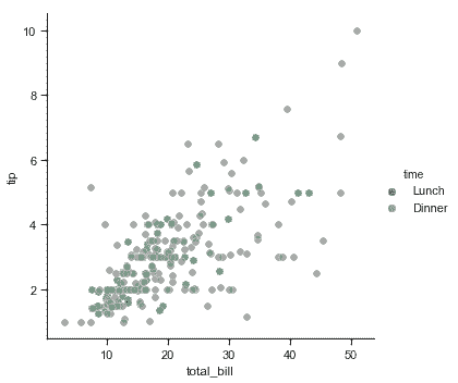
可以用 seaborn 調色板(即可以傳遞給[`color_palette()`](../generated/seaborn.color_palette.html#seaborn.color_palette "seaborn.color_palette")的東西。)還可以用字典將`hue`變量中的值映射到 matplotlib 顏色:
```py
pal = dict(Lunch="seagreen", Dinner="gray")
g = sns.FacetGrid(tips, hue="time", palette=pal, height=5)
g.map(plt.scatter, "total_bill", "tip", s=50, alpha=.7, linewidth=.5, edgecolor="white")
g.add_legend();
```
還可以讓圖的其他方面(如點的形狀)在色調變量的各個級別之間變化,這在以黑白方式打印時使圖易于理解。為此,只需將一個字典傳遞給 hue_kws,其中鍵是繪圖函數關鍵字參數的名稱,值是關鍵字值列表,每個級別為一個色調變量。
```py
g = sns.FacetGrid(tips, hue="sex", palette="Set1", height=5, hue_kws={"marker": ["^", "v"]})
g.map(plt.scatter, "total_bill", "tip", s=100, linewidth=.5, edgecolor="white")
g.add_legend();
```

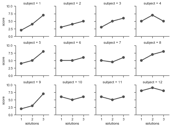
如果一個變量的水平數過多,除了可以沿著列繪制之外,也可以“包裝”它們以便它們跨越多行。執行此 wrap 操作時,不能使用`row`變量。
```py
attend = sns.load_dataset("attention").query("subject <= 12")
g = sns.FacetGrid(attend, col="subject", col_wrap=4, height=2, ylim=(0, 10))
g.map(sns.pointplot, "solutions", "score", color=".3", ci=None);
```
```py
/Users/mwaskom/code/seaborn/seaborn/axisgrid.py:715: UserWarning: Using the pointplot function without specifying order is likely to produce an incorrect plot.
warnings.warn(warning)
```
使用[`FacetGrid.map()`](../generated/seaborn.FacetGrid.map.html#seaborn.FacetGrid.map "seaborn.FacetGrid.map") (可以多次調用)繪圖后,你可以調整繪圖的外觀。 `FacetGrid`對象有許多方法可以在更高的抽象層次上操作圖形。最一般的是`FacetGrid.set()`,還有其他更專業的方法,如`FacetGrid.set_axis_labels()`,它們都遵循內部構面沒有軸標簽的約定。例如:
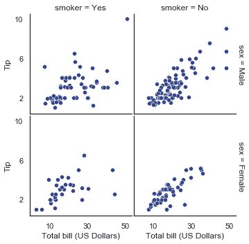
```py
with sns.axes_style("white"):
g = sns.FacetGrid(tips, row="sex", col="smoker", margin_titles=True, height=2.5)
g.map(plt.scatter, "total_bill", "tip", color="#334488", edgecolor="white", lw=.5);
g.set_axis_labels("Total bill (US Dollars)", "Tip");
g.set(xticks=[10, 30, 50], yticks=[2, 6, 10]);
g.fig.subplots_adjust(wspace=.02, hspace=.02);
```
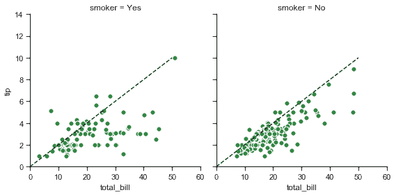
對于需要更多自定義的情形,你可以直接使用底層 matplotlib 圖形`Figure`和軸`Axes`對象,它們分別作為成員屬性存儲在`Figure`和軸`Axes`(一個二維數組)中。在制作沒有行或列刻面的圖形時,你還可以使用`ax`屬性直接訪問單個軸。
```py
g = sns.FacetGrid(tips, col="smoker", margin_titles=True, height=4)
g.map(plt.scatter, "total_bill", "tip", color="#338844", edgecolor="white", s=50, lw=1)
for ax in g.axes.flat:
ax.plot((0, 50), (0, .2 * 50), c=".2", ls="--")
g.set(xlim=(0, 60), ylim=(0, 14));
```
## 使用自定義函數
使用[`FacetGrid`](../generated/seaborn.FacetGrid.html#seaborn.FacetGrid "seaborn.FacetGrid")時,你除了可以使用現有的 matplotlib 和 seaborn 函數,還可以使用自定義函數。但是,這些函數必須遵循一些規則:
1. 它必須繪制到“當前活動的”matplotlib 軸`Axes`上。 `matplotlib.pyplot`命名空間中的函數就是如此。如果要直接使用當前軸的方法,可以調用`plt.gca`來獲取對當前`Axes`的引用。
2. 它必須接受它在位置參數中繪制的數據。在內部,[`FacetGrid`](../generated/seaborn.FacetGrid.html#seaborn.FacetGrid "seaborn.FacetGrid")將為傳遞給[`FacetGrid.map()`](../generated/seaborn.FacetGrid.map.html#seaborn.FacetGrid.map "seaborn.FacetGrid.map")的每個命名位置參數傳遞一`Series`數據。
3. 它必須能接受`color`和`label`關鍵字參數,理想情況下,它會用它們做一些有用的事情。在大多數情況下,最簡單的方法是捕獲`** kwargs`的通用字典并將其傳遞給底層繪圖函數。
讓我們看一下自定義繪圖函數的最小示例。這個函數在每個構面采用一個數據向量:
```py
from scipy import stats
def quantile_plot(x, **kwargs):
qntls, xr = stats.probplot(x, fit=False)
plt.scatter(xr, qntls, **kwargs)
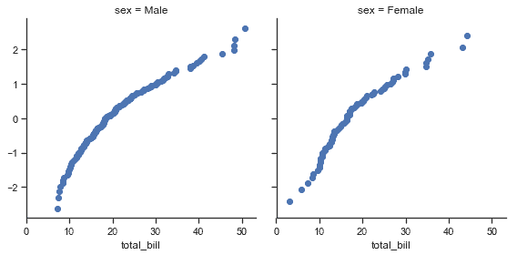
g = sns.FacetGrid(tips, col="sex", height=4)
g.map(quantile_plot, "total_bill");
```
如果你想要制作一個雙變量圖,編寫函數則應該有分別接受 x 軸變量,y 軸變量的參數:
```py
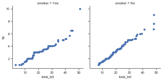
def qqplot(x, y, **kwargs):
_, xr = stats.probplot(x, fit=False)
_, yr = stats.probplot(y, fit=False)
plt.scatter(xr, yr, **kwargs)
g = sns.FacetGrid(tips, col="smoker", height=4)
g.map(qqplot, "total_bill", "tip");
```
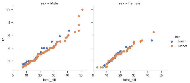
因為`plt.scatter`接受顏色和標簽關鍵字參數并做相應的處理,所以我們可以毫無困難地添加一個色調構面:
```py
g = sns.FacetGrid(tips, hue="time", col="sex", height=4)
g.map(qqplot, "total_bill", "tip")
g.add_legend();
```
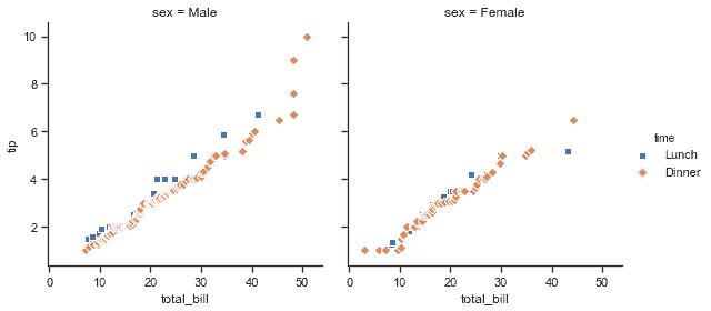
這種方法還允許我們使用額外的美學元素來區分色調變量的級別,以及不依賴于分面變量的關鍵字參數:
```py
g = sns.FacetGrid(tips, hue="time", col="sex", height=4,
hue_kws={"marker": ["s", "D"]})
g.map(qqplot, "total_bill", "tip", s=40, edgecolor="w")
g.add_legend();
```
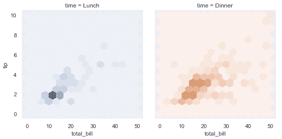
有時候,你需要使用`color`和`label`關鍵字參數映射不能按預期方式工作的函數。在這種情況下,你需要顯式捕獲它們并在自定義函數的邏輯中處理它們。例如,這種方法可用于映射`plt.hexbin`,使它與[`FacetGrid`](../generated/seaborn.FacetGrid.html#seaborn.FacetGrid "seaborn.FacetGrid") API 匹配:
```py
def hexbin(x, y, color, **kwargs):
cmap = sns.light_palette(color, as_cmap=True)
plt.hexbin(x, y, gridsize=15, cmap=cmap, **kwargs)
with sns.axes_style("dark"):
g = sns.FacetGrid(tips, hue="time", col="time", height=4)
g.map(hexbin, "total_bill", "tip", extent=[0, 50, 0, 10]);
```
## 繪制成對數據關系
[`PairGrid`](../generated/seaborn.PairGrid.html#seaborn.PairGrid "seaborn.PairGrid")允許你使用相同的繪圖類型快速繪制小子圖的網格。在[`PairGrid`](../generated/seaborn.PairGrid.html#seaborn.PairGrid "seaborn.PairGrid")中,每個行和列都分配給一個不同的變量,結果圖顯示數據集中的每個對變量的關系。這種圖有時被稱為“散點圖矩陣”,這是顯示成對關系的最常見方式,但是[`PairGrid`](../generated/seaborn.PairGrid.html#seaborn.PairGrid "seaborn.PairGrid")不僅限于散點圖。
了解[`FacetGrid`](../generated/seaborn.FacetGrid.html#seaborn.FacetGrid "seaborn.FacetGrid")和[`PairGrid`](../generated/seaborn.PairGrid.html#seaborn.PairGrid "seaborn.PairGrid")之間的差異非常重要。前者每個構面顯示以不同級別的變量為條件的相同關系。后者顯示不同的關系(盡管上三角和下三角組成鏡像圖)。使用[`PairGrid`](../generated/seaborn.PairGrid.html#seaborn.PairGrid "seaborn.PairGrid")可為你提供數據集中有趣關系的快速,高級的摘要。
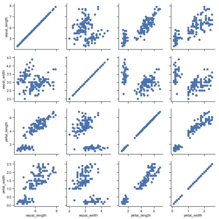
該類的基本用法與[`FacetGrid`](../generated/seaborn.FacetGrid.html#seaborn.FacetGrid "seaborn.FacetGrid")非常相似。首先初始化網格,然后將繪圖函數傳遞給`map`方法,并在每個子圖上調用它。還有一個伴侶函數, [`pairplot()`](../generated/seaborn.pairplot.html#seaborn.pairplot "seaborn.pairplot") ,可以更快的繪圖。
```py
iris = sns.load_dataset("iris")
g = sns.PairGrid(iris)
g.map(plt.scatter);
```
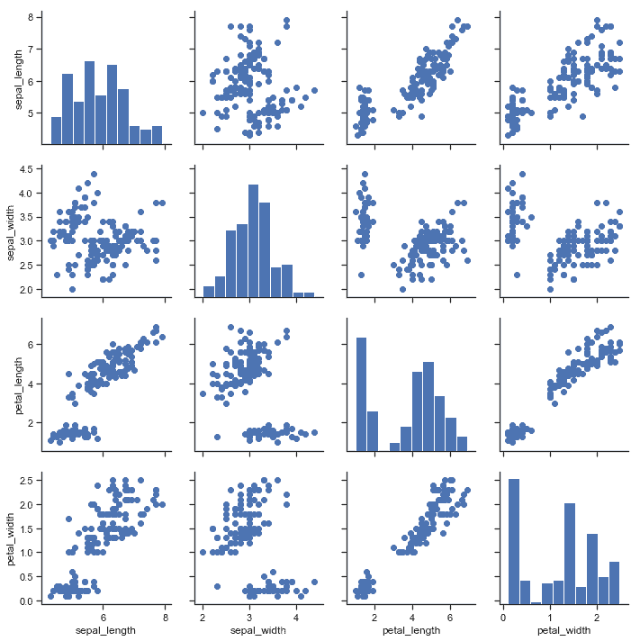
可以在對角線上繪制不同的函數,以顯示每列中變量的單變量分布。但請注意,軸刻度與該繪圖的計數或密度軸不對應。
```py
g = sns.PairGrid(iris)
g.map_diag(plt.hist)
g.map_offdiag(plt.scatter);
```
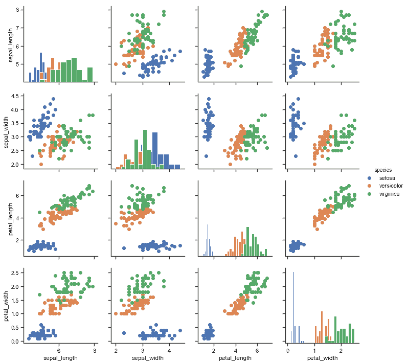
此圖的一種常見用法是通過單獨的分類變量對觀察結果進行著色。例如,iris 數據集三種不同種類的鳶尾花都有四種測量值,因此你可以看到不同花在這些取值上的差異。
```py
g = sns.PairGrid(iris, hue="species")
g.map_diag(plt.hist)
g.map_offdiag(plt.scatter)
g.add_legend();
```
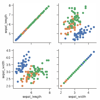
默認情況下,使用數據集中的每個數值列,但如果需要,你可以專注于特定列。
```py
g = sns.PairGrid(iris, vars=["sepal_length", "sepal_width"], hue="species")
g.map(plt.scatter);
```
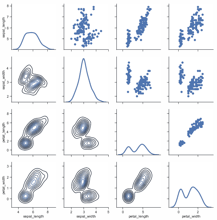
也可以在上三角和下三角中使用不同的函數來強調關系的不同方面。
```py
g = sns.PairGrid(iris)
g.map_upper(plt.scatter)
g.map_lower(sns.kdeplot)
g.map_diag(sns.kdeplot, lw=3, legend=False);
```
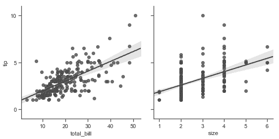
對角線上具有單位關系的方形網格實際上只是一種特殊情況,你也可以在行和列中使用不同的變量進行繪圖。
```py
g = sns.PairGrid(tips, y_vars=["tip"], x_vars=["total_bill", "size"], height=4)
g.map(sns.regplot, color=".3")
g.set(ylim=(-1, 11), yticks=[0, 5, 10]);
```
當然,美學屬性是可配置的。例如,你可以使用不同的調色板(例如,顯示色調變量的順序)并將關鍵字參數傳遞到繪圖函數中。
```py
g = sns.PairGrid(tips, hue="size", palette="GnBu_d")
g.map(plt.scatter, s=50, edgecolor="white")
g.add_legend();
```

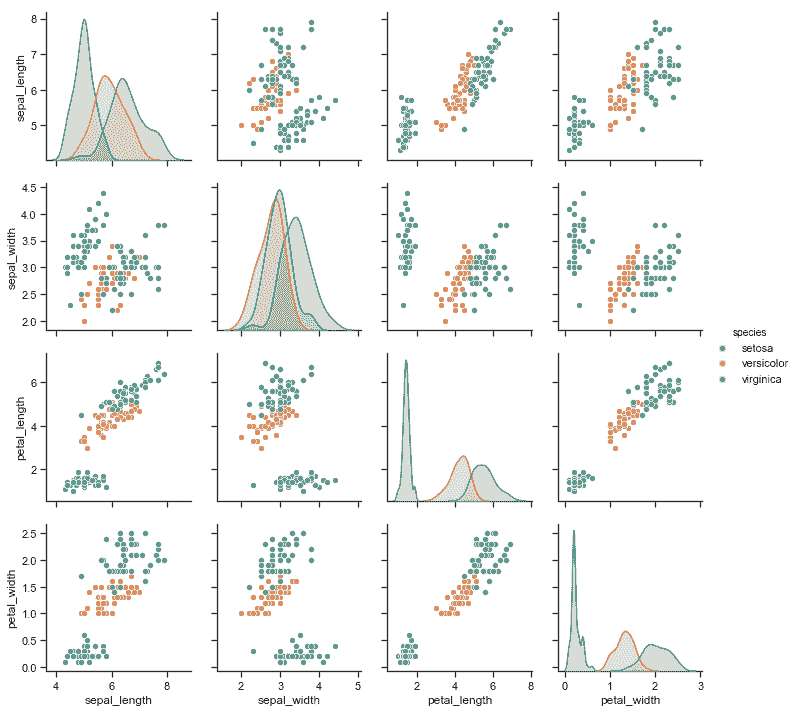
[`PairGrid`](../generated/seaborn.PairGrid.html#seaborn.PairGrid "seaborn.PairGrid")很靈活,但要快速查看數據集,使用[`pairplot()`](../generated/seaborn.pairplot.html#seaborn.pairplot "seaborn.pairplot")更容易。此函數默認使用散點圖和直方圖,但會添加一些其他類型(目前,你還可以繪制非對角線上的回歸圖和對角線上的 KDE)。
```py
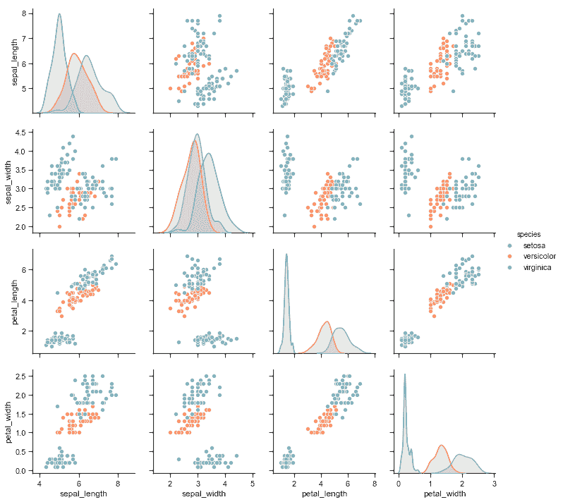
sns.pairplot(iris, hue="species", height=2.5);
```
還可以使用關鍵字參數控制繪圖的美觀,函數會返回[`PairGrid`](../generated/seaborn.PairGrid.html#seaborn.PairGrid "seaborn.PairGrid")實例以便進一步調整。
```py
g = sns.pairplot(iris, hue="species", palette="Set2", diag_kind="kde", height=2.5)
```
- seaborn 0.9 中文文檔
- Seaborn 簡介
- 安裝和入門
- 可視化統計關系
- 可視化分類數據
- 可視化數據集的分布
- 線性關系可視化
- 構建結構化多圖網格
- 控制圖像的美學樣式
- 選擇調色板
- seaborn.relplot
- seaborn.scatterplot
- seaborn.lineplot
- seaborn.catplot
- seaborn.stripplot
- seaborn.swarmplot
- seaborn.boxplot
- seaborn.violinplot
- seaborn.boxenplot
- seaborn.pointplot
- seaborn.barplot
- seaborn.countplot
- seaborn.jointplot
- seaborn.pairplot
- seaborn.distplot
- seaborn.kdeplot
- seaborn.rugplot
- seaborn.lmplot
- seaborn.regplot
- seaborn.residplot
- seaborn.heatmap
- seaborn.clustermap
- seaborn.FacetGrid
- seaborn.FacetGrid.map
- seaborn.FacetGrid.map_dataframe
- seaborn.PairGrid
- seaborn.PairGrid.map
- seaborn.PairGrid.map_diag
- seaborn.PairGrid.map_offdiag
- seaborn.PairGrid.map_lower
- seaborn.PairGrid.map_upper
- seaborn.JointGrid
- seaborn.JointGrid.plot
- seaborn.JointGrid.plot_joint
- seaborn.JointGrid.plot_marginals
- seaborn.set
- seaborn.axes_style
- seaborn.set_style
- seaborn.plotting_context
- seaborn.set_context
- seaborn.set_color_codes
- seaborn.reset_defaults
- seaborn.reset_orig
- seaborn.set_palette
- seaborn.color_palette
- seaborn.husl_palette
- seaborn.hls_palette
- seaborn.cubehelix_palette
- seaborn.dark_palette
- seaborn.light_palette
- seaborn.diverging_palette
- seaborn.blend_palette
- seaborn.xkcd_palette
- seaborn.crayon_palette
- seaborn.mpl_palette
- seaborn.choose_colorbrewer_palette
- seaborn.choose_cubehelix_palette
- seaborn.choose_light_palette
- seaborn.choose_dark_palette
- seaborn.choose_diverging_palette
- seaborn.load_dataset
- seaborn.despine
- seaborn.desaturate
- seaborn.saturate
- seaborn.set_hls_values