
[TOC]
# 參考資料
[React Native 中文網](https://reactnative.cn/docs/components-and-apis/)
# 一、基礎組件
## Text
【用途】:
一個用于顯示文本的 React 組件,并且它也支持嵌套、樣式,以及觸摸處理。在下面的例子里,嵌套的標題和正文文字會繼承來自`styles.baseText`的`fontFamily`字體樣式,不過標題上還附加了它自己額外的樣式。標題和文本會在頂部依次堆疊,并且被代碼中內嵌的換行符分隔開。
```js
renderText: function() {
return (
<Text style={styles.baseText}>
<Text style={styles.titleText} onPress={this.onPressTitle}>
{this.state.titleText + '\n\n'}
</Text>
<Text numberOfLines={5}>
{this.state.bodyText}
</Text>
</Text>
);
},
...
var styles = StyleSheet.create({
baseText: {
fontFamily: 'Cochin',
},
titleText: {
fontSize: 20,
fontWeight: 'bold',
},
};
```
【部分屬性】:
- onPress *function*:當文本被點擊以后調用此回調函數
- onLongPress *function*:當文本被長按以后調用此回調函數
- numberOfLines *number*:用來當文本過長的時候裁剪文本。包括折疊產生的換行在內,總的行數不會超過這個屬性的限制。
## TextInput
【用途】:
TextInput是一個允許用戶在應用中通過鍵盤輸入文本的基本組件。本組件的屬性提供了多種特性的配置,譬如自動完成、自動大小寫、占位文字,以及多種不同的鍵盤類型(如純數字鍵盤)等等。
最簡單的用法就是丟一個`TextInput`到應用里,然后訂閱它的`onChangeText`事件來讀取用戶的輸入。注意,從 TextInput 里取值這就是目前唯一的做法!即使用`onChangeText`寫入 state,然后從 this.state 中取出值。它還有一些其它的事件,譬如`onSubmitEditing`和`onFocus`。
【部分屬性】:
- defaultValue *string*:提供一個文本框中的初始值。當用戶開始輸入的時候,值就可以改變
- placeholder *string*:如果沒有任何文字輸入,會顯示此字符串
- editable *bool*:如果為 false,文本框是不可編輯的,默認值為 true
- maxLength *number*:限制文本框中最多的字符數。使用這個屬性而不用JS邏輯去實現,可以避免閃爍的現象
- onChange *function*:當文本框內容變化時調用此回調函數
- onFocus *function*:當文本框獲得焦點的時候調用此回調函數
- value *string*:文本框中文字的內容
## View
【用途】:
作為創建 UI 時最基礎的組件,`View`是一個支持 Flexbox 布局、樣式、一些觸摸處理、和一些無障礙功能的容器,并且它可以放到其它的視圖里,也可以有任意多個任意類型的子視圖。不論在什么平臺上,`View`都會直接對應一個平臺的原生視圖,無論它是`UIView`、`<div>`還是`android.view.View`。下面的例子創建了一個`View`,包含了兩個有顏色的方塊和一個自定義的組件,并且設置了一個內邊距:
```js
<View style={{flexDirection: 'row', height: 100, padding: 20}}>
<View style={{backgroundColor: 'blue', flex: 0.3}} />
<View style={{backgroundColor: 'red', flex: 0.5}} />
<MyCustomComponent {...customProps} />
</View>
```
`View`的設計初衷是和`StyleSheet`搭配使用,這樣可以使代碼更清晰并且獲得更高的性能。盡管內聯樣式也同樣可以使用。
【合成觸摸事件】:
用于`View`響應屬性 (例如,`onResponderMove`), 合成觸摸事件采用以下的格式:
* `nativeEvent`
* `changedTouches`\- 從上一次事件以來的觸摸事件數組。
* `identifier`\- 觸摸事件的 ID。
* `locationX`\- 觸摸事件相對元素位置的 X 坐標。
* `locationY`\- 觸摸事件相對元素位置的 Y 坐標。
* `pageX`\- 觸摸事件相對根元素位置的 X 坐標。
* `pageY`\- 觸摸事件相對根元素位置的 Y 坐標。
* `target`\- 接收觸摸事件的元素 ID.
* `timestamp`\- 觸摸事件的時間標記,用來計算速度.
* `touches`\- 屏幕上所有當前觸摸事件的數組.
## Image
【用途】:一個用于顯示多種不同類型圖片的 React 組件,包括網絡圖片、靜態資源、臨時的本地圖片、以及本地磁盤上的圖片(如相冊)等。
【部分屬性】:
- onLayout *function*:當元素掛載或者布局改變的時候調用,參數為:`{nativeEvent: {layout: {x, y, width, height}}}`
- onLoad *function*:加載成功完成時調用此回調函數。
- source *{uri: string}*:`uri`是一個表示圖片的資源標識的字符串,它可以是一個 http 地址或是一個本地文件路徑(使用`require(相對路徑)`來引用)。
【示例】:
```js
renderImages() {
return (
<View>
<Image
style={styles.icon}
source={require('./icon.png')}
/>
<Image
style={styles.logo}
source={{uri: 'http://facebook.github.io/react/img/logo_og.png'}}
/>
</View>
);
}
```
默認情況下 Android 是不支持 GIF 和 WebP 格式的。你需要在 android/app/build.gradle 文件中根據需要手動添加以下模塊:
```js
dependencies {
// 如果你需要支持Android4.0(API level 14)之前的版本
compile 'com.facebook.fresco:animated-base-support:1.0.1'
// 如果你需要支持GIF動圖
compile 'com.facebook.fresco:animated-gif:1.0.1'
// 如果你需要支持WebP格式,包括WebP動圖
compile 'com.facebook.fresco:animated-webp:1.0.1'
compile 'com.facebook.fresco:webpsupport:1.0.1'
// 如果只需要支持WebP格式而不需要動圖
compile 'com.facebook.fresco:webpsupport:1.0.1'
}
```
## StyleSheet
StyleSheet 提供了一種類似 CSS 樣式表的抽象。
創建一個樣式表:
```js
const styles = StyleSheet.create({
container: {
borderRadius: 4,
borderWidth: 0.5,
borderColor: '#d6d7da',
},
title: {
fontSize: 19,
fontWeight: 'bold',
},
activeTitle: {
color: 'red',
},
});
```
使用一個樣式表:
```html
<View style={styles.container}>
<Text style={[styles.title, this.props.isActive && styles.activeTitle]} />
</View>
```
# 二、交互控件
常見的跨平臺交互控件
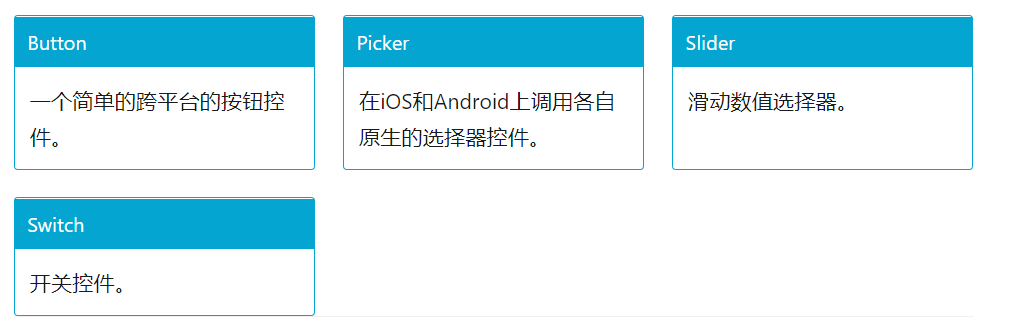
## Button
【用途】:跨平臺的按鈕組件
【屬性】
- accessibilityLabel *string*:用于給殘障人士顯示的文本(比如讀屏器軟件可能會讀取這一內容)
- color *string*:文本的顏色(iOS),或是按鈕的背景色(Android)
- disabled *bool*:設置為 true 時此按鈕將不可點擊
- onPress *function*:用戶點擊此按鈕時所調用的處理函數
- title *string*:按鈕內顯示的文本
【示例】:
```html
<Button
onPress={onPressLearnMore}
title="Learn More"
color="#841584"
accessibilityLabel="Learn more about this purple button"
/>
```
## Picker
本組件可以在 iOS 和 Android 上渲染原生的選擇器(Picker)。用例:
```js
<Picker
selectedValue={this.state.language}
onValueChange={(lang) => this.setState({language: lang})}>
<Picker.Item label="Java" value="java" />
<Picker.Item label="JavaScript" value="js" />
</Picker>
```
【屬性】
- onValueChange *function*:某一項被選中時執行此回調。調用時帶有如下參數:
- itemValue: 被選中項的 value 屬性
- itemPosition: 被選中項在 picker 中的索引位置
- selectedValue *any*:默認選中的值。可以是字符串或整數。
- style *pickerStyleType*
- androidenabled *bool* :如果設為 false,則會禁用此選擇器。
- androidmode *enum('dialog', 'dropdown')*:在 Android 上,可以指定在用戶點擊選擇器時,以怎樣的形式呈現選項:
- dialog(對話框形式): 顯示一個模態對話框。默認選項。
- dropdown(下拉框形式): 以選擇器所在位置為錨點展開一個下拉框。
- androidprompt *string*:設置選擇器的提示字符串。在 Android 的對話框模式中用作對話框的標題。
- iositemStyle *itemStylePropType* :指定應用在每項標簽上的樣式。
# 三、列表視圖

## FlatList
[https://reactnative.cn/docs/0.43/flatlist/](https://reactnative.cn/docs/0.43/flatlist/)
高性能的簡單列表組件,支持下面這些常用的功能:
* 完全跨平臺。
* 支持水平布局模式。
* 行組件顯示或隱藏時可配置回調事件。
* 支持單獨的頭部組件。
* 支持單獨的尾部組件。
* 支持自定義行間分隔線。
* 支持下拉刷新。
* 支持上拉加載。
如果需要分組/類/區(section),請使用`<SectionList>`
【部分屬性】:
- ListFooterComponent *ReactClass\<any>* :尾部組件
- ListHeaderComponent *ReactClass\<any>* :頭部組件
- data *Array\<ItemT>*:為了簡化起見,data 屬性目前只支持普通數組。如果需要使用其他特殊數據結構,例如 immutable 數組,請直接使用更底層的 VirtualizedList 組件。
- refresh?
- refreshing?
【示例】:
```html
<FlatList
data={[{key: 'a'}, {key: 'b'}]}
renderItem={({item}) => <Text>{item.key}</Text>}
/>
```
# 四、Android 獨有的組件和 API
下面很多組件提供了對 Andriod 常用類的封裝。
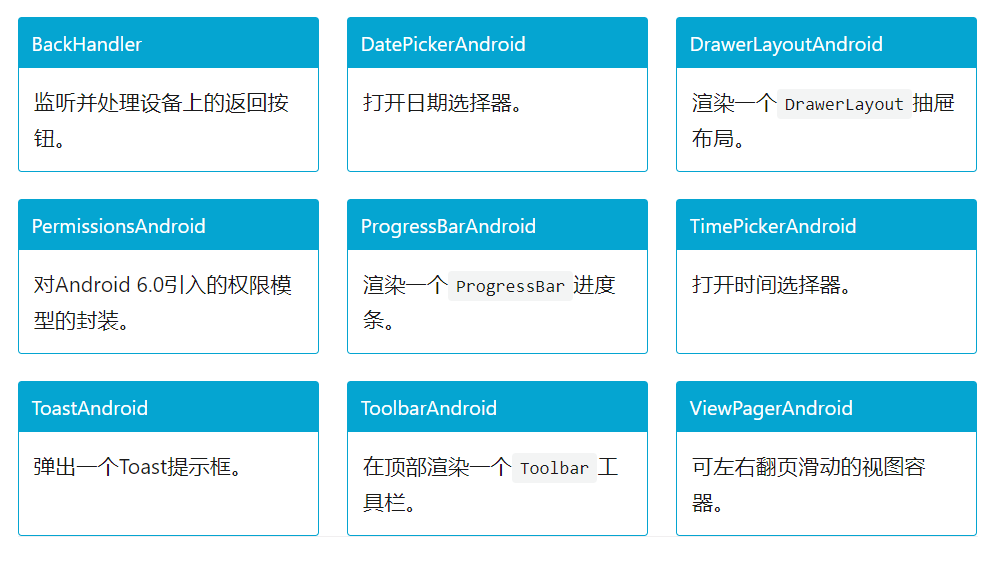
## DrawerLayoutAndroid
該組件僅限 Android 平臺。
抽屜(通常用于導航切換)是通過`renderNavigationView`方法渲染的,并且 DrawerLayoutAndroid 的直接子視圖會成為主視圖(用于放置你的內容)。導航視圖一開始在屏幕上并不可見,不過可以從`drawerPosition`指定的窗口側面拖拽出來,并且抽屜的寬度可以使用`drawerWidth`屬性來指定。

【屬性】
- drawerLockMode *enum('unlocked', 'locked-closed', 'locked-open')*:設置抽屜的鎖定模式。有三種狀態:
- unlocked (默認值),意味著此時抽屜可以響應打開和關閉的手勢操作。
- locked-closed,意味著此時抽屜將保持關閉,不可用手勢打開。
- locked-open,意味著此時抽屜將保持打開,不可用手勢關閉。
無論抽屜處于哪種狀態,都仍然可以調用 openDrawer/closeDrawer 這兩個方法打開和關閉。
- drawerPosition *enum(DrawerConsts.DrawerPosition.Left,DrawerConsts.DrawerPosition.Right)*
指定抽屜可以從屏幕的哪一邊滑入。
- drawerWidth *number*:指定抽屜的寬度,也就是從屏幕邊緣拖進的視圖的寬度。
- keyboardDismissMode *enum('none', "on-drag")*:指定在拖拽的過程中是否要隱藏軟鍵盤。
- none (默認值),拖拽不會隱藏軟鍵盤。
- on-drag 當拖拽開始的時候隱藏軟鍵盤。
- onDrawerOpen *function*:每當導航視圖(抽屜)被打開之后調用此回調函數。
- onDrawerClose *function*:每當導航視圖(抽屜)被關閉之后調用此回調函數。
- onDrawerSlide *function*:每當導航視圖(抽屜)產生交互的時候調用此回調函數。
- onDrawerStateChanged *function*:每當抽屜的狀態變化時調用此回調函數。抽屜可以有 3 種狀態:
- idle(空閑),表示現在導航條上沒有任何正在進行的交互。
- dragging(拖拽中),表示用戶正在與導航條進行交互。
- settling(停靠中),表示用戶剛剛結束與導航條的交互,導航條正在結束打開或者關閉的動畫。
- renderNavigationView *function*:此方法用于渲染一個可以從屏幕一邊拖入的導航視圖
【示例】:
```js
render: function() {
var navigationView = (
<View style={{flex: 1, backgroundColor: '#fff'}}>
<Text style={{margin: 10, fontSize: 15, textAlign: 'left'}}>I'm in the Drawer!</Text>
</View>
);
return (
<DrawerLayoutAndroid
drawerWidth={300}
drawerPosition={DrawerLayoutAndroid.positions.Left}
renderNavigationView={() => navigationView}>
<View style={{flex: 1, alignItems: 'center'}}>
<Text style={{margin: 10, fontSize: 15, textAlign: 'right'}}>Hello</Text>
<Text style={{margin: 10, fontSize: 15, textAlign: 'right'}}>World!</Text>
</View>
</DrawerLayoutAndroid>
);
},
```
# 五、其他
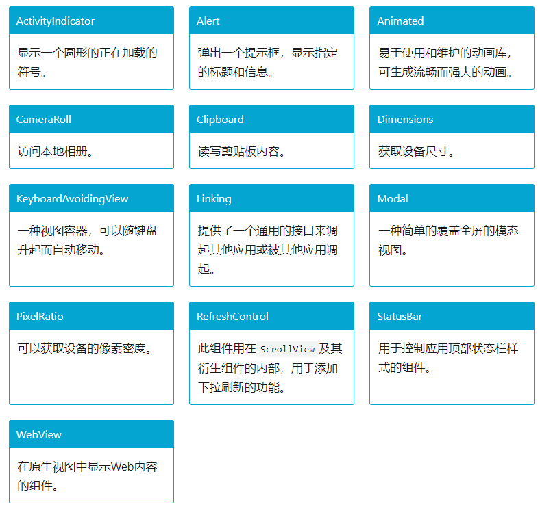
## ActivityIndicator
【用途】:顯示一個圓形的 loading 提示符號
【屬性】:
- animating *bool*:是否顯示指示器,默認為 true
- color *string*:滾輪的前景顏色,默認為灰色
- ioshidesWhenStopped *bool*:在沒有動畫的時候,是否要隱藏指示器(默認為true)
- size *enum('small', 'large')*:指示器的大小。small 的高度為 20,large 為 36
【示例】:
```js
render() {
return (
<ActivityIndicator
animating={this.state.animating}
style={[styles.centering, {height: 80}]}
size="large"
/>
)
}
```
## Modal
【用途】:
Modal 組件可以用來覆蓋包含 React Native 根視圖的原生視圖(如UIViewController,Activity)。
在嵌入React Native 的混合應用中可以使用 Modal。Modal 可以使你應用中 RN 編寫的那部分內容覆蓋在原生視圖上顯示。
【示例】:
```js
import React, { Component } from 'react';
import { Modal, Text, TouchableHighlight, View } from 'react-native';
class ModalExample extends Component {
constructor(props) {
super(props);
this.state = {modalVisible: false};
}
setModalVisible(visible) {
this.setState({modalVisible: visible});
}
render() {
return (
<View style={{marginTop: 22}}>
<Modal
animationType={"slide"}
transparent={false}
visible={this.state.modalVisible}
onRequestClose={() => {alert("Modal has been closed.")}}
>
<View style={{marginTop: 22}}>
<View>
<Text>Hello World!</Text>
<TouchableHighlight onPress={() => {
this.setModalVisible(!this.state.modalVisible)
}}>
<Text>Hide Modal</Text>
</TouchableHighlight>
</View>
</View>
</Modal>
<TouchableHighlight onPress={() => {
this.setModalVisible(true)
}}>
<Text>Show Modal</Text>
</TouchableHighlight>
</View>
);
}
}
```
- 序言 & 更新日志
- H5
- Canvas
- 序言
- Part1-直線、矩形、多邊形
- Part2-曲線圖形
- Part3-線條操作
- Part4-文本操作
- Part5-圖像操作
- Part6-變形操作
- Part7-像素操作
- Part8-漸變與陰影
- Part9-路徑與狀態
- Part10-物理動畫
- Part11-邊界檢測
- Part12-碰撞檢測
- Part13-用戶交互
- Part14-高級動畫
- CSS
- SCSS
- codePen
- 速查表
- 面試題
- 《CSS Secrets》
- SVG
- 移動端適配
- 濾鏡(filter)的使用
- JS
- 基礎概念
- 作用域、作用域鏈、閉包
- this
- 原型與繼承
- 數組、字符串、Map、Set方法整理
- 垃圾回收機制
- DOM
- BOM
- 事件循環
- 嚴格模式
- 正則表達式
- ES6部分
- 設計模式
- AJAX
- 模塊化
- 讀冴羽博客筆記
- 第一部分總結-深入JS系列
- 第二部分總結-專題系列
- 第三部分總結-ES6系列
- 網絡請求中的數據類型
- 事件
- 表單
- 函數式編程
- Tips
- JS-Coding
- Framework
- Vue
- 書寫規范
- 基礎
- vue-router & vuex
- 深入淺出 Vue
- 響應式原理及其他
- new Vue 發生了什么
- 組件化
- 編譯流程
- Vue Router
- Vuex
- 前端路由的簡單實現
- React
- 基礎
- 書寫規范
- Redux & react-router
- immutable.js
- CSS 管理
- React 16新特性-Fiber 與 Hook
- 《深入淺出React和Redux》筆記
- 前半部分
- 后半部分
- react-transition-group
- Vue 與 React 的對比
- 工程化與架構
- Hybird
- React Native
- 新手上路
- 內置組件
- 常用插件
- 問題記錄
- Echarts
- 基礎
- Electron
- 序言
- 配置 Electron 開發環境 & 基礎概念
- React + TypeScript 仿 Antd
- TypeScript 基礎
- React + ts
- 樣式設計
- 組件測試
- 圖標解決方案
- Storybook 的使用
- Input 組件
- 在線 mock server
- 打包與發布
- Algorithm
- 排序算法及常見問題
- 劍指 offer
- 動態規劃
- DataStruct
- 概述
- 樹
- 鏈表
- Network
- Performance
- Webpack
- PWA
- Browser
- Safety
- 微信小程序
- mpvue 課程實戰記錄
- 服務器
- 操作系統基礎知識
- Linux
- Nginx
- redis
- node.js
- 基礎及原生模塊
- express框架
- node.js操作數據庫
- 《深入淺出 node.js》筆記
- 前半部分
- 后半部分
- 數據庫
- SQL
- 面試題收集
- 智力題
- 面試題精選1
- 面試題精選2
- 問答篇
- 2025面試題收集
- Other
- markdown 書寫
- Git
- LaTex 常用命令
- Bugs