
## 模態框 modal.js
* 模態框不支持嵌套,需要嵌套模態框的話,只能自己手動實現。
* 模態框包含的html最好盡量作為body的直接子元素,以避免其他組件影響模態框的展現和功能。
* 彈出層出來以后,頁面的滾動條會被覆蓋。
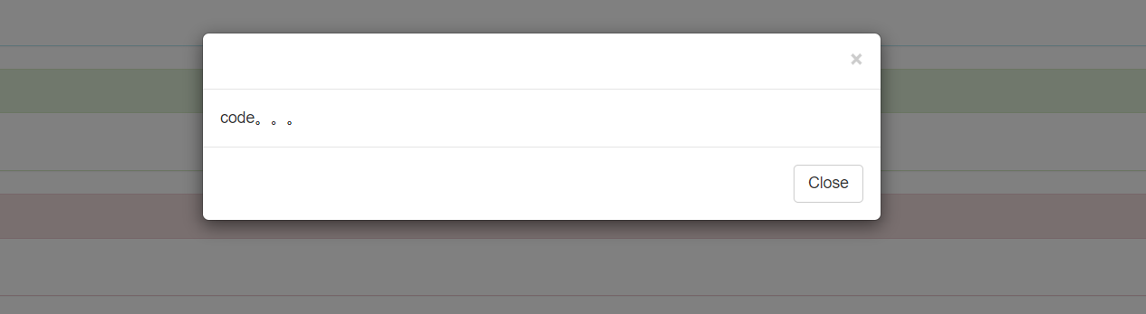
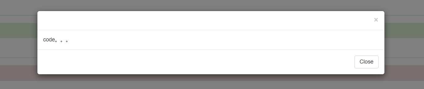
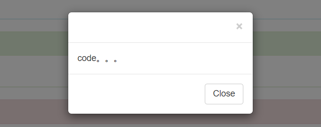
模態框主體結構包含了模態框的頭、體和一組放置于底部的按鈕 :
* modal 彈出層父級
* modal-dialog 彈出層
* modal-content 彈出層的內容區域
* modal-header 彈出層的頭部區域
* modal-body 彈出層的主體區域
* modal-footer 彈出層的底部區域
* fade 讓彈出層有一個運動的效果,加給彈出層父級
基本結構代碼如下:
```html
<div class="modal fade" id="myModal" tabindex="-1" role="dialog" aria-labelledby="myModalLabel" aria-hidden="true">
<div class="modal-dialog">
<div class="modal-content">
<div class="modal-header">
<button type="button" class="close" data-dismiss="modal" aria-hidden="true">
×
</button>
</div>
<div class="modal-body">
code。。。
</div><!--modal-body-->
<div class="modal-footer">
<button type="button" class="btn btn-default" data-dismiss="modal">Close</button>
</div>
<!--modal-footer-->
</div><!-- modal-content -->
</div><!--modal-dialog -->
</div>
```
**動態實例**
點擊下面的按鈕即可通過 JavaScript 啟動一個模態框。在模態框之前添加一個按鈕(button),還需要給button添加data-toggle="modal" 和 data-target="目標模態框ID"(指定要切換的特定的模態框) 來啟動模態框效果,模態框將從上到下、逐漸浮現到頁面前。代碼如下:
```html
<button class="btn btn-primary btn-lg" data-toggle="modal" data-target="#myModal">
開始演示模態框
</button>
<div class="modal fade" id="myModal" tabindex="-1" role="dialog" aria-labelledby="myModalLabel" aria-hidden="true">
<div class="modal-dialog">
<div class="modal-content">
<div class="modal-header">
<button type="button" class="close" data-dismiss="modal" aria-hidden="true">
×
</button>
</div>
<div class="modal-body">
code。。。
</div><!--modal-body-->
<div class="modal-footer">
<button type="button" class="btn btn-default" data-dismiss="modal">Close</button>
</div>
<!--modal-footer-->
</div><!-- modal-content -->
</div><!--modal-dialog -->
</div>
```
注意:增強模態框的可訪問性。務必為`.modal`添加`role="dialog"`和`aria-labelledby="..."`屬性,用于指向模態框的標題欄(modal-title);為`.modal-dialog`添加`aria-hidden="true"`屬性。
*****
**模態框可選尺寸**
模態框提供了兩個可選尺寸,通過為`.modal-dialog`增加一個樣式調整類實現。
大尺寸模態框(modal-lg):
```html
<button class="btn btn-primary btn-lg" data-toggle="modal" data-target="#myModal">
開始演示模態框
</button>
<div class="modal fade" id="myModal" tabindex="-1" role="dialog" aria-labelledby="myModalLabel" aria-hidden="true">
<div class="modal-dialog modal-lg">
<div class="modal-content">
<div class="modal-header">
<button type="button" class="close" data-dismiss="modal" aria-hidden="true">
×
</button>
</div>
<div class="modal-body">
code。。。
</div><!--modal-body-->
<div class="modal-footer">
<button type="button" class="btn btn-default" data-dismiss="modal">Close</button>
</div>
<!--modal-footer-->
</div><!-- modal-content -->
</div><!--modal-dialog -->
</div>
```
小尺寸模態框(modal-sm):
```html
<button class="btn btn-primary btn-lg" data-toggle="modal" data-target="#myModal">
開始演示模態框
</button>
<div class="modal fade" id="myModal" tabindex="-1" role="dialog" aria-labelledby="myModalLabel" aria-hidden="true">
<div class="modal-dialog modal-sm">
<div class="modal-content">
<div class="modal-header">
<button type="button" class="close" data-dismiss="modal" aria-hidden="true">
×
</button>
</div>
<div class="modal-body">
code。。。
</div><!--modal-body-->
<div class="modal-footer">
<button type="button" class="btn btn-default" data-dismiss="modal">Close</button>
</div>
<!--modal-footer-->
</div><!-- modal-content -->
</div><!--modal-dialog -->
</div>
```
實際效果需要自己實際操作并在瀏覽器上展示。
*****
**禁止動畫效果**
如果不需要模態框彈出時的動畫效果(淡入淡出效果),刪掉`.fade`類就可以了。
*****
要利用模態中的引導網格系統(柵格系統),只需在.modal主體(modal-body)中嵌套.rows,然后使用普通的網格系統類;同樣的,在模態框中使用表單,只需在.modal主體(modal-body)中嵌套form表單。
**用法**
通過 data 屬性或 JavaScript 調用模態框插件,可以根據需要動態展示隱藏的內容。模態框彈出時還會為`<body>`元素添加`.modal-open`類,從而覆蓋頁面默認的滾動行為,并且還會自動生成一個`.modal-backdrop`元素用于提供一個可點擊的區域,點擊此區域就即可關閉模態框。
* 通過 data 屬性:在控制器元素(比如按鈕或者鏈接)上設置屬性 data-toggle=”modal”,同時設置 data-target=”#identifier” 或 href=”#identifier” 來指定要切換的特定的模態框(帶有 id=”identifier”)。例如:
```html
<button class="btn btn-primary btn-lg" data-toggle="modal" data-target="#myModal">
開始演示模態框
</button>
```
* 通過 JavaScript 調用:只需一行 JavaScript 代碼,即可通過元素的 id`myModal`調用模態框:
```js
$('#identifier').modal(options)
```
**參數**
* backdrop: true/false/'static' 背景遮罩的顯示與否
* keyboard: true/false 鍵盤上的esc鍵可否關閉模態框
* show:true/false 模態框是否初始好了就立即顯示
* remote: path 用jquery的load方法加載指定url的內容到*.modal-content*中
**方法**
```js
$('#myModal').modal(option); //顯示模態框
$('#myModal').modal('toggle'); //切換模態框的顯示和隱藏
$('#myModal').modal('show'); //顯示
$('#myModal').modal('hide'); //隱藏
```
**事件**
Bootstrap 的模態框類提供了一些事件用于監聽并執行你自己的代碼。
| 事件類型 | 描述 |
| --- | --- |
| show.bs.modal | `show`方法調用之后立即觸發該事件。如果是通過點擊某個作為觸發器的元素,則此元素可以通過事件的`relatedTarget`屬性進行訪問。 |
| shown.bs.modal | 此事件在模態框已經顯示出來(并且同時在 CSS 過渡效果完成)之后被觸發。如果是通過點擊某個作為觸發器的元素,則此元素可以通過事件的`relatedTarget`屬性進行訪問。 |
| hide.bs.modal | `hide`方法調用之后立即觸發該事件。 |
| hidden.bs.modal | 此事件在模態框被隱藏(并且同時在 CSS 過渡效果完成)之后被觸發。 |
| loaded.bs.modal | 從`遠端的數據源`加載完數據之后觸發該事件。 |
- 第一章 . bootstrap介紹
- 第二章 . 全局CSS樣式
- 1、總體注意事項
- 2、柵格系統
- 3、排版
- 4、代碼
- 5、表格
- 6、表單
- 7、 按鈕
- 8、 圖片
- 9、輔助類
- 10、響應式工具
- 第三章 . bootstrap相關CSS應用
- 1、CSS媒體查詢 @media
- 2、px,em,rem之間的關系和換算方式
- 第四章 . 組件
- 1、Glyphicons 字體圖標
- 2、下拉菜單
- 3、按鈕組
- 4、按鈕式下拉菜單
- 5、輸入框組
- 6、導航
- 7、導航條
- 8、路徑導航
- 9、分頁
- 10、標簽
- 11、徽章
- 12、巨幕
- 13、頁頭
- 14、縮略圖
- 15、警告框
- 16、進度條
- 17、媒體對象
- 18、列表組
- 19、面版
- 20、Well
- 第五章 . JavaScript 插件
- 1、JavaScript 插件引入前提
- 2、過渡效果 (transition.js)
- 3、模態框 (modal.js)
- 4、下拉菜單 (dropdown.js)
- 5、滾動監聽 (scrollspy.js)
- 6、可切換標簽 (tab.js)
- 7、工具提示 (tooltip.js)
- 8、彈出框 (popover.js)
- 9、警告信息 (alert.js)
- 10、按鈕 (button.js)
- 11、折疊插件(collapse.js)
- 12、輪播插件(carousel.js)
- 13、Affix插件(affix.js)