
[toc]
# 1. 相關預備知識
我們知道在Canvas 中,使用drawText()函數繪制文字。這里簡單看下將要使用的方法:
~~~
/**
* Draw the text, with origin at (x,y), using the specified paint. The origin is interpreted
* based on the Align setting in the paint.
*
* @param text The text to be drawn
* @param x The x-coordinate of the origin of the text being drawn
* @param y The y-coordinate of the baseline of the text being drawn
* @param paint The paint used for the text (e.g. color, size, style)
*/
public void drawText(@NonNull String text, float x, float y, @NonNull Paint paint) {
super.drawText(text, x, y, paint);
}
~~~
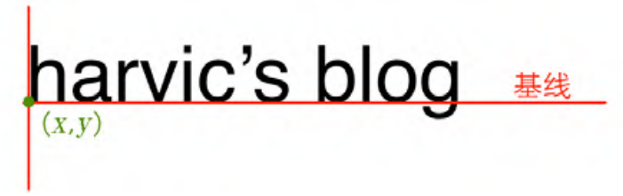
繪制的文本為text,位置為(x,y)。這里的坐標(x,y)和平時中所遇到的不同,這里不是左上角坐標,而是文本的右下角位置,如下圖所示:
于此同時,在字體中存在四條邏輯的線,系統在繪制文字時還有 4 條線,分別是 ascent、descent、top 和 bottom。如下圖所示:
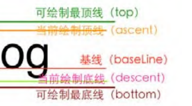
對應的這些邏輯值存儲在FontMetrics中,且不是直接存儲在其中的,而是經過了轉換,也就是:
```
ascent = ascent 線的 y 坐標 - baseline 線的 y 坐標。
descent = descent 線的 y 坐標 - baseline 線的 y 坐標。
top = top 線的 y 坐標 - baseline 線的 y 坐標。
bottom = bottom 線的 y 坐標 - baseline 線的 y 坐標。
```
那么,如果我們要在自定義View中繪制出來這四條線,就需要基于baseline的坐標來進行計算,即:
~~~
// 繪制文本
val fontMetrics = mPaint.fontMetrics
// startY這里就是baseline
val ascent = fontMetrics.ascent + startY
val bottom = fontMetrics.bottom + startY
val top = fontMetrics.top + startY
val descent = fontMetrics.descent + startY
drawLine(startX, startY, startX + 300, startY, mPaint) // baseline
drawLine(startX, ascent, startX + 300, ascent, mPaint) //ascent
drawLine(startX, bottom, startX + 300, bottom, mPaint) // bottom
drawLine(startX, top, startX + 300, top, mPaint) // top
drawLine(startX, descent, startX + 300, descent, mPaint) // descent
~~~
# 2. 獲取字體寬高
## 2.1 獲取字體寬度
可以利用畫筆工具來測量所占據的寬度:
~~~
// 使用畫筆工具來獲取字體的寬度
val defaultWidth = mPaint.measureText(mContent)
~~~
## 2.2 獲取字體高度
~~~
// 使用bottom線值減去top線值,得到字符串所占據的高度值
val bottom = mPaint.fontMetrics.bottom
val top = mPaint.fontMetrics.top
val defaultHeight = bottom - top
~~~
# 3. 獲取剛好罩住字體的最小矩形
可以創建一個Rect矩形對象,然后使用Paint的getTextBounds方法來傳入,進行測量:
~~~
// 獲取剛好罩住字體的矩形大小
val rect = Rect()
mPaint.getTextBounds(mContent, 0, mContent.length, rect)
Log.e("TAG", "rect: ${rect.toShortString()}", )
~~~
其中,其參數分別為:
~~~
/**
* Retrieve the text boundary box and store to bounds.
*
* Return in bounds (allocated by the caller) the smallest rectangle that
* encloses all of the characters, with an implied origin at (0,0).
*
* @param text string to measure and return its bounds
* @param start index of the first char in the string to measure
* @param end 1 past the last char in the string to measure
* @param bounds returns the unioned bounds of all the text. Must be allocated by the caller
*/
public void getTextBounds(String text, int start, int end, Rect bounds)
~~~
也就是第二、三個參數分別為始終的字符下標位置,前閉后開區間。
這里分別打印一下測量的字體的寬高和這里矩形的坐標:
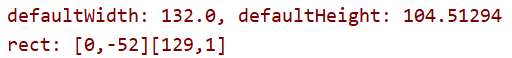
對應的矩形坐標,左上角為(0,-52),右下角為(129,1)。因為在代碼中我們并沒有給 getTextBounds()函數傳遞基線位置,那它就是以(0,0)點所在位置為基線來得到這個最小矩形的,所以這個最小矩形的位置就是以(0,0)點所在位置為基線的結果。
所以實際的矩形應該是向下平移baseline的距離。這里可以在onDraw方法中將它繪制出來:
~~~
// 獲取剛好罩住字體的矩形大小
val rect = Rect()
mPaint.getTextBounds(mContent, 0, mContent.length, rect)
val rectPaint = Paint()
rectPaint.color = resources.getColor(R.color.rect, null) // #4400FF00
rectPaint.isDither = true
rectPaint.isAntiAlias = true
rectPaint.style = Paint.Style.FILL
drawRect(rect.left.toFloat(), rect.top.toFloat() + startY,
rect.right.toFloat(), rect.bottom.toFloat() + startY, rectPaint)
~~~

# 4. 字體相關函數
設置文字大小:
```
setTextSize(float textSize)
```
設置是否為粗體文字
```
setFakeBoldText(boolean fakeBoldText)
```
設置帶有刪除線效果
```
setStrikeThruText(boolean strikeThruText)
```
設置下畫線
```
setUnderlineText(boolean underlineText)
```
設置對其方式
```
setTextAlign(Paint.Align align)
```
設置字體樣式
```
setTypeface(Typeface typeface)
```
- 介紹
- UI
- MaterialButton
- MaterialButtonToggleGroup
- 字體相關設置
- Material Design
- Toolbar
- 下拉刷新
- 可折疊式標題欄
- 懸浮按鈕
- 滑動菜單DrawerLayout
- NavigationView
- 可交互提示
- CoordinatorLayout
- 卡片式布局
- 搜索框SearchView
- 自定義View
- 簡單封裝單選
- RecyclerView
- xml設置點擊樣式
- adb
- 連接真機
- 小技巧
- 通過字符串ID獲取資源
- 自定義View組件
- 使用系統控件重新組合
- 旋轉菜單
- 輪播圖
- 下拉輸入框
- 自定義VIew
- 圖片組合的開關按鈕
- 自定義ViewPager
- 聯系人快速索引案例
- 使用ListView定義側滑菜單
- 下拉粘黏效果
- 滑動沖突
- 滑動沖突之非同向沖突
- onMeasure
- 繪制字體
- 設置畫筆Paint
- 貝賽爾曲線
- Invalidate和PostInvalidate
- super.onTouchEvent(event)?
- setShadowLayer與陰影效果
- Shader
- ImageView的scaleType屬性
- 漸變
- LinearGradient
- 圖像混合模式
- PorterDuffXfermode
- 橡皮擦效果
- Matrix
- 離屏繪制
- Canvas和圖層
- Canvas簡介
- Canvas中常用操作總結
- Shape
- 圓角屬性
- Android常見動畫
- Android動畫簡介
- View動畫
- 自定義View動畫
- View動畫的特殊使用場景
- LayoutAnimation
- Activity的切換轉場效果
- 屬性動畫
- 幀動畫
- 屬性動畫監聽
- 插值器和估值器
- 工具
- dp和px的轉換
- 獲取屏幕寬高
- JNI
- javah命令
- C和Java相互調用
- WebView
- Android Studio快捷鍵
- Bitmap和Drawable圖像
- Bitmap簡要介紹
- 圖片縮放和裁剪效果
- 創建指定顏色的Bitmap圖像
- Gradle本地倉庫
- Gradle小技巧
- RxJava+Okhttp+Retrofit構建網絡模塊
- 服務器相關配置
- node環境配置
- 3D特效