
上篇文章我們學習了如何在node + vue中安裝sass工具,并對 嵌套 (nested rules) 功能做出了演示,本篇文章我們對sass工具的另一大功能 變量(variables) 進行學習和使用。
1.為什么使用變量(variables)功能
設計師在整個頁面的視覺設計工作中,會根據網站特性、產品功能、企業文化等特點對頁面進行一個色彩的基礎定位,每個成功的網站設計都會有其確定的主色、輔助色和點綴色等。同樣的,一個網站中的字體同樣影響著一個網站的整體視覺。
當我們在全局對一個顏色、字體進行變量的定義,并且在頁面中使用該變量顏色后,在后期顏色、字體的調整中會變得方便且嚴謹,不需要在每個頁面查找需要修改的顏色和字體,也不用擔心少改了哪個部分。
2.定義顏色變量
通過鍵值對形式對顏色變量進行定義,格式與數組相同,但語法符號有差異。其中$color中的變量名可以不加引號,由于黑色白色等與后面定義的顏色有沖突容易引起錯誤,所以一般都用引號引起避免鍵值對與定義顏色字段的沖突(如 white: white, 就容易引發沖突,所以我們常用 “white”: white, 來定義)。
3.使用顏色變量
顏色我們已經定義好了,該如何使用呢?并不是直接在前端組件中引入這個sass變量,而是將我們定義的變量進行遍歷,其邏輯是用少量的代碼生成大量我們需要的樣式。
```
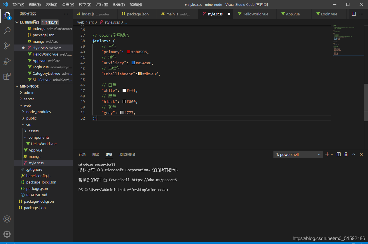
// colors常用顏色
$colors: (
// 主色
"primary": #a80506,
// 輔色
"auxiliary": #054ea8,
// 點綴色
"Embellishment":#db9e3f,
// 白色
"white": #fff,
// 黑色
"black": #000,
// 灰色
"gray": #777,
);
// 從$colors變量中找到 $colorKey 鍵值,再找到 $color 色值,進行遍歷。
// 在class名中使用變量需要用 "#{}" 方法,而色值中使用直接使用變量即可。
@each $colorKey, $color in $colors {
// 文字顏色
.text-#{$colorKey} {
color: $color;
}
// 背景顏色
.bg-#{$colorKey} {
background: $color;
}
}
```
此時我們進入web端,查看一下生成的顏色。
```
cd web
npm run serve
```
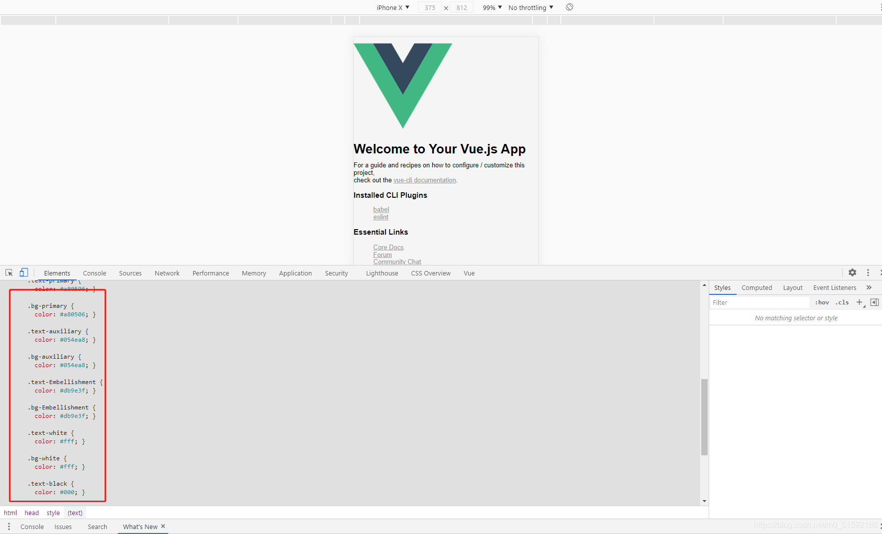
此時,我們定義的顏色就以類名的形式生成了css代碼,我們可以隨時使用。
4.使用直接量定義類名
同樣使用遍歷方法生成css類名,但某些時候我們沒有必要為了幾個值定義一個變量,例如文本的左中右對其。
普通css中,我們需要編寫css:
```
text-left{
text-align: left;
}
text-right{
text-align: right;
}
text-center{
text-align: center;
}
```
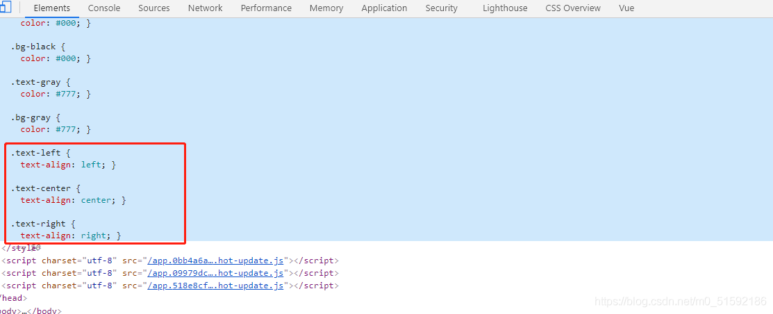
如果我們使用sass中的遍歷方法:
```
@each $var in (left, center, right) {
.text-#{$var}{
text-align: $var;
}
}
```
同樣可以生成類名:
同樣的方法,我們還可以定義字體大小、粗細等樣式。
```
// 使用px to rem插件設置默認字體大小為13px
// 設置基礎字體大小
$base-font-size: 1rem;
// 根據基礎字體大小設置字體大小
$font-size: (
// 使用px to rem插件,alt + z 轉化px到rem
// xs為10px
xs: 0.7692,
// sm為12px
sm: 0.9231,
// md為13px
md: 1,
// lg為14px
lg: 1.0769,
// xl為16px
xl: 1.2308,
);
@each $sizeKey, $size in $font-size {
// 文字顏色
.fs-#{$sizeKey} {
// 尺寸比例 * 基礎字體大小
font-size: $size * $base-font-size;
}
}
```
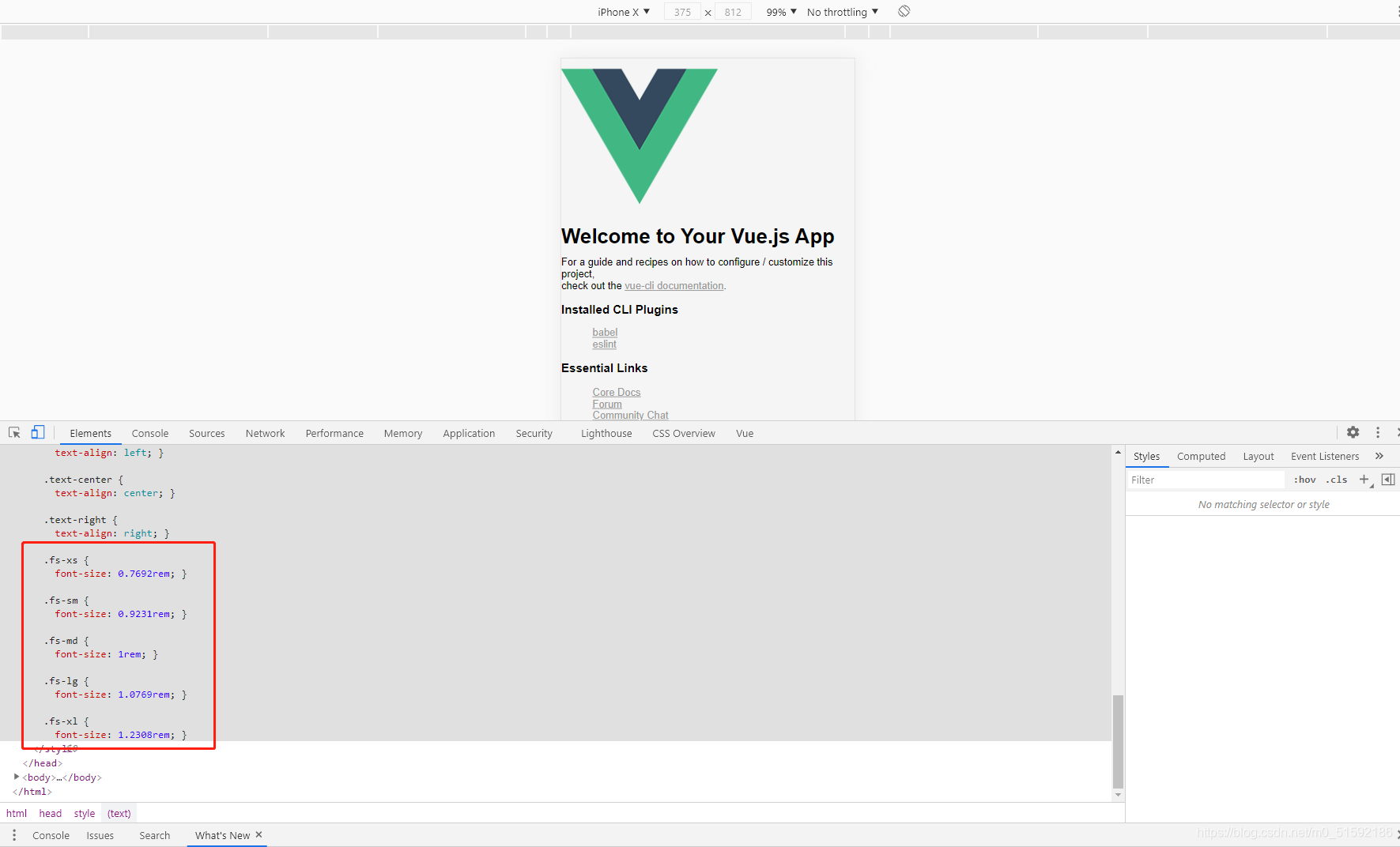
px是相對于瀏覽器和顯示屏分辨率進行大小的定義,而rem是針對HTML根元素進行大小比例的定義。
這就是sass的 變量 (variables) 功能,掌握了這個方法,我們應該就掌握做出像bootstrap, layui等常見大型css框架的類名定義方法。
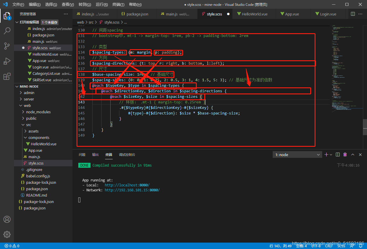
5.參考bootstrap制作間距類名
```
// 間距spacing
// bootstrap中,mt-1 -> margin-top: 1rem, pb-2 -> padding-bottom: 2rem
// 類型
$spacing-types: (m: margin, p: padding);
// 方向
$spacing-directions: (t: top, r: right, b: bottom, l:left);
// 尺寸
$base-spacing-size: 1rem; // 基礎尺寸
$spacing-sizes: (0: 0, 1: 0.25, 2: 0.5, 3: 1, 4: 1.5, 5: 3); // 基礎尺寸為準的倍數
@each $typeKey, $type in $spacing-types {
@each $directionKey, $direction in $spacing-directions {
@each $sizeKey, $size in $spacing-sizes {
// 樣版: .mt-1 { margin-top: 0.25rem }
.#{$typeKey}#{$directionKey}-#{$sizeKey} {
#{$type}-#{$direction}: $size * $base-spacing-size;
}
}
}
}
```
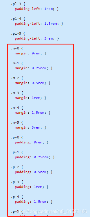
除了margin-top: 1rem;等以外還有margin: 1rem;等:
```
// m-1, p-1等只需要嵌套類型變量$spacing-directions和尺寸變量$spacing-sizes
@each $typeKey, $type in $spacing-types {
@each $sizeKey, $size in $spacing-sizes {
// 樣版: .mt-1 { margin-top: 0.25rem }
.#{$typeKey}-#{$sizeKey} {
#{$type}: $size * $base-spacing-size;
}
}
}
```
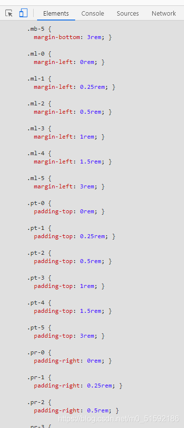
以此類推,還有上下邊距(margin-top + margin- bottom)和左右邊距(margin-left + margin-right),分別為mx-0,px-0和my-0,py-0。
```
// 水平、垂直方向邊距
@each $typeKey, $type in $spacing-types {
@each $sizeKey, $size in $spacing-sizes {
// mx-1,px-1
.#{$typeKey}x-#{$sizeKey} {
#{$type}-left: $size * $base-spacing-size;
#{$type}-right: $size * $base-spacing-size;
}
// my-1,py-1
.#{$typeKey}y-#{$sizeKey} {
#{$type}-top: $size * $base-spacing-size;
#{$type}-bottom: $size * $base-spacing-size;
}
}
}
```
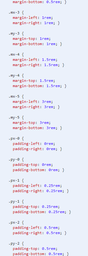
如此,就可以實現像bootstrap中的類名樣式。
- tp6+vue
- 1.工具和本地環境
- 2.啟動項目
- 3.路由、模型與數據庫操作
- 4.優化后端接口,前端使用axios實現接口功能
- 5.用戶登錄,bcrypt(hash)加密與驗證
- 6.用戶登錄(二),token驗證
- 7.分類的模型關聯和通用CRUD接口
- 8.使用vue的markdown編輯器并批量上傳圖片
- Node.js + Vue.js
- 工具,本地環境
- 2.1啟動項目
- 3.element-ui和vue-router路由的安裝和使用
- 4.使用axios,并創建接口上傳數據到mongodb數據庫
- 5.mongoodb數據庫的“刪、改、查”操作
- 6.mongodb數據庫無限層級的數據關聯(子分類)
- 7.使用mongodb數據庫關聯多個分類(關聯多個數據)
- 8.server端使用通用CRUD接口
- 9.圖片上傳
- 10.vue的富文本編輯器(vue2-editor)
- 11.動態添加分欄上傳多組數據
- 12-1.管理員模塊
- 13-1.搭建前臺web端頁面
- 1.使用sass工具搭建前臺web端頁面
- 2.sass工具的變量
- 3.使用flex布局并開始搭建web端
- 4.vue廣告輪播圖,并使用接口引入數據
- 5.使用字體圖標(iconfont)
- 6.卡片組件的封裝
- 14-1.生產環境編譯
- 1.環境編譯
- 2.購買域名服務器并解析域名到服務器
- 3.nginx配置web服務器并安裝網站環境
- 4.git拉取代碼到服務器
- 5.配置Nginx反向代理
- 6.遷移本地數據到服務器(mongodump)
- uni
- 1.工具&本地環境
- 2.頁面制作
- 3.頁面制作、組件與輪播
- 4.頁面跳轉與橫向滑動
- 5.用戶授權登錄和用戶信息獲取
- 6.用戶注冊和數據存儲
- 7.用戶填寫表單信息