
1.用sass工具定義flex布局樣式
```
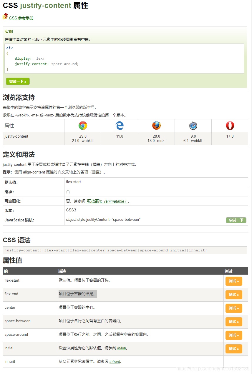
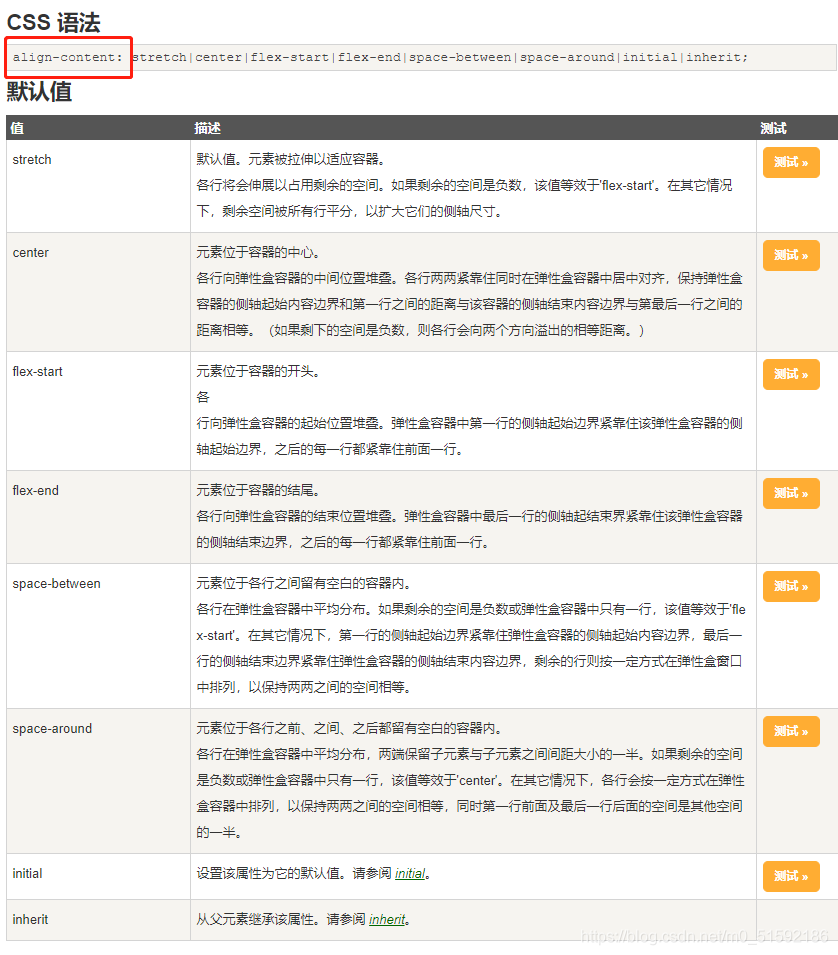
**flex 屬性用于設置或檢索彈性盒模型對象的子元素如何分配空間。
其中justify-content(水平方向對齊)屬性和align-content(垂直方向對齊)屬性更方便地解決元素的對其、分布方式**
```
```
具體在什么場景如何得到效果大家去鏈接中測試。
```
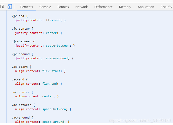
sass工具定義:
```
// flex布局
.d-flex{
display: flex;
}
$flex-jc: (
start: flex-start,
end: flex-end,
center: center,
between: space-between,
around: space-around,
);
@each $key,$value in $flex-jc {
.jc-#{$key} {
justify-content: $value;
}
}
$flex-ac: (
start: flex-start,
end: flex-end,
center: center,
between: space-between,
around: space-around,
stretch: stretch,
);
@each $key,$value in $flex-ac {
.ac-#{$key} {
align-content: $value;
}
}
```
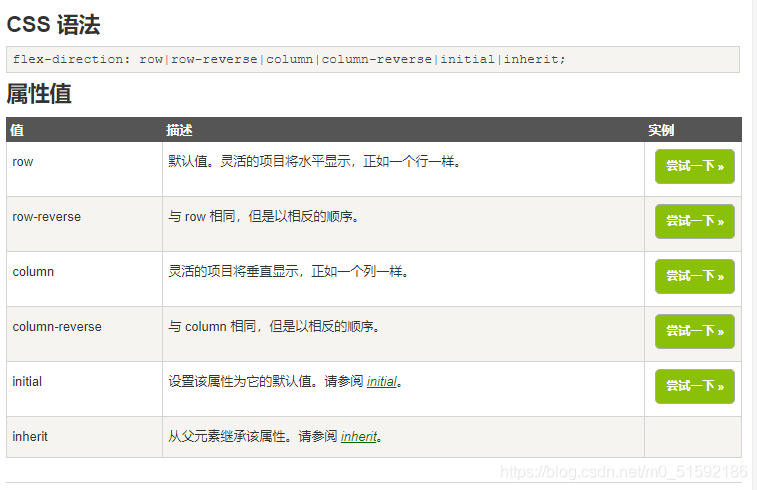
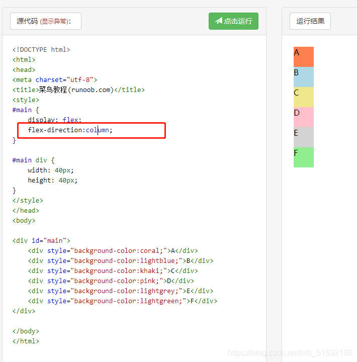
另外,如果遇到需要讓幾個靈活項目橫、縱向排列,可以用到flex-derection:
```
.flex-column{
// 靈活的項目將垂直顯示,正如一個列一樣。
flex-direction: column;
}
```
2.利用sass生成的css搭建web端
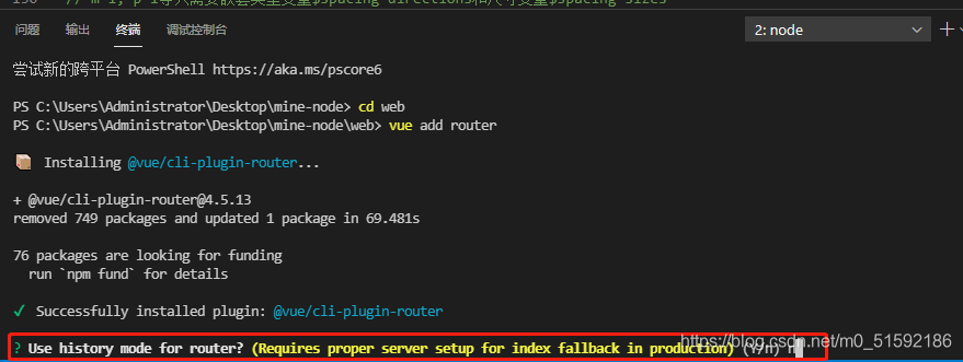
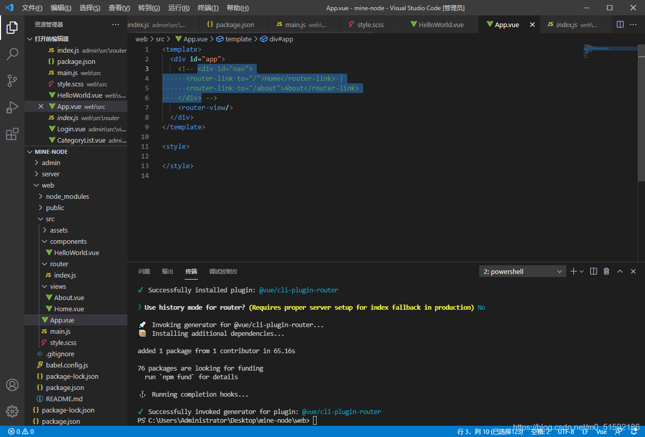
(1)添加web端路由
具體路由操作見admin路由設置
與admin端相同,直接給web端添加路由:
```
cd web
vue add router
```
選擇no,使用普通路由
安裝完成后,web端文件自動配置,同時頁面出現了路由:
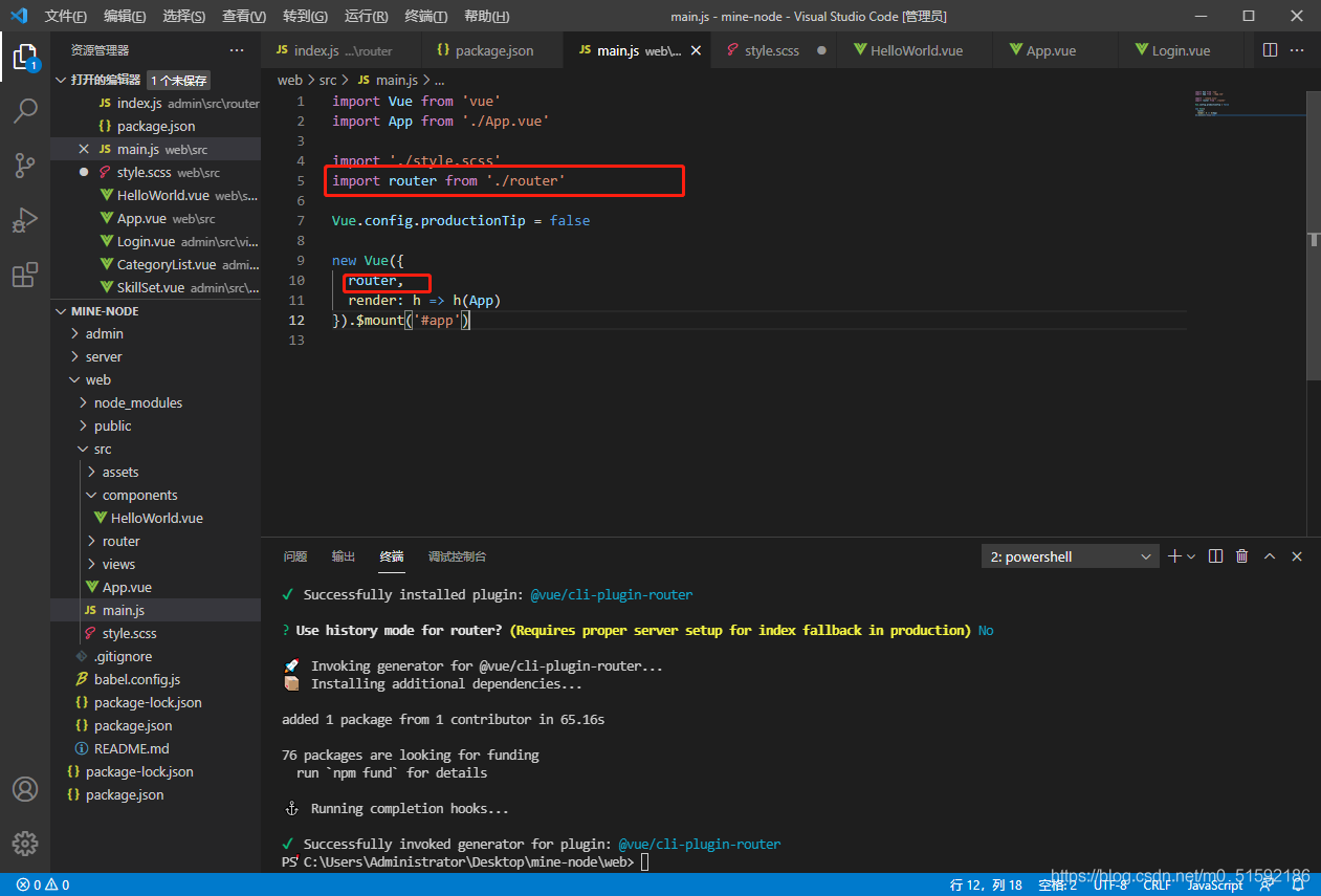
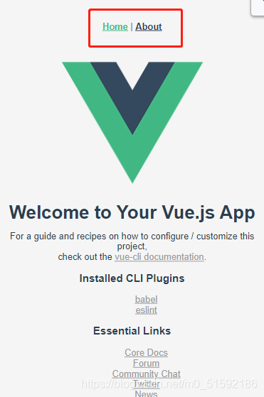
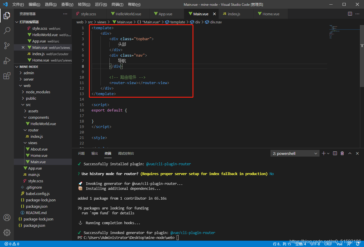
我們不在所有頁面使用固定路由,所以刪掉vue默認設置的路由。
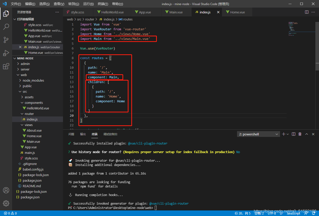
新建主入口頁面Main.vue,將Main組件當作主頁面,把Home.vue視為首頁組件,通過路由將Home.vue作為子組件引入到Main.vue:
待頁面樣式完善后,添加其他頁面路由。
(2)使用sass生成的css優化界面
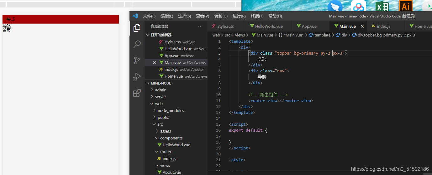
給我們需要添加效果的模塊直接添加類名即可。
我的頁面,其中首頁為Home.vue,技能學習為Skill.vue,文章中心為Article.vue:
在這里插入圖片描述
```
<template>
<div>
<div class="topbar py-2 px-3 d-flex ac-center">
<img src="../assets/logo.png" height="50">
<div class="px-2 flex-1">
<div class="text-black fs-lg pt-2">八方設計</div>
<div class="text-gray fs-xxs pt-2">用設計挖掘夢想</div>
</div>
<div class="py-3">
<button class="btn bg-primary text-white">用戶登錄</button>
</div>
</div>
<div class="bg-primary pt-3 pb-2">
<div class="nav d-flex text-white jc-around">
<div class="nav-item">
<!-- 導航使用路由的active-class,根據所在路由位置為標簽添加類名,同時在style.scss中設置active類名的樣式 -->
<!-- extra屬性與active-class配合使用,更精確找到路由位置,若不加則會認為/skill在/內(即技能學習在首頁內部),二者都會被賦予active類名 -->
<router-link class="nav-link" tag="div" to="/" active-class="active" exact>首頁</router-link>
</div>
<div class="nav-item">
<router-link class="nav-link" tag="div" to="/skill" active-class="active" exact>技能學習</router-link>
</div>
<div class="nav-item">
<router-link class="nav-link" tag="div" to="/article" active-class="active" exact>文章中心</router-link>
</div>
</div>
</div>
<!-- 路由組件 -->
<router-view></router-view>
</div>
</template>
<script>
export default {
}
</script>
<style>
.fs-xxs{
letter-spacing: 3px;
}
.fs-lg{
letter-spacing: 3px;
}
.topbar{
/* 吸頂效果 */
position: sticky;
top: 0;
z-index: 999;
}
</style>
```
style.scss
```
// 規范樣式
* {
// 避免margin/padding等將頁面向外擴充,加入border-box后頁面像內部擠壓
box-sizing: border-box;
// 取消鼠標移入等高亮樣式
outline: none;
}
html {
// 設置默認字體大小
font-size: 13px;
}
body {
// 設置body默認
// 去除body邊框
margin: 0;
// 設置字體:所有計算機自帶字體,蘋果電腦自帶字體,非襯線字體
font-family: Arial, Helvetica, sans-serif;
// 行距
line-height: 1.2rem;
// 背景顏色
background: #f5f5f5;
}
a {
color: #999;
}
ul, li{
list-style: none;
}
// colors常用顏色
$colors: (
// 主色
"primary": #a80506,
// 輔色
"auxiliary": #054ea8,
// 點綴色
"Embellishment":#db9e3f,
// 白色
"white": #fff,
// 黑色
"black": #000,
// 灰色
"gray": #777,
);
@each $colorKey, $color in $colors {
// 文字顏色
.text-#{$colorKey} {
color: $color;
}
// 背景顏色
.bg-#{$colorKey} {
background: $color;
}
}
// text常用文本
@each $var in (left, center, right) {
.text-#{$var}{
text-align: $var;
}
}
// 使用px to rem插件設置默認字體大小為13px
// 設置基礎字體大小
$base-font-size: 1rem;
// 根據基礎字體大小設置字體大小
$font-size: (
// 使用px to rem插件,alt + z 轉化px到rem
// xs為6px
xxs: 0.4615,
// xs為10px
xs: 0.7692,
// sm為12px
sm: 0.9231,
// md為13px
md: 1,
// lg為14px
lg: 1.0769,
// xl為16px
xl: 1.2308,
);
@each $sizeKey, $size in $font-size {
// 文字顏色
.fs-#{$sizeKey} {
font-size: $size * $base-font-size;
}
}
// flex布局
.d-flex{
display: flex;
}
.flex-1{
flex: 1;
}
.flex-column{
// 靈活的項目將垂直顯示,正如一個列一樣。
flex-direction: column;
}
$flex-jc: (
start: flex-start,
end: flex-end,
center: center,
between: space-between,
around: space-around,
);
@each $key,$value in $flex-jc {
.jc-#{$key} {
justify-content: $value;
}
}
$flex-ac: (
start: flex-start,
end: flex-end,
center: center,
between: space-between,
around: space-around,
stretch: stretch,
);
@each $key,$value in $flex-ac {
.ac-#{$key} {
align-content: $value;
}
}
// 間距spacing
// bootstrap中,mt-1 -> margin-top: 1rem, pb-2 -> padding-bottom: 2rem
// 類型
$spacing-types: (m: margin, p: padding);
// 方向
$spacing-directions: (t: top, r: right, b: bottom, l:left);
// 尺寸
$base-spacing-size: 1rem; // 基礎尺寸
$spacing-sizes: (0: 0, 1: 0.25, 2: 0.5, 3: 1, 4: 1.5, 5: 3); // 基礎尺寸為準的倍數
@each $typeKey, $type in $spacing-types {
@each $directionKey, $direction in $spacing-directions {
@each $sizeKey, $size in $spacing-sizes {
// 樣版: .mt-1 { margin-top: 0.25rem }
.#{$typeKey}#{$directionKey}-#{$sizeKey} {
#{$type}-#{$direction}: $size * $base-spacing-size;
}
}
}
}
// m-1, p-1等只需要嵌套類型變量$spacing-directions和尺寸變量$spacing-sizes
@each $typeKey, $type in $spacing-types {
@each $sizeKey, $size in $spacing-sizes {
// 樣版: .mt-1 { margin-top: 0.25rem }
.#{$typeKey}-#{$sizeKey} {
#{$type}: $size * $base-spacing-size;
}
}
}
// 水平、垂直方向邊距
@each $typeKey, $type in $spacing-types {
@each $sizeKey, $size in $spacing-sizes {
// mx-1,px-1
.#{$typeKey}x-#{$sizeKey} {
#{$type}-left: $size * $base-spacing-size;
#{$type}-right: $size * $base-spacing-size;
}
// my-1,py-1
.#{$typeKey}y-#{$sizeKey} {
#{$type}-top: $size * $base-spacing-size;
#{$type}-bottom: $size * $base-spacing-size;
}
}
}
// button
.btn{
border: none;
border-radius: 0.1538rem;
font-size: map-get($font-size, 'sm') * $base-font-size;
padding: 0.4rem 0.6rem;
}
// nav-border
.nav{
.nav-item{
border-bottom: 3px solid transparent;
padding-bottom: 0.2rem;
// 符號&代表上一層本身
.active{
border-bottom: 2px solid #fff;
}
}
}
```
- tp6+vue
- 1.工具和本地環境
- 2.啟動項目
- 3.路由、模型與數據庫操作
- 4.優化后端接口,前端使用axios實現接口功能
- 5.用戶登錄,bcrypt(hash)加密與驗證
- 6.用戶登錄(二),token驗證
- 7.分類的模型關聯和通用CRUD接口
- 8.使用vue的markdown編輯器并批量上傳圖片
- Node.js + Vue.js
- 工具,本地環境
- 2.1啟動項目
- 3.element-ui和vue-router路由的安裝和使用
- 4.使用axios,并創建接口上傳數據到mongodb數據庫
- 5.mongoodb數據庫的“刪、改、查”操作
- 6.mongodb數據庫無限層級的數據關聯(子分類)
- 7.使用mongodb數據庫關聯多個分類(關聯多個數據)
- 8.server端使用通用CRUD接口
- 9.圖片上傳
- 10.vue的富文本編輯器(vue2-editor)
- 11.動態添加分欄上傳多組數據
- 12-1.管理員模塊
- 13-1.搭建前臺web端頁面
- 1.使用sass工具搭建前臺web端頁面
- 2.sass工具的變量
- 3.使用flex布局并開始搭建web端
- 4.vue廣告輪播圖,并使用接口引入數據
- 5.使用字體圖標(iconfont)
- 6.卡片組件的封裝
- 14-1.生產環境編譯
- 1.環境編譯
- 2.購買域名服務器并解析域名到服務器
- 3.nginx配置web服務器并安裝網站環境
- 4.git拉取代碼到服務器
- 5.配置Nginx反向代理
- 6.遷移本地數據到服務器(mongodump)
- uni
- 1.工具&本地環境
- 2.頁面制作
- 3.頁面制作、組件與輪播
- 4.頁面跳轉與橫向滑動
- 5.用戶授權登錄和用戶信息獲取
- 6.用戶注冊和數據存儲
- 7.用戶填寫表單信息