
# 絕對損失和 Huber 損失
> 原文:[https://www.ste 科書.ds100.org/ch/10/modeling_abs_huber.html](https://www.ste 科書.ds100.org/ch/10/modeling_abs_huber.html)
```
# HIDDEN
# Clear previously defined variables
%reset -f
# Set directory for data loading to work properly
import os
os.chdir(os.path.expanduser('~/notebooks/10'))
```
```
# HIDDEN
import warnings
# Ignore numpy dtype warnings. These warnings are caused by an interaction
# between numpy and Cython and can be safely ignored.
# Reference: https://stackoverflow.com/a/40846742
warnings.filterwarnings("ignore", message="numpy.dtype size changed")
warnings.filterwarnings("ignore", message="numpy.ufunc size changed")
import numpy as np
import matplotlib.pyplot as plt
import pandas as pd
import seaborn as sns
%matplotlib inline
import ipywidgets as widgets
from ipywidgets import interact, interactive, fixed, interact_manual
import nbinteract as nbi
sns.set()
sns.set_context('talk')
np.set_printoptions(threshold=20, precision=2, suppress=True)
pd.options.display.max_rows = 7
pd.options.display.max_columns = 8
pd.set_option('precision', 2)
# This option stops scientific notation for pandas
# pd.set_option('display.float_format', '{:.2f}'.format)
```
```
# HIDDEN
tips = sns.load_dataset('tips')
tips['pcttip'] = tips['tip'] / tips['total_bill'] * 100
```
```
# HIDDEN
def mse_loss(theta, y_vals):
return np.mean((y_vals - theta) ** 2)
def abs_loss(theta, y_vals):
return np.mean(np.abs(y_vals - theta))
```
```
# HIDDEN
def compare_mse_abs(thetas, y_vals, xlims, figsize=(10, 7), cols=3):
if not isinstance(y_vals, np.ndarray):
y_vals = np.array(y_vals)
rows = int(np.ceil(len(thetas) / cols))
plt.figure(figsize=figsize)
for i, theta in enumerate(thetas):
ax = plt.subplot(rows, cols, i + 1)
sns.rugplot(y_vals, height=0.1, ax=ax)
plt.axvline(theta, linestyle='--',
label=rf'$ \theta = {theta} $')
plt.title(f'MSE = {mse_loss(theta, y_vals):.2f}\n'
f'MAE = {abs_loss(theta, y_vals):.2f}')
plt.xlim(*xlims)
plt.yticks([])
plt.legend()
plt.tight_layout()
```
為了擬合模型,我們選擇了一個損失函數,并選擇了使損失最小化的模型參數。在上一節中,我們介紹了均方誤差(mse)損失函數:
$$ \begin{aligned} L(\theta, \textbf{y}) &= \frac{1}{n} \sum_{i = 1}^{n}(y_i - \theta)^2\\ \end{aligned} $$
我們使用了一個常量模型來預測數據集中所有條目的相同數字$\theta$。當我們使用 MSE 損失來擬合這個模型時,我們發現$\hat \theta=\text mean(\textbf y)$。在 Tips 數據集中,我們發現擬合常數模型將預測$16.08\%$因為$16.08\%$是 Tip 百分比的平均值。
在本節中,我們介紹了兩個新的損耗函數,即**平均絕對誤差**損耗函數和**huber**損耗函數。
### 平均絕對誤差
現在,我們將保持我們的模型相同,但切換到一個不同的損失函數:平均絕對誤差(MAE)。這個損失函數取的是絕對差,而不是每個點的平方差和我們的預測值:
$$ \begin{aligned} L(\theta, \textbf{y}) &= \frac{1}{n} \sum_{i = 1}^{n} |y_i - \theta| \\ \end{aligned} $$
### 比較 mse 和 mae[?](#Comparing-MSE-and-MAE)
為了更好地了解 MSE 和 MAE 的比較方式,讓我們比較它們在不同數據集中的損失。首先,我們將使用一個點的數據集:$\textbf y=[14]$。
```
# HIDDEN
compare_mse_abs(thetas=[11, 12, 13, 14, 15, 16],
y_vals=[14], xlims=(10, 17))
```
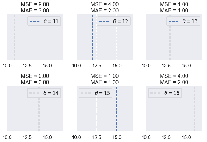
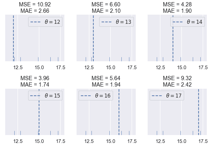
我們發現 MSE 通常高于 MAE,因為誤差是平方的。讓我們看看當有五個點時會發生什么:$\textbf y=[12.1,12.8,14.9,16.3,17.2]。$
```
# HIDDEN
compare_mse_abs(thetas=[12, 13, 14, 15, 16, 17],
y_vals=[12.1, 12.8, 14.9, 16.3, 17.2],
xlims=(11, 18))
```
請記住,實際損失值本身對我們不是很有趣;它們只對比較不同的$theta$值有用。一旦我們選擇了一個損失函數,我們將尋找產生最小損失的$\hat \theta$,即$\theta$。因此,我們感興趣的是損失函數是否產生不同的$\hat \theta$。
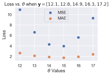
到目前為止,這兩個損失函數似乎在$\hat \theta 上達成一致。然而,如果我們再近一點看,就會發現一些差異。我們首先計算損失,并將它們與我們嘗試的 6 個$\theta$值的$theta$進行比較。
```
# HIDDEN
thetas = np.array([12, 13, 14, 15, 16, 17])
y_vals = np.array([12.1, 12.8, 14.9, 16.3, 17.2])
mse_losses = [mse_loss(theta, y_vals) for theta in thetas]
abs_losses = [abs_loss(theta, y_vals) for theta in thetas]
plt.scatter(thetas, mse_losses, label='MSE')
plt.scatter(thetas, abs_losses, label='MAE')
plt.title(r'Loss vs. $ \theta $ when $ \bf{y}$$= [ 12.1, 12.8, 14.9, 16.3, 17.2 ] $')
plt.xlabel(r'$ \theta $ Values')
plt.ylabel('Loss')
plt.legend();
```
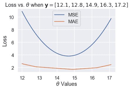
然后,我們計算更多的$\theta$值,使曲線平滑:
```
# HIDDEN
thetas = np.arange(12, 17.1, 0.05)
y_vals = np.array([12.1, 12.8, 14.9, 16.3, 17.2])
mse_losses = [mse_loss(theta, y_vals) for theta in thetas]
abs_losses = [abs_loss(theta, y_vals) for theta in thetas]
plt.plot(thetas, mse_losses, label='MSE')
plt.plot(thetas, abs_losses, label='MAE')
plt.title(r'Loss vs. $ \theta $ when $ \bf{y}$$ = [ 12.1, 12.8, 14.9, 16.3, 17.2 ] $')
plt.xlabel(r'$ \theta $ Values')
plt.ylabel('Loss')
plt.legend();
```
然后,我們放大 Y 軸上 1.5 到 5 之間的區域,以更清楚地看到最小值的差異。我們用虛線標出了最小值。
```
# HIDDEN
thetas = np.arange(12, 17.1, 0.05)
y_vals = np.array([12.1, 12.8, 14.9, 16.3, 17.2])
mse_losses = [mse_loss(theta, y_vals) for theta in thetas]
abs_losses = [abs_loss(theta, y_vals) for theta in thetas]
plt.figure(figsize=(7, 5))
plt.plot(thetas, mse_losses, label='MSE')
plt.plot(thetas, abs_losses, label='MAE')
plt.axvline(np.mean(y_vals), c=sns.color_palette()[0], linestyle='--',
alpha=0.7, label='Minimum MSE')
plt.axvline(np.median(y_vals), c=sns.color_palette()[1], linestyle='--',
alpha=0.7, label='Minimum MAE')
plt.title(r'Loss vs. $ \theta $ when $ \bf{y}$$ = [ 12.1, 12.8, 14.9, 16.3, 17.2 ] $')
plt.xlabel(r'$ \theta $ Values')
plt.ylabel('Loss')
plt.ylim(1.5, 5)
plt.legend()
plt.tight_layout();
```
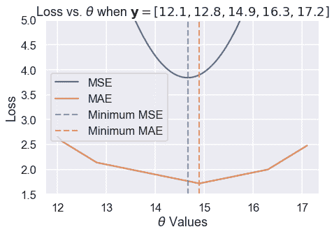
我們從經驗上發現,MSE 和 MAE 可以為同一個數據集生成不同的$\hat \theta。一個更仔細的分析揭示了它們何時會不同,更重要的是,它們為什么會不同。
### 離群值[?](#Outliers)
我們可以在上面的損失圖和$\theta$圖中看到的一個區別在于損失曲線的形狀。繪制均方根誤差會導致損失函數中平方項產生拋物線。
另一方面,繪制 MAE 會產生一系列連接的線條。當我們考慮到絕對值函數是線性的時,這是有意義的,因此取許多絕對值函數的平均值應該產生一個半線性函數。
由于 MSE 有一個平方誤差項,所以它對異常值更為敏感。如果$\theta=10$且一個點位于 110,則該點的毫秒誤差項將為$(10-110)^2=10000$而在 mae 中,該點的誤差項將為$10-110=100$。我們可以用一組三點來說明這一點,即$textbf y=[12,13,14]$并繪制 MSE 和 MAE 的損失與$theta$曲線。
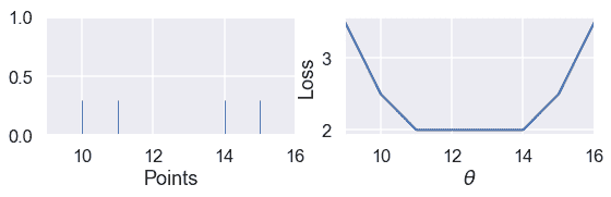
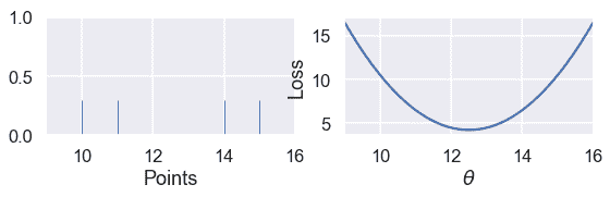
使用下面的滑塊將第三個點移動到遠離其余數據的位置,并觀察損失曲線會發生什么。(由于 MSE 的值大于 MAE,所以我們已經縮放了曲線以保持這兩個曲線都在視圖中。)
```
# HIDDEN
def compare_mse_abs_curves(y3=14):
thetas = np.arange(11.5, 26.5, 0.1)
y_vals = np.array([12, 13, y3])
mse_losses = [mse_loss(theta, y_vals) for theta in thetas]
abs_losses = [abs_loss(theta, y_vals) for theta in thetas]
mse_abs_diff = min(mse_losses) - min(abs_losses)
mse_losses = [loss - mse_abs_diff for loss in mse_losses]
plt.figure(figsize=(9, 2))
ax = plt.subplot(121)
sns.rugplot(y_vals, height=0.3, ax=ax)
plt.xlim(11.5, 26.5)
plt.xlabel('Points')
ax = plt.subplot(122)
plt.plot(thetas, mse_losses, label='MSE')
plt.plot(thetas, abs_losses, label='MAE')
plt.xlim(11.5, 26.5)
plt.ylim(min(abs_losses) - 1, min(abs_losses) + 10)
plt.xlabel(r'$ \theta $')
plt.ylabel('Loss')
plt.legend()
```
```
# HIDDEN
interact(compare_mse_abs_curves, y3=(14, 25));
```
<button class="js-nbinteract-widget">Loading widgets...</button>
我們已經顯示了下面$y_3=14$和$y_3=25$的曲線。
```
# HIDDEN
compare_mse_abs_curves(y3=14)
```
```
# HIDDEN
compare_mse_abs_curves(y3=25)
```
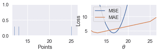
當我們將該點移離其他數據時,MSE 曲線也隨之移動。當$y_=14$時,mse 和 mae 都有$that \theta=13$。然而,當$y_=25$時,MSE 損失產生的是$hat \theta=16.7$而 MAE 產生的是$hat \theta=13$,與以前沒有變化。
### 最小化 mae[?](#Minimizing-the-MAE)
既然我們對 MSE 和 MAE 的區別有了定性的認識,我們就可以最小化 MAE,使這一區別更加精確。如前所述,我們將取損失函數對$\theta$的導數,并將其設為零。
然而,這一次我們必須處理這樣一個事實:絕對函數并不總是可微的。當$x>;0$時,$\frac \部分\部分 x x=1$時。當$x<;0$時,$\frac \部分\部分 x x=-1$時。雖然$x 在$x=0$時在技術上是不可微的,但是我們將設置$\frac \ partial \ partial x x=0$以便方程更容易處理。
回想一下,MAE 的方程是:
$$ \begin{aligned} L(\theta, \textbf{y}) &= \frac{1}{n} \sum_{i = 1}^{n}|y_i - \theta|\\ &= \frac{1}{n} \left( \sum_{y_i < \theta}|y_i - \theta| + \sum_{y_i = \theta}|y_i - \theta| + \sum_{y_i > \theta}|y_i - \theta| \right)\\ \end{aligned} $$
在上面的行中,我們將求和分為三個單獨的求和:一個是每$y_i<;\theta$有一個術語,一個是每$y_i=\theta$有一個術語,一個是每$y_i>;\theta$有一個術語。為什么求和看起來更復雜?如果我們知道$y_i<;\theta$我們也知道$y_i-\theta<;0$因此之前的$frac \ partial \ partial \theta y_i-\theta=-1$上面的每個術語都有類似的邏輯,以使取導數更容易。
現在,我們取與$\theta$相關的導數,并將其設為零:
$$ \begin{aligned} \frac{1}{n} \left( \sum_{y_i < \theta}(-1) + \sum_{y_i = \theta}(0) + \sum_{y_i > \theta}(1) \right) &= 0 \\ \sum_{y_i < \theta}(-1) + \sum_{y_i > \theta}(1) &= 0 \\ -\sum_{y_i < \theta}(1) + \sum_{y_i > \theta}(1) &= 0 \\ \sum_{y_i < \theta}(1) &= \sum_{y_i > \theta}(1) \\ \end{aligned} $$
上面的結果是什么意思?在左側,對于每個小于$\theta$的數據點,我們有一個術語。在右邊,對于每個大于$\theta$的數據點,我們都有一個。然后,為了滿足這個方程,我們需要為$\theta$選擇一個值,該值具有相同數量的較小和較大的點。這是一組數字的 _ 中位數 _ 的定義。因此,MAE 的$theta$的最小值是$that\theta=\text 中位數(\textbf y)$。
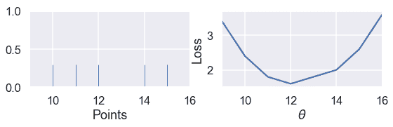
當我們有奇數個點時,當點按排序順序排列時,中間值就是中間點。我們可以看到,在下面的例子中,當$\theta$位于中間值時,損失最小:
```
# HIDDEN
def points_and_loss(y_vals, xlim, loss_fn=abs_loss):
thetas = np.arange(xlim[0], xlim[1] + 0.01, 0.05)
abs_losses = [loss_fn(theta, y_vals) for theta in thetas]
plt.figure(figsize=(9, 2))
ax = plt.subplot(121)
sns.rugplot(y_vals, height=0.3, ax=ax)
plt.xlim(*xlim)
plt.xlabel('Points')
ax = plt.subplot(122)
plt.plot(thetas, abs_losses)
plt.xlim(*xlim)
plt.xlabel(r'$ \theta $')
plt.ylabel('Loss')
points_and_loss(np.array([10, 11, 12, 14, 15]), (9, 16))
```
但是,當我們有偶數個點時,當$\theta$是兩個中心點之間的任何值時,損失最小。
```
# HIDDEN
points_and_loss(np.array([10, 11, 14, 15]), (9, 16))
```
當我們使用 MSE 時,情況并非如此:
```
# HIDDEN
points_and_loss(np.array([10, 11, 14, 15]), (9, 16), mse_loss)
```
### mse 與 mae 比較[?](#MSE-and-MAE-Comparison)
我們的研究和上述推導表明,MSE 比 MAE 更容易區分,但對異常值更敏感。對于 MSE,$\hat \theta=\text mean(\textbf y)$,而對于 mae \hat \theta=\text mean(\textbf y)$。注意中位數受異常值的影響比平均值小。這一現象源于我們對兩個損失函數的構造。
我們還發現 MSE 有一個唯一的$\hat \theta$,而平均絕對值在有偶數個數據點的情況下可以是多個可能的$\hat \theta$值。
### Huber 損失
第三個損失函數 huber loss 結合了 mse 和 mae,創建了一個對離群值具有可微性 _ 和 _ 的損失函數。Huber 損失通過類似于接近最小值的$\theta$值的 mse 函數和遠離最小值的$\theta$值的絕對損失來實現這一點。
和往常一樣,我們通過獲取數據集中每個點的 Huber 損失的平均值來創建一個損失函數。
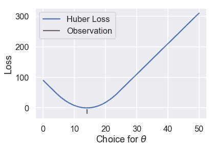
讓我們看看當我們改變$\theta$時,huber loss 函數為一個數據集輸出了什么樣的結果。
```
# HIDDEN
def huber_loss(est, y_obs, alpha = 1):
d = np.abs(est - y_obs)
return np.where(d < alpha,
(est - y_obs)**2 / 2.0,
alpha * (d - alpha / 2.0))
thetas = np.linspace(0, 50, 200)
loss = huber_loss(thetas, np.array([14]), alpha=5)
plt.plot(thetas, loss, label="Huber Loss")
plt.vlines(np.array([14]), -20, -5,colors="r", label="Observation")
plt.xlabel(r"Choice for $\theta$")
plt.ylabel(r"Loss")
plt.legend()
plt.savefig('huber_loss.pdf')
```
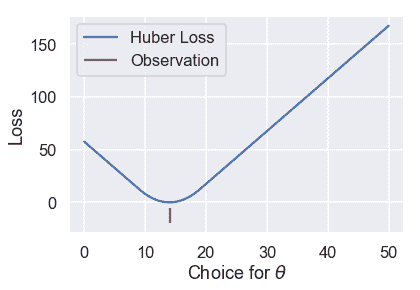
我們可以看到 Huber 損失是平穩的,不像 Mae。Huber 損失也以線性速率增加,與均方損失的二次速率不同。
然而,Huber 損失確實有一個缺點。注意,一旦$\theta$離這一點足夠遠,它就會從 MSE 過渡到 MAE。我們可以調整這個“足夠遠”來得到不同的損失曲線。例如,我們可以在離觀察點只有一個單位遠的地方進行一次$theta$轉換:
```
# HIDDEN
loss = huber_loss(thetas, np.array([14]), alpha=1)
plt.plot(thetas, loss, label="Huber Loss")
plt.vlines(np.array([14]), -20, -5,colors="r", label="Observation")
plt.xlabel(r"Choice for $\theta$")
plt.ylabel(r"Loss")
plt.legend()
plt.savefig('huber_loss.pdf')
```
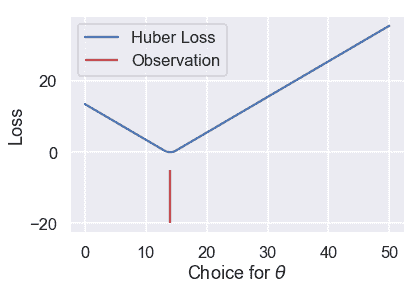
或者我們可以在離觀察點 10 個單位遠的地方進行轉換:
```
# HIDDEN
loss = huber_loss(thetas, np.array([14]), alpha=10)
plt.plot(thetas, loss, label="Huber Loss")
plt.vlines(np.array([14]), -20, -5,colors="r", label="Observation")
plt.xlabel(r"Choice for $\theta$")
plt.ylabel(r"Loss")
plt.legend()
plt.savefig('huber_loss.pdf')
```
此選擇會導致不同的損失曲線,因此可能會導致不同的值$\hat\theta$。如果我們想使用 Huber 損失函數,我們還有一個額外的任務,就是將這個轉換點設置為合適的值。
Huber 損失函數的數學定義如下:
$$ L_\alpha(\theta, \textbf{y}) = \frac{1}{n} \sum_{i=1}^n \begin{cases} \frac{1}{2}(y_i - \theta)^2 & | y_i - \theta | \le \alpha \\ \alpha ( |y_i - \theta| - \frac{1}{2}\alpha ) & \text{otherwise} \end{cases} $$
它比以前的損失函數更復雜,因為它結合了 MSE 和 MAE。附加參數$\alpha$設置 Huber 損失從 MSE 過渡到絕對損失的點。
嘗試求 Huber 損失函數的導數是繁瑣的,不會產生像 mse 和 mae 這樣優雅的結果。相反,我們可以使用一種稱為梯度下降的計算方法來找到$\theta$的最小值。
### 摘要[?](#Summary)
在本節中,我們介紹了兩個損失函數:平均絕對誤差和 Huber 損失函數。我們展示了一個使用 mae 擬合的常數模型,$\hat \theta=\text 中位數(\textbf y)$。
- 一、數據科學的生命周期
- 二、數據生成
- 三、處理表格數據
- 四、數據清理
- 五、探索性數據分析
- 六、數據可視化
- Web 技術
- 超文本傳輸協議
- 處理文本
- python 字符串方法
- 正則表達式
- regex 和 python
- 關系數據庫和 SQL
- 關系模型
- SQL
- SQL 連接
- 建模與估計
- 模型
- 損失函數
- 絕對損失和 Huber 損失
- 梯度下降與數值優化
- 使用程序最小化損失
- 梯度下降
- 凸性
- 隨機梯度下降法
- 概率與泛化
- 隨機變量
- 期望和方差
- 風險
- 線性模型
- 預測小費金額
- 用梯度下降擬合線性模型
- 多元線性回歸
- 最小二乘-幾何透視
- 線性回歸案例研究
- 特征工程
- 沃爾瑪數據集
- 預測冰淇淋評級
- 偏方差權衡
- 風險和損失最小化
- 模型偏差和方差
- 交叉驗證
- 正規化
- 正則化直覺
- L2 正則化:嶺回歸
- L1 正則化:LASSO 回歸
- 分類
- 概率回歸
- Logistic 模型
- Logistic 模型的損失函數
- 使用邏輯回歸
- 經驗概率分布的近似
- 擬合 Logistic 模型
- 評估 Logistic 模型
- 多類分類
- 統計推斷
- 假設檢驗和置信區間
- 置換檢驗
- 線性回歸的自舉(真系數的推斷)
- 學生化自舉
- P-HACKING
- 向量空間回顧
- 參考表
- Pandas
- Seaborn
- Matplotlib
- Scikit Learn