
# 正則化直覺
> 原文:[https://www.textbook.ds100.org/ch/16/reg_invituation.html](https://www.textbook.ds100.org/ch/16/reg_invituation.html)
```
# HIDDEN
# Clear previously defined variables
%reset -f
# Set directory for data loading to work properly
import os
os.chdir(os.path.expanduser('~/notebooks/16'))
```
```
# HIDDEN
import warnings
# Ignore numpy dtype warnings. These warnings are caused by an interaction
# between numpy and Cython and can be safely ignored.
# Reference: https://stackoverflow.com/a/40846742
warnings.filterwarnings("ignore", message="numpy.dtype size changed")
warnings.filterwarnings("ignore", message="numpy.ufunc size changed")
import numpy as np
import matplotlib.pyplot as plt
import pandas as pd
import seaborn as sns
%matplotlib inline
import ipywidgets as widgets
from ipywidgets import interact, interactive, fixed, interact_manual
import nbinteract as nbi
sns.set()
sns.set_context('talk')
np.set_printoptions(threshold=20, precision=2, suppress=True)
pd.options.display.max_rows = 7
pd.options.display.max_columns = 8
pd.set_option('precision', 2)
# This option stops scientific notation for pandas
# pd.set_option('display.float_format', '{:.2f}'.format)
```
```
# HIDDEN
def df_interact(df, nrows=7, ncols=7):
'''
Outputs sliders that show rows and columns of df
'''
def peek(row=0, col=0):
return df.iloc[row:row + nrows, col:col + ncols]
if len(df.columns) <= ncols:
interact(peek, row=(0, len(df) - nrows, nrows), col=fixed(0))
else:
interact(peek,
row=(0, len(df) - nrows, nrows),
col=(0, len(df.columns) - ncols))
print('({} rows, {} columns) total'.format(df.shape[0], df.shape[1]))
```
```
# HIDDEN
df = pd.read_csv('water_large.csv')
```
```
# HIDDEN
from collections import namedtuple
Curve = namedtuple('Curve', ['xs', 'ys'])
def flatten(seq): return [item for subseq in seq for item in subseq]
def make_curve(clf, x_start=-50, x_end=50):
xs = np.linspace(x_start, x_end, num=100)
ys = clf.predict(xs.reshape(-1, 1))
return Curve(xs, ys)
def plot_data(df=df, ax=plt, **kwargs):
ax.scatter(df.iloc[:, 0], df.iloc[:, 1], s=50, **kwargs)
def plot_curve(curve, ax=plt, **kwargs):
ax.plot(curve.xs, curve.ys, **kwargs)
def plot_curves(curves, cols=2):
rows = int(np.ceil(len(curves) / cols))
fig, axes = plt.subplots(rows, cols, figsize=(10, 8),
sharex=True, sharey=True)
for ax, curve, deg in zip(flatten(axes), curves, degrees):
plot_data(ax=ax, label='Training data')
plot_curve(curve, ax=ax, label=f'Deg {deg} poly')
ax.set_ylim(-5e10, 170e10)
ax.legend()
# add a big axes, hide frame
fig.add_subplot(111, frameon=False)
# hide tick and tick label of the big axes
plt.tick_params(labelcolor='none', top='off', bottom='off',
left='off', right='off')
plt.grid(False)
plt.title('Polynomial Regression')
plt.xlabel('Water Level Change (m)')
plt.ylabel('Water Flow (Liters)')
plt.tight_layout()
def print_coef(clf):
reg = clf.named_steps['reg']
print(reg.intercept_)
print(reg.coef_)
```
```
# HIDDEN
X = df.iloc[:, [0]].as_matrix()
y = df.iloc[:, 1].as_matrix()
degrees = [1, 2, 8, 12]
clfs = [Pipeline([('poly', PolynomialFeatures(degree=deg, include_bias=False)),
('reg', LinearRegression())])
.fit(X, y)
for deg in degrees]
curves = [make_curve(clf) for clf in clfs]
ridge_clfs = [Pipeline([('poly', PolynomialFeatures(degree=deg, include_bias=False)),
('reg', Ridge(alpha=0.1, normalize=True))])
.fit(X, y)
for deg in degrees]
ridge_curves = [make_curve(clf) for clf in ridge_clfs]
```
我們從一個例子開始討論正則化,這個例子說明了正則化的重要性。
## 大壩數據
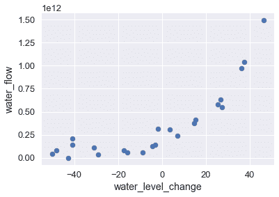
以下數據集以升為單位記錄某一天從大壩流出的水量,以米為單位記錄該天水位的變化量。
```
# HIDDEN
df
```
| | 水位變化 | 水流 |
| --- | --- | --- |
| 零 | -15.936758 | 6.042233E+10 號 |
| --- | --- | --- |
| 1 個 | -29.152979 年 | 3.321490E+10 型 |
| --- | --- | --- |
| 二 | 36.189549 年 | 9.727064E+11 號 |
| --- | --- | --- |
| …… | …… | ... |
| --- | --- | --- |
| 20 個 | 7.085480 | 2.363520E+11 號 |
| --- | --- | --- |
| 21 歲 | 46.282369 年 | 1.494256E+12 |
| --- | --- | --- |
| 二十二 | 14.612289 年 | 3.781463E+11 號 |
| --- | --- | --- |
23 行×2 列
繪制這些數據表明,隨著水位變得更為積極,水流呈上升趨勢。
```
# HIDDEN
df.plot.scatter(0, 1, s=50);
```
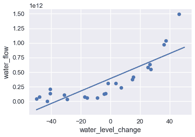
為了建立這個模式,我們可以使用最小二乘線性回歸模型。我們在下面的圖表中顯示數據和模型的預測。
```
# HIDDEN
df.plot.scatter(0, 1, s=50);
plot_curve(curves[0])
```
可視化結果表明,該模型不捕獲數據中的模式,模型具有很高的偏差。正如我們之前所做的,我們可以嘗試通過在數據中添加多項式特征來解決這個問題。我們添加 2、8 和 12 度的多項式特征;下表顯示了訓練數據和每個模型的預測。
```
# HIDDEN
plot_curves(curves)
```
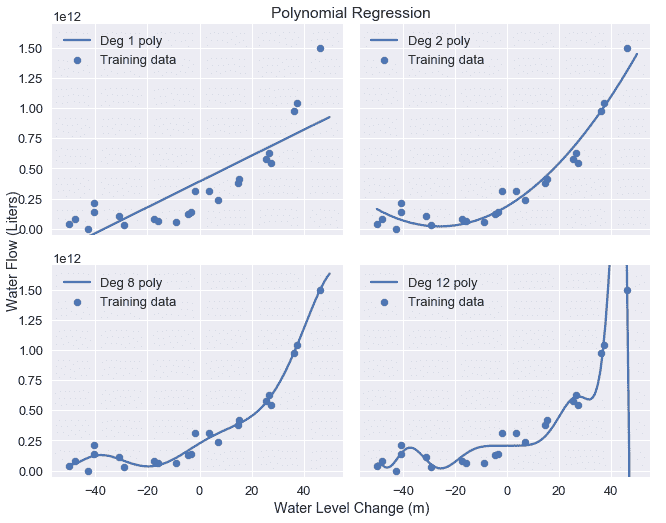
正如預期的那樣,12 次多項式很好地匹配訓練數據,但似乎也適合由噪聲引起的數據中的偽模式。這提供了另一個關于偏差-方差權衡的說明:線性模型具有高偏差和低方差,而度 12 多項式具有低偏差但高方差。
## 檢查系數[?](#Examining-Coefficients)
檢驗 12 次多項式模型的系數,發現該模型根據以下公式進行預測:
$$ 207097470825 + 1.8x + 482.6x^2 + 601.5x^3 + 872.8x^4 + 150486.6x^5 \\ + 2156.7x^6 - 307.2x^7 - 4.6x^8 + 0.2x^9 + 0.003x^{10} - 0.00005x^{11} + 0x^{12} $$
其中$x$是當天的水位變化。
模型的系數相當大,尤其是對模型方差有顯著貢獻的更高階項(例如,x^5$和 x^6$)。
## 懲罰參數[?](#Penalizing-Parameters)
回想一下,我們的線性模型根據以下內容進行預測,其中$\theta$是模型權重,$x$是特征向量:
$$ f_\hat{\theta}(x) = \hat{\theta} \cdot x $$
為了適應我們的模型,我們將均方誤差成本函數最小化,其中$x$用于表示數據矩陣,$y$用于觀察結果:
$$ \begin{aligned} L(\hat{\theta}, X, y) &= \frac{1}{n} \sum_{i}(y_i - f_\hat{\theta} (X_i))^2\\ \end{aligned} $$
為了將上述成本降到最低,我們調整$\hat \theta$直到找到最佳的權重組合,而不管權重本身有多大。然而,我們發現更復雜特征的權重越大,模型方差越大。如果我們可以改變成本函數來懲罰較大的權重值,那么得到的模型將具有較低的方差。我們用正規化來增加這個懲罰。
- 一、數據科學的生命周期
- 二、數據生成
- 三、處理表格數據
- 四、數據清理
- 五、探索性數據分析
- 六、數據可視化
- Web 技術
- 超文本傳輸協議
- 處理文本
- python 字符串方法
- 正則表達式
- regex 和 python
- 關系數據庫和 SQL
- 關系模型
- SQL
- SQL 連接
- 建模與估計
- 模型
- 損失函數
- 絕對損失和 Huber 損失
- 梯度下降與數值優化
- 使用程序最小化損失
- 梯度下降
- 凸性
- 隨機梯度下降法
- 概率與泛化
- 隨機變量
- 期望和方差
- 風險
- 線性模型
- 預測小費金額
- 用梯度下降擬合線性模型
- 多元線性回歸
- 最小二乘-幾何透視
- 線性回歸案例研究
- 特征工程
- 沃爾瑪數據集
- 預測冰淇淋評級
- 偏方差權衡
- 風險和損失最小化
- 模型偏差和方差
- 交叉驗證
- 正規化
- 正則化直覺
- L2 正則化:嶺回歸
- L1 正則化:LASSO 回歸
- 分類
- 概率回歸
- Logistic 模型
- Logistic 模型的損失函數
- 使用邏輯回歸
- 經驗概率分布的近似
- 擬合 Logistic 模型
- 評估 Logistic 模型
- 多類分類
- 統計推斷
- 假設檢驗和置信區間
- 置換檢驗
- 線性回歸的自舉(真系數的推斷)
- 學生化自舉
- P-HACKING
- 向量空間回顧
- 參考表
- Pandas
- Seaborn
- Matplotlib
- Scikit Learn