
#### 4.4.3 自定義View示例
4.4.1節和4.4.2節分別介紹了自定義View的類別和注意事項,本節將通過幾個實際的例子來演示如何自定義一個規范的View,通過本節的例子再結合上面兩節的內容,可以讓讀者更好地掌握自定義View。下面仍然按照自定義View的分類來介紹具體的實現細節。
* 1.繼承View重寫onDraw方法
這種方法主要用于實現一些不規則的效果,一般需要重寫onDraw方法。采用這種方式需要自己支持wrap_content,并且padding也需要自己處理。下面通過一個具體的例子來演示如何實現這種自定義View。
為了更好地展示一些平時不容易注意到的問題,這里選擇實現一個很簡單的自定義控件,簡單到只是繪制一個圓,盡管如此,需要注意的細節還是很多的。為了實現一個規范的控件,在實現過程中必須考慮到wrap_content模式以及padding,同時為了提高便捷性,還要對外提供自定義屬性。我們先來看一下最簡單的實現,代碼如下所示。
public class CircleView extends View {
private int mColor = Color.RED;
private Paint mPaint = new Paint(Paint.ANTI_ALIAS_FLAG);
public CircleView(Context context) {
super(context);
init();
}
public CircleView(Context context, AttributeSet attrs) {
super(context, attrs);
init();
}
public CircleView(Context context, AttributeSet attrs, int defStyleAttr) {
super(context, attrs, defStyleAttr);
init();
}
private void init() {
mPaint.setColor(mColor);
}
@Override
protected void onDraw(Canvas canvas) {
super.onDraw(canvas);
int width = getWidth();
int height = getHeight();
int radius = Math.min(width, height) / 2;
canvas.drawCircle(width / 2, height / 2, radius, mPaint);
}
}
上面的代碼實現了一個具有圓形效果的自定義View,它會在自己的中心點以寬/高的最小值為直徑繪制一個紅色的實心圓,它的實現很簡單,并且上面的代碼相信大部分初學者都能寫出來,但是不得不說,上面的代碼只是一種初級的實現,并不是一個規范的自定義View,為什么這么說呢?我們通過調整布局參數來對比一下。
請看下面的布局:
<LinearLayout xmlns:android="http://schemas.android.com/apk/res/android"
xmlns:tools="http://schemas.android.com/tools"
android:layout_width="match_parent"
android:layout_height="match_parent"
android:background="#ffffff"
android:orientation="vertical" >
<com.ryg.chapter_4.ui.CircleView
android:id="@+id/circleView1"
android:layout_width="match_parent"
android:layout_height="100dp"
android:background="#000000"/>
</LinearLayout>
再看一下運行的效果,如圖4-3中的(1)所示,這是我們預期的效果。接著再調整CircleView的布局參數,為其設置20dp的margin,調整后的布局如下所示。
:-: 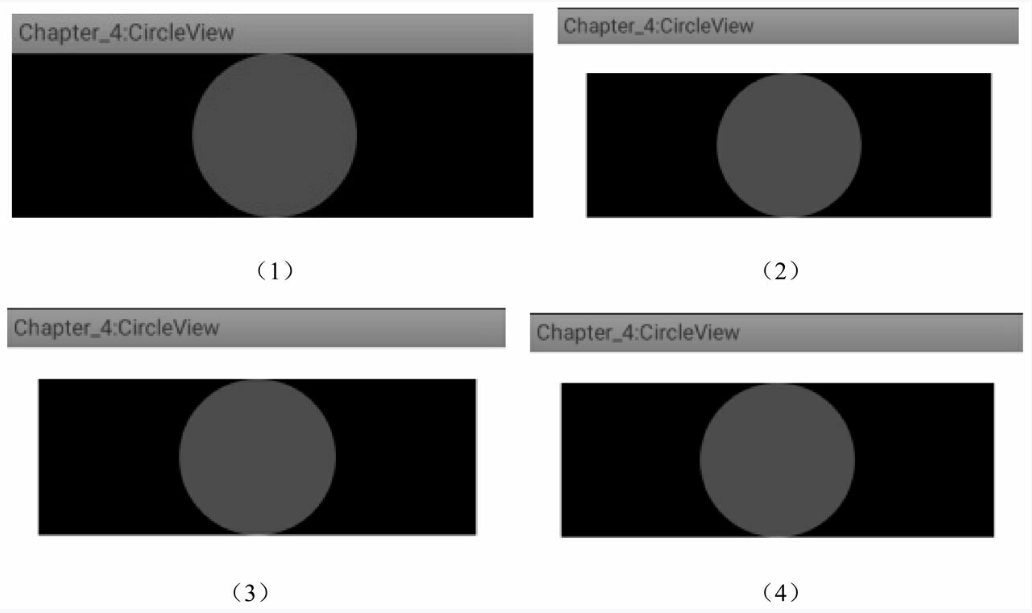
圖4-3 CircleView運行效果圖
```
<com.ryg.chapter_4.ui.CircleView
android:id="@+id/circleView1"
android:layout_width=" match_parent"
android:layout_height="100dp"
android:layout_margin="20dp"
android:background="#000000"/>
```
運行后看一下效果,如圖4-3中的(2)所示,這也是我們預期的效果,這說明margin屬性是生效的。這是因為margin屬性是由父容器控制的,因此不需要在CircleView中做特殊處理。再調整CircleView的布局參數,為其設置20dp的padding,如下所示。
```
<com.ryg.chapter_4.ui.CircleView
android:id="@+id/circleView1"
android:layout_width="match_parent"
android:layout_height="100dp"
android:layout_margin="20dp"
android:padding="20dp"
android:background="#000000"/>
```
運行后看一下效果,如圖4-3中的(3)所示。結果發現padding根本沒有生效,這就是我們在前面提到的直接繼承自View和ViewGroup的控件,padding是默認無法生效的,需要自己處理。再調整一下CircleView的布局參數,將其寬度設置為wrap_content,如下所示。
<com.ryg.chapter_4.ui.CircleView
android:id="@+id/circleView1"
android:layout_width="wrap_content"
android:layout_height="100dp"
android:layout_margin="20dp"
android:padding="20dp"
android:background="#000000"/>
運行后看一下效果,如圖4-3中的(4)所示,結果發現wrap_content并沒有達到預期的效果。對比下(3)和(4)的效果圖,發現寬度使用wrap_content和使用match_parent沒有任何區別。的確是這樣的,這一點在前面也已經提到過:對于直接繼承自View的控件,如果不對wrap_content做特殊處理,那么使用wrap_content就相當于使用match_parent。
為了解決上面提到的幾種問題,我們需要做如下處理:
首先,針對wrap_content的問題,其解決方法在4.3.1節中已經做了詳細的介紹,這里只需要指定一個wrap_content模式的默認寬/高即可,比如選擇200px作為默認的寬/高。
其次,針對padding的問題,也很簡單,只要在繪制的時候考慮一下padding即可,因此我們需要對onDraw稍微做一下修改,修改后的代碼如下所示。
protected void onDraw(Canvas canvas) {
super.onDraw(canvas);
final int paddingLeft = getPaddingLeft();
final int paddingRight = getPaddingLeft();
final int paddingTop = getPaddingLeft();
final int paddingBottom = getPaddingLeft();
int width = getWidth() - paddingLeft - paddingRight;
int height = getHeight() - paddingTop - paddingBottom;
int radius = Math.min(width, height) / 2;
canvas.drawCircle(paddingLeft + width / 2, paddingTop + height/2, radius,
mPaint);
}
上面的代碼很簡單,中心思想就是在繪制的時候考慮到View四周的空白即可,其中圓心和半徑都會考慮到View四周的padding,從而做相應的調整。
<com.ryg.chapter_4.ui.CircleView
android:id="@+id/circleView1"
android:layout_width="wrap_content"
android:layout_height="100dp"
android:layout_margin="20dp"
android:padding="20dp"
android:background="#000000"/>
針對上面的布局參數,我們再次運行一下,結果如圖4-4中的(1)所示,可以發現布局參數中的wrap_content和padding均生效了。
:-: 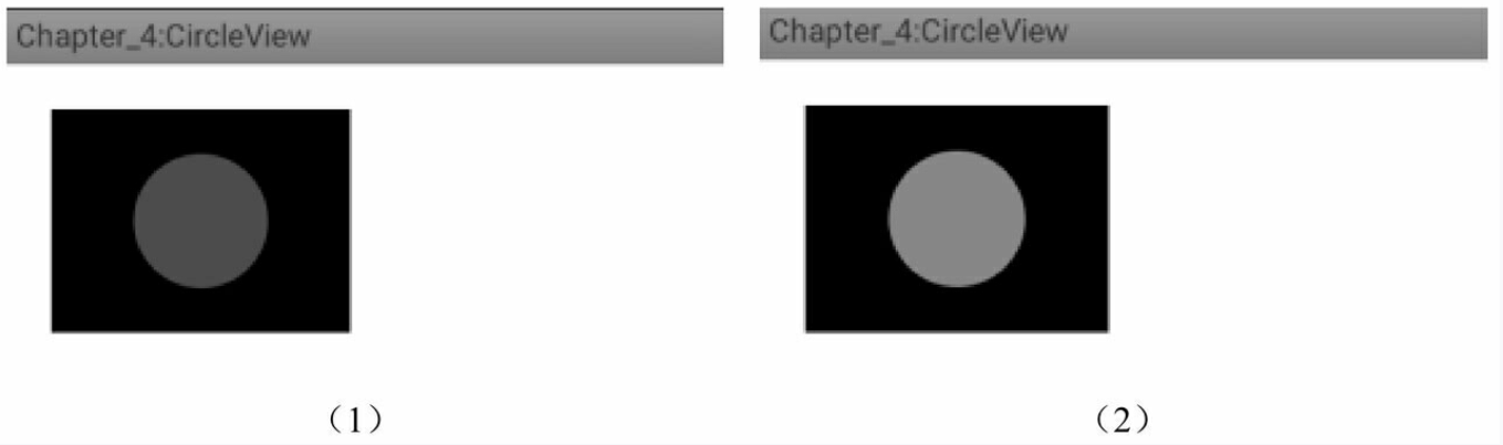
圖4-4 CircleView運行效果圖
最后,為了讓我們的View更加容易使用,很多情況下我們還需要為其提供自定義屬性,像android:layout_width和android:padding這種以android開頭的屬性是系統自帶的屬性,那么如何添加自定義屬性呢?這也不是什么難事,遵循如下幾步:
第一步,在values目錄下面創建自定義屬性的XML,比如attrs.xml,也可以選擇類似于attrs_circle_view.xml等這種以attrs_開頭的文件名,當然這個文件名并沒有什么限制,可以隨便取名字。針對本例來說,選擇創建attrs.xml文件,文件內容如下:
<? xml version="1.0" encoding="utf-8"? >
<resources>
<declare-styleable name="CircleView">
<attr name="circle_color" format="color" />
</declare-styleable>
</resources>
在上面的XML中聲明了一個自定義屬性集合“CircleView”,在這個集合里面可以有很多自定義屬性,這里只定義了一個格式為“color”的屬性“circle_color”,這里的格式color指的是顏色。除了顏色格式,自定義屬性還有其他格式,比如reference是指資源id, dimension是指尺寸,而像string、integer和boolean這種是指基本數據類型。除了列舉的這些還有其他類型,這里就不一一描述了,讀者查看一下文檔即可,這并沒有什么難度。
第二步,在View的構造方法中解析自定義屬性的值并做相應處理。對于本例來說,我們需要解析circle_color這個屬性的值,代碼如下所示。
public CircleView(Context context, AttributeSet attrs, int defStyleAttr) {
super(context, attrs, defStyleAttr);
TypedArray a = context.obtainStyledAttributes(attrs, R.styleable.
CircleView);
mColor = a.getColor(styleable.CircleView_circle_color, Color.RED);
a.recycle();
init();
}
這看起來很簡單,首先加載自定義屬性集合CircleView,接著解析CircleView屬性集合中的circle_color屬性,它的id為R.styleable.CircleView_circle_color。在這一步驟中,如果在使用時沒有指定circle_color這個屬性,那么就會選擇紅色作為默認的顏色值,解析完自定義屬性后,通過recycle方法來實現資源,這樣CircleView中所做的工作就完成了。
第三步,在布局文件中使用自定義屬性,如下所示。
<LinearLayout xmlns:android="http://schemas.android.com/apk/res/android"
xmlns:app="http://schemas.android.com/apk/res-auto"
android:layout_width="match_parent"
android:layout_height="match_parent"
android:background="#ffffff"
android:orientation="vertical" >
<com.ryg.chapter_4.ui.CircleView
android:id="@+id/circleView1"
android:layout_width="wrap_content"
android:layout_height="100dp"
android:layout_margin="20dp"
app:circle_color="@color/light_green"
android:padding="20dp"
android:background="#000000"/>
</LinearLayout>
上面的布局文件中有一點需要注意,首先,為了使用自定義屬性,必須在布局文件中添加schemas聲明:xmlns:app=http://schemas.android.com/apk/res-auto。在這個聲明中,app是自定義屬性的前綴,當然可以換其他名字,但是CircleView中的自定義屬性的前綴必須和這里的一致,然后就可以在CircleView中使用自定義屬性了,比如:app:circle_color= "@color/light_green"。另外,也有按照如下方式聲明`schemas:xmlns:app=http:// schemas.android.com/apk/res/com. ryg.chapter_4`,這種方式會在apk/res/后面附加應用的包名。但是這兩種方式并沒有本質區別,筆者比較喜歡的是xmlns:app=http://schemas.android.com/ apk/res-auto這種聲明方式。
到這里自定義屬性的使用過程就完成了,運行一下程序,效果如圖4-4中的(2)所示,很顯然,CircleView的自定義屬性circle_color生效了。下面給出CircleView的完整代碼,這時的CircleView已經是一個很規范的自定義View了,如下所示。
public class CircleView extends View {
private int mColor = Color.RED;
private Paint mPaint = new Paint(Paint.ANTI_ALIAS_FLAG);
public CircleView(Context context) {
super(context);
init();
}
public CircleView(Context context, AttributeSet attrs) {
this(context, attrs, 0);
}
public CircleView(Context context, AttributeSet attrs, int defStyleAttr)
{
super(context, attrs, defStyleAttr);
TypedArray a = context.obtainStyledAttributes(attrs, R.styleable.
CircleView);
mColor = a.getColor(R.styleable.CircleView_circle_color, Color.RED);
a.recycle();
init();
}
private void init() {
mPaint.setColor(mColor);
}
@Override
protected void onMeasure(int widthMeasureSpec, int heightMeasureSpec) {
super.onMeasure(widthMeasureSpec, heightMeasureSpec);
int widthSpecMode = MeasureSpec.getMode(widthMeasureSpec);
int widthSpecSize = MeasureSpec.getSize(widthMeasureSpec);
int heightSpecMode = MeasureSpec.getMode(heightMeasureSpec);
int heightSpecSize = MeasureSpec.getSize(heightMeasureSpec);
if (widthSpecMode == MeasureSpec.AT_MOST && heightSpecMode ==
MeasureSpec.AT_MOST) {
setMeasuredDimension(200, 200);
} else if (widthSpecMode == MeasureSpec.AT_MOST) {
setMeasuredDimension(200, heightSpecSize);
} else if (heightSpecMode == MeasureSpec.AT_MOST) {
setMeasuredDimension(widthSpecSize, 200);
}
}
@Override
protected void onDraw(Canvas canvas) {
super.onDraw(canvas);
final int paddingLeft = getPaddingLeft();
final int paddingRight = getPaddingLeft();
final int paddingTop = getPaddingLeft();
final int paddingBottom = getPaddingLeft();
int width = getWidth() - paddingLeft - paddingRight;
int height = getHeight() - paddingTop - paddingBottom;
int radius = Math.min(width, height) / 2;
canvas.drawCircle(paddingLeft + width / 2, paddingTop + height / 2,
radius, mPaint);
}
}
* 2.繼承ViewGroup派生特殊的Layout
這種方法主要用于實現自定義的布局,采用這種方式稍微復雜一些,需要合適地處理ViewGroup的測量、布局這兩個過程,并同時處理子元素的測量和布局過程。在第3章的3.5.3節中,我們分析了滑動沖突的兩種方式并實現了兩個自定義View:HorizontalScroll-ViewEx和StickyLayout,其中HorizontalScrollViewEx就是通過繼承ViewGroup來實現的自定義View,這里會再次分析它的measure和layout過程。
需要說明的是,如果要采用此種方法實現一個很規范的自定義View,是有一定的代價的,這點通過查看LinearLayout等的源碼就知道,它們的實現都很復雜。對于Horizontal-ScrollViewEx來說,這里不打算實現它的方方面面,僅僅是完成主要功能,但是需要規范化的地方會給出說明。
這里再回顧一下HorizontalScrollViewEx的功能,它主要是一個類似于ViewPager的控件,也可以說是一個類似于水平方向的LinearLayout的控件,它內部的子元素可以進行水平滑動并且子元素的內部還可以進行豎直滑動,這顯然是存在滑動沖突的,但是HorizontalScrollViewEx內部解決了水平和豎直方向的滑動沖突問題。關于HorizontalScrollViewEx是如何解決滑動沖突的,請參看第3章的相關內容。這里有一個假設,那就是所有子元素的寬/高都是一樣的。下面主要看一下它的onMeasure和onLayout方法的實現,先看onMeasure,如下所示。
```
protected void onMeasure(int widthMeasureSpec, int heightMeasureSpec) {
super.onMeasure(widthMeasureSpec, heightMeasureSpec);
int measuredWidth = 0;
int measuredHeight = 0;
final int childCount = getChildCount();
measureChildren(widthMeasureSpec, heightMeasureSpec);
int widthSpaceSize = MeasureSpec.getSize(widthMeasureSpec);
int widthSpecMode = MeasureSpec.getMode(widthMeasureSpec);
int heightSpaceSize = MeasureSpec.getSize(heightMeasureSpec);
int heightSpecMode = MeasureSpec.getMode(heightMeasureSpec);
if (childCount == 0) {
setMeasuredDimension(0, 0);
} else if (widthSpecMode == MeasureSpec.AT_MOST && heightSpecMode ==
MeasureSpec.AT_MOST) {
final View childView = getChildAt(0);
measuredWidth = childView.getMeasuredWidth() * childCount;
measuredHeight = childView.getMeasuredHeight();
setMeasuredDimension(measuredWidth, measuredHeight);
} else if (heightSpecMode == MeasureSpec.AT_MOST) {
final View childView = getChildAt(0);
measuredHeight = childView.getMeasuredHeight();
setMeasuredDimension(widthSpaceSize, childView.getMeasured-
Height());
} else if (widthSpecMode == MeasureSpec.AT_MOST) {
final View childView = getChildAt(0);
measuredWidth = childView.getMeasuredWidth() * childCount;
setMeasuredDimension(measuredWidth, heightSpaceSize);
}
}
```
這里說明一下上述代碼的邏輯,首先會判斷是否有子元素,如果沒有子元素就直接把自己的寬/高設為0;然后就是判斷寬和高是不是采用了wrap_content,如果寬采用了wrap_content,那么HorizontalScrollViewEx的寬度就是所有子元素的寬度之和;如果高度采用了wrap_content,那么HorizontalScrollViewEx的高度就是第一個子元素的高度。
上述代碼不太規范的地方有兩點:第一點是沒有子元素的時候不應該直接把寬/高設為0,而應該根據LayoutParams中的寬/高來做相應處理;第二點是在測量HorizontalScrollViewEx的寬/高時沒有考慮到它的padding以及子元素的margin,因為它的padding以及子元素的margin會影響到HorizontalScrollViewEx的寬/高。這是很好理解的,因為不管是自己的padding還是子元素的margin,占用的都是HorizontalScrollViewEx的空間。
接著再看一下HorizontalScrollViewEx的onLayout方法,如下所示。
protected void onLayout(boolean changed, int l, int t, int r, int b) {
int childLeft = 0;
final int childCount = getChildCount();
mChildrenSize = childCount;
for (int i = 0; i < childCount; i++) {
final View childView = getChildAt(i);
if (childView.getVisibility() ! = View.GONE) {
final int childWidth = childView.getMeasuredWidth();
mChildWidth = childWidth;
childView.layout(childLeft, 0, childLeft + childWidth,
childView.getMeasuredHeight());
childLeft += childWidth;
}
}
}
上述代碼的邏輯并不復雜,其作用是完成子元素的定位。首先會遍歷所有的子元素,如果這個子元素不是處于GONE這個狀態,那么就通過layout方法將其放置在合適的位置上。從代碼上來看,這個放置過程是由左向右的,這和水平方向的LinearLayout比較類似。上述代碼的不完美之處仍然在于放置子元素的過程沒有考慮到自身的padding以及子元素的margin,而從一個規范的控件的角度來看,這些都是應該考慮的。下面給出Horizontal-ScrollViewEx的完整代碼,如下所示。
public class HorizontalScrollViewEx extends ViewGroup {
private static final String TAG = "HorizontalScrollViewEx";
private int mChildrenSize;
private int mChildWidth;
private int mChildIndex;
// 分別記錄上次滑動的坐標
private int mLastX = 0;
private int mLastY = 0;
// 分別記錄上次滑動的坐標(onInterceptTouchEvent)
private int mLastXIntercept = 0;
private int mLastYIntercept = 0;
private Scroller mScroller;
private VelocityTracker mVelocityTracker;
public HorizontalScrollViewEx(Context context) {
super(context);
init();
}
public HorizontalScrollViewEx(Context context, AttributeSet attrs) {
super(context, attrs);
init();
}
public HorizontalScrollViewEx(Context context, AttributeSet attrs,
int defStyle) {
super(context, attrs, defStyle);
init();
}
private void init() {
if (mScroller == null) {
mScroller = new Scroller(getContext());
mVelocityTracker = VelocityTracker.obtain();
}
}
@Override
public boolean onInterceptTouchEvent(MotionEvent event) {
boolean intercepted = false;
int x = (int) event.getX();
int y = (int) event.getY();
switch (event.getAction()) {
case MotionEvent.ACTION_DOWN: {
intercepted = false;
if (! mScroller.isFinished()) {
mScroller.abortAnimation();
intercepted = true;
}
break;
}
case MotionEvent.ACTION_MOVE: {
int deltaX = x - mLastXIntercept;
int deltaY = y - mLastYIntercept;
if (Math.abs(deltaX) > Math.abs(deltaY)) {
intercepted = true;
} else {
intercepted = false;
}
break;
}
case MotionEvent.ACTION_UP: {
intercepted = false;
break;
}
default:
break;
}
Log.d(TAG, "intercepted=" + intercepted);
mLastX = x;
mLastY = y;
mLastXIntercept = x;
mLastYIntercept = y;
return intercepted;
}
@Override
public boolean onTouchEvent(MotionEvent event) {
mVelocityTracker.addMovement(event);
int x = (int) event.getX();
int y = (int) event.getY();
switch (event.getAction()) {
case MotionEvent.ACTION_DOWN: {
if (! mScroller.isFinished()) {
mScroller.abortAnimation();
}
break;
}
case MotionEvent.ACTION_MOVE: {
int deltaX = x - mLastX;
int deltaY = y - mLastY;
scrollBy(-deltaX, 0);
break;
}
case MotionEvent.ACTION_UP: {
int scrollX = getScrollX();
mVelocityTracker.computeCurrentVelocity(1000);
float xVelocity = mVelocityTracker.getXVelocity();
if (Math.abs(xVelocity) >= 50) {
mChildIndex = xVelocity > 0 ? mChildIndex -1 : mChildIndex + 1;
} else {
mChildIndex = (scrollX + mChildWidth / 2) / mChildWidth;
}
mChildIndex = Math.max(0, Math.min(mChildIndex, mChildrenSize -1));
int dx = mChildIndex * mChildWidth - scrollX;
smoothScrollBy(dx, 0);
mVelocityTracker.clear();
break;
}
default:
break;
}
mLastX = x;
mLastY = y;
return true;
}
@Override
protected void onMeasure(int widthMeasureSpec, int heightMeasureSpec) {
super.onMeasure(widthMeasureSpec, heightMeasureSpec);
int measuredWidth = 0;
int measuredHeight = 0;
final int childCount = getChildCount();
measureChildren(widthMeasureSpec, heightMeasureSpec);
int widthSpaceSize = MeasureSpec.getSize(widthMeasureSpec);
int widthSpecMode = MeasureSpec.getMode(widthMeasureSpec);
int heightSpaceSize = MeasureSpec.getSize(heightMeasureSpec);
int heightSpecMode = MeasureSpec.getMode(heightMeasureSpec);
if (childCount == 0) {
setMeasuredDimension(0, 0);
} else if (widthSpecMode == MeasureSpec.AT_MOST && heightSpecMode ==
MeasureSpec.AT_MOST) {
final View childView = getChildAt(0);
measuredWidth = childView.getMeasuredWidth() * childCount;
measuredHeight = childView.getMeasuredHeight();
setMeasuredDimension(measuredWidth, measuredHeight);
} else if (heightSpecMode == MeasureSpec.AT_MOST) {
final View childView = getChildAt(0);
measuredHeight = childView.getMeasuredHeight();
setMeasuredDimension(widthSpaceSize, childView.getMeasured-
Height());
} else if (widthSpecMode == MeasureSpec.AT_MOST) {
final View childView = getChildAt(0);
measuredWidth = childView.getMeasuredWidth() * childCount;
setMeasuredDimension(measuredWidth, heightSpaceSize);
}
}
@Override
protected void onLayout(boolean changed, int l, int t, int r, int b) {
int childLeft = 0;
final int childCount = getChildCount();
mChildrenSize = childCount;
for (int i = 0; i < childCount; i++) {
final View childView = getChildAt(i);
if (childView.getVisibility() ! = View.GONE) {
final int childWidth = childView.getMeasuredWidth();
mChildWidth = childWidth;
childView.layout(childLeft, 0, childLeft + childWidth,
childView.getMeasuredHeight());
childLeft += childWidth;
}
}
}
private void smoothScrollBy(int dx, int dy) {
mScroller.startScroll(getScrollX(), 0, dx, 0, 500);
invalidate();
}
@Override
public void computeScroll() {
if (mScroller.computeScrollOffset()) {
scrollTo(mScroller.getCurrX(), mScroller.getCurrY());
postInvalidate();
}
}
@Override
protected void onDetachedFromWindow() {
mVelocityTracker.recycle();
super.onDetachedFromWindow();
}
}
繼承特定的View(比如TextView)和繼承特定的ViewGroup(比如LinearLayout)這兩種方式比較簡單,這里就不再舉例說明了,關于第3章中提到的StickyLayout的具體實現,大家可以參看筆者在Github上的開源項目:https://github.com/singwhatiwanna/Pinned-HeaderExpandableListView。
- 前言
- 第1章 Activity的生命周期和啟動模式
- 1.1 Activity的生命周期全面分析
- 1.1.1 典型情況下的生命周期分析
- 1.1.2 異常情況下的生命周期分析
- 1.2 Activity的啟動模式
- 1.2.1 Activity的LaunchMode
- 1.2.2 Activity的Flags
- 1.3 IntentFilter的匹配規則
- 第2章 IPC機制
- 2.1 Android IPC簡介
- 2.2 Android中的多進程模式
- 2.2.1 開啟多進程模式
- 2.2.2 多進程模式的運行機制
- 2.3 IPC基礎概念介紹
- 2.3.1 Serializable接口
- 2.3.2 Parcelable接口
- 2.3.3 Binder
- 2.4 Android中的IPC方式
- 2.4.1 使用Bundle
- 2.4.2 使用文件共享
- 2.4.3 使用Messenger
- 2.4.4 使用AIDL
- 2.4.5 使用ContentProvider
- 2.4.6 使用Socket
- 2.5 Binder連接池
- 2.6 選用合適的IPC方式
- 第3章 View的事件體系
- 3.1 View基礎知識
- 3.1.1 什么是View
- 3.1.2 View的位置參數
- 3.1.3 MotionEvent和TouchSlop
- 3.1.4 VelocityTracker、GestureDetector和Scroller
- 3.2 View的滑動
- 3.2.1 使用scrollTo/scrollBy
- 3.2.2 使用動畫
- 3.2.3 改變布局參數
- 3.2.4 各種滑動方式的對比
- 3.3 彈性滑動
- 3.3.1 使用Scroller7
- 3.3.2 通過動畫
- 3.3.3 使用延時策略
- 3.4 View的事件分發機制
- 3.4.1 點擊事件的傳遞規則
- 3.4.2 事件分發的源碼解析
- 3.5 View的滑動沖突
- 3.5.1 常見的滑動沖突場景
- 3.5.2 滑動沖突的處理規則
- 3.5.3 滑動沖突的解決方式
- 第4章 View的工作原理
- 4.1 初識ViewRoot和DecorView
- 4.2 理解MeasureSpec
- 4.2.1 MeasureSpec
- 4.2.2 MeasureSpec和LayoutParams的對應關系
- 4.3 View的工作流程
- 4.3.1 measure過程
- 4.3.2 layout過程
- 4.3.3 draw過程
- 4.4 自定義View
- 4.4.1 自定義View的分類
- 4.4.2 自定義View須知
- 4.4.3 自定義View示例
- 4.4.4 自定義View的思想
- 第5章 理解RemoteViews
- 5.1 RemoteViews的應用
- 5.1.1 RemoteViews在通知欄上的應用
- 5.1.2 RemoteViews在桌面小部件上的應用
- 5.1.3 PendingIntent概述
- 5.2 RemoteViews的內部機制
- 5.3 RemoteViews的意義
- 第6章 Android的Drawable
- 6.1 Drawable簡介
- 6.2 Drawable的分類
- 6.2.1 BitmapDrawable2
- 6.2.2 ShapeDrawable
- 6.2.3 LayerDrawable
- 6.2.4 StateListDrawable
- 6.2.5 LevelListDrawable
- 6.2.6 TransitionDrawable
- 6.2.7 InsetDrawable
- 6.2.8 ScaleDrawable
- 6.2.9 ClipDrawable
- 6.3 自定義Drawable
- 第7章 Android動畫深入分析
- 7.1 View動畫
- 7.1.1 View動畫的種類
- 7.1.2 自定義View動畫
- 7.1.3 幀動畫
- 7.2 View動畫的特殊使用場景
- 7.2.1 LayoutAnimation
- 7.2.2 Activity的切換效果
- 7.3 屬性動畫
- 7.3.1 使用屬性動畫
- 7.3.2 理解插值器和估值器 /
- 7.3.3 屬性動畫的監聽器
- 7.3.4 對任意屬性做動畫
- 7.3.5 屬性動畫的工作原理
- 7.4 使用動畫的注意事項
- 第8章 理解Window和WindowManager
- 8.1 Window和WindowManager
- 8.2 Window的內部機制
- 8.2.1 Window的添加過程
- 8.2.2 Window的刪除過程
- 8.2.3 Window的更新過程
- 8.3 Window的創建過程
- 8.3.1 Activity的Window創建過程
- 8.3.2 Dialog的Window創建過程
- 8.3.3 Toast的Window創建過程
- 第9章 四大組件的工作過程
- 9.1 四大組件的運行狀態
- 9.2 Activity的工作過程
- 9.3 Service的工作過程
- 9.3.1 Service的啟動過程
- 9.3.2 Service的綁定過程
- 9.4 BroadcastReceiver的工作過程
- 9.4.1 廣播的注冊過程
- 9.4.2 廣播的發送和接收過程
- 9.5 ContentProvider的工作過程
- 第10章 Android的消息機制
- 10.1 Android的消息機制概述
- 10.2 Android的消息機制分析
- 10.2.1 ThreadLocal的工作原理
- 10.2.2 消息隊列的工作原理
- 10.2.3 Looper的工作原理
- 10.2.4 Handler的工作原理
- 10.3 主線程的消息循環
- 第11章 Android的線程和線程池
- 11.1 主線程和子線程
- 11.2 Android中的線程形態
- 11.2.1 AsyncTask
- 11.2.2 AsyncTask的工作原理
- 11.2.3 HandlerThread
- 11.2.4 IntentService
- 11.3 Android中的線程池
- 11.3.1 ThreadPoolExecutor
- 11.3.2 線程池的分類
- 第12章 Bitmap的加載和Cache
- 12.1 Bitmap的高效加載
- 12.2 Android中的緩存策略
- 12.2.1 LruCache
- 12.2.2 DiskLruCache
- 12.2.3 ImageLoader的實現446
- 12.3 ImageLoader的使用
- 12.3.1 照片墻效果
- 12.3.2 優化列表的卡頓現象
- 第13章 綜合技術
- 13.1 使用CrashHandler來獲取應用的crash信息
- 13.2 使用multidex來解決方法數越界
- 13.3 Android的動態加載技術
- 13.4 反編譯初步
- 13.4.1 使用dex2jar和jd-gui反編譯apk
- 13.4.2 使用apktool對apk進行二次打包
- 第14章 JNI和NDK編程
- 14.1 JNI的開發流程
- 14.2 NDK的開發流程
- 14.3 JNI的數據類型和類型簽名
- 14.4 JNI調用Java方法的流程
- 第15章 Android性能優化
- 15.1 Android的性能優化方法
- 15.1.1 布局優化
- 15.1.2 繪制優化
- 15.1.3 內存泄露優化
- 15.1.4 響應速度優化和ANR日志分析
- 15.1.5 ListView和Bitmap優化
- 15.1.6 線程優化
- 15.1.7 一些性能優化建議
- 15.2 內存泄露分析之MAT工具
- 15.3 提高程序的可維護性